Warehouse Efficiency Dashboard in HTML
Warehouse Efficiency Dashboard in HTML is a modern, interactive, and browser-based analytics dashboard built for warehouse managers, logistics coordinators, supply chain directors, and operations teams who need to monitor shipment performance, storage costs, worker productivity, and shipping efficiency from a single centralized reporting tool. This dashboard includes 5 interactive pages and tracks 6 key performance indicators including Total Shipments, Total Shipping Cost, Avg Pick Time, Total Storage Cost, Avg Satisfaction, and Total Qty Shipped.
In today’s competitive supply chain environment, warehouse teams manage dozens of metrics across multiple facilities, zones, shifts, and carriers simultaneously. Without a centralized reporting tool, critical insights get buried in scattered spreadsheets and manual reports. The Warehouse Efficiency Dashboard in HTML solves this challenge by transforming raw warehouse data into clear, visual, and actionable insights through an interactive browser-based interface with dynamic charts, KPI cards, and slicer-based filtering.
Whether you handle shipments for a single warehouse or coordinate operations across multiple facilities, this HTML dashboard gives you the clarity you need to optimize every aspect of warehouse operations — from picking and packing to carrier selection and worker shift analysis. Simply unzip the file, open index.html in any modern browser, and start analyzing immediately with no software installation required.

Key Features of Warehouse Efficiency Dashboard in HTML
The Warehouse Efficiency Dashboard in HTML delivers a comprehensive warehouse analytics experience through 5 interactive pages. Each page is designed to address a specific area of warehouse operations — from high-level KPI monitoring on the Overview page to granular worker-level productivity analysis on the Worker Productivity page.
The dashboard tracks 6 high-level KPI cards on the Overview page: Total Shipments, Total Shipping Cost, Avg Pick Time, Total Storage Cost, Avg Satisfaction, and Total Qty Shipped. These metrics provide an instant health check of your entire warehouse operation at a glance. Dynamic slicer controls allow you to filter all pages by product category, warehouse, order type, carrier, shift, zone, and priority level for targeted analysis.
The template features professional SaaS-style design with a clean, modern interface optimized for desktops, laptops, and tablets. It runs entirely in your web browser with no software installation, no plugins, and no coding required. The Data View page includes search, sorting, pagination, and CSV export functionality for record-level analysis and custom reporting.
If you are looking for more HTML Dashboard Templates, explore the full collection at NextGenTemplates. You may also find the Warehouse Efficiency Dashboard in Excel useful if your team prefers spreadsheet-based analytics, or check out the Inventory Management Dashboard in HTML for stock and warehouse tracking.
Dashboard Pages Explanation
1. Overview Page
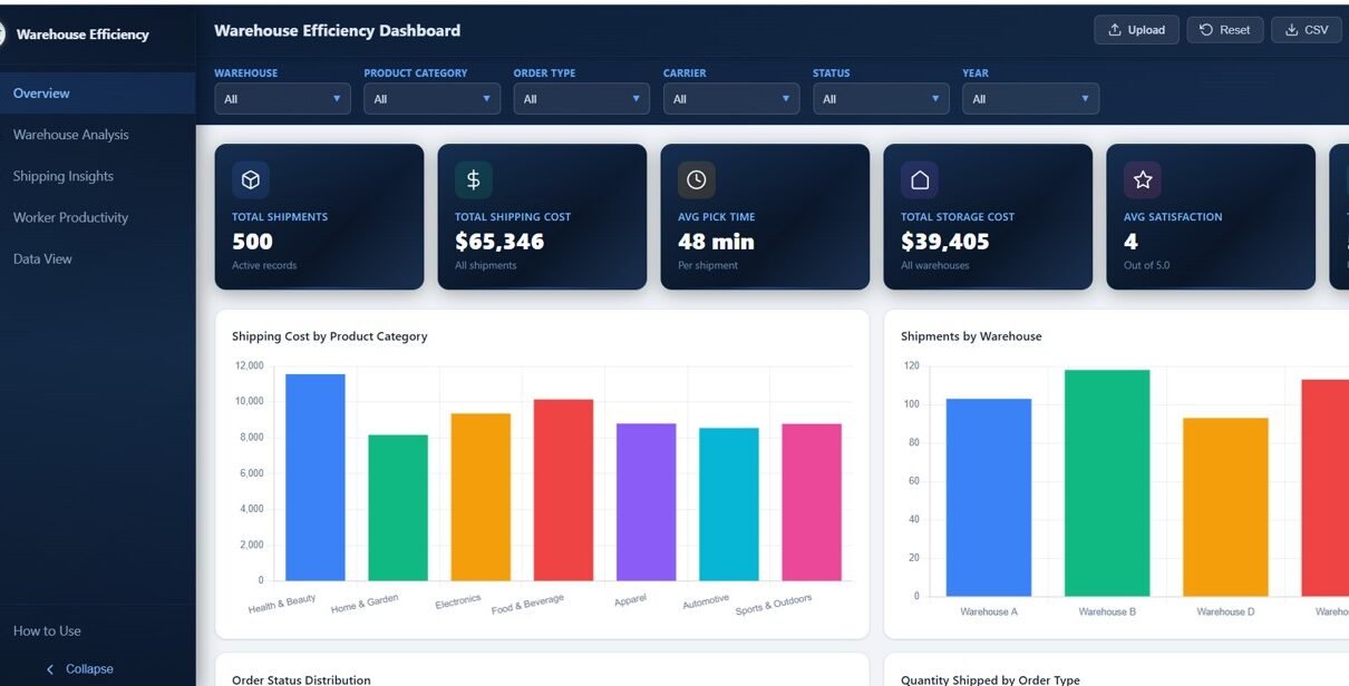
The Overview page serves as the central command center of the Warehouse Efficiency Dashboard in HTML. At the top, you will find 6 KPI summary cards displaying Total Shipments, Total Shipping Cost, Avg Pick Time, Total Storage Cost, Avg Satisfaction, and Total Qty Shipped — giving you an immediate snapshot of warehouse health.
Below the KPI cards, the page features several analytical charts: Shipping Cost by Product Category breaks down costs across different product lines to identify the most expensive categories to ship. Shipments by Warehouse compares shipment volumes across your warehouse facilities. Order Status Distribution shows the breakdown of orders by their current status (completed, pending, cancelled, etc.). Quantity Shipped by Order Type analyzes how much volume flows through different order channels. Multiple slicers on the page let you apply filters and see the filtered dashboard quickly.
Warehouse Efficiency Dashboard Overview2. Warehouse Analysis
The Warehouse Analysis page provides a deep-dive into warehouse-level performance metrics. This page includes four focused analytical charts: Pick Time by Warehouse shows how long it takes to pick orders at each facility, helping you identify slow facilities that need process improvement. Storage Cost by Zone breaks down storage expenses across different warehouse zones, enabling better zone allocation and cost optimization.
Shipments by Zone visualizes shipment volumes across zones to understand which areas handle the most traffic. Quantity Ordered vs Shipped by Warehouse compares order demand against actual shipments to identify fulfillment gaps and bottlenecks at specific locations.
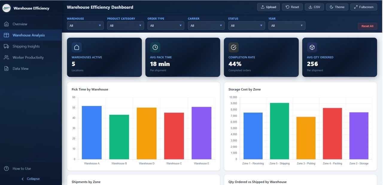 Warehouse Analysis
3. Shipping Insights
The Shipping Insights page focuses on transportation and carrier performance analytics. Shipping Cost by Carrier compares how much each carrier charges, helping logistics teams negotiate better rates and identify the most cost-effective partners. Shipments by Priority analyzes shipment distribution across different priority levels (standard, express, overnight) to understand your shipping mix.
Monthly Shipping Cost Trend tracks shipping expenses over time to identify seasonal patterns and cost spikes. Average Distance by Carrier shows which carriers handle longer or shorter routes, supporting route optimization and carrier assignment decisions.
 Shipping Insights
4. Worker Productivity
The Worker Productivity page provides comprehensive workforce analytics for warehouse operations. Shipments by Shift compares how many shipments each shift handles, helping managers balance workload distribution. Average Satisfaction Score by Shift tracks customer satisfaction linked to each shift’s output quality.
Pick Time vs Pack Time by Shift analyzes the efficiency breakdown between picking and packing operations across different shifts. Top 10 Workers by Shipments highlights your best-performing warehouse workers by total shipments processed — essential for performance reviews, incentive programs, and identifying training opportunities for underperforming staff.
 Worker Productivity
5. Data View
The Data View page is a detailed data table page where you can see all the records with search, sort, and pagination features. You can quickly find specific records using the search bar, sort by any column for organized analysis, and navigate through pages of data effortlessly. You can also export the filtered data to CSV for further analysis in Excel, Google Sheets, or any data tool of your choice.
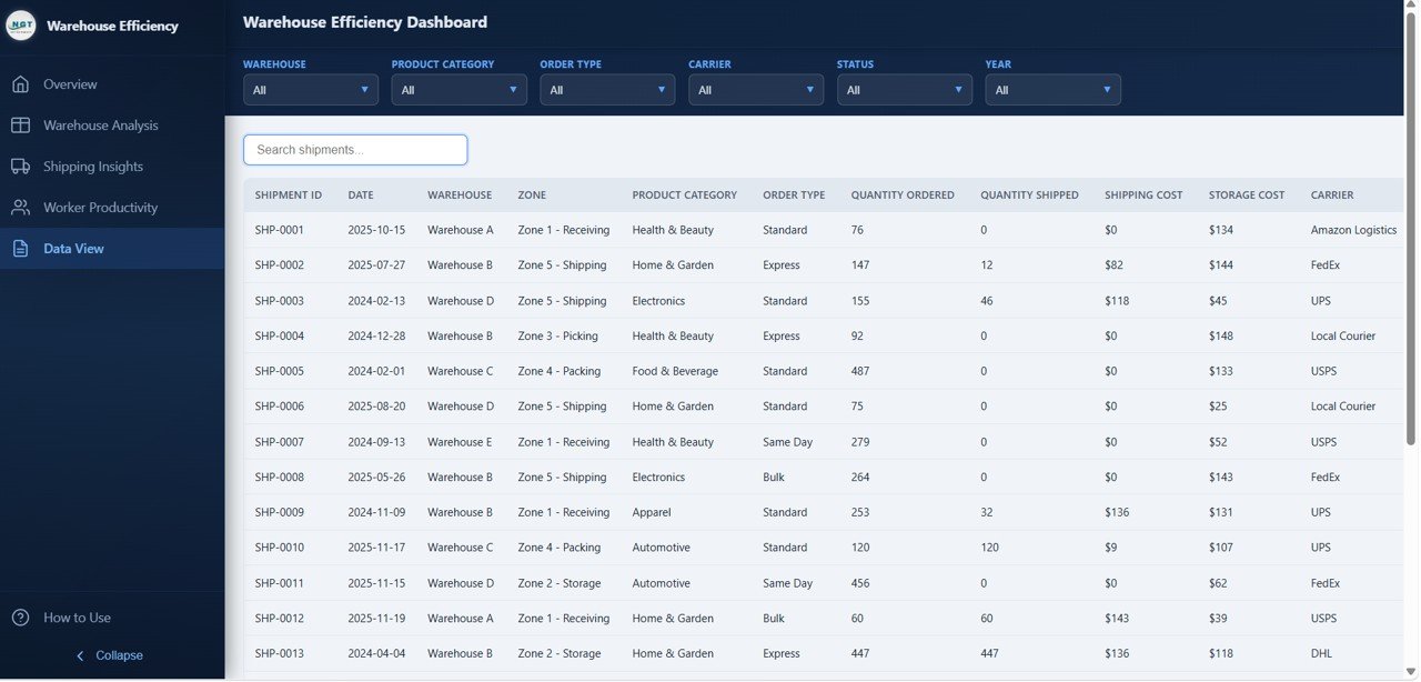 Data View
Advantages of Warehouse Efficiency Dashboard in HTML
The Warehouse Efficiency Dashboard in HTML offers several significant advantages over traditional reporting methods. First, it provides centralized visibility — all your warehouse KPIs, shipping metrics, and worker performance data are consolidated into one interactive interface instead of being scattered across multiple spreadsheets and reports.
Second, the browser-based design means zero software installation. Any team member can open the dashboard in Chrome, Edge, or Firefox without needing Excel, Power BI, or specialized BI tools. This makes it perfect for sharing with stakeholders who may not have analytics software installed.
Third, the interactive slicers and dynamic filtering allow instant drill-down analysis. Instead of creating separate reports for each warehouse, zone, or carrier, you can filter the entire dashboard with one click. The professional SaaS-style design also makes it presentation-ready for executive meetings and stakeholder reviews without any additional formatting.
Opportunities for Improvement
While the Warehouse Efficiency Dashboard in HTML provides comprehensive warehouse analytics out of the box, there are opportunities to extend its functionality. Teams with advanced requirements could integrate real-time data feeds by connecting the dashboard to a live database or API endpoint for automatic data updates.
Organizations with very large datasets exceeding thousands of records may want to implement server-side pagination for the Data View page. Additionally, teams that need automated email alerts for KPI thresholds (such as when pick times exceed targets or shipping costs spike) could extend the dashboard with notification integrations.
Best Practices for Using This Dashboard
To get the most value from the Warehouse Efficiency Dashboard in HTML, start by reviewing the Overview page daily to catch any KPI anomalies early. Use the slicers to compare performance across warehouses and shifts on a weekly basis. Review the Shipping Insights page monthly to evaluate carrier costs and negotiate better rates based on data.
Keep your data updated regularly — ideally weekly or daily for active warehouses. Use the Worker Productivity page during quarterly performance reviews to identify top performers and areas needing training. Export data from the Data View page for deeper analysis or to create custom reports for specific stakeholders. For the best presentation experience, use the dashboard in full-screen mode during executive meetings.
Explore Relevant Templates
If you found the Warehouse Efficiency Dashboard in HTML useful, explore these related templates from NextGenTemplates:
- Warehouse Efficiency Dashboard in Excel — Track warehouse operations with pivot-driven charts and slicers in Microsoft Excel with 5 interactive pages.
- Inventory Management Dashboard in HTML — Monitor stock levels, warehouse performance, and inventory movement with interactive visuals in HTML.
- Transportation and Logistics Dashboard in HTML — Track shipments, carriers, routes, and logistics KPIs in one interactive browser-based report.
- Vendor Performance Dashboard in HTML — Evaluate vendor costs, delivery performance, quality ratings, and comparisons across suppliers.
- Inventory & Warehouse Master Kit — Bundle of 8 premium inventory and warehouse templates for Excel, Google Sheets, VBA, and Power BI at 36% savings.
Frequently Asked Questions
What KPIs does the Warehouse Efficiency Dashboard in HTML track?
The Warehouse Efficiency Dashboard in HTML tracks 6 key performance indicators: Total Shipments, Total Shipping Cost, Avg Pick Time, Total Storage Cost, Avg Satisfaction, and Total Qty Shipped. These KPIs are displayed on the Overview page and analyzed across all 5 interactive dashboard pages covering warehouse zones, shipping carriers, worker shifts, and more.
How many pages are included in this warehouse dashboard template?
This dashboard includes 5 interactive pages: Overview, Warehouse Analysis, Shipping Insights, Worker Productivity, and Data View. Each page provides unique analytical perspectives on different aspects of warehouse efficiency and operations.
Do I need coding skills or special software to use this HTML dashboard?
No coding skills or special software are required. Simply unzip the downloaded file and open index.html in any modern web browser like Chrome, Edge, or Firefox. The dashboard works completely offline without any plugins, installations, or server setup.
Can I track warehouse worker productivity and shift performance?
Yes. The Worker Productivity page includes dedicated charts for Shipments by Shift, Average Satisfaction Score by Shift, Pick Time vs Pack Time by Shift, and Top 10 Workers by Shipments. These metrics help you optimize shift schedules, identify top-performing workers, and improve overall workforce efficiency.
What is the best HTML dashboard for tracking warehouse shipping and efficiency?
The Warehouse Efficiency Dashboard in HTML from NextGenTemplates is one of the most comprehensive warehouse analytics templates available in HTML format. It features 5 interactive pages covering shipment tracking, warehouse zone analysis, shipping cost intelligence, worker productivity, and a data explorer with CSV export — all in an interactive browser-based format with no coding required.
Can I replace the sample data with my own warehouse data?
Yes. The dashboard includes a data file where you can replace the sample records with your own warehouse, shipping, and worker data. Once updated, all charts, KPIs, and analytics across all 5 pages refresh automatically to reflect your actual business data.
Conclusion
The Warehouse Efficiency Dashboard in HTML is a powerful, ready-to-use analytics tool that transforms complex warehouse data into clear, actionable insights. With 5 interactive pages tracking 6 KPIs across shipments, storage costs, shipping carriers, worker productivity, and granular data records, this dashboard provides everything warehouse teams need to optimize operations and make smarter decisions.
Whether you are a warehouse manager tracking daily throughput, a logistics coordinator analyzing carrier costs, or a supply chain director presenting performance metrics to leadership — this dashboard delivers professional-grade analytics without any software installation or technical expertise.