Office Utilization Dashboard in HTML is a comprehensive, browser-based analytics template built for facility managers, office administrators, operations directors, and workplace strategy teams who need to monitor and optimize how their corporate workspace is being used. In today’s hybrid work environment, understanding office space booking patterns and occupancy rates is critical for reducing real estate costs, improving employee experience, and making data-driven decisions about workspace planning. This ready-to-use HTML dashboard transforms raw booking and space data into clear, actionable visual insights across 5 interactive pages — no software installation required.
Whether you manage a single office floor or a multi-building corporate campus, this Office Utilization Dashboard in HTML from NextGenTemplates gives you everything you need to track Total Bookings, Total Hours Utilized, Avg Duration, Unique Employees, Occupancy Rate, and Active Locations in one centralized view. Simply unzip the downloaded file, open index.html in any modern browser, and you are ready to analyze your workspace data.
Click to buy Office Utilization Dashboard in HTML
Key Features of Office Utilization Dashboard in HTML
The Office Utilization Dashboard in HTML is packed with powerful features that make office space booking analysis effortless and insightful. Here is a detailed look at what makes this template stand out:
- 5 Interactive Dashboard Pages — The dashboard includes an Overview page, Space Analysis, Department Insights, Time Analysis, and Data View page. Each page provides a different analytical perspective on how your office space is being booked and utilized.
- 6 High-Level KPI Cards — The Overview page displays Total Bookings, Total Hours Utilized, Avg Duration, Unique Employees, Occupancy Rate, and Active Locations as instant-read summary cards.
- 15+ Dynamic Charts and Visualizations — From Bookings by Department to Avg Duration by Space Type and Monthly Trend by Year, every chart is designed to make complex space data understandable at a glance.
- Interactive Filters and Slicers — Apply multiple slicers to drill down into specific departments, locations, space types, or date ranges without any coding knowledge.
- Zero Software Installation — Works in any modern browser (Chrome, Firefox, Edge, Safari). No Excel, Power BI, or desktop application needed.
- Full Data View with CSV Export — The dedicated Data View page shows all records with search, sort, pagination, and CSV export capabilities for external reporting.
- Pre-loaded Sample Data — Explore the dashboard immediately with realistic sample data. Replace with your own data and all charts update automatically.
If you are interested in more browser-based dashboards, check out our collection of HTML Dashboard Templates covering various industries and departments.
Dashboard Pages Explanation
The Office Utilization Dashboard in HTML contains 5 carefully designed pages, each focusing on a specific dimension of office space management. Below is a detailed explanation of every page.
1 — Overview Page
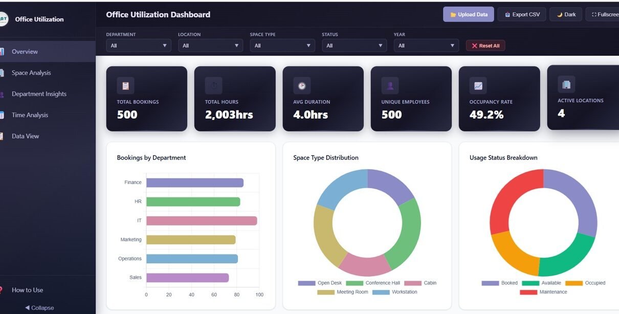
The Overview page serves as your executive summary for office space performance. At the top, 6 KPI cards display the most important metrics: Total Bookings, Total Hours Utilized, Avg Duration, Unique Employees, Occupancy Rate, and Active Locations. Below the cards, you will find several analytical charts that provide a high-level understanding of your workspace usage patterns.
The Bookings by Department chart breaks down how different teams across your organization are reserving spaces, helping you identify which departments have the highest demand. The Space Type Distribution chart shows the proportion of bookings across different space categories such as meeting rooms, hot desks, conference halls, and private offices. The Usage Status Breakdown chart reveals how many bookings are completed, cancelled, or no-shows, giving you insight into actual versus planned utilization. The Bookings by Month chart displays seasonal booking patterns over time, while Bookings by Location highlights which office sites or floors are most heavily used. Multiple interactive slicers allow you to filter the entire dashboard quickly by department, location, or date range.
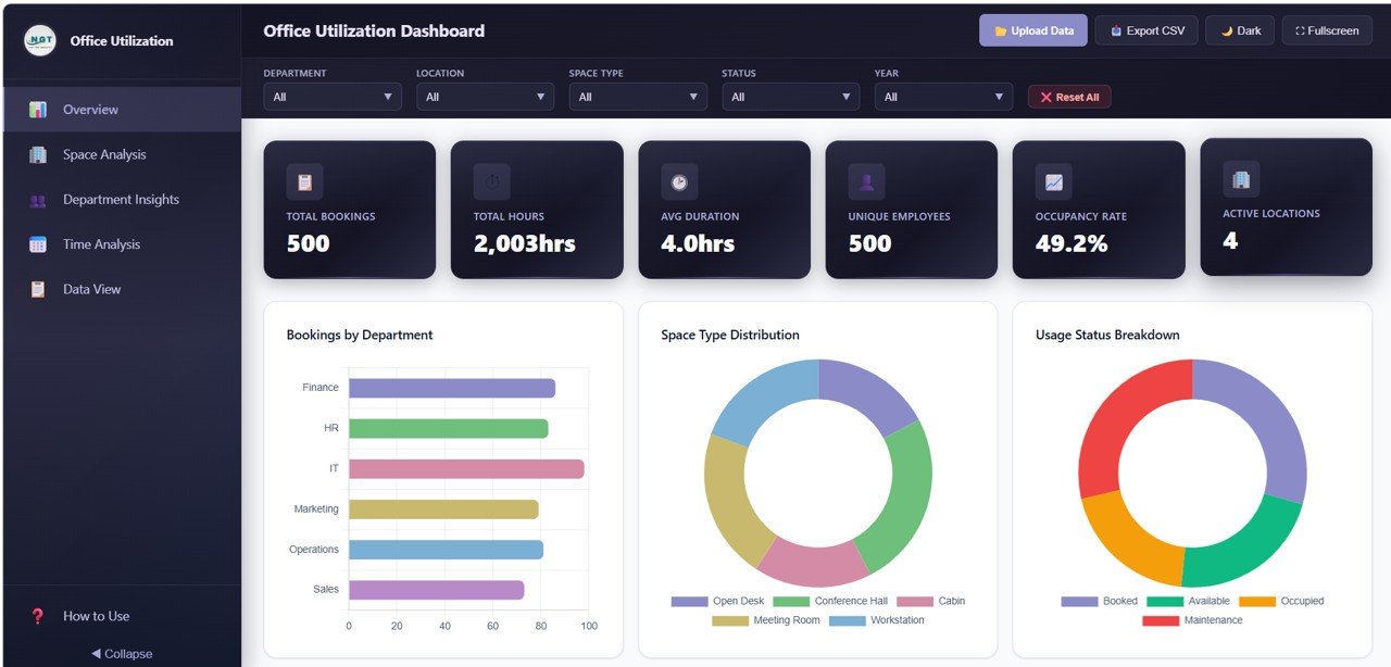
Office Utilization Dashboard Overview
2 — Space Analysis
The Space Analysis page takes a deep dive into how your physical workspace categories are being used. The Avg Duration by Space Type chart reveals which types of spaces are booked for longer periods, helping you understand whether meeting rooms are being used for quick stand-ups or extended workshops. The Bookings by Space Type and Location chart cross-references space categories with physical locations, so you can see if certain offices have higher demand for specific room types. The Space Usage by Status chart breaks down completed, cancelled, and no-show bookings by space type, highlighting spaces with high cancellation rates. The Bookings by Hour of Day chart shows peak booking times, enabling you to identify rush hours and quiet periods across your office.
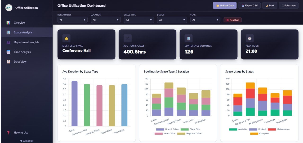
Space Analysis Page
3 — Department Insights
The Department Insights page provides comprehensive visibility into how different teams across your organization are using office spaces. The Bookings by Department chart ranks all departments by their total booking volume, making it easy to see which teams are the heaviest users of shared spaces. The Avg Duration by Department chart shows the average booking length for each department, revealing whether some teams tend to book spaces for longer periods than others. The Department by Space Type Preference chart uncovers which types of spaces each department prefers, whether it is conference rooms, hot desks, or private offices. The Department by Location chart shows where each team primarily books, which is especially useful for organizations with multiple office sites.
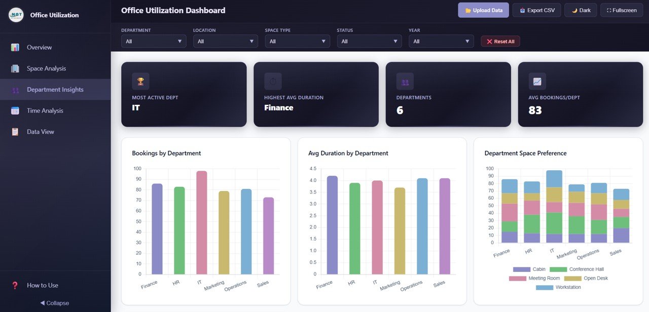
Department Insights Page
4 — Time Analysis
The Time Analysis page provides historical and temporal patterns for your office space bookings. The Monthly Trend by Year chart overlays booking volumes across different years, allowing you to compare year-over-year growth or seasonal patterns. The Bookings by Day of Week chart reveals which days have the highest and lowest demand, essential for hybrid work scheduling decisions. The Bookings by Duration chart shows the distribution of short, medium, and long bookings, helping you understand typical usage patterns. The Bookings by Quarter and Year chart provides a broader view of quarterly trends, ideal for strategic capacity planning and budget allocation.
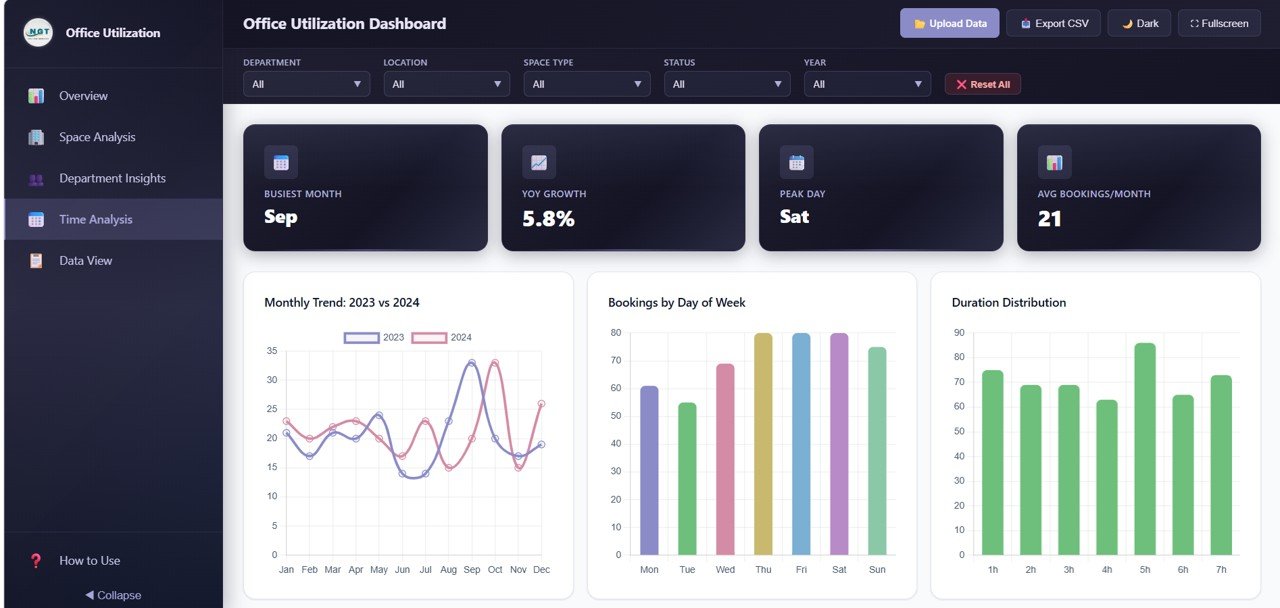
Time Analysis Page
5 — Data View
The Data View page is a detailed data table showing all individual booking records. It includes search functionality to find specific records, column sorting to organize data by any field, and pagination to navigate through large datasets efficiently. You can also export the filtered data to CSV for further analysis in Excel, Google Sheets, or any other spreadsheet application. This page is invaluable for auditing, compliance reporting, and detailed operational reviews.
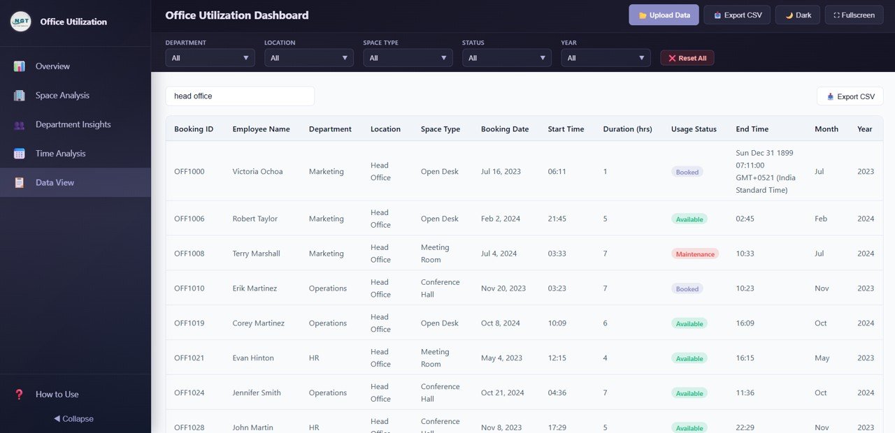
Data View Page
Advantages of Office Utilization Dashboard in HTML
The Office Utilization Dashboard in HTML offers several significant advantages over traditional reporting methods:
- No Software Dependencies — Unlike Excel or Power BI dashboards that require specific desktop applications, this HTML dashboard runs in any web browser. This makes it accessible to anyone in your organization without software licensing costs or IT support.
- Instant Deployment — Unzip and open — that is all it takes. No installation, configuration, or database setup required. You can be analyzing data within minutes of downloading.
- Cross-Platform Compatibility — Works identically on Windows, macOS, Linux, and even mobile devices. Share the file with anyone and they can view the same interactive dashboard.
- Cost-Effective Space Planning — By visualizing booking volumes, occupancy rates, and space usage status across departments and locations, facility managers can identify savings opportunities and eliminate wasted space.
- Hybrid Work Optimization — The day-of-week analysis, hourly booking patterns, and department preferences help organizations make data-driven decisions about hybrid work policies and flexible seating arrangements.
- Built-in Data Export — The CSV export feature on the Data View page means you can always extract your data for external reporting, compliance audits, or further analysis.
You might also find the Construction Dashboard in HTML useful if you manage construction or renovation projects for your office facilities.
Opportunities for Improvement
While the Office Utilization Dashboard in HTML provides comprehensive workspace analytics, there are several areas where users can extend its capabilities:
- IoT Sensor Integration — Organizations with smart building sensors could feed real-time occupancy data into the dashboard for live utilization monitoring rather than periodic manual updates.
- Booking System Connection — Connecting data from platforms like Microsoft Outlook, Google Calendar, or dedicated room booking systems like Robin or Envoy would automate data collection.
- Energy Consumption Correlation — Adding energy usage data alongside space bookings could reveal opportunities to reduce HVAC and lighting costs in underutilized areas. Explore our Energy and Utility Dashboard in HTML for energy tracking.
- Cost-per-Booking Analysis — Adding cost data per space type would enable ROI calculations for different workspace investments and inform lease renewal decisions.
Best Practices for Using the Office Utilization Dashboard
- Update Data Weekly — For the most accurate insights, update your booking data at least once per week. This ensures trends and patterns reflect current workspace usage.
- Monitor No-Show Rates — Use the Usage Status charts to track cancellations and no-shows. High no-show rates indicate spaces are being reserved but not used, artificially reducing availability for other employees.
- Compare Day-of-Week Patterns — Use the Time Analysis page to identify which days have lowest bookings. This data supports decisions about mandatory office days or building closure schedules.
- Share with Department Heads — Distribute the dashboard to department heads so they can independently explore their team’s booking patterns and make informed scheduling decisions.
- Review Quarterly with Leadership — Use the Bookings by Quarter and Year chart during quarterly business reviews to track progress against space optimization goals.
For more analytics templates across different platforms, visit our HTML Dashboard blog category where we cover detailed walkthroughs for each template.
Explore Relevant Templates
- Office Utilization Dashboard in HTML — The product featured in this post. Track bookings, space analysis, department insights, and time trends across 5 interactive pages.
- Construction Dashboard in HTML — Monitor construction project metrics, budgets, timelines, and resource allocation with this browser-based dashboard.
- Virtual Concerts Dashboard in Power BI — Analyze event performance, ticket sales, and audience engagement metrics.
- Boutique Hotels Dashboard in Power BI — Track hotel occupancy, revenue, and guest satisfaction KPIs.
- E-commerce KPI Scorecard in Google Sheets — Monitor e-commerce performance with key metrics in Google Sheets.
Frequently Asked Questions
What is the best HTML dashboard template for tracking office space utilization?
The Office Utilization Dashboard in HTML from NextGenTemplates is one of the best options for tracking office space utilization. It includes 5 interactive dashboard pages, 15+ dynamic charts, 6 KPI cards, CSV data export, and works in any modern browser without software installation. It covers bookings analysis, space utilization, department insights, time-based trends, and a full data view in a single comprehensive template.
What KPIs does the Office Utilization Dashboard in HTML track?
The dashboard tracks 6 key performance indicators: Total Bookings, Total Hours Utilized, Avg Duration, Unique Employees, Occupancy Rate, and Active Locations. These KPIs are displayed as high-level summary cards on the Overview page and are supported by 15+ detailed charts across all 5 dashboard pages.
Do I need Excel or Power BI to use this office utilization dashboard?
No. This dashboard is built entirely in HTML, CSS, and JavaScript. Simply unzip the downloaded file and open index.html in any modern web browser such as Google Chrome, Mozilla Firefox, Microsoft Edge, or Safari. No Excel, Power BI, or any desktop software installation is required. It works on Windows, macOS, Linux, and mobile devices.
Can I export data from this dashboard?
Yes. The Data View page includes a full data table with search, sort, and pagination features. You can also export the filtered data to CSV for further analysis in Excel, Google Sheets, or any other spreadsheet application.
How do I replace the sample data with my own office booking data?
The dashboard comes with a structured data file inside the ZIP package. Open this data file in any text editor, replace the sample records with your own office booking data following the same column format, save the file, and refresh the dashboard in your browser. All charts, KPIs, and visualizations update automatically with your new data.
Can I see which departments are using the most office space?
Yes. The Department Insights page includes four dedicated charts: Bookings by Department, Avg Duration by Department, Department by Space Type Preference, and Department by Location. These charts give you complete visibility into how each team across your organization is booking and using office spaces.
Conclusion
The Office Utilization Dashboard in HTML is a powerful, zero-installation analytics solution for anyone responsible for managing office space. With 5 interactive pages covering Overview, Space Analysis, Department Insights, Time Analysis, and Data View, plus 15+ dynamic charts, 6 KPI cards, and CSV export capabilities, it provides everything facility managers, operations directors, and workplace strategy teams need to optimize their corporate workspace. Whether you are tracking booking volumes, analyzing department space preferences, or forecasting future demand with quarterly trends, this template delivers actionable insights without the complexity of traditional BI tools.
Click here to Purchase Office Utilization Dashboard in HTML
For step-by-step video tutorials on how to use this and other dashboard templates, visit our YouTube channel:
Youtube.com/@NeoTechNavigators
Click to buy Office Utilization Dashboard in HTML