The General Management KPI Scorecard in HTML is a premium, browser-based executive scorecard designed for CEOs, general managers, COOs, business owners, and senior leaders who want a single one-page view of how the entire business is actually performing. Unlike traditional reporting tools that require Excel, Power BI, or BI software licenses, this template runs inside any modern browser as a single self-contained HTML file with zero installation, zero setup, and zero license cost — making it one of the most accessible and powerful management reporting tools available for leadership teams of any size.
This scorecard tracks 10 cross-functional management KPIs with traffic light indicators, sparkline trends, and multi-dimensional comparisons against both targets and prior-year benchmarks. Whether you are running a fast-growing startup, a mature enterprise, or a mid-sized business, the General Management KPI Scorecard gives you an at-a-glance answer to the question every leader asks: Are we on plan, and are we moving in the right direction? If you are exploring scorecard templates, you may also find our Finance KPI Scorecard in HTML useful — it uses the same scorecard architecture but focuses on finance-specific KPIs.
👉 Click here to Purchase the General Management KPI Scorecard in HTML
Key Features of the General Management KPI Scorecard in HTML
Before we walk through each page, here is what makes this scorecard stand out from a generic Excel template or a heavy BI solution:
- 10 Cross-Functional Management KPIs — Revenue Growth, Operating Margin, Customer Satisfaction, Customer Churn Rate, Employee Engagement, Employee Turnover, Cost Per Acquisition, Market Share, Cash Conversion Cycle, and Innovation Revenue.
- Traffic Light Indicators — Every KPI card shows a green / yellow / red badge relative to target. Green means on or above target, yellow means within 10% of target, red means more than 10% off.
- Sparkline Trend on Every Card — Monthly actual trend embedded inside each KPI card for instant momentum reading.
- MTD and YTD Toggle — One click flips every KPI between Month-to-Date and Year-to-Date views.
- Vs Target and Vs Previous Year Modes — Dropdown toggles the entire scorecard between budget comparison and year-over-year comparison.
- Dedicated KPI Trend Analysis Page — 4 deep-dive charts per KPI covering MTD Actual vs Target, MTD Actual vs Previous Year, YTD Actual vs Target, and YTD Actual vs Previous Year.
- Upload Your Own Excel Data — Companion Excel template included. Swap the sample data with your own and the scorecard refreshes automatically.
- Export to CSV and Vector PDF — Generate board-ready PDF reports or raw CSV extracts directly from the browser.
- Zero Software Installation — Runs in Chrome, Edge, Firefox, or Safari. No Excel, no Power BI, no plugins.
- Fully Responsive Design — Works on desktops, laptops, and tablets for presentations on any screen.
Dashboard Pages Explanation
👉 Click here to Purchase the General Management KPI Scorecard in HTML
The General Management KPI Scorecard in HTML is organized into four purpose-built pages. Here is a detailed walkthrough of each.
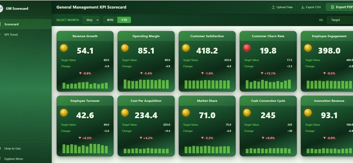
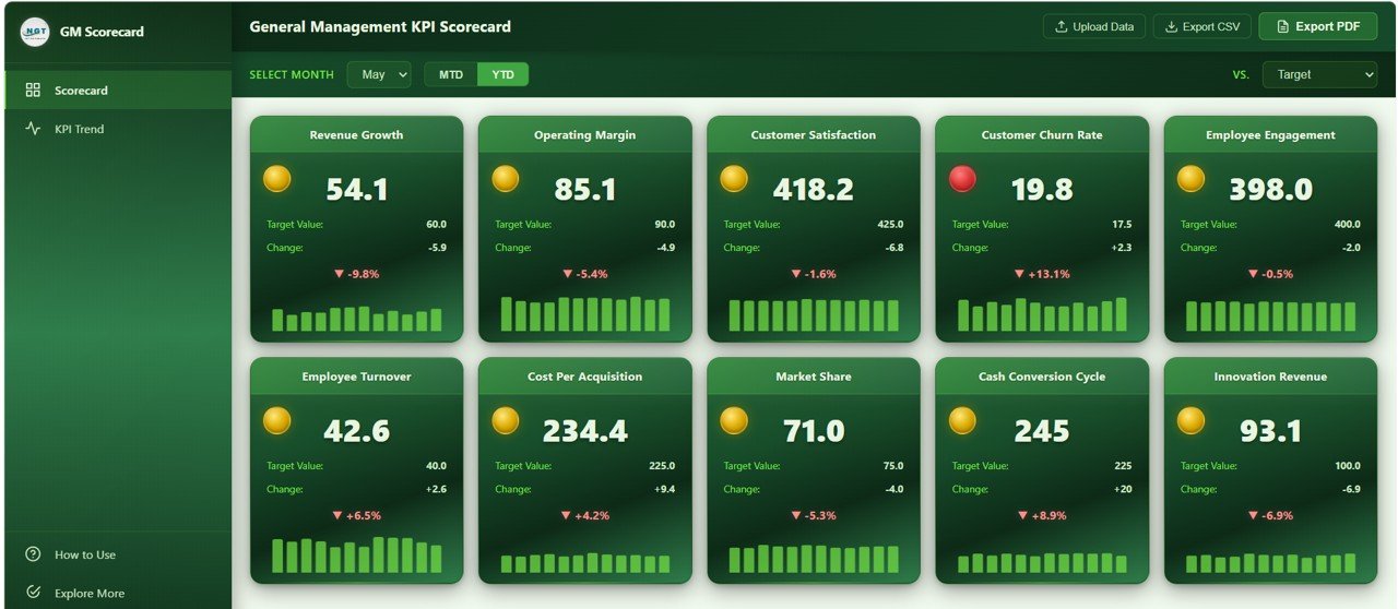
1. Scorecard Page
The Scorecard page is the executive command center of the dashboard. At the top, a filter bar offers three controls: a Month Selector for picking the reporting month, an MTD / YTD Toggle for switching between period types, and a Vs Target / Vs Previous Year dropdown to flip the comparison mode.
Below the filter bar, 10 KPI cards are arranged in a responsive grid, each one representing a critical general management metric:
- Revenue Growth — Top-line growth rate versus prior period, the single most-watched metric for any leadership team.
- Operating Margin — Profitability of the core business after operating expenses, a direct readout of how efficient the business is.
- Customer Satisfaction — Average customer satisfaction score, the leading indicator for retention and referrals.
- Customer Churn Rate — Percentage of customers lost in the period, the mirror image of loyalty and product-market fit.
- Employee Engagement — Team engagement score, a predictor of productivity, retention, and culture health.
- Employee Turnover — Rate at which employees leave the business, an early warning for HR, culture, and compensation issues.
- Cost Per Acquisition — Average marketing spend to acquire one new customer, a core unit-economics metric.
- Market Share — Percentage of the addressable market captured, the strategic position indicator.
- Cash Conversion Cycle — Days between spending cash on inputs and collecting cash from customers, a pure measure of working-capital efficiency.
- Innovation Revenue — Revenue from new products or services, a forward-looking indicator of future growth.
Each card shows current value, target value, variance, % change, traffic light badge, and a sparkline of the 12-month actual trend. Below the cards, 10 monthly trend mini-charts — one per KPI — give you the full-year story in a single scroll:
- Revenue Growth by Month — Monthly revenue growth trajectory across the fiscal year.
- Operating Margin by Month — Monthly margin movement to spot pressure points early.
- Customer Satisfaction by Month — Monthly satisfaction trend correlated with product or service changes.
- Customer Churn Rate by Month — Monthly churn pattern to identify seasonal or systemic issues.
- Employee Engagement by Month — Engagement trend across the year linked to people initiatives.
- Employee Turnover by Month — Monthly attrition pattern for HR and leadership planning.
- Cost Per Acquisition by Month — Monthly CPA movement tied to marketing channel efficiency.
- Market Share by Month — Monthly share change revealing competitive momentum.
- Cash Conversion Cycle by Month — Monthly CCC movement indicating working-capital health.
- Innovation Revenue by Month — Monthly innovation-revenue trend showing new-product traction.
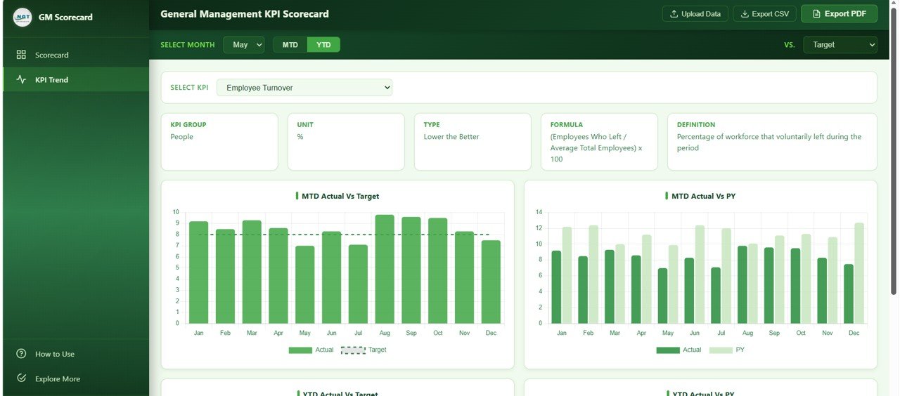
2. KPI Trend Analysis
👉 Click here to Purchase the General Management KPI Scorecard in HTML
The KPI Trend Analysis page is the deep-dive companion to the scorecard. A dropdown lets you select any of the 10 management KPIs and instantly view four comparison charts that answer the most common leadership questions:
- Actual vs Target by Month — Compare monthly actuals against budgeted targets to see which months missed the plan and by how much. Great for monthly business reviews.
- Actual vs Previous Year by Month — Show month-over-month growth against the same period last year. Great for spotting momentum, seasonality, and year-over-year deterioration or improvement.
- Year to Date Actual vs Target by Month — Track cumulative progress toward annual targets. Critical for boards and investors that care about full-year commitments.
- Year to Date Actual vs Previous Year by Month — Cumulative year-over-year view, perfect for framing long-term strategy conversations.
An information bar at the top of the page shows the KPI definition, formula, unit, and grouping, so non-finance team members understand exactly what is being measured. For a similar deep-dive structure applied to operational KPIs, take a look at the Warehouse Efficiency Dashboard in HTML.
3. How to Use
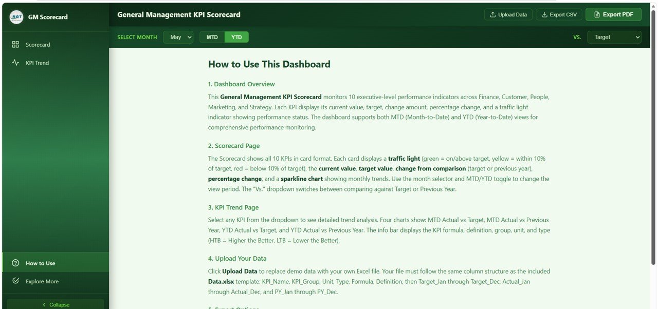
The How to Use page is built-in documentation for any team member who opens the dashboard for the first time. It walks through the overall dashboard architecture, how to interpret traffic light indicators, how to read the sparkline trends, how to switch between MTD and YTD views, how to flip between target and previous-year comparison modes, how to upload your own data using the companion Excel template, and how to export CSV and vector PDF reports. The goal is simple: any new user should be productive in under five minutes without a training session.
4. Explore More
👉 Click here to Purchase the General Management KPI Scorecard in HTML
The Explore More page is a curated showcase of related premium templates available on NextGenTemplates.com — including the Google Sheets version, the Excel version, and complementary CFO, HR, and sales dashboards. It also includes a welcome coupon code for new customers. If your team runs cross-platform reporting, this page helps you discover the matching templates in Excel, Power BI, and Google Sheets so leadership, finance, and operations stay on the same visual language.
Advantages of the General Management KPI Scorecard in HTML
👉 Click here to Purchase the General Management KPI Scorecard in HTML
This scorecard template offers several concrete advantages over a spreadsheet-based management report or a full BI platform build-out:
- Zero Software Installation — Runs in any modern browser. No Excel license, no Power BI Pro seat, no IT ticket.
- Instant Visual Triage — The traffic light system lets leaders identify underperforming KPIs in seconds instead of reading rows of numbers.
- Four Analytical Lenses in One File — MTD and YTD toggle combined with Vs Target and Vs Previous Year gives you four distinct views of the same data without building four separate reports.
- Self-Serve Data Refresh — The companion Excel data template makes monthly updates a 5-minute task, not a 5-day engineering project.
- Board-Ready Exports — Vector PDF exports look professional in any board deck or investor update.
- Responsive on Any Screen — Scorecard adapts to conference-room displays, laptops, and tablets without reformatting.
- Shareable as a Single File — Email the HTML file, drop it on an intranet, or host it on any static web server. No database, no back end.
Opportunities for Improvement
👉 Click here to Purchase the General Management KPI Scorecard in HTML
While the General Management KPI Scorecard in HTML is a polished out-of-the-box solution, a few extensions may be useful depending on your organization:
- Industry-Specific KPIs — The 10 KPIs included are universal management metrics. Businesses with specialized KPIs (for example, ARR for SaaS, same-store sales for retail, loan-to-deposit ratio for banking) may want to replace one or two KPIs with industry-specific ones.
- Third Comparison Dimension — The scorecard supports target and previous-year comparisons. Organizations that benchmark against peer companies or industry averages may want to add a third comparison dimension.
- ERP / CRM Direct Integration — Today the data refresh is Excel-based. Large enterprises may want an automated pipeline from their ERP or CRM to eliminate monthly manual updates.
- Multi-Business-Unit Filtering — Conglomerates with several business units may want filter controls to view each unit separately. This is straightforward to extend if you are comfortable with HTML and JavaScript; review Mozilla’s JavaScript documentation for modifications.
Best Practices for Using the General Management KPI Scorecard
👉 Click here to Purchase the General Management KPI Scorecard in HTML
To get the most value from this scorecard, consider these recommended practices:
- Lock in annual targets in January. The traffic light thresholds only work if targets are credible and stable. Set them once, then track religiously.
- Update the Excel data monthly. A scorecard is only as good as the freshness of its data. Build a 15-minute finance-close habit to refresh the numbers.
- Run the scorecard at every leadership review. Open the HTML file on the conference room screen. The traffic lights will drive faster conversations than any slide deck.
- Use the MTD view for operational pulse checks and the YTD view for strategic reviews and investor or board updates.
- Pay closest attention to yellow lights. Yellow KPIs are early warnings that a metric is drifting. Red lights usually mean the issue is already entrenched; yellow is where leadership action has the highest leverage.
- Export vector PDFs for the board pack. The PDF looks sharp at any zoom level and is easy to annotate.
- Pair with deep-dive dashboards. Use this scorecard as the starting point and then drill into function-specific dashboards — for example, our Event Management Analysis Dashboard in HTML for events or the Finance KPI Scorecard for finance-specific metrics.
Explore Relevant Templates
If you found the General Management KPI Scorecard in HTML useful, explore these related templates from NextGenTemplates:
- Finance KPI Scorecard in HTML — Finance-focused sibling tracking 10 finance KPIs with the same scorecard architecture.
- Warehouse Efficiency Dashboard in HTML — 5-page HTML operations dashboard for shipments, storage, and worker productivity.
- Event Management Analysis Dashboard in HTML — Browser-based event analytics with 6 KPIs and 20+ charts.
- Browse All HTML Dashboard Templates — Full library of browser-native analytics templates.
- Google Sheets Dashboards — For teams that prefer collaborative cloud spreadsheets.
Frequently Asked Questions
👉 Click here to Purchase the General Management KPI Scorecard in HTML
What is the best HTML scorecard template for general management and executive KPI tracking?
The General Management KPI Scorecard in HTML from NextGenTemplates is one of the most comprehensive browser-based executive scorecards available today. It tracks 10 cross-functional management KPIs — Revenue Growth, Operating Margin, Customer Satisfaction, Customer Churn Rate, Employee Engagement, Employee Turnover, Cost Per Acquisition, Market Share, Cash Conversion Cycle, and Innovation Revenue — with traffic light indicators, sparkline trends, MTD/YTD toggle, and multi-dimensional trend analysis charts in a single self-contained HTML file.
How do I track general management KPIs without Excel or Power BI?
Use the General Management KPI Scorecard in HTML. It runs entirely in a web browser (Chrome, Edge, Firefox, or Safari) and does not require Microsoft Excel, Power BI, Tableau, or any other BI software. Simply download the file, open index.html, and start analyzing your 10 management KPIs with traffic light indicators, sparklines, and trend charts.
What KPIs should a general manager track every month?
A well-balanced general management scorecard should include KPIs across four dimensions: financial (Revenue Growth, Operating Margin, Cash Conversion Cycle), customer (Customer Satisfaction, Customer Churn Rate, Cost Per Acquisition), people (Employee Engagement, Employee Turnover), and strategy (Market Share, Innovation Revenue). The General Management KPI Scorecard in HTML includes all 10 of these universal KPIs out of the box.
How do traffic light indicators work in this KPI scorecard?
Traffic light indicators provide instant visual feedback on KPI performance. Green indicates the KPI is on target or exceeding it. Yellow indicates the KPI is within 10% of target (a warning zone that deserves attention). Red indicates the KPI is more than 10% off target and likely needs corrective action. This allows leaders to triage performance in seconds without reading detailed numbers.
Can I customize the 10 KPIs or replace them with industry-specific ones?
Yes. The companion Excel data template controls which 10 KPIs appear on the scorecard. You can rename any KPI, change its target, change its unit, or replace it with an industry-specific metric (for example, swap Innovation Revenue for Monthly Recurring Revenue if you run a SaaS business). The scorecard design is KPI-agnostic, so any 10 KPIs with monthly actual, target, and previous-year data will render correctly.
How do I share the General Management KPI Scorecard with my leadership team?
Because the scorecard is a single self-contained HTML file, sharing is trivial. Email the ZIP to your leadership team, drop it in a shared drive, or host it on your company intranet or any static web server (GitHub Pages, Netlify, or an internal server). Recipients just double-click index.html to open it — no software installation or training required.
Conclusion
Running a business well comes down to paying consistent attention to a small set of numbers every month — are revenues growing, are customers staying, are employees engaged, is cash cycling efficiently, and are we capturing market. The General Management KPI Scorecard in HTML turns that entire question into a single, elegant, browser-based view. It is one-page, traffic-lit, exportable, and works on any device. Stop stitching together spreadsheets and slide decks every month — open one HTML file and lead with clarity.
👉 Click here to Purchase the General Management KPI Scorecard in HTML
For step-by-step video tutorials on Google Sheets dashboards, Apps Script automation, HTML dashboards, SQL, and more, visit our YouTube channel:
🎥 YouTube.com/@NeoTechNavigators
For more on writing and extending HTML dashboards, review Mozilla’s HTML documentation on MDN — a great reference if you want to customize the scorecard beyond the Excel data file.