SaaS finance lives or dies on a handful of numbers: MRR, ARR, LTV, CAC and runway. The SaaS Financial Performance Dashboard in Google Sheets puts all of them in one place, tracking 5 headline KPIs across 6 connected tabs with 14 pre-built charts and slicer filters. Setup takes under 10 minutes – paste your data and every chart updates.
Most early-stage SaaS teams either pay $100-$1,000+ a month for a tool like ChartMogul or Baremetrics, or stitch together messy spreadsheets that break every quarter. This guide walks through how the SaaS Financial Performance Dashboard in Google Sheets gives you the same financial visibility for a one-time $9.99, with full control over the data and formulas.
Key Features of the SaaS Financial Performance Dashboard in Google Sheets
The SaaS Financial Performance Dashboard in Google Sheets tracks 5 headline KPIs – Total MRR, Total ARR, Average Lifetime Value, Average CAC and Total Customers – so recurring-revenue health is visible the moment you open the file. It ships with 14 charts spread across four analysis tabs covering subscription status, revenue by plan and region, ARR trend, LTV-to-CAC ratios, expenses and quarterly net cash flow.
Slicers on the Overview tab filter the whole dashboard by plan type, subscription status, region and quarter in a single click. A dedicated Search tab returns the full profile of any customer by Record ID, and because the dashboard is built natively in Google Sheets, your finance and growth teams can collaborate in real time with link sharing – no installs, no per-seat fees.
Dashboard Tabs Explained
Overview Tab
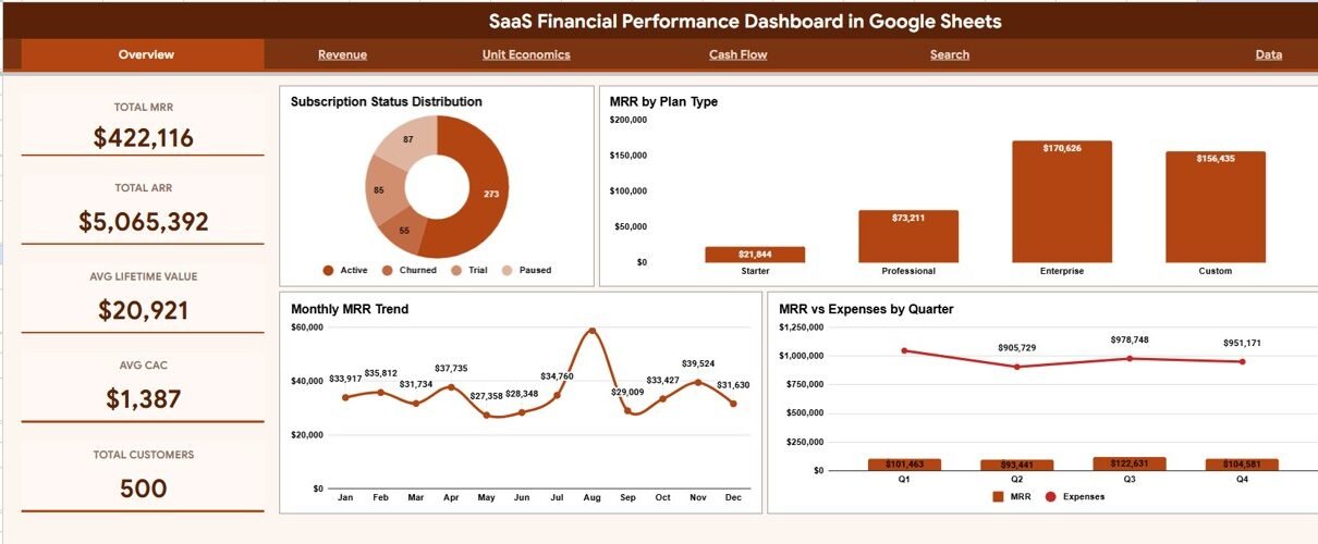
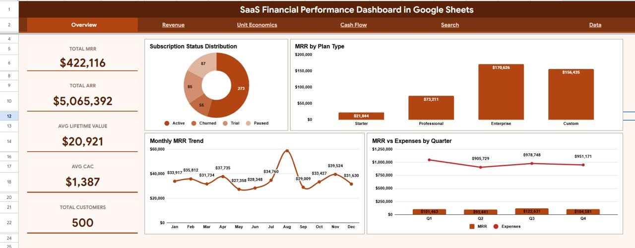
The Overview tab leads with five KPI cards – Total MRR, Total ARR, Average Lifetime Value, Average CAC and Total Customers – above four charts: Subscription Status Distribution, MRR by Plan Type, Monthly MRR Trend and MRR vs Expenses by Quarter. Slicers at the top filter every card and chart at once.
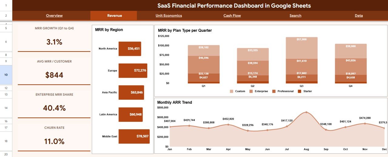
Revenue Tab
Click here to Purchase the SaaS Financial Performance Dashboard in Google Sheets
The Revenue tab shows MRR by Region, MRR by Plan Type per Quarter and Monthly ARR Trend. Together these reveal which markets concentrate your revenue and which plan tiers are growing fastest over time.
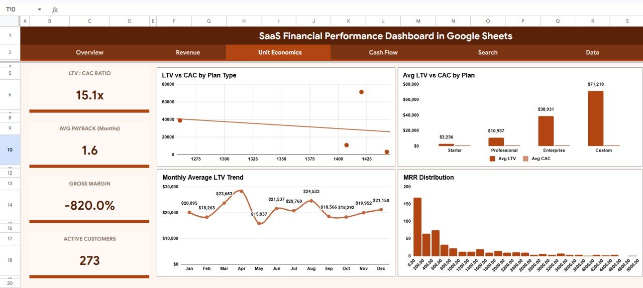
Unit Economics Tab
The Unit Economics tab covers LTV vs CAC by Plan Type, Average LTV vs CAC by Plan, Monthly Average LTV Trend and MRR Distribution. This is where you confirm whether each plan is acquiring customers profitably.
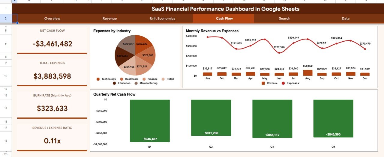
Cash Flow Tab
Click here to Purchase the SaaS Financial Performance Dashboard in Google Sheets
The Cash Flow tab presents Expenses by Industry, Monthly Revenue vs Expenses and Quarterly Net Cash Flow. It connects your recurring revenue to spending and shows whether the business is burning or banking cash.
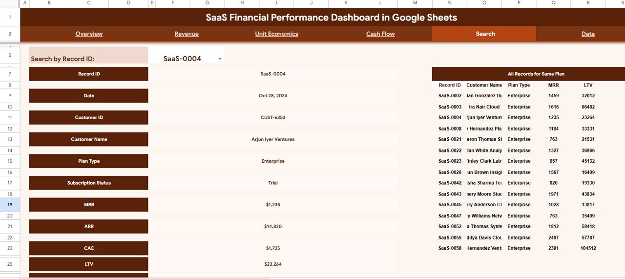
Search Tab
The Search tab adds record-level lookup. Choose any Record ID and the sheet returns that customer’s Date, Customer ID, Name, Plan Type, Subscription Status, MRR, ARR, CAC and LTV, while the right side lists every other record on the same plan type.
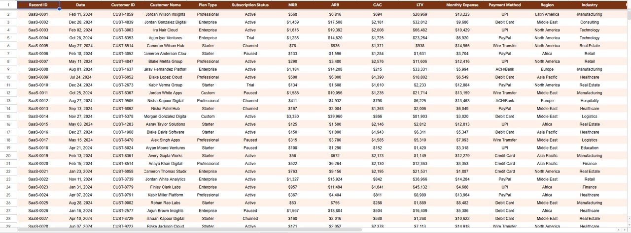
Data Tab
Click here to Purchase the SaaS Financial Performance Dashboard in Google Sheets
The Data tab is the single source of truth. Paste your subscription records here in the existing column format and every other tab recalculates automatically.
SaaS Financial Performance Dashboard in Google Sheets vs. Microsoft Excel Dashboard vs. ChartMogul / Baremetrics – Feature Comparison
| Feature | SaaS Financial Performance Dashboard in Google Sheets | Microsoft Excel Dashboard | ChartMogul / Baremetrics |
|---|---|---|---|
| Cost | $9.99 one-time | $10-25 one-time | $100-$1,000+ / month |
| Platform | Google Sheets (browser, no install) | Desktop Excel required | Cloud SaaS |
| Setup time | Under 10 minutes | Under 15 minutes | Connect billing + onboarding |
| Real-time team collaboration | Yes, native | Limited (file versions) | Yes |
| Mobile access | Yes, Sheets app | Limited | Yes |
| Own your data & formulas | Yes, fully | Yes | No (closed system) |
| Customizable fields | Yes | Yes | Limited to vendor schema |
| Per-customer Search lookup | Yes | Manual | Yes |
| Year-1 cost at 5 users | $9.99 | ~$15 | $1,200-$12,000+ |
For SaaS founders and finance teams that want MRR, ARR, LTV and cash-flow visibility without paying four figures a year, the SaaS Financial Performance Dashboard in Google Sheets sits in the sweet spot.
Who Should Use This Template
Perfect for:
- Bootstrapped and seed-stage SaaS founders tracking MRR, ARR and runway without a finance hire
- Finance and RevOps analysts who want LTV-to-CAC and cash-flow views they fully control
- Agencies and consultants reporting subscription performance to SaaS clients
- Small SaaS teams that prefer Google Sheets over a $100+/month analytics subscription
Not a fit if:
- You need a direct, automated sync to Stripe, Chargebee or a data warehouse
- Your reporting tool itself must carry SOC 2, SSO and audit logging
- Your business has no recurring-revenue or subscription model to measure
Real-World Use Cases
Click here to Purchase the SaaS Financial Performance Dashboard in Google Sheets
Maya, founder of a 12-person B2B SaaS startup, opens the Overview tab every Monday, filters by plan with the slicers, and checks Total MRR and the Monthly MRR Trend before her team standup – replacing the $200/month analytics tool she cancelled to extend runway.
Daniel runs finance at a subscription analytics agency. He uses the Unit Economics tab to show clients which plans have healthy LTV-to-CAC ratios, then switches to the Cash Flow tab to flag months where expenses outrun revenue before they become a problem.
Priya, a RevOps analyst, relies on the Search tab to pull up any account by Record ID and answer churn questions in seconds, comparing the customer against every other record on the same plan type.
Advantages of the SaaS Financial Performance Dashboard in Google Sheets
The biggest advantage is cost certainty: a one-time $9.99 versus four-figure annual SaaS bills that scale with your seat count. You also own the data and every formula, so the dashboard is fully auditable and customizable – add a plan tier, rename a region, or extend the date range without waiting on a vendor roadmap. Running in Google Sheets means zero installation, native real-time collaboration, and mobile access from the Sheets app.
Opportunities for Improvement
Being honest about the trade-offs: the SaaS Financial Performance Dashboard in Google Sheets is not a live billing integration. It does not auto-sync from Stripe or Chargebee, so you refresh it by pasting updated data rather than connecting an API. Very large datasets (tens of thousands of rows) will run slower in Google Sheets than in a dedicated warehouse, and it does not include SOC 2 or SSO controls inside the tool itself. For most early and growth-stage SaaS teams, those limits are a fair trade for the price and control.
Best Practices
Keep the Data tab clean: maintain one row per subscription record and never reorder the existing columns, since the charts and the Search tab reference them by position. Refresh on a fixed cadence – weekly or monthly – so the Monthly MRR Trend and Quarterly Net Cash Flow charts stay meaningful. Use the slicers to review one plan or region at a time during reviews, and duplicate the file each quarter if you want a historical snapshot to compare against.
Explore Relevant Templates
If you like this dashboard, these related Google Sheets and finance templates pair well with it:
- SaaS Financial Model Dashboard in Google Sheets – for forward-looking projections and scenarios.
- Startup Burn Rate Dashboard in Google Sheets – a focused view of runway and monthly burn.
- Startup Growth KPI Scorecard in Google Sheets – growth metrics in a scorecard layout.
- Subscription Business Dashboard in HTML – a web-based alternative for subscription metrics.
- Finance KPI Scorecard in HTML – a lightweight finance scorecard you can host anywhere.
Frequently Asked Questions
Click here to Purchase the SaaS Financial Performance Dashboard in Google Sheets
What is the SaaS Financial Performance Dashboard in Google Sheets?
The SaaS Financial Performance Dashboard in Google Sheets is a ready-made template that tracks 5 KPIs – Total MRR, Total ARR, Average LTV, Average CAC and Total Customers – across 6 tabs and 14 charts, so SaaS teams can monitor recurring revenue, unit economics and cash flow in one file.
How long does it take to set up?
Under 10 minutes. Paste your subscription records into the Data tab in the existing column order, and the Overview, Revenue, Unit Economics, Cash Flow and Search tabs recalculate automatically – no formula rebuilding required.
How does it compare to ChartMogul or Baremetrics?
ChartMogul and Baremetrics typically cost $100-$1,000+ per month. The SaaS Financial Performance Dashboard in Google Sheets is a one-time $9.99 purchase you own outright, with full visibility into every formula instead of a closed reporting tool.
Can I filter the dashboard?
Yes. The Overview tab has slicers that filter the entire dashboard by plan type, subscription status, region and quarter at once, so every card and chart redraws instantly without editing formulas.
Does it work on mobile?
Yes. Because the SaaS Financial Performance Dashboard in Google Sheets runs in Google Sheets, you can open and view it in the Google Sheets mobile app, and share it with your team using a single link.
Can I look up a single customer?
Yes. The Search tab lets you select any Record ID and see that account’s Date, Customer ID, Name, Plan Type, Subscription Status, MRR, ARR, CAC and LTV, alongside every other record on the same plan type.
About the Author
Built by PK – Microsoft Certified Professional with 15+ years of Excel, Google Sheets and Power BI experience. Founder of NextGenTemplates, reaching 300K+ subscribers across YouTube channels. Every template is hand-built and tested before release.
Conclusion
The SaaS Financial Performance Dashboard in Google Sheets turns scattered subscription data into a clear view of MRR, ARR, unit economics and cash flow – the numbers that actually decide whether a SaaS business is healthy. For a one-time $9.99, it replaces tools that bill four figures a year while keeping every formula in your hands.
👉 Click here to Purchase the SaaS Financial Performance Dashboard in Google Sheets
Instant download · One-time payment · No subscription
🎥 For step-by-step tutorials, visit YouTube.com/@NeoTechNavigators.
Last updated: June 2026