The Emergency Management Dashboard in Google Sheets is built for teams that need a clear, editable way to monitor incidents, response costs, team activity, emergency types, severity, readiness, and follow-up status. It brings the main operational views into one Google Sheets template so emergency managers, public safety teams, municipal departments, and preparedness coordinators can review high-level performance and drill into individual incident records without building a dashboard from scratch.
Emergency work moves quickly, and reliable visibility matters. FEMA’s National Incident Management System emphasizes a shared approach for coordination, and NOAA’s disaster event archive shows why emergency planning teams need practical ways to review recurring risk, costs, and response patterns. This template supports that day-to-day review with slicers, charts, cards, a searchable record view, and a structured data sheet.
Get the Emergency Management Dashboard Template
Key Features of Emergency Management Dashboard in Google Sheets
- Seven useful sheet tabs: Overview, Team Performance, Incident Analysis, Response and Cost, Force Readiness, Search Sheet, and Data Sheet.
- Executive KPI cards: Track Total Incidents, Response Cost, Avg Response Time, and Avg Response Score at the top of the dashboard.
- Interactive slicers: Filter the dashboard quickly by available dimensions so the same dashboard can support different response reviews.
- Incident and response analytics: Review incidents by zone, status, response team, emergency type, alert source, severity, commander, and month.
- Cost and readiness visibility: Analyze response cost, average response time, personnel deployed, response score, and status performance.
- Searchable incident record: Select an Incident ID and view the full record details in one place.
- Editable data structure: Add new emergency management records in the Data Sheet tab using the same columns and format.
- Google Sheets format: Work inside a familiar, collaborative spreadsheet environment. Google also provides guidance for sharing and collaborating in Docs, Sheets, and Slides.
Dashboard Pages Explanation
Overview Page
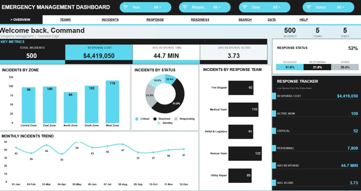
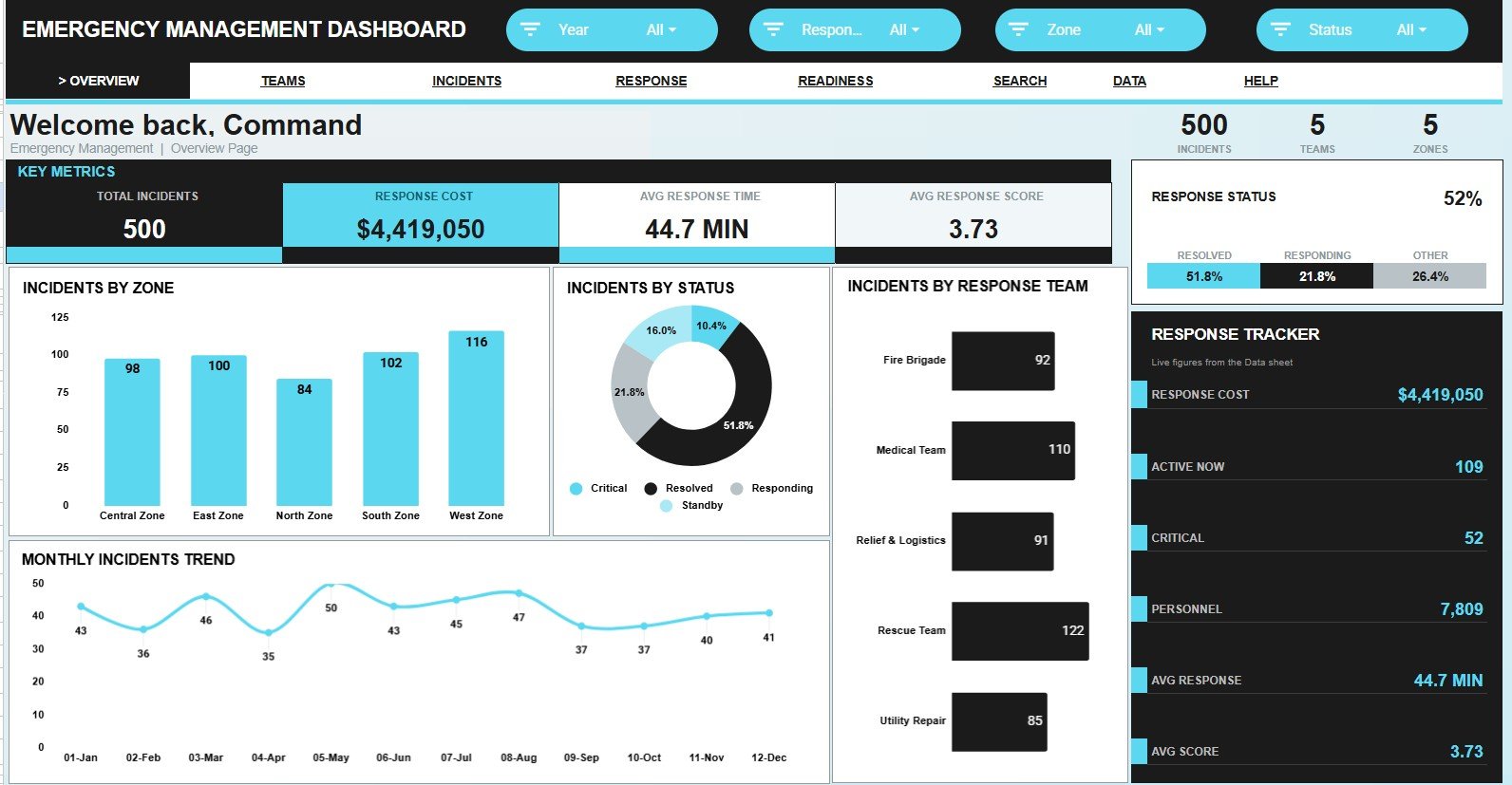
The Overview Page gives a high-level summary of emergency management activity. At the top, the dashboard includes cards for Total Incidents, Response Cost, Avg Response Time, and Avg Response Score, making it easy to review the main performance indicators before looking at detailed charts.Emergency Management Dashboard in Google Sheets
Incidents by Zone: This chart shows which zones have the highest concentration of incidents. It helps teams compare geographic demand and identify areas that may need more resources or prevention planning.Emergency Management Dashboard in Google Sheets
Incidents by Status: This chart separates incidents by their current status, such as completed, pending, escalated, or in progress. It gives managers a quick view of backlog, resolution progress, and open response workload.
Incidents by Response Team: This chart compares incident volume across response teams. It helps managers see whether workload is evenly distributed and whether specific teams are handling heavier response demand.
Monthly Incidents by Month: This chart tracks how incident volume changes month by month. It is useful for identifying seasonal patterns, planning staffing, and preparing for recurring risk periods.Emergency Management Dashboard in Google Sheets
Response Status by Status: This chart summarizes response completion or progress by status category. It supports quick monitoring of operational follow-through and highlights status groups that may need attention.Emergency Management Dashboard in Google Sheets
Team Performance
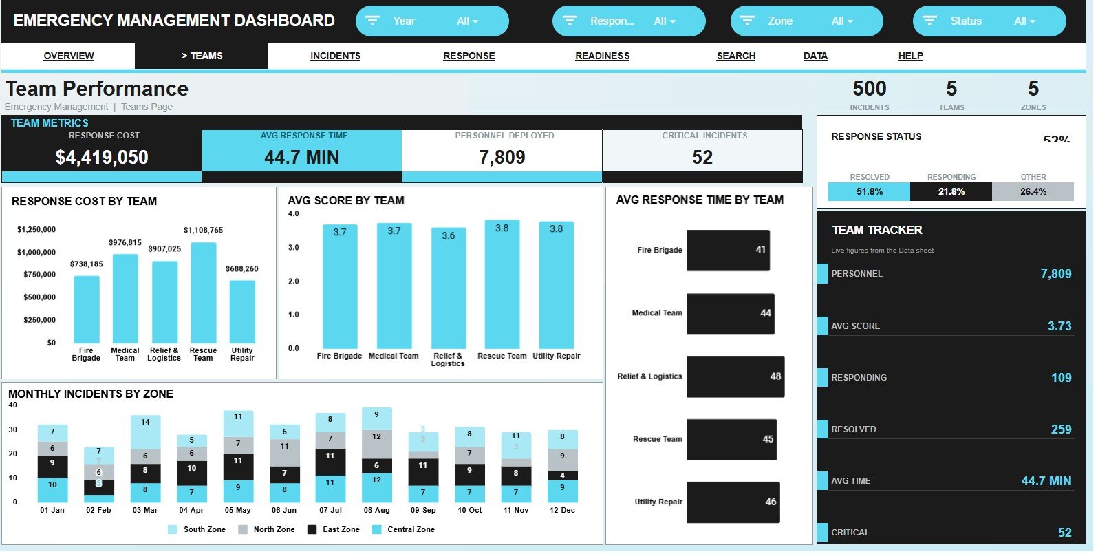
The Team Performance tab focuses on how emergency response teams are performing across cost, score, response time, zone activity, and status. This view helps leaders compare team efficiency and identify where coaching, staffing, or process improvements may be needed.
Response Cost by Team: This chart compares total response cost by team. It helps identify which teams are associated with higher spending and whether that spending matches incident volume or severity.
Avg Score by Team: This chart shows the average response score for each team. It helps managers compare response quality and spot teams with consistently strong or weak performance.
Avg Response Time by Team: This chart compares how quickly each team responds on average. It can reveal delays, dispatch bottlenecks, or teams that need better coverage or routing support.
Monthly Incidents by Zone: This chart shows monthly incident activity across zones. It helps teams see whether zone-level demand is rising, falling, or shifting across the year.
Response Status by Status: This chart provides a status-based view of response outcomes. It helps leadership understand how much work is completed, pending, or still active.
Incident Analysis
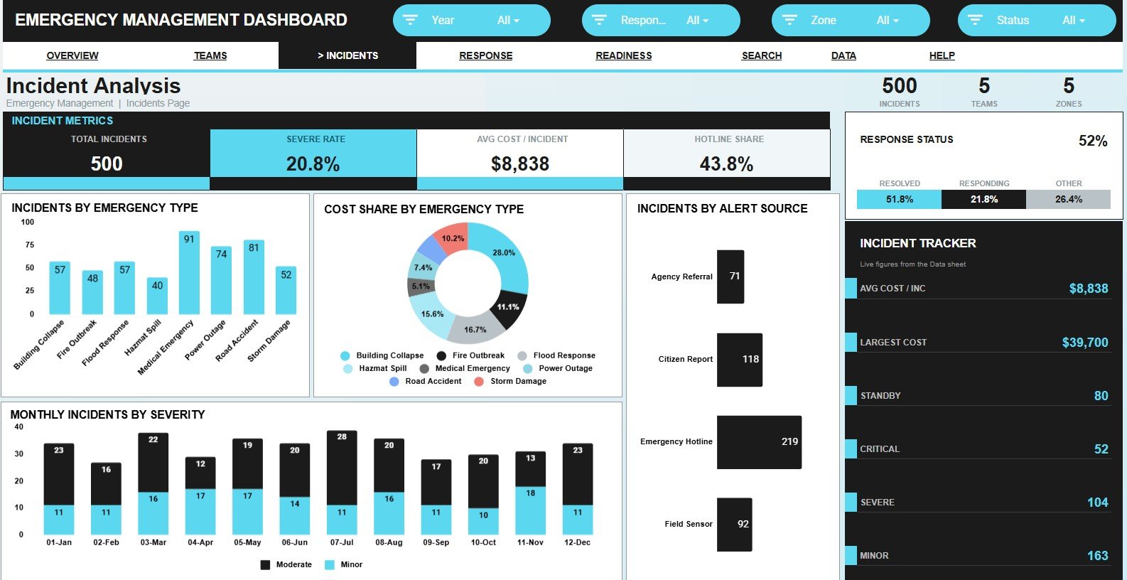
The Incident Analysis tab helps users understand what types of emergencies are occurring and how those incidents vary by source, severity, cost share, and status. This makes the dashboard useful for post-incident review, prevention planning, and reporting.
Incidents by Emergency Type: This chart breaks down incident volume by emergency category. It helps teams understand which types of events occur most often and where preparedness plans should be strengthened.
Cost Share by Emergency Type: This chart compares the share of response cost across emergency types. It helps leaders see which event categories consume the most budget, even if they are not the most frequent.
Incidents by Alert Source: This chart shows where alerts originate, such as calls, monitoring systems, field reports, or agency notifications. It helps evaluate which channels generate the most response activity.
Monthly Incidents by Severity: This chart tracks incident severity across months. It helps emergency managers see whether high-severity activity is increasing and whether risk patterns are changing over time.
Response Status by Status: This chart summarizes response progress by status. It makes it easier to see whether incidents are being closed efficiently or accumulating in active categories.
Response and Cost
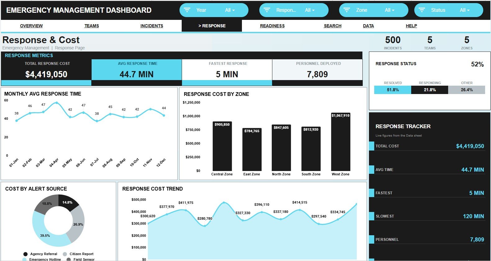
The Response and Cost tab focuses on time and budget performance. It gives users a dedicated place to review response speed, cost by zone, cost by alert source, monthly spending, and response status.
Monthly Avg Response Time by Month: This chart shows the average response time trend month by month. It helps identify whether response speed is improving, worsening, or affected by seasonal incident patterns.
Response Cost by Zone: This chart compares response cost by zone. It helps managers see which areas require the most financial resources and whether those costs align with incident counts or severity.
Response Cost by Alert Source: This chart shows how costs vary by the source of the incident alert. It can reveal whether certain alert channels are associated with higher-cost responses or more complex incidents.
Response Cost by Month: This chart displays monthly response cost trends. It helps budget owners monitor spending patterns and prepare for periods with higher operational costs.
Response Status by Status: This chart gives a status-level view of response progress. It helps connect spending and time metrics with actual response completion patterns.
Force Readiness
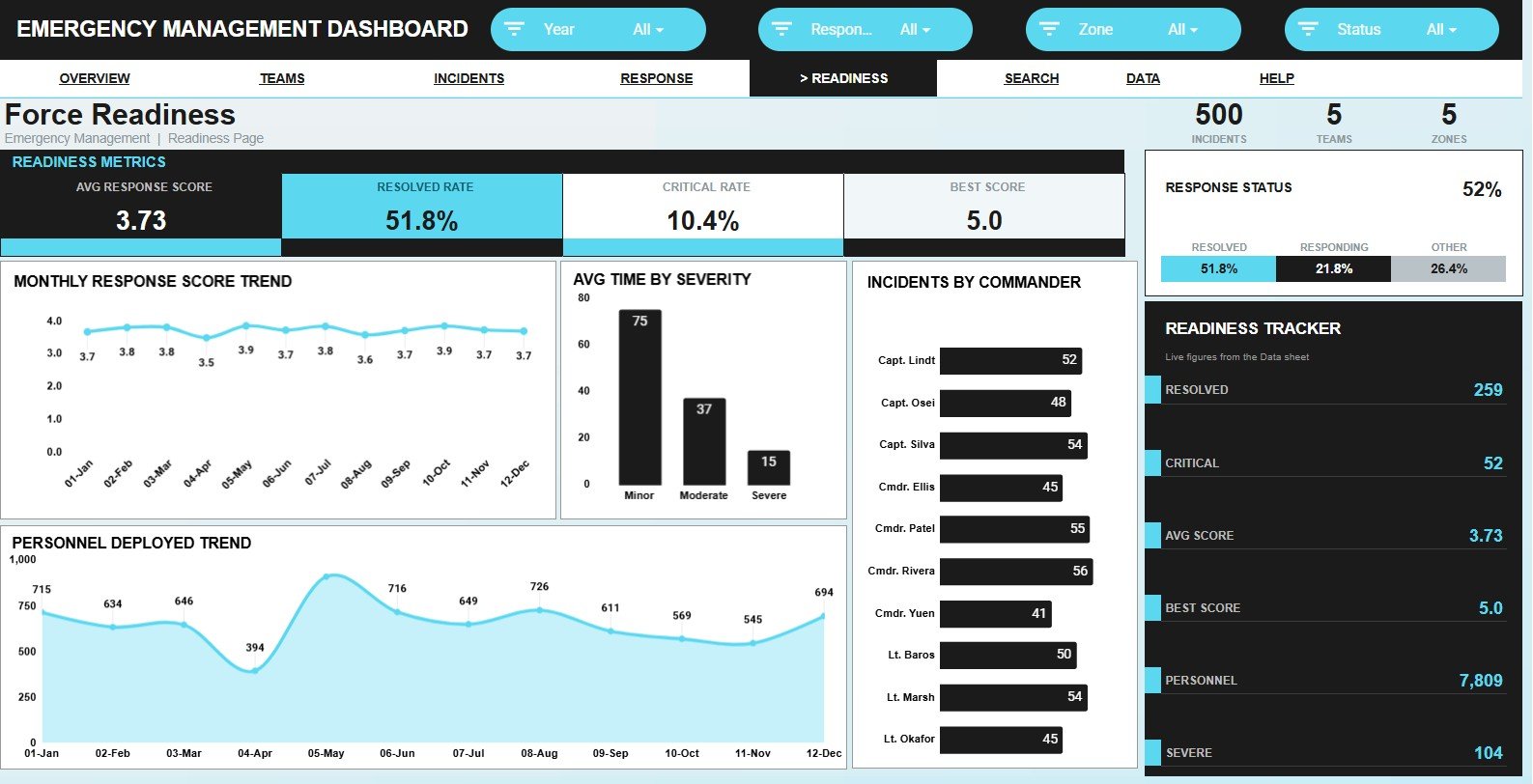
The Force Readiness tab helps evaluate response capability and preparedness. It focuses on response score, response time by severity, commander-level incident activity, personnel deployed, and response status.
Monthly Response Score by Month: This chart tracks response score performance over time. It helps managers monitor whether readiness and response quality are improving or declining.
Avg Time by Severity: This chart compares average response time across severity levels. It helps confirm whether high-severity incidents are receiving faster attention and where process gaps may exist.
Incidents by Commander: This chart shows how incident volume is distributed by commander. It helps review command workload and supports after-action evaluation.
Personnel Deployed by Month: This chart tracks the number of personnel deployed over time. It helps managers understand staffing demand and plan for future readiness needs.
Response Status by Status: This chart summarizes response outcomes by status. It gives a quick view of readiness follow-through and unresolved response activity.
Search Sheet Tab
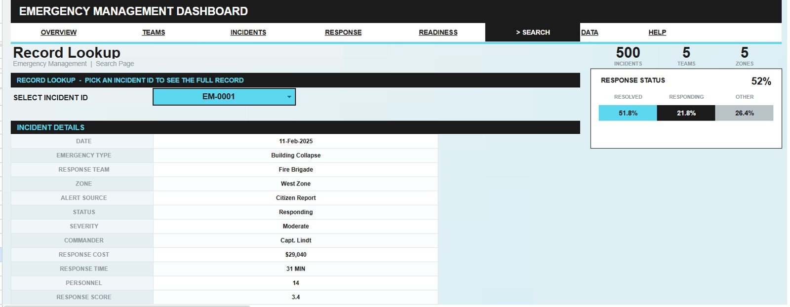
The Search Sheet tab is designed for quick record lookup. Users can select an Incident ID and see the full incident details in one place, including date, emergency type, response team, zone, alert source, status, severity, commander, response cost, response time, personnel, and response score.
This tab is especially helpful during review meetings or follow-up discussions because it avoids switching through the raw data table to find one incident. It turns the spreadsheet into a faster operational reference tool.
Data Sheet Tab
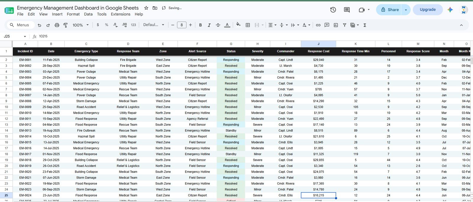
The Data Sheet tab is where users add or update emergency management records in the same structured format used by the dashboard. Keeping the fields consistent helps the charts, cards, slicers, and search sheet update correctly.
This sheet is useful for maintaining a single source of truth for incident data. Teams can add new records as incidents occur and keep the dashboard refreshed for ongoing review.
Emergency Management Dashboard in Google Sheets vs. Microsoft Excel Dashboard vs. Paid Emergency Management SaaS – Feature Comparison
| Feature | Google Sheets Dashboard | Microsoft Excel Dashboard | Paid Emergency Management SaaS |
|---|---|---|---|
| Setup speed | Fast copy-and-use setup inside Google Drive | Fast if the team already uses Excel | May require onboarding and configuration |
| Collaboration | Strong browser-based sharing and co-editing | Good with Microsoft 365 workflows | Usually strong, depending on plan and permissions |
| Customization | Editable fields, charts, tabs, and formulas | Highly customizable for Excel users | Often controlled by vendor settings or admin roles |
| Cost | One-time template purchase | One-time template purchase, plus Excel access | Usually subscription-based |
| Best fit | Small to mid-sized teams that want an editable spreadsheet dashboard | Teams standardized on Excel reporting | Organizations needing enterprise workflows, integrations, and formal incident systems |
Who Should Use This Template
- Emergency management departments that need a practical incident reporting dashboard.
- Municipal and public sector teams tracking response status, severity, zones, and costs.
- Public safety coordinators who want quick charts for review meetings.
- Operations managers responsible for response time, personnel deployment, and readiness.
- Preparedness teams that need a reusable dashboard for recurring incident records.
- Consultants or analysts preparing emergency response reports for stakeholders.
Real-World Use Cases
- Monthly emergency operations review: Use the Overview Page to summarize incident count, response cost, response time, and response score.
- Team workload review: Use the Team Performance tab to compare cost, response speed, and response score by team.
- Incident pattern analysis: Use the Incident Analysis tab to review emergency type, alert source, severity, and status trends.
- Budget monitoring: Use the Response and Cost tab to track cost by month, zone, and alert source.
- Readiness planning: Use the Force Readiness tab to review personnel deployed, commander activity, severity response time, and monthly response score.
- Incident lookup: Use the Search Sheet tab to retrieve full incident details during audits, meetings, or follow-up reviews.
Advantages of Emergency Management Dashboard in Google Sheets
- Easy to edit: Since the dashboard is built in Google Sheets, users can adjust fields, labels, and analysis views based on their workflow.
- Clear visual reporting: Cards and charts help turn incident records into a dashboard that is easier to review with stakeholders.Emergency Management Dashboard in Google Sheets
- Cost-effective: The template avoids the cost and setup time of a larger software system when a spreadsheet dashboard is enough.Emergency Management Dashboard in Google Sheets
- Useful across many response types: The structure can support public safety, operations, municipal services, emergency preparedness, and internal response teams.
- Searchable details: The Search Sheet tab helps users find a complete incident record quickly by Incident ID.Emergency Management Dashboard in Google Sheets
Opportunities for Improvement
- Automated imports: Teams with mature systems may want to connect form submissions or source systems instead of entering records manually.
- Role-based controls: Larger organizations may need more advanced permissions than a single spreadsheet template provides.
- Incident workflow automation: The template is designed for dashboard reporting, so formal case assignment and escalation workflows may require additional tools.
- Custom terminology: Agencies may want to rename emergency types, zones, commanders, or status categories to match internal operating language.
Best Practices
- Keep the Data Sheet format consistent so dashboard formulas, charts, and slicers continue working correctly.
- Use a standard naming convention for zones, teams, commanders, alert sources, and status values.
- Review response time and response score together so speed is not evaluated without quality context.
- Track response cost by both month and zone to understand whether budget pressure is concentrated or seasonal.
- Use the Search Sheet tab during review meetings to quickly pull the details behind a specific chart or KPI.
- Align status definitions with your internal emergency management process and, where relevant, with broader coordination practices such as FEMA NIMS.
- Back up important records and manage sharing permissions carefully when collaborating in Google Sheets.
Explore Relevant Templates
- Emergency Management Dashboard in Google Sheets
- Public Safety Dashboard in Google Sheets
- Government Administration Dashboard in Google Sheets
- Municipal Services Dashboard in Google Sheets
- Public Sector KPI Dashboard in Google Sheets
- Emergency Rescue Services Dashboard in Excel
Frequently Asked Questions
Is this Emergency Management Dashboard built in Google Sheets?
Yes. The template is designed for Google Sheets, so you can copy it into Google Drive and work with the dashboard in a browser-based spreadsheet environment.
What pages are included in the dashboard?
The template includes Overview, Team Performance, Incident Analysis, Response and Cost, Force Readiness, Search Sheet, and Data Sheet tabs.Emergency Management Dashboard in Google Sheets
Can I track individual incident details?
Yes. The Search Sheet tab lets you select an Incident ID and view the full record details, including date, emergency type, response team, zone, alert source, status, severity, commander, response cost, response time, personnel, and response score.Emergency Management Dashboard in Google Sheets
Can I customize the dashboard?
Yes. You can edit the Google Sheets file to adjust categories, labels, source data, charts, and reporting views based on your emergency management process.
Does this replace emergency management software?
No. This is a spreadsheet dashboard template for reporting and analysis. Larger organizations with formal dispatch, case management, integrations, or compliance requirements may still need dedicated emergency management software.
Who is this template best suited for?
It is best suited for public safety teams, municipal departments, emergency coordinators, preparedness planners, analysts, and small to mid-sized response teams that want a practical dashboard in Google Sheets.
About the Author
NeoTech Navigators shares practical tutorials, templates, and digital workflow ideas for teams that want better dashboards, reporting systems, and spreadsheet-based tools. For more walkthroughs and dashboard ideas, visit https://www.youtube.com/@NeoTechNavigators.
Conclusion
The Emergency Management Dashboard in Google Sheets gives teams a practical way to monitor incident activity, response cost, response time, team performance, severity, readiness, and individual incident records. With its overview cards, slicers, charts, search tab, and editable data sheet, it can help emergency management teams turn raw incident data into a clearer reporting system.
Download the Emergency Management Dashboard in Google Sheets