Looking to visualize your data effortlessly? Google Sheets makes it incredibly simple to create pie charts that can help you turn your numbers into beautiful, understandable visuals. In this post, I’ll walk you through exactly how to create a pie chart in Google Sheets using a straightforward example. Even if you’ve never worked with charts before, you’ll be able to follow along and create your own!
Why Pie Charts?
Pie charts are one of the easiest ways to showcase the proportions of different categories in a dataset. Whether you’re managing your budget or tracking expenses, a pie chart helps you quickly visualize where your money or resources are going. It’s perfect for those times when you need a quick snapshot.
Example Data for Your Pie Chart
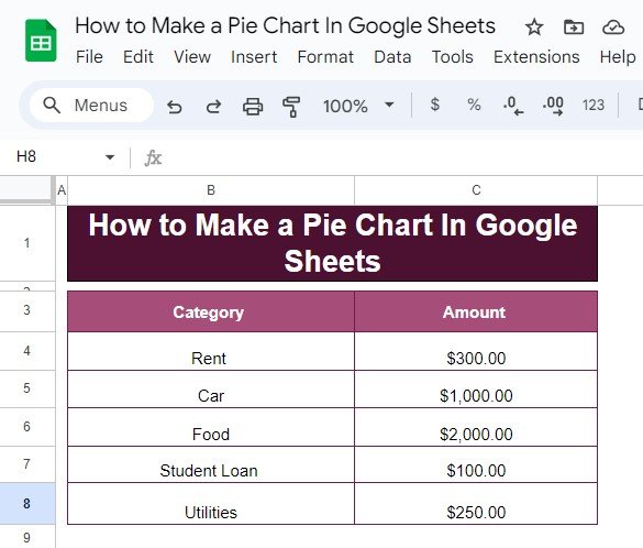
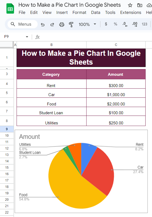
Let’s start with some simple data. Imagine you’re tracking your monthly expenses, and you want to know what percentage of your total budget goes to each category like rent, food, utilities, etc.
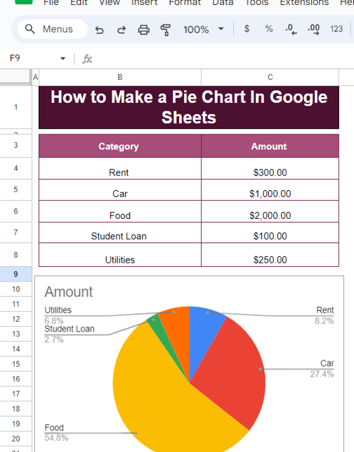
With this data, we’ll create a pie chart that clearly shows how much each category represents in your total expenses.
How to Make a Pie Chart in Google Sheets
Now that we have our data, let’s jump into how to turn this into a pie chart.
- Enter the Data: Open Google Sheets and input the above data in columns, with “Category” in column A and “Amount” in column B.
- Highlight the Data: Select the data from cell A3 to B8. This tells Google Sheets which data you want to include in your pie chart.
Insert the Pie Chart:
Go to the Insert menu and click on Chart.
In the Chart Editor that appears on the right side, under Chart Type, select Pie Chart.
Customize Your Chart:
You can customize your chart to match your needs. You can change the colors, add labels, or even adjust the size of the chart for a better fit on your sheet.
The Formula Behind the Pie Chart
Google Sheets doesn’t require a complex formula to create a pie chart. However, understanding the basic formula you might use for calculating percentages can help you better understand how the chart works.
Here’s a simple formula to calculate what portion of your total each category represents:
=Amount/Total Amount
This formula divides the amount for each category by the total sum of all categories to get the percentage each category contributes. Once you create the pie chart, Google Sheets will automatically handle these calculations and display the chart accordingly.
Example Explanation:
If the total amount for all categories is $3,650, for rent ($300), the calculation would be:
Which gives you approximately 8.22%, meaning rent represents 8.22% of your total monthly expenses.
The Final Output: Your Beautiful Pie Chart
Once you’ve followed the steps above, your final pie chart will show how much each category contributes to your overall budget. Here’s what it might look like:
Why You’ll Love Pie Charts in Google Sheets
Now that you know how to create a pie chart, let’s quickly go over why this type of chart is so useful:
- Simple and Clear: Pie charts offer a clear and easy way to visualize how different categories compare.
- Great for Proportions: They help you see which categories make up the largest and smallest portions of your total data.
- Customizable: Google Sheets lets you customize your pie chart to make it look exactly how you want, with different colors, labels, and more.
Wrap-Up
Creating a pie chart in Google Sheets is a fast and effective way to make sense of your data. Whether you’re tracking expenses, analyzing sales, or simply categorizing any type of data, a pie chart can provide clarity at a glance. And the best part? It’s super easy!
Visit our YouTube channel to learn step-by-step video tutorials
Youtube.com/@NeotechNavigators
View this post on Instagram
