A gauge chart in Google Sheets shows one number on a dial, like a speedometer. That makes it a natural fit for a single KPI such as service level, target achievement or utilisation. This guide builds the gauge from the free practice file, which shows a Service Level of 86% on a red, orange and green dial, and explains every setting you need to make your own.
It is written for team leads, call-centre and operations analysts, and anyone building a simple KPI dashboard in Google Sheets. You need only two cells (a label and a value), the built-in Gauge chart type and a few minutes in the Chart editor.
🎥 Watch the Video Tutorial
Make a Copy of the Free Gauge Chart File
What the Finished Gauge Looks Like
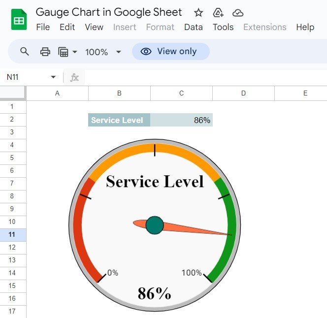
The practice sheet is called “Gauge Chart in Google Sheet”. The label Service Level sits in B2 and its value, 86%, in C2. Below them, the gauge shows the label in the middle of the dial and the value at the bottom. The scale is marked from 0% to 100%, and coloured bands run red, then orange, then green, so the needle in the green zone reads as “good” at a glance.
Step 1: Prepare the Data
- In B2, type the KPI name: Service Level. The gauge uses this text as its label.
- In C2, enter the value as a percentage, for example 86%. Google Sheets stores this as 0.86.
- If the value comes from other data, use a formula in C2 instead of a typed number (see the worked example below).
Step 2: Insert the Gauge Chart in Google Sheets
- Select B2:C2 (label and value together).
- Go to Insert > Chart.
- In the Chart editor, open Setup > Chart type, scroll to the Other group and choose Gauge chart.
- Check that the data range reads B2:C2. If the label is missing from the dial, make sure the label column is included in the range.
Step 3: Set the Scale and Colour Bands
Open Customize > Gauge. These are the settings that matter:
| Setting | What it controls | For a percentage KPI |
|---|---|---|
| Min value | Start of the dial | 0 |
| Max value | End of the dial | 1 (because 100% is stored as 1) |
| Range: start and end | Where each coloured band begins and ends | Your own thresholds, e.g. 0–0.6, 0.6–0.8, 0.8–1 |
| Range: colour | Colour of each band | Red for poor, orange for watch, green for on-target |
The thresholds in the table are only an example. Set them to match your own target. For instance, if your service level target is 80%, the green band should start at 0.8. Then use Customize > Chart style to set the background and font, and drag the chart’s corner handles until it fits your dashboard.
Worked Example: Calculating the Service Level
Service level is usually the share of calls answered within a target time. Suppose your sheet has these sample numbers:
| Cell | Item | Sample value |
|---|---|---|
| F2 | Calls answered within target time | 860 |
| F3 | Total calls offered | 1,000 |
Put this formula in C2 and format it as a percentage (Format > Number > Percent):
=IFERROR(F2/F3,0)860 ÷ 1,000 = 86%, the same reading as the practice file. Because the gauge points at C2, the needle moves whenever F2 or F3 changes. IFERROR shows 0 instead of an error on days with no calls.
Practical Variations
1. Several gauges in one chart
List several KPIs in rows, such as Service Level, CSAT and Utilisation in B2:C4, select the whole block and choose Gauge chart. Google Sheets draws one dial per row, all with the same scale, so this works best when every KPI is a percentage.
2. Target achievement
Show actual against target as a percentage, and set Max to 1.2 or 1.5 if you want room to show over-achievement:
=IFERROR(Actual/Target,0)3. Gauge that follows a dropdown
Add a dropdown with team or month names, and pull the matching value into C2 with a lookup, for example:
=XLOOKUP(E1,Data!A2:A13,Data!B2:B13)The dial then changes as you change the selection.
4. Average of a column
=AVERAGE(Data!C2:C31)This is useful for a month-to-date average of a daily KPI.
5. Whole-number KPIs
For KPIs that are not percentages, such as an average handle time of 240 seconds, set Min and Max to sensible whole numbers (for example 0 and 600) and choose bands in seconds. Remember that for “lower is better” KPIs, green should sit on the left.
Common Problems and Fixes
| Problem | Cause | Fix |
|---|---|---|
| Needle stuck at the far right | Value is 86 but Max is 1 (or value is 0.86 but Max is 100) | Make the value and Min/Max use the same unit. |
| No label on the dial | Only the value cell was selected | Include the label column in the data range (B2:C2). |
| Gauge chart missing from the list | Looking in the wrong group | Scroll to Other in the Chart type list. |
| Bands look wrong | Range starts and ends overlap or leave gaps | Make each band start where the previous one ends. |
| Gauge shows 0 | The source formula returns text or an error | Check C2 holds a number; wrap it in IFERROR. |
Best Practices
- Use a gauge for one headline number. For trends over time, a line or column chart is clearer.
- Base the colour bands on real targets, not on what looks balanced.
- Keep the value cell visible near the gauge, as the practice file does, so readers can see the exact figure.
- Use the same scale and colours for every gauge on a dashboard.
Gauges work well next to other compact visuals. Try a progress circle chart for project status, a 3D doughnut chart or a target vs actual chart with conditional colours. For a full page of call-centre metrics, see the Call Center KPI Dashboard in Google Sheets.
If you want to go further with structured lessons on charts and dashboards, the Excel Pivot Tables & Dashboards course on NextGenTemplates Academy covers KPI visuals and dashboard layout step by step.
Related template: working in Excel? See the Ultimate Speedometer in Excel on NextGenTemplates.
Frequently Asked Questions
Where is the gauge chart in Google Sheets?
Select your data, go to Insert > Chart, then in Setup > Chart type scroll to the Other section and choose Gauge chart.
How do I show percentages on a gauge?
Enter the value as a percentage (for example 86%) and set Min value to 0 and Max value to 1. A percentage is stored as a decimal, so 100% equals 1.
Can one gauge chart show more than one KPI?
Yes. Select several label–value rows and Google Sheets draws one dial per row. All dials share the same scale and colour bands.
Can I change the needle colour?
The built-in gauge offers limited styling. You can change the bands, scale, background and fonts, but not every element of the dial.
Will the gauge update automatically?
Yes. The gauge reads the value cell, so it moves whenever that cell or the formula behind it changes.
Wrapping Up
A gauge chart turns one important number into something people read in a second. Put the label and value in two cells, insert a Gauge chart, set Min and Max to match the unit, and add colour bands based on your real target. Make a copy of the practice file, change the 86% to your own figure, and drop the dial onto your dashboard.
Copy the Free Gauge Chart File
📅 Last updated: October 2026