Conditional formatting in a Google Sheets chart means your bars change colour on their own: red when a month misses its target and green when it meets or beats it. Google Sheets has no single “colour by rule” switch for column charts, so this guide uses a reliable workaround. Two helper columns split the sales into “Red” and “Green” series, and a combo chart draws them against the target.
It is written for anyone who builds sales reports, KPI sheets or monthly dashboards. You will learn the exact formulas from the free practice file, how to set up the chart step by step, several variations (three colours, highlight the best month), and fixes for the problems people usually hit.
🎥 Watch the Video Tutorial
Make a Copy of the Free Practice File
What the Finished Chart Does
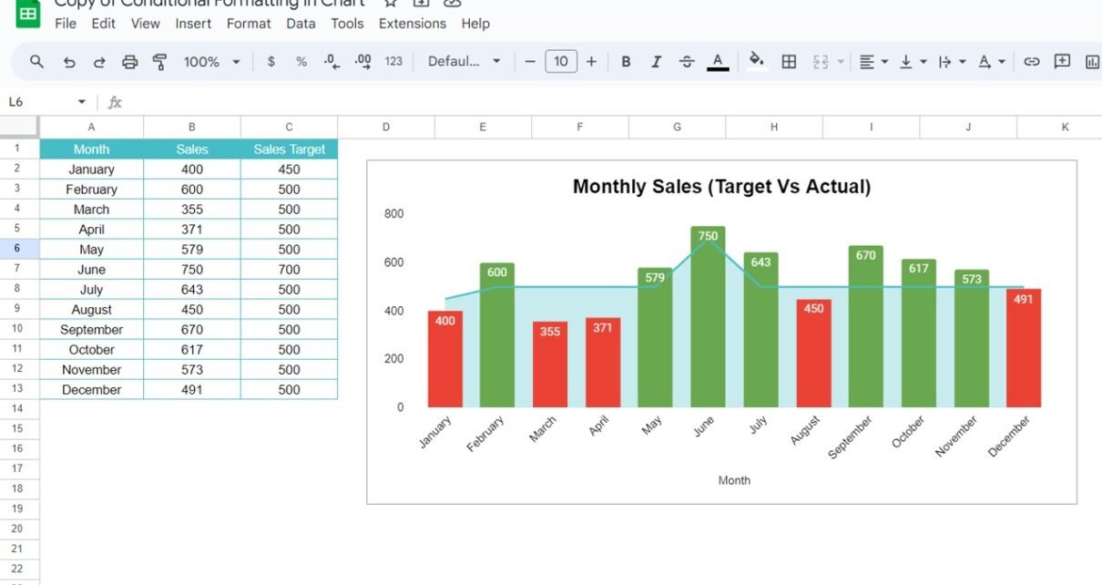
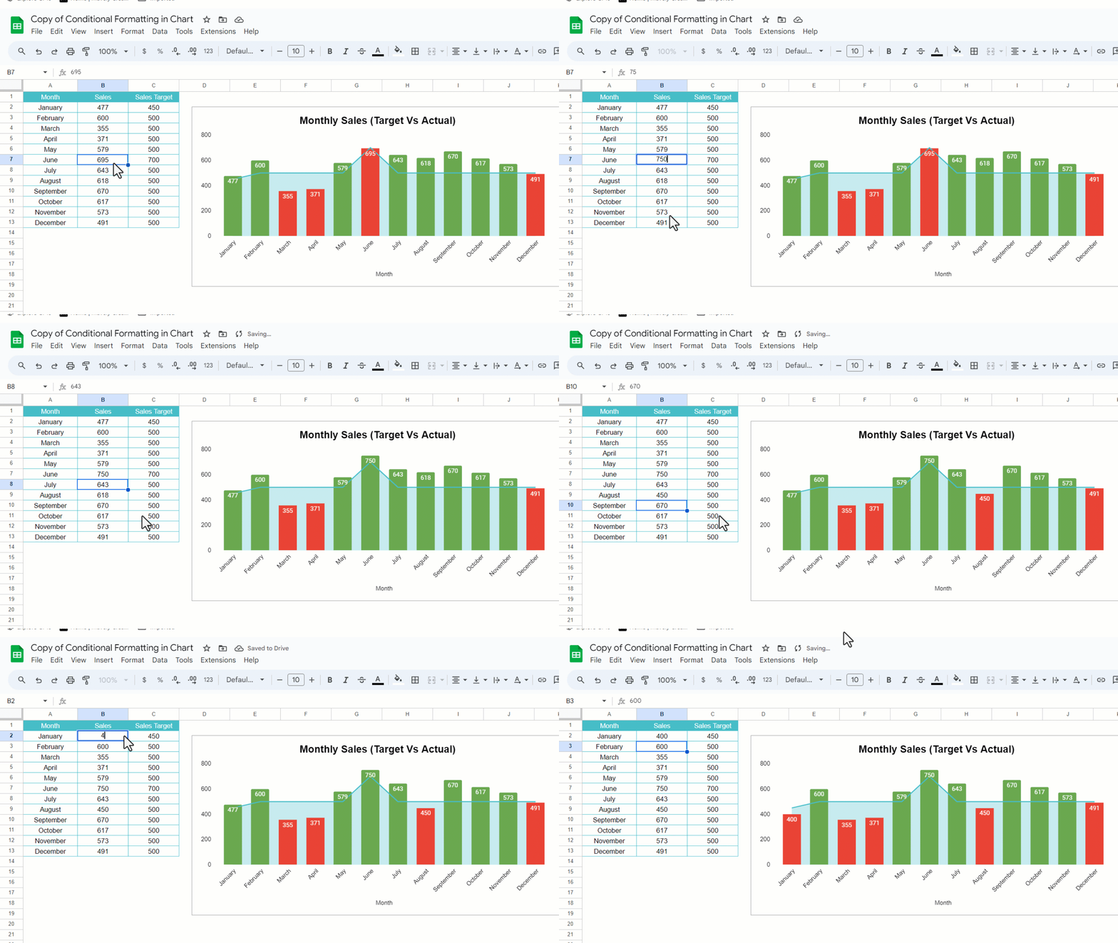
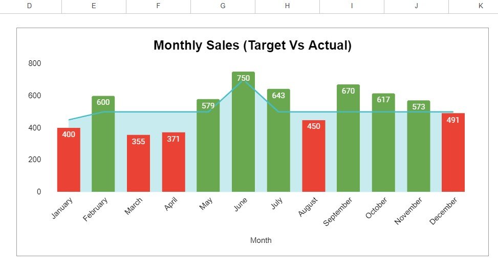
The chart is titled “Monthly Sales (Target Vs Actual)”. Each month shows one column with its value on top, and the target appears as a line with a light shaded area underneath. Change a sales number and the column switches colour instantly. In the animation below, June turns red at 695 against a 700 target and green again at 750.
The Formulas Behind It
The data sits in A1:C13 with the headers Month, Sales and Sales Target. Two helper columns do the work:
D2 (Red):   =IF(B2<C2,B2,NA())
E2 (Green): =IF(B2>=C2,B2,NA())
Copy both formulas down to row 13.
| Part | Meaning |
|---|---|
B2<C2 |
The test: did sales miss the target? |
B2 (value if true) |
Return the sales figure so it is plotted in this series. |
NA() (value if false) |
Return #N/A, which the chart skips, so no bar and no “0” label are drawn. |
B2>=C2 |
The opposite test for the Green column. “Equal to target” counts as met. |
Each month has a number in exactly one helper column and #N/A in the other, so each month gets exactly one coloured bar.
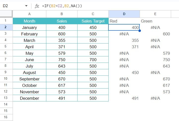
Worked example from the practice file
| Month | Sales | Target | Red | Green |
|---|---|---|---|---|
| January | 400 | 450 | 400 | #N/A |
| February | 600 | 500 | #N/A | 600 |
| June | 750 | 700 | #N/A | 750 |
| August | 450 | 500 | 450 | #N/A |
| December | 491 | 500 | 491 | #N/A |
Across the full year, five months miss the target (January, March, April, August and December) and show red. The other seven show green.
Step-by-Step: Apply Conditional Formatting in a Google Sheets Chart
- Enter the data. Put Month, Sales and Sales Target in A1:C13, then add the Red and Green headers in D1 and E1 with the formulas above.
- Select the chart ranges. Select A1:A13, then hold Ctrl (Cmd on Mac) and select C1:E13. That gives you Month, Sales Target, Red and Green. Leave out column B, because Red and Green already carry the sales values.
- Insert the chart. Go to Insert > Chart. In the Chart editor, open Setup > Chart type and choose Combo chart.
- Stack the columns. Under Setup > Stacking, choose Standard. Because one helper is always #N/A, each month shows a single centred column instead of two thin side-by-side bars.
- Colour the series. In Customize > Series, pick Red and set its fill to red, then pick Green and set it to green.
- Show the target. Select the Sales Target series and set its type to Area (or Line) with a light fill so the bars stay readable.
- Add labels and titles. Under Customize > Series, tick Data labels for Red and Green. Under Chart & axis titles, set the title to “Monthly Sales (Target Vs Actual)” and the horizontal axis title to “Month”.
Useful Variations
1. Three colours: missed, close, achieved
Add an amber band for months within 5% of the target. Use three helper columns and colour them red, amber and green:
Red:   =IF(B2<C2*0.95,B2,NA())
Amber: =IF(AND(B2>=C2*0.95,B2<C2),B2,NA())
Green: =IF(B2>=C2,B2,NA())
2. Highlight only the best month
Best:  =IF(B2=MAX($B$2:$B$13),B2,NA())
Other: =IF(B2<MAX($B$2:$B$13),B2,NA())
3. Compare with the average instead of a target
Below: =IF(B2<AVERAGE($B$2:$B$13),B2,NA())
Above: =IF(B2>=AVERAGE($B$2:$B$13),B2,NA())
4. One fixed target for every month
Put the target in a single cell, for example G1, and lock it: =IF(B2<$G$1,B2,NA()).
5. Colour individual points by hand
For a one-off report, you can also click a single bar, open Customize > Series > Format data point and change its colour. That colour does not update when the data changes, though, which is why the helper-column method is better for live reports.
Common Problems and Fixes
| Problem | Cause | Fix |
|---|---|---|
| Two thin bars per month, offset from the label | Stacking is set to None | Set Setup > Stacking > Standard. |
| Zero labels or tiny bars appear | Helpers return 0 or “” instead of #N/A | Use NA() as the “value if false”. |
| Series named “Column D” in the legend | Headers were not included in the selection | Include row 1, or tick Use row 1 as headers. |
| Colours do not change when data changes | Points were coloured by hand | Reset them and colour the whole Red and Green series instead. |
| Target drawn as a column | Series type left as Column | Change the Sales Target series to Line or Area. |
Tips
- Keep the colour meaning the same across every chart in a report (red = missed, green = achieved).
- Hide the helper columns, or group them (View > Group), so readers see only the source data.
- Name the helper headers clearly (“Below Target”, “On/Above Target”), because those names appear in the legend.
- Do not rely on colour alone. Data labels help readers with colour vision deficiency.
We also have a second walkthrough that compares employee sales to a fixed target: conditional formatting in Google Sheets charts with a sales target. For other compact visuals, try sparklines in Google Sheets, a progress circle chart or a gauge chart for a single KPI. You can see charts like these combined on a page in the Sales KPI dashboard in Google Sheet.
If you want to go further with structured lessons on charts and dashboards, the Excel Pivot Tables & Dashboards course on NextGenTemplates Academy covers chart design and target-vs-actual reporting. The same helper-column idea works in Excel too.
Frequently Asked Questions
Can Google Sheets colour chart bars automatically based on a rule?
Not directly for column charts. The standard workaround is to split the values into separate helper series with IF formulas and give each series its own colour, as shown above.
Why use NA() instead of an empty string?
The chart skips #N/A values completely. Empty strings or zeros can still produce zero-height points and “0” data labels, which clutter the chart.
Does this work with bar or line charts?
Yes. For bar charts, use the same helpers with a stacked bar chart. For line charts, the helpers create coloured line segments or points. Show points (Customize > Series > Point size) so single values stay visible.
What if a month exactly hits the target?
With B2>=C2 in the Green column, a month that equals its target shows green. Change it to B2>C2 (and the Red test to B2<=C2) if “equal” should count as missed.
Will the colours update when I add new data?
Yes, as long as the helper formulas are copied down to the new rows and the chart range includes them.
Wrapping Up
Two IF formulas with NA(), a stacked combo chart and two series colours are all you need for a chart that flags missed targets on its own. Make a copy of the practice file, change a few sales numbers, and watch the bars switch colour. Then try the three-colour version for your next monthly report.
Copy the Free Chart Practice File
📅 Last updated: October 2026