Tooltips in Power BI are more than just floating numbers. With custom tooltips, you can add meaningful visualizations that appear when a user hovers over any chart or graphic. This feature enables powerful storytelling without overwhelming your main report canvas.Custom Tooltip in Power BI
In this blog post, we will explain what custom tooltips are, how they differ from standard tooltips, and how you can build them using a real-world marketing campaign dataset. We’ll also explore real examples with charts and insights.
What is a Custom Tooltip in Power BI?
A custom tooltip is a specially designed report page that acts as an enhanced hover-popup for visuals like charts, KPIs, or tables. Unlike standard tooltips, custom tooltips allow you to add charts, slicers, and cards to provide detailed, contextual insights.
Step-by-Step Guide to Creating Custom Tooltips in Power BI
Step 1: Load the Dataset
Load the provided campaign dataset into Power BI Desktop. Your dataset should include columns such as:
- Campaign ID
- Campaign Name
- Region
- Status
- Impressions, Clicks, Conversions
- Cost and Revenue
- Campaign Type
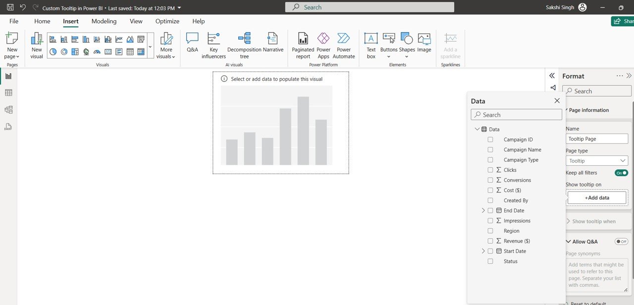
Step 2: Create the Tooltip Page
- Add a new page to your Power BI report.
- In the Visualizations pane, go to Page Information and turn ON the Tooltip toggle.
- Rename the page as
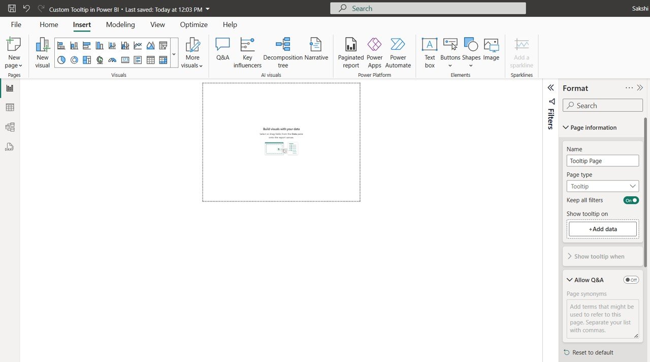
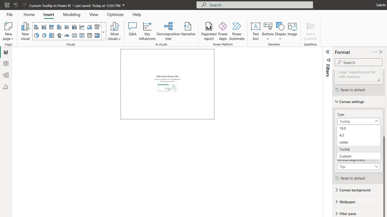
Step 3: Set the Tooltip Page Size
- Go to Format Pane > Canvas Settings
- Set Page Size to Tooltip
- Optionally, customize dimensions if you need more space
Step 4: Design the Tooltip Visuals
On the tooltip page, create visuals that offer contextual insights. In this example, we use:
- Bar Chart: Cost and Revenue by Region
- Donut or Pie Chart: Campaign Status (Active, Paused, Completed)
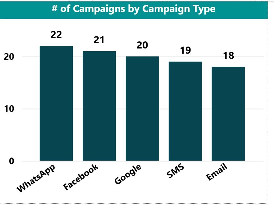
- Bar Chart: Campaign Count by Campaign Type
These visuals provide dynamic insights based on what the user is hovering over.
Step 5: Assign the Tooltip
- Select any visual in your main report
- Go to Format > Tooltip
- Set Type to
Report Page - Choose
Tooltip_Page
Tooltip Page Design: Visual Examples
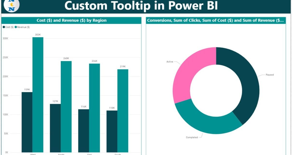
Visual 1: Cost and Revenue by Region
- Shows side-by-side comparisons of marketing costs vs revenue for West, North, East, and South
- Helps users identify regions with best ROI instantly
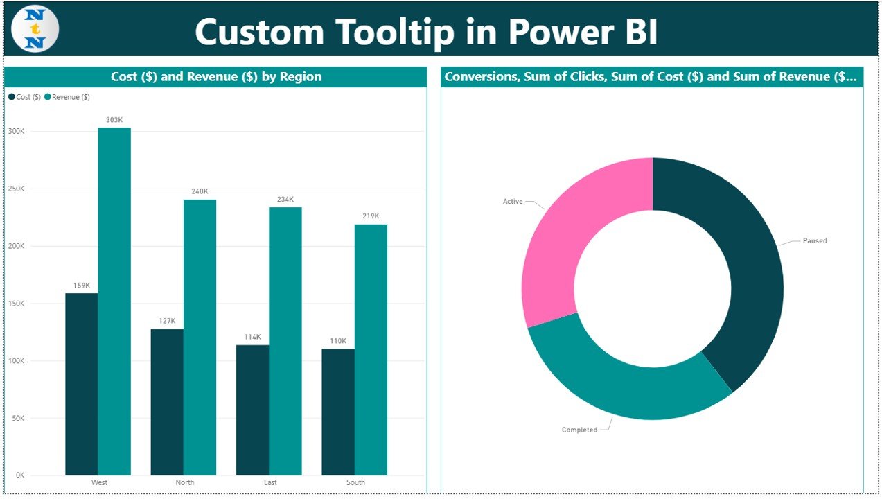
Visual 2: Campaign Status Breakdown
- Represents the ratio of Active, Paused, and Completed campaigns
- Helps assess campaign life cycle stages at a glance
Visual 3: Campaign Type Distribution
- Displays the number of campaigns by channel: WhatsApp, Facebook, Google, SMS, Email
- Useful for understanding which platforms are most used
These visuals are showcased in your tooltip page screenshots. The layout is clean and balanced, providing high-impact information in a compact format.
Best Practices for Custom Tooltips
- Keep visuals minimal and high-value
- Avoid clutter and overlapping tooltips inside charts
- Maintain consistent formatting with the main report
- Avoid slicers inside tooltip pages
- Use large fonts and contrasting colors for readability
Advantages of Using Custom Tooltips
- Compact Storytelling: Show deep insights without cluttering the main page
- Dynamic Context: Auto-adjust based on hover location
- Cleaner Dashboards: Keep main report visual-only, tooltips carry the data load
- Smart Data Exploration: Users explore more without clicks or page changes
Opportunities for Improvement
- Add conditional formatting to highlight changes over time
- Add a column for trend insights in the tooltip
- Add time intelligence DAX to compare with previous periods
- Use Google Analytics-style metrics like CTR or Conversion Rate
Conclusion
Custom tooltips in Power BI elevate your reports by offering interactive, data-rich popups without overwhelming the core visuals. By combining region-wise performance, campaign distribution, and status tracking in tooltips, you empower users with instant, contextual analytics.
Your campaign dataset with visuals like bar charts and donut charts makes this a perfect use case to demonstrate the power of custom tooltips.
Frequently Asked Questions (FAQs)
1. Can I add slicers in tooltip pages?
You can, but it’s not recommended as it may confuse users or conflict with hover filters.
2. Do tooltips work in Power BI Service?
Yes, all custom tooltips work seamlessly in Power BI Service and embedded reports.
3. Can I use tooltips on maps, cards, or slicers?
Tooltips work on most visuals like bar, column, matrix, and line charts. They are not supported on slicers or maps.
4. Can I embed images or logos in tooltips?
Yes! You can insert images to enhance branding or explain context.
5. Do custom tooltips work on mobile view?
Tooltips may not behave the same way in Power BI mobile apps. Always test mobile compatibility.
Visit our YouTube channel to learn step-by-step video tutorials
Youtube.com/@NeotechNavigators