Managing financial performance effectively is crucial for every organization, big or small. Tracking revenues, expenses, and profits manually can lead to errors and confusion. The Revenue and Expense Monitoring Dashboard in Google Sheets provides a simple, powerful, and automated way to visualize and manage financial data — all in one place.Revenue and Expense Monitoring Dashboard in Google Sheets
In this article, we’ll explore how this ready-to-use dashboard works, its structure, key charts, advantages, improvement opportunities, best practices, and frequently asked questions.Revenue and Expense Monitoring Dashboard in Google Sheets
What Is a Revenue and Expense Monitoring Dashboard in Google Sheets?
Click to Buy Revenue and Expense Monitoring Dashboard in Google Sheets
A Revenue and Expense Monitoring Dashboard in Google Sheets is a data-driven financial management tool that allows you to track income, spending, and profitability in real time.Revenue and Expense Monitoring Dashboard in Google Sheets
It helps businesses, departments, and individuals monitor financial performance through visual insights such as charts, KPIs, and trend analysis — all built within the flexibility of Google Sheets.Revenue and Expense Monitoring Dashboard in Google Sheets
This dashboard is perfect for entrepreneurs, finance teams, and managers who want a clear picture of their financial health without investing in complex software.
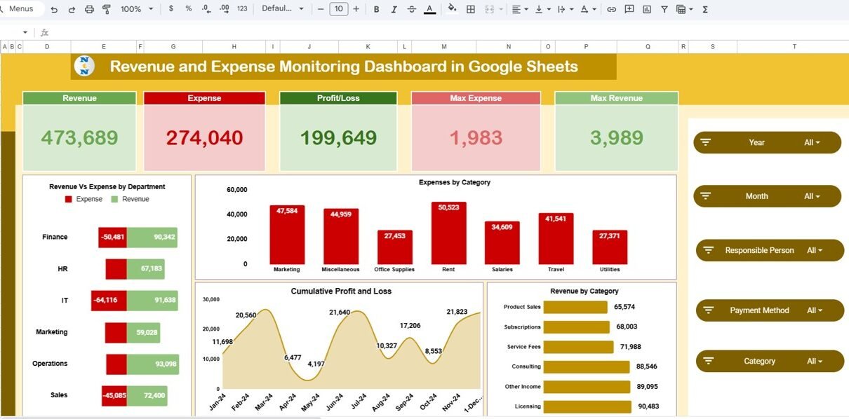
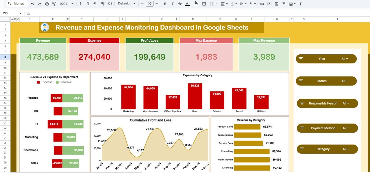
Overview Sheet Tab
The Overview Sheet serves as the main dashboard where all key financial metrics and visualizations are displayed.
🎯 KPI Cards
At the top, you’ll find five essential Key Performance Indicators (KPIs) that summarize the business’s financial health:
-
Revenue – Total earnings over a selected period.
-
Expense – Total spending across all departments and categories.
-
Profit/Loss – Net outcome after subtracting expenses from revenue.
-
Max Revenue – Highest revenue recorded among departments or months.
-
Max Expense – Highest expense recorded in a single department or category.
These cards instantly give management an overview of overall financial performance.
📈 Key Charts in the Overview
The Overview Sheet features multiple interactive charts for easy analysis:
-
Revenue vs Expense by Department – Compares income and spending across departments to identify profit centers or cost-heavy areas.
-
Expenses by Category – Displays how expenses are distributed among categories such as travel, salaries, supplies, and utilities.
-
Revenue by Category – Shows which product lines or services contribute the most to total revenue.
-
Cumulative Profit and Loss – Visualizes profit growth or decline over time.
-
Profit/Loss Chart – Highlights overall profitability trends.
Click to Buy Revenue and Expense Monitoring Dashboard in Google Sheets
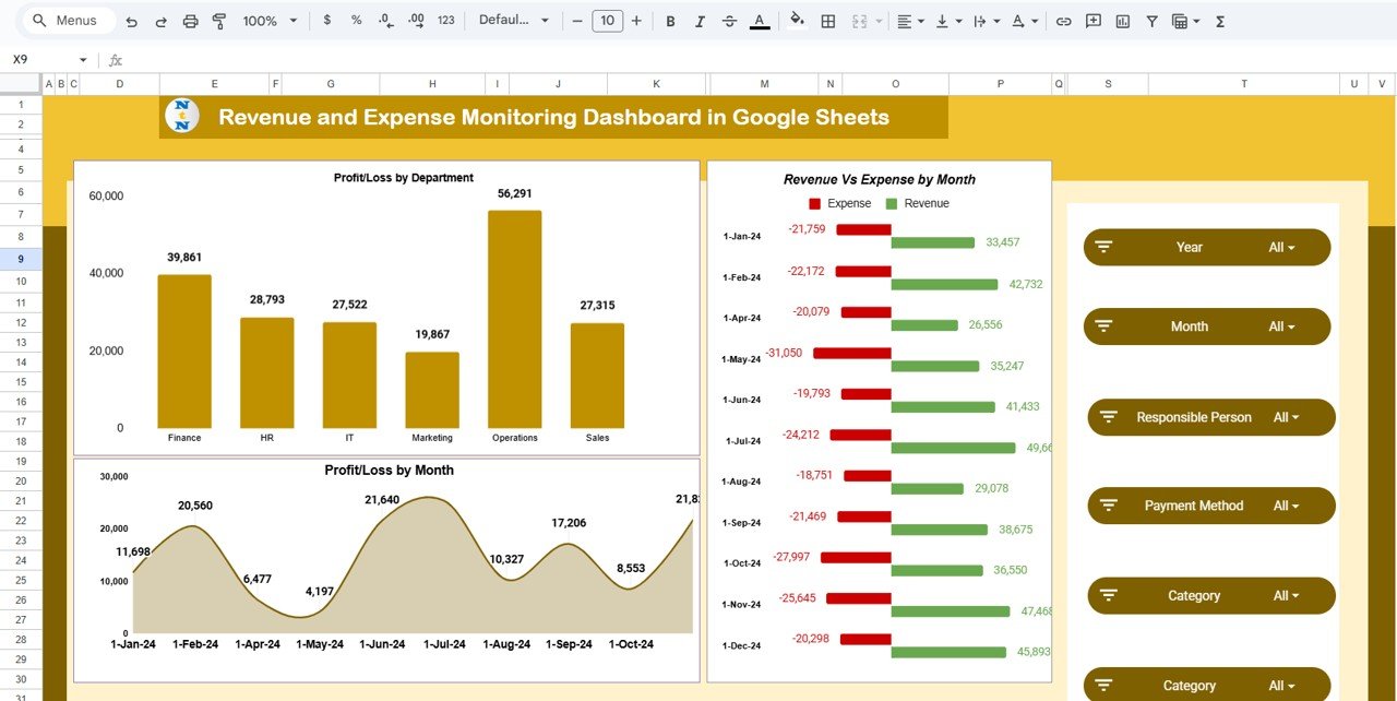
Profit and Loss Analysis
To understand financial trends better, the dashboard includes multiple charts specifically focused on profit and loss performance:
-
Profit/Loss by Department – Identifies departments that are generating profit or loss.
-
Profit/Loss by Month – Displays how profitability changes throughout the year.
-
Revenue vs Expense by Month – Provides a side-by-side comparison of income and spending for every month.
This analysis helps leadership make informed decisions about budgeting, cost control, and growth planning.
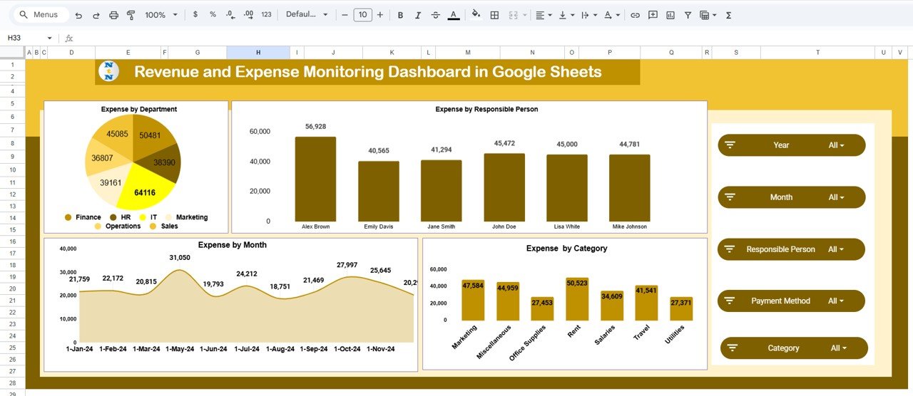
Expense Analysis
The Expense Section provides detailed insights into how and where the organization is spending its money.
Charts Included:
-
Expense by Department – Highlights departments with the highest costs.
-
Expense by Responsible Person – Displays spending by employee or manager in charge.
-
Expense by Category – Breaks down expenses into detailed categories for clarity.
-
Expense by Month – Tracks monthly expense trends to identify spending peaks and patterns.
These visuals ensure that finance teams can quickly spot anomalies or overspending in specific areas.
Click to Buy Revenue and Expense Monitoring Dashboard in Google Sheets
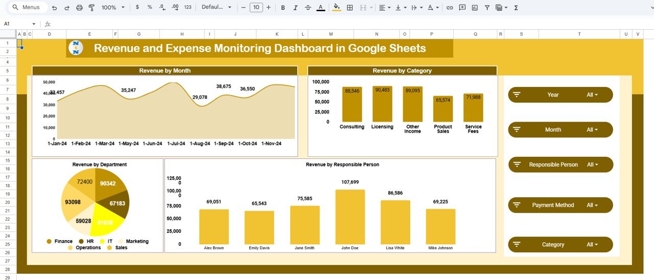
Revenue Analysis
Just like expenses, understanding revenue sources is equally important.
Charts in This Section:
-
Revenue by Month – Reveals monthly income trends for better forecasting.
-
Revenue by Category – Displays top-performing product or service categories.
-
Revenue by Responsible Person – Shows which team members or account managers generate the most revenue.
-
Revenue by Department – Compares revenue generation across business units or departments.
This analysis ensures that companies can focus efforts on high-revenue areas while improving low-performing sectors.
Click to Buy Revenue and Expense Monitoring Dashboard in Google Sheets
Data Sheet Tab
The Data Sheet Tab is the heart of this dashboard. It stores all raw financial data including revenue, expenses, and responsible personnel details.
Common fields include:
- Date
- Department
- Category
- Responsible Person
- Revenue Amount (USD)
- Expense Amount (USD)
- Profit/Loss Calculation (automatically generated)
As new data is entered, all dashboard visuals and KPIs update automatically, maintaining real-time accuracy without manual recalculations.
How the Dashboard Works
-
Enter data in the Data Sheet with relevant fields such as date, category, and amount.
-
Dashboard updates automatically, showing real-time charts and KPI summaries.
-
Use filters to view specific departments, months, or categories.
-
Analyze revenue trends, expense distribution, and profit patterns for actionable insights.
The dashboard uses dynamic formulas and chart references, eliminating the need for complex macros or add-ons.
Advantages of Revenue and Expense Monitoring Dashboard in Google Sheets
Click to Buy Revenue and Expense Monitoring Dashboard in Google Sheets
-
Centralized Financial Tracking: Monitor revenues, expenses, and profits all in one place.
-
Real-Time Updates: All charts and KPIs refresh instantly when data changes.
-
Visual Insights: Identify financial trends and problem areas through charts.
-
Collaboration Ready: Multiple users can access and update the dashboard simultaneously.
-
Customizable: Add more metrics, charts, or filters as per your organization’s needs.
-
Accessible Anywhere: Google Sheets allows you to check financials from any device.
-
Simple & Cost-Effective: Avoid complex accounting software while maintaining professional analytics.
Opportunities for Improvement
While this dashboard provides comprehensive functionality, there’s potential for further enhancement:
-
Automated Data Import: Connect the sheet with accounting or POS systems for live data updates.
-
Expense Approval Workflow: Add approval status tracking for expenses.
-
Budget vs Actual Comparison: Include columns for budgeted vs actual values.
-
Currency Conversion Feature: Ideal for companies handling multiple currencies.
-
Email Alerts: Automate notifications when expenses exceed thresholds.
-
Visualization Integration: Link with Google Looker Studio or Power BI for advanced visuals.
Best Practices for Using This Dashboard
Click to Buy Revenue and Expense Monitoring Dashboard in Google Sheets
-
Update Data Weekly or Monthly: Regular updates ensure accurate performance insights.
-
Maintain Consistent Categories: Use standard naming conventions for expenses and revenues.
-
Analyze Trends Quarterly: Identify repeating expense spikes or revenue drops.
-
Use Filters for Focused Analysis: Slice data by department or category for deep dives.
-
Secure Sensitive Data: Limit edit access to authorized users.
-
Automate Calculations: Let formulas handle profit/loss calculations to reduce errors.
-
Visualize Variances: Highlight large deviations using conditional formatting.
Who Can Use This Dashboard?
Click to Buy Revenue and Expense Monitoring Dashboard in Google Sheets
-
Finance Managers – To analyze overall company financial performance.
-
Department Heads – To monitor departmental spending and revenue.
-
Small Business Owners – To track daily income and expenses.
-
Accountants – To verify and reconcile financial transactions.
-
Consultants and Freelancers – To monitor personal revenue and cost trends.
Conclusion
The Revenue and Expense Monitoring Dashboard in Google Sheets is a powerful yet simple solution for businesses looking to take control of their finances. It brings together real-time analytics, automated KPIs, and visual summaries, enabling smarter decisions without complex tools.
Whether you’re a small business owner, department head, or finance professional, this dashboard helps you monitor performance, control costs, and maximize profits — all within the flexibility of Google Sheets.
Click to Buy Revenue and Expense Monitoring Dashboard in Google Sheets
Frequently Asked Questions (FAQ)
1. Can this dashboard handle multiple departments and currencies?
Yes. You can add multiple departments and even a currency conversion column for international operations.
2. Can I compare monthly trends automatically?
Yes. Charts such as “Revenue vs Expense by Month” and “Profit/Loss by Month” show trend comparisons instantly.
3. Can I track both revenue and expenses by employee?
Yes. The “Responsible Person” column enables you to analyze financial performance by employee.
4. Does it support real-time updates?
Yes. Every change in the Data Sheet automatically updates charts and KPIs in real time.
5. Can I use this dashboard on a mobile device?
Absolutely. Since it’s built in Google Sheets, it’s mobile-accessible anytime, anywhere.
Visit our YouTube channel to learn step-by-step video tutorials
Youtube.com/@NeotechNavigators
Watch the step-by-step video Demo:
Click to Buy Revenue and Expense Monitoring Dashboard in Google Sheets