In this article, we introduce the Shared Services KPI Dashboard in Google Sheets, a ready-to-use template designed to track and optimize the performance of shared services within your organization. With this dashboard, you can monitor key performance indicators (KPIs) in real-time and make data-driven decisions to improve efficiency, reduce costs, and enhance service quality.
Below are the key features of this Shared Services KPI Dashboard:
This dashboard consists of 6 worksheets, each serving a specific purpose:
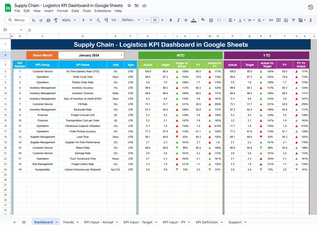
1. Dashboard Sheet Tab
The Dashboard Sheet is the main view of your KPI metrics. Here, you can:
-
Month Selection: Select the month from a dropdown in Range D3. The dashboard updates automatically to show the selected month’s data.
-
MTD (Month-to-Date) Metrics: Displays actual data, target values, and previous year’s data, along with comparisons using Target vs Actual and PY vs Actual, including conditional formatting (up/down arrows).
-
YTD (Year-to-Date) Metrics: Similar to MTD, but shows cumulative data from the start of the year, with comparisons and conditional formatting.

Click to buy Shared Services KPI Dashboard in Google Sheets
2. KPI Trend Sheet Tab
In the KPI Trend Sheet, you can:
-
Select the specific KPI Name from the dropdown available in Range C3.
-
View the KPI Group, Unit, Type of KPI (whether “Lower the Better” or “Upper the Better”).
-
Access the Formula for each KPI and its Definition, ensuring clarity on how each KPI is calculated and what it represents.

3. Actual Numbers Sheet Tab
This tab is where you input the actual data for both MTD and YTD performance. To update the dashboard, simply select the first month of the year in Range E1 and enter the corresponding data for the selected month.

Click to buy Shared Services KPI Dashboard in Google Sheets
4. Target Sheet Tab
In this sheet, you enter the target values for each KPI for the MTD and YTD periods. These values are compared against actual data to assess performance.

5. Previous Year Numbers Sheet Tab
Here, input the corresponding metrics from the previous year for each KPI. This enables you to track year-over-year changes and performance trends.

Click to buy Shared Services KPI Dashboard in Google Sheets
6. KPI Definition Sheet Tab
This sheet contains detailed information about each KPI, including:
-
KPI Name
-
KPI Group
-
Unit
-
Formula
-
Definition
This sheet ensures that everyone involved understands the KPIs they are tracking and their impact on shared services.

Advantages of Using a Shared Services KPI Dashboard
A Shared Services KPI Dashboard offers several advantages, including:
-
Real-Time Performance Tracking: Managers can monitor key metrics like SLA Compliance and First Contact Resolution in real time, allowing for immediate action to address performance issues.
-
Informed Decision-Making: The dashboard provides actionable insights based on real-time data, enabling better strategic decisions regarding resource allocation and process improvements.
-
Cost Efficiency: By tracking Cost per Service Request and Employee Productivity, the dashboard helps identify areas where costs can be reduced, improving overall operational efficiency.
-
Improved Customer Satisfaction: With metrics like Customer Satisfaction (CSAT) and Response Time, managers can quickly spot areas for improvement and implement changes that enhance customer experience.
-
Tracking Employee Performance: Metrics like Employee Turnover Rate and Employee Productivity help track team performance, identify gaps, and make data-driven decisions regarding training and development.
Opportunities for Improvement in Shared Services KPI Dashboards
While the Shared Services KPI Dashboard is a powerful tool, there are several opportunities for improvement:
-
Automation of Data Entry: Integrating the dashboard with other business tools, such as CRM or ERP systems, can help automate data collection, ensuring real-time updates and reducing manual errors.
-
Advanced Visualizations: Incorporating advanced data visualizations like charts, graphs, and heatmaps can enhance the usability of the dashboard, making trends and patterns easier to understand.
-
Mobile Access: Optimizing the dashboard for mobile devices allows managers to monitor performance while on the go, ensuring that critical data is always accessible.
-
Predictive Analytics: Integrating predictive analytics could help forecast future performance and enable proactive decision-making.
Best Practices for Using the Shared Services KPI Dashboard
Click to buy Shared Services KPI Dashboard in Google Sheets
To maximize the value of your Shared Services KPI Dashboard, follow these best practices:
-
Align KPIs with Business Goals: Make sure the KPIs you track align directly with the objectives of the shared services function and broader business goals.
-
Update Data Regularly: Keep your dashboard up to date by entering actual data frequently. This ensures that decisions are based on the most current information available.
-
Limit KPI Focus: Focus on a smaller number of KPIs that provide the most value and insight. Too many KPIs can lead to confusion and decrease the effectiveness of the dashboard.
-
Monitor Performance Continuously: Regularly review the dashboard to monitor the progress of KPIs, identify underperforming areas, and implement corrective actions quickly.
-
Train the Team: Ensure that everyone in your team understands how to use the dashboard effectively. This will help them stay aligned with business goals and improve their performance.
Frequently Asked Questions (FAQs)
What KPIs should I track on a Shared Services KPI Dashboard?
The key KPIs include SLA Compliance, First Contact Resolution (FCR), Cost per Service Request, Customer Satisfaction (CSAT), and Employee Productivity.
How can I create a Shared Services KPI Dashboard in Google Sheets?
Create the dashboard by setting up different sheets for each KPI, entering the actual and target data, and using Google Sheets features such as dropdown menus, formulas, and conditional formatting for dynamic updates.
Why is monitoring First Contact Resolution (FCR) important?
FCR is crucial because it shows how efficiently issues are being resolved in the first interaction, which improves customer satisfaction and reduces operational costs.
How can I improve Customer Satisfaction (CSAT)?
To improve CSAT, focus on faster response times, effective issue resolution, and regular feedback collection to understand customer needs.
Can I integrate my Shared Services KPI Dashboard with other tools?
Yes, you can integrate the dashboard with CRM or ERP systems to automate data flow and improve accuracy.
Conclusion
Click to buy Shared Services KPI Dashboard in Google Sheets
The Shared Services KPI Dashboard in Google Sheets is a valuable tool for monitoring the performance of shared services operations. By tracking essential KPIs such as SLA Compliance, Cost per Service Request, and Customer Satisfaction, this dashboard helps improve efficiency, reduce costs, and enhance the quality of service. By following best practices and exploring opportunities for improvement, you can continuously optimize your shared services performance.
Click to buy the Shared Services KPI Dashboard in Google Sheets
Visit our YouTube channel to learn step-by-step video tutorials
Youtube.com/@NeotechNavigators
Watch the step-by-step video Demo: