The Subscription Box Dashboard in Google Sheets tracks 4 headline KPIs — Total Revenue, Boxes Shipped, Active Subscriptions, and Avg Order Value — across 4 interactive analysis pages with 15 pre-built charts, slicer filters on every page, a dedicated order Search sheet, and a single Data sheet for input. Setup takes under 10 minutes, and the template costs $9.99 as a one-time purchase instead of $39–$119 per month for platform analytics.
Most subscription box founders run their numbers across order exports, payment reports, and a half-finished spreadsheet — which makes simple questions like “which plan actually earns more?” surprisingly hard to answer. The Subscription Box Dashboard in Google Sheets solves that by turning one clean order table into a full reporting suite that any team member can open in a browser.
Key Features of the Subscription Box Dashboard in Google Sheets
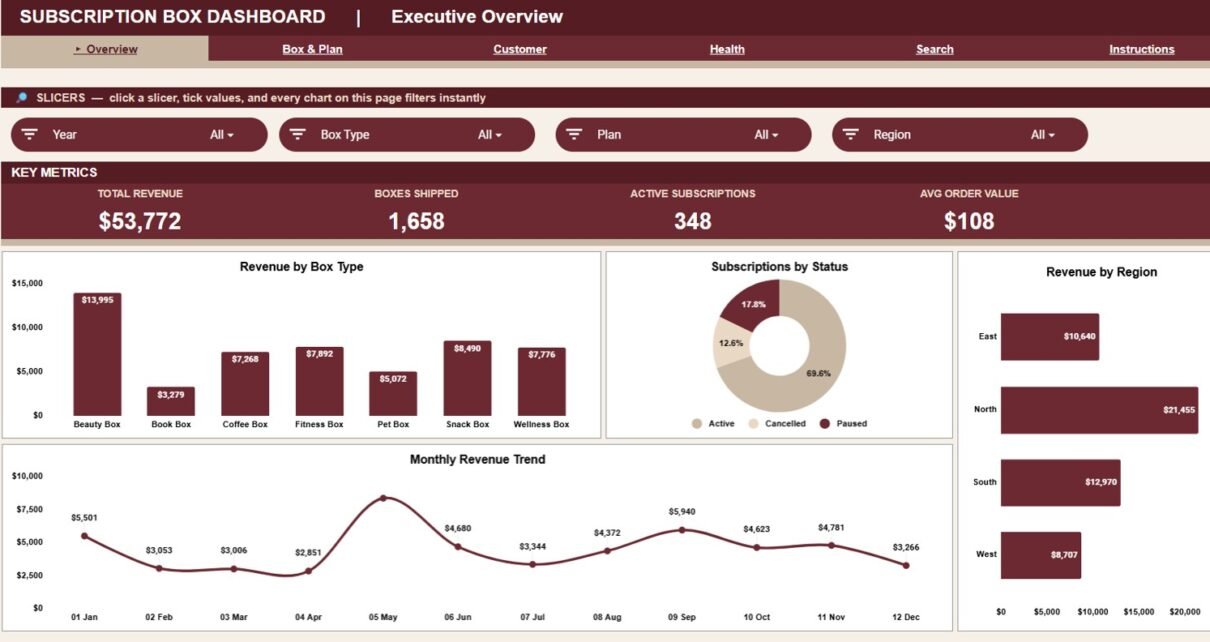
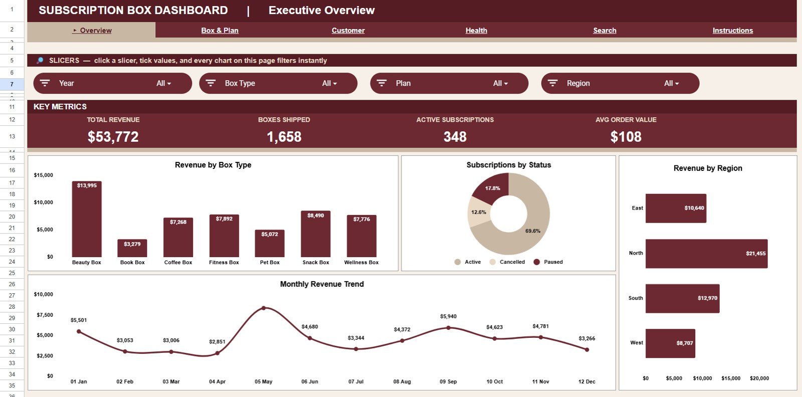
- 4 KPI cards — the Overview page shows Total Revenue, Boxes Shipped, Active Subscriptions, and Avg Order Value, recalculated live from your data.
- 15 pre-built charts across 4 pages — covering revenue by box type, plan, region, channel, and month, plus order mix, new vs returning customers, and subscription status.
- Slicers on every page — filter the entire dashboard by box type, plan, region, channel, customer type, or status in one click, with no formulas to touch.
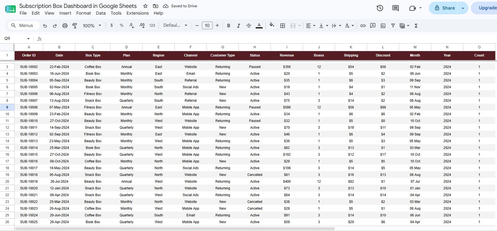
- Order Search sheet — pick any Order ID and instantly see its Date, Box Type, Plan, Region, Channel, Customer Type, Status, Revenue, Boxes, Shipping, Discount, and Month.
- One Data sheet input — paste your orders in the given format and every KPI, chart, and lookup refreshes automatically.
- 100% native Google Sheets — no add-ons, no Apps Script setup, works on any browser and the Google Sheets mobile app.
Dashboard Pages Explanation
1. Overview Page
The Overview page opens with 4 cards — Total Revenue, Boxes Shipped, Active Subscriptions, and Avg Order Value — and multiple slicers at the top so you can filter the whole page and see the filtered dashboard quickly. Charts include Revenue by Box Type, Subscriptions by Status, Revenue by Region, and Revenue by Month: together they show your product mix, retention picture, strongest regions, and the monthly revenue trend on a single screen.
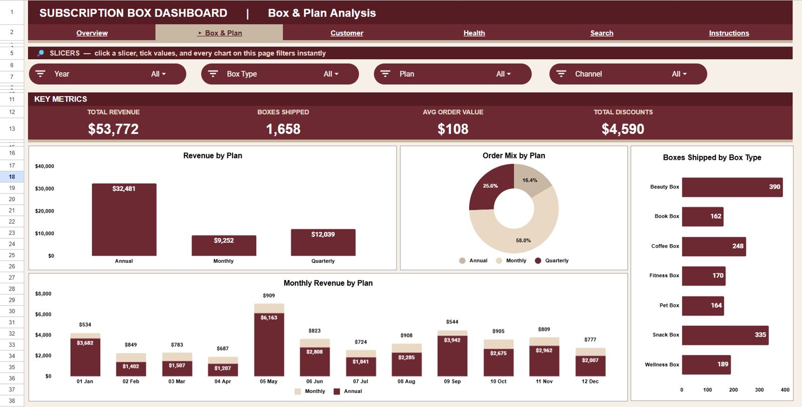
2. Box & Plan Analysis
This sheet tab answers the product-strategy questions. Revenue by Plan and Order Mix by Plan show which billing plans carry your business, Monthly Revenue by Plan reveals how each plan trends over the year, and Boxes Shipped by Box Type tells your fulfillment team exactly where the volume goes.
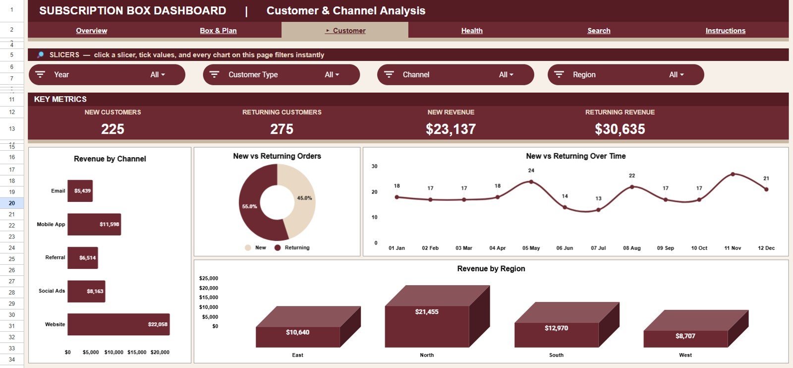
3. Customer & Channel Analysis
This sheet tab focuses on acquisition and loyalty. Revenue by Channel compares your storefront, marketplace, and social sales; Orders by Customer Type and New vs Returning by Month track repeat-purchase behavior over time; and Revenue by Region shows where your subscribers actually live.
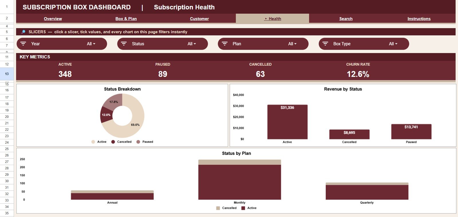
4. Subscription Health
This sheet tab is your churn radar. Subscriptions by Status shows how many subscriptions are active, paused, or cancelled; Revenue by Status quantifies how much money each status represents; and Status by Plan reveals whether a specific plan is quietly driving your cancellations.
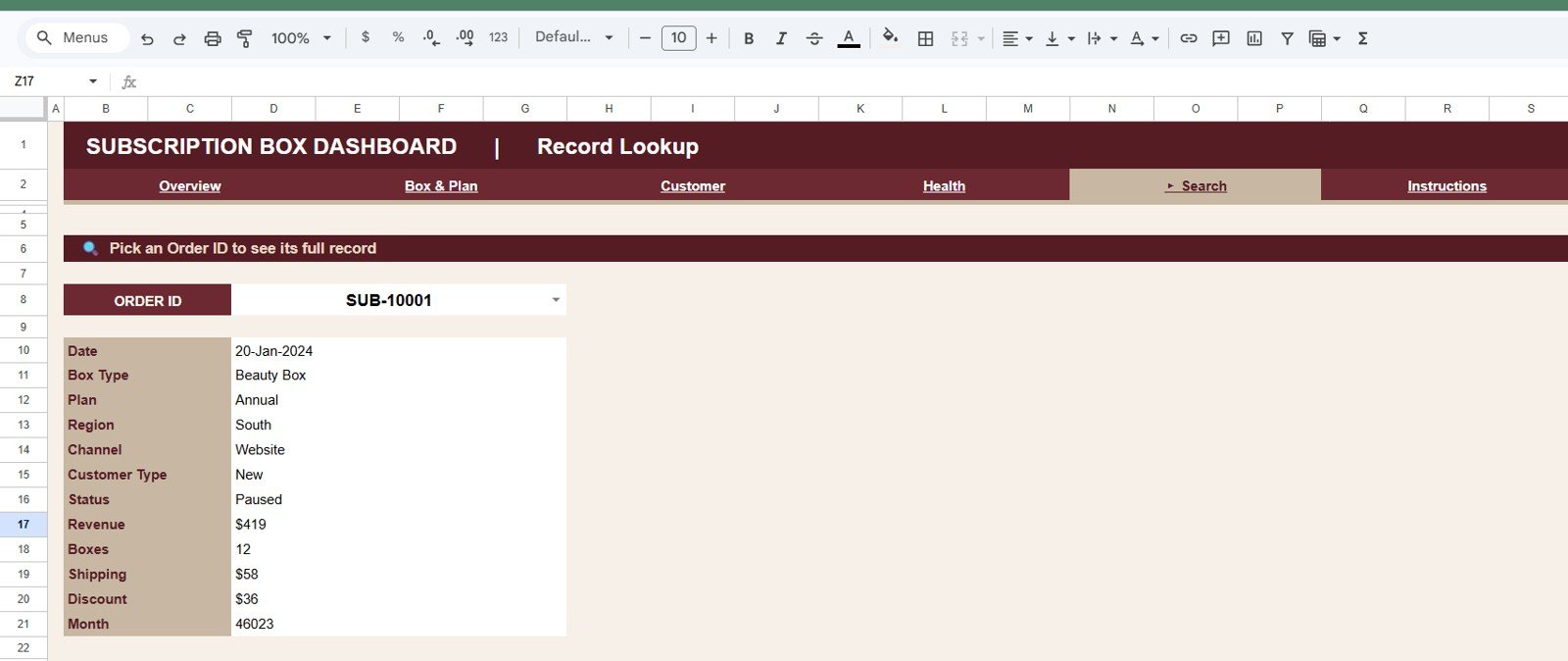
5. Search Sheet Tab
The Search sheet lets users pick an Order ID and view the full record instantly. The lookup shows Date, Box Type, Plan, Region, Channel, Customer Type, Status, Revenue, Boxes, Shipping, Discount, and Month — perfect for answering customer emails without digging through hundreds of raw rows.
6. Data Sheet Tab
This is the Data sheet — the single input point for the whole template. Add your orders in the same column format and every page, KPI card, chart, slicer, and the Search sheet updates automatically.
Subscription Box Dashboard in Google Sheets vs. Excel Dashboard vs. Cratejoy/Subbly — Feature Comparison
| Feature | Subscription Box Dashboard in Google Sheets | Microsoft Excel Dashboard | Cratejoy / Subbly Analytics |
|---|---|---|---|
| Cost | $9.99 one-time ✅ | $17.99 one-time + Excel license | $39–$119 / month platform fees |
| Platform | Any browser, free Google account ✅ | Desktop Excel required | Locked to their platform |
| Setup time | Under 10 minutes ✅ | Under 15 minutes | Full store migration required |
| Real-time team collaboration | Native Google Sheets sharing ✅ | Limited (OneDrive co-authoring) | Per-seat pricing |
| Mobile access | Google Sheets app ✅ | Excel mobile (limited) | Yes |
| Customizable fields & charts | Fully editable ✅ | Fully editable | Fixed reports only |
| Share with a link | Yes ✅ | File-based sharing | Account required |
| Order-level search lookup | Built-in Search sheet ✅ | Depends on template | Yes |
| Year-1 cost at 5 users | $9.99 total ✅ | $17.99 + licenses | $468–$1,428+ |
For subscription box sellers who want real analytics without monthly platform fees, the Subscription Box Dashboard in Google Sheets sits in the sweet spot.
Who Should Use This Template
Perfect for:
- Subscription box founders on Shopify, WooCommerce, Etsy, or their own site who track orders in spreadsheets
- Small e-commerce teams (1–20 people) needing shared, browser-based reporting without new software
- Side-hustle box sellers who want partner-ready charts from day one
- Operations managers planning inventory around Boxes Shipped by Box Type and region
Not a fit if:
- You need automated API syncs from Stripe or Recharge — this template uses manual/paste-in data entry
- You require cohort-level churn modeling or LTV forecasting — this dashboard reports statuses and revenue, not predictive analytics
Real-World Use Cases
Maya runs a specialty coffee subscription box with 450 active subscribers. Every Monday she pastes her weekly Shopify export into the Data sheet, then opens the Subscription Health page to catch paused and cancelled plans early. A targeted win-back email to that list recovers roughly a dozen subscribers a month — without paying $99/month for platform analytics.
Daniel sells a quarterly book box as a side business. The Box & Plan Analysis page showed him that his quarterly plan drives a noticeably higher Avg Order Value than the monthly plan, so he now leads with it on his landing page and in his ads.
Priya manages fulfillment for a snack box brand shipping to 4 regions. She uses New vs Returning by Month to see which channels bring loyal customers, and Boxes Shipped by Box Type to plan packaging inventory before each shipping cycle.
Advantages of the Subscription Box Dashboard in Google Sheets
- Massive cost saving — $9.99 once versus $468–$1,428+ per year for subscription platform analytics at 5 users.
- Zero learning curve — if your team can use Google Sheets, they can use this dashboard; slicers replace formulas entirely.
- Store-agnostic — works with orders from Shopify, WooCommerce, Etsy, Amazon, or offline sales, because the input is just a table.
- Real collaboration — share one link and your whole team sees the same live numbers, with Google’s built-in version history as a safety net.
- Faster decisions — the four analysis pages answer plan, channel, region, and churn questions that normally take an hour of pivoting.
Opportunities for Improvement
Being honest about limits: data entry is manual, so if you process hundreds of orders daily you will want to automate the export-paste step or connect a sync tool. The dashboard reports current statuses rather than predictive churn scores, and the 12-column data format means any extra fields you track (for example, SKU-level costs) need small manual extensions. Google Sheets also slows down past roughly 50,000 rows, so very large historical datasets are better archived yearly.
Best Practices
- Update the Data sheet on a fixed schedule (weekly works for most box businesses) so trends stay honest.
- Keep the column format identical to the sample rows — the fastest path to a broken chart is a renamed column.
- Use the slicers to review one plan or region at a time in monthly business reviews; per Google’s own documentation, slicers filter every connected chart on the sheet at once.
- Check the Subscription Health page first each week — paused subscriptions are your cheapest win-back opportunity.
- Archive completed years into a separate tab or file to keep the dashboard fast.
Explore Relevant Templates
- Subscription Box Dashboard in Google Sheets — the template covered in this post
- Subscription Business Dashboard in Google Sheets — SaaS-style MRR and renewal tracking
- Subscription Business KPI Dashboard in Google Sheets — KPI-card focused variant
- Subscription Business Dashboard in HTML — a standalone browser dashboard version
- Browse all Google Sheets Dashboards on NextGenTemplates
Also available as: Subscription Box Dashboard in Excel · Subscription Box Dashboard in Power BI
Frequently Asked Questions
What KPIs does the Subscription Box Dashboard in Google Sheets track?
The Subscription Box Dashboard in Google Sheets tracks 4 headline KPIs — Total Revenue, Boxes Shipped, Active Subscriptions, and Avg Order Value — plus 15 charts covering box types, plans, regions, channels, customer types, and subscription status, all updating automatically from the Data sheet.
How long does setup take?
Under 10 minutes. Open the copy link in your download, make your own copy in Google Drive, and paste your orders into the Data sheet. The Subscription Box Dashboard in Google Sheets recalculates every card and chart instantly.
How does this compare to Cratejoy or Subbly?
Cratejoy and Subbly charge $39–$119 per month and require running your store on their platform. The Subscription Box Dashboard in Google Sheets costs $9.99 once and works with order data from any store — Shopify, WooCommerce, Etsy, or offline sales.
Can I filter by box type, plan, or region?
Yes. Every page of the Subscription Box Dashboard in Google Sheets includes slicers, so you can filter all KPIs and charts by box type, plan, region, channel, customer type, or status in one click.
Do I need add-ons or Apps Script knowledge?
No. The Subscription Box Dashboard in Google Sheets uses only native Google Sheets features — summaries, charts, and slicers. If you can copy and paste data, you can run it.
Can I add my own columns or charts?
Yes. The Subscription Box Dashboard in Google Sheets is fully editable — you can add columns to the Data sheet, restyle charts, or duplicate a page for a custom analysis, since nothing is locked or hidden.
About the Author
Built by PK — Microsoft Certified Professional with 15+ years of Excel, Google Sheets, and Power BI experience. Founder of NextGenTemplates, reaching 300K+ subscribers across YouTube channels. Every template is hand-built and tested before release.
Conclusion
If you run a subscription box business and your reporting still lives in scattered exports, the Subscription Box Dashboard in Google Sheets gives you KPI cards, 15 charts, slicer filtering, and order-level search for less than the cost of a single month of platform analytics.
👉 Click here to Purchase the Subscription Box Dashboard in Google Sheets
✅ Instant download · One-time payment · No subscription
🎥 For step-by-step video tutorials, visit Youtube.com/@NeoTechNavigators
📅 Last updated: July 2026