In the competitive digital world, delivering a great user experience and interface design is more than just aesthetics—it’s about data-driven decisions. To consistently improve design outcomes, monitor performance, and communicate results, you need a powerful tool. That’s where the UX/UI Design KPI Dashboard in Google Sheets comes in.
This dashboard is a ready-to-use solution that helps UX/UI professionals, product managers, and design teams track their key performance indicators (KPIs) easily, efficiently, and visually. It transforms raw design data into actionable insights, helping you make better decisions and showcase your value.
In this article, we’ll explore everything you need to know about the UX/UI Design KPI Dashboard, including its benefits, features, setup process, and best practices.
What Is a UX/UI Design KPI Dashboard in Google Sheets?
A UX/UI Design KPI Dashboard is a data visualization tool built in Google Sheets that captures, displays, and monitors key metrics related to user experience (UX) and user interface (UI) design.
Unlike complex platforms, this dashboard keeps things simple and accessible. It includes multiple interconnected sheets that allow you to enter, track, and analyze monthly design performance data.
You can view real-time comparisons between actual performance, targets, and previous year’s data—making it ideal for both individual designers and teams working across agile sprints or product life cycles.
Key Features of the UX/UI Design KPI Dashboard
Let’s break down the six key sheets of this dashboard and how each one adds value:
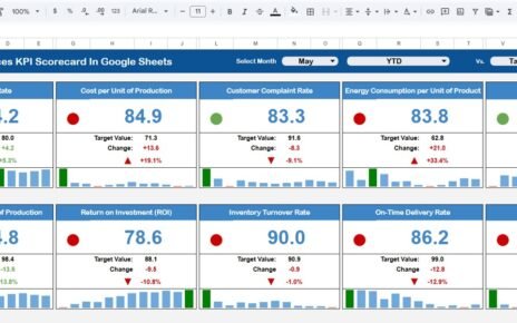
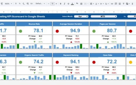
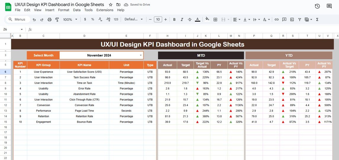
1. Dashboard Sheet
This is the main visual page of the dashboard. You’ll find:
-
Drop-down for Month Selection (Range D3): Select a month and the dashboard automatically updates.
-
MTD & YTD Views: Get insights into current month (MTD) and year-to-date (YTD) figures.
-
Target vs Actual Comparison: See where your design team stands.
-
Previous Year Comparison: Evaluate growth or areas of decline.
-
Conditional Formatting Arrows: Instantly know if performance is improving or dropping.
Click to buy UX/UI Design KPI Dashboard in Google Sheets
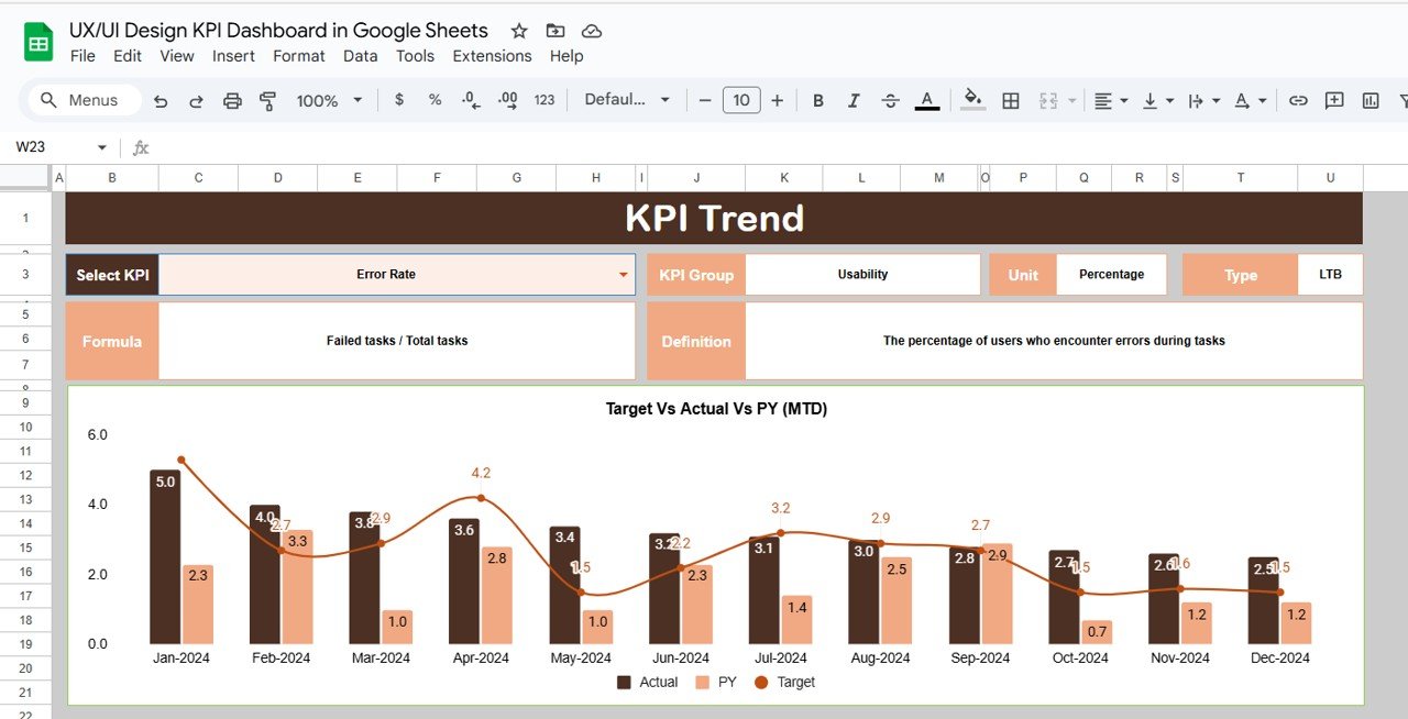
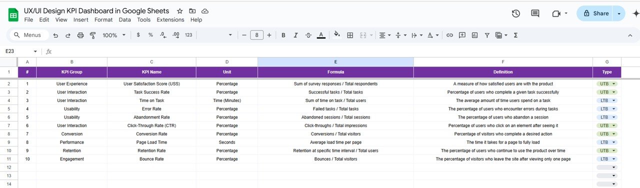
2. KPI Trend Sheet
This sheet gives you a deep dive into a selected KPI:
-
Dropdown to Choose KPI (Cell C3)
-
KPI Group, Unit, Type (UTB/LTB), Formula, and Definition all shown for clarity.
-
Use this sheet to track trends and explain fluctuations.
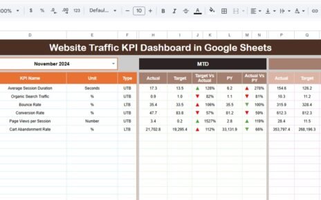
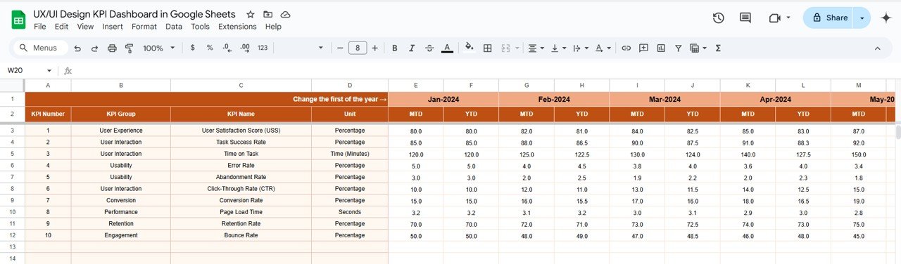
3. Actual Numbers Sheet
This is where you input real design performance numbers:
-
Month Selection (Range E1): Change the month to update values accordingly.
-
MTD and YTD Inputs: Enter actual performance data for each KPI.
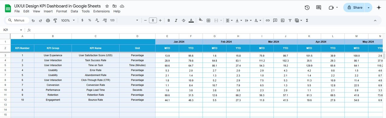
4. Target Sheet
Click to buy UX/UI Design KPI Dashboard in Google Sheets
Define your monthly goals here:
-
Enter Targets for MTD and YTD KPIs
-
Works in sync with the Dashboard sheet.
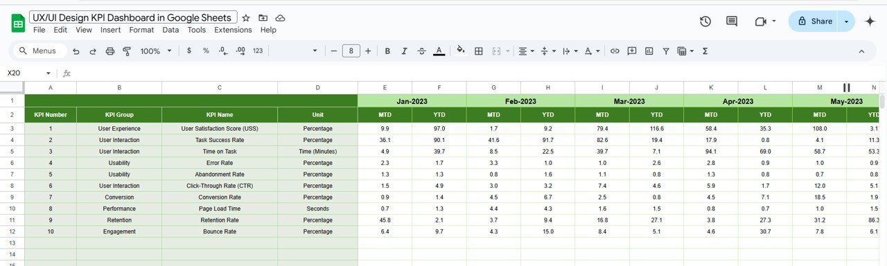
5. Previous Year Numbers Sheet
Compare your current design performance to the previous year:
-
Input Previous Year MTD and YTD figures
-
Enables year-over-year performance insights.
Click to buy UX/UI Design KPI Dashboard in Google Sheets
6. KPI Definition Sheet
Understand what each KPI means and how it’s calculated:
-
Includes: KPI Name, Group, Unit, Formula, and Definition
-
KPI Type: Shows whether it’s a “Lower the Better (LTB)” or “Upper the Better (UTB)” metric.
Why Use a KPI Dashboard for UX/UI Design?
Designers often rely on instincts and creativity—but data should guide direction. Here’s why this dashboard matters:
-
Tracks usability and user satisfaction.
-
Shows design efficiency and productivity.
-
Identifies bottlenecks or quality issues early.
-
Provides transparency to stakeholders.
-
Helps justify design decisions with data.
Advantages of UX/UI Design KPI Dashboard in Google Sheets
Click to buy UX/UI Design KPI Dashboard in Google Sheets
Here’s why this tool is a game-changer:
- Real-Time Performance Monitoring: Quickly switch months and see how your team is performing. The dashboard auto-updates, ensuring fresh insights every time.
- Accessible and Easy to Use: Google Sheets is universally accessible. There’s no steep learning curve—anyone with basic spreadsheet knowledge can use it.
- Fully Customizable: Add or remove KPIs, change formulas, and tailor the dashboard to your organization’s specific UX/UI strategy.
- Visual Feedback with Conditional Formatting: Arrows and color codes make it simple to spot trends at a glance.
- . No Expensive Tools Required: This dashboard avoids expensive analytics software. It offers high value at zero cost.
Best Practices for Using the UX/UI Design KPI Dashboard
Follow these tips to get the most out of your dashboard:
- Define KPIs Clearly: Make sure every KPI has a clear unit, formula, and meaning. Use the KPI Definition sheet to align team understanding.
- Update Data Monthly: Set a reminder to update actual and target sheets every month. This ensures your dashboard remains relevant.
- Use Color Coding Wisely: Avoid overusing colors. Stick to green for success and red for concern to maintain visual clarity.
- Regularly Review Trends: Use the KPI Trend Sheet weekly or monthly to review progress and identify gaps.
- Collaborate with Stakeholders: Share the Google Sheet with team leads or executives to encourage transparency and alignment.
Opportunity to Improve the UX/UI Design KPI Dashboard
Click to buy UX/UI Design KPI Dashboard in Google Sheets
While the dashboard is feature-rich, there’s always room to grow:
- Add Automation via App Script: Automate data updates or notifications using Google Apps Script to reduce manual work.
- Integrate with Other Tools: Connect with tools like Figma, Jira, or Google Analytics to auto-import relevant KPIs.
- Introduce More Visual Charts: Include pie charts, line graphs, and bar visuals to make data storytelling more effective.
- Build Alerts for Poor Performance: Set conditional alerts (e.g., performance drops by more than 10%) to get email notifications.
Conclusion
A well-structured UX/UI Design KPI Dashboard in Google Sheets can transform how your team measures success, identifies gaps, and communicates results. It’s an invaluable tool for ensuring continuous design improvement, aligning with user needs, and achieving business goals.
Whether you’re an individual designer or managing a product team, leveraging a KPI dashboard empowers you to bring clarity, focus, and accountability into your design process—without needing advanced analytics tools.
Frequently Asked Questions (FAQs)
Q1. What is the purpose of a UX/UI KPI Dashboard?
A UX/UI KPI Dashboard helps monitor key metrics that reflect user satisfaction, design efficiency, and overall experience quality. It allows teams to make informed design decisions.
Q2. Why use Google Sheets for a KPI Dashboard?
Google Sheets is accessible, free, and collaborative. It allows real-time updates, sharing, and easy customization without needing third-party software.
Q3. How many KPIs should I track?
Start with 8–12 KPIs to avoid clutter. Choose metrics most relevant to your goals, such as user satisfaction, page load time, and error rates.
Q4. What does LTB and UTB mean?
LTB stands for “Lower the Better” (e.g., page load time), and UTB means “Upper the Better” (e.g., user satisfaction score). These help classify performance direction.
Q5. Can I integrate this dashboard with other tools?
Yes. You can use tools like Google Apps Script, Google Analytics API, or Zapier to connect this dashboard with platforms like Figma, Jira, or Hotjar.
Visit our YouTube channel to learn step-by-step video tutorials
Youtube.com/@NeotechNavigators
Watch the step-by-step video Demo: