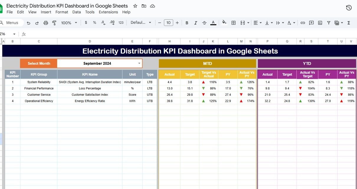
Managing electricity distribution requires accurate monitoring of supply quality, network efficiency, outages, energy losses, and operational performance. The Electricity Distribution KPI Dashboard in Google Sheets is a ready-to-use solution that helps utility companies track key metrics with automated charts, real-time comparisons, and detailed trend analysis.Electricity Distribution KPI Dashboard in Google Sheets
This dashboard includes Monthly (MTD), Year-to-Date (YTD), Target, and Previous Year comparisons, helping energy teams make quick, informed decisions.Electricity Distribution KPI Dashboard in Google Sheets
In this article, we will explain the full structure of the dashboard, the working of each sheet, and provide a complete KPI Definition Table for electricity distribution.Electricity Distribution KPI Dashboard in Google Sheets
What Is an Electricity Distribution KPI Dashboard in Google Sheets?
The Electricity Distribution KPI Dashboard is a Google Sheets–based reporting tool designed for power utilities, distribution companies, energy departments, and operations teams.
It helps monitor:
-
Power supply efficiency
-
Outage frequency and duration
-
Customer service performance
-
Energy loss percentage
-
Safety, reliability & operational KPIs
The dashboard updates automatically once data is entered, making performance monitoring fast, accurate, and easy.
Dashboard Structure
Click to Buy Electricity Distribution KPI Dashboard in Google Sheets
The file contains six interconnected worksheets:
Dashboard Sheet Tab
This is the main sheet that displays all KPIs for a selected month.
✔ Key Features:
-
Month selection (Dropdown on cell D3)
-
MTD Actual, MTD Target, MTD Previous Year
-
YTD Actual, YTD Target, YTD Previous Year
-
Conditional Formatting

Click to Buy Electricity Distribution KPI Dashboard in Google Sheets
KPI Trend Sheet Tab
A detailed view for individual KPI performance trends.
✔ Features:
-
Dropdown to select KPI (Cell C3)
Shows:
- KPI Group
- Unit
- KPI Type (UTB / LTB)
- KPI Formula
- KPI Definition
A trend chart based on MTD and YTD data
-
Helps visualize performance over time

Click to Buy Electricity Distribution KPI Dashboard in Google Sheets
Actual Number Sheet Tab
Enter monthly MTD and YTD actual values.
✔ How It Works:
-
Choose the year start month on cell E1
-
Enter actual values for both MTD and YTD
-
Dashboard updates instantly

Target Sheet Tab
Enter monthly MTD and YTD targets for every KPI.
This helps compare actual vs. target quickly on the dashboard.

Click to Buy Electricity Distribution KPI Dashboard in Google Sheets
Previous Year Number Sheet Tab
Enter previous year MTD and YTD values.
Used for YOY (Year-over-Year) comparison.

KPI Definition Sheet Tab
Contains complete information for every KPI:
-
KPI Name
-
KPI Group
-
Unit
-
Formula
-
Definition
-
Type (UTB or LTB)

Click to Buy Electricity Distribution KPI Dashboard in Google Sheets
Advantages of Electricity Distribution KPI Dashboard
-
Provides real-time monitoring of electricity distribution performance
-
Helps reduce outage duration and frequency
-
Improves billing & revenue collection efficiency
-
Tracks energy losses and identifies improvement areas
-
Supports regulatory compliance for utilities
-
Offers historical and monthly trend insights
-
Enhances customer satisfaction through quicker response
Opportunities for Improvement
You can enhance the dashboard further by adding:
-
Google Form integration for outage reporting
-
Predictive analytics for transformer failure
-
Department-wise dashboards
-
Region-wise performance mapping
-
Conditional formatting for overloading alerts
-
Automatic email alerts for KPI breaches
Best Practices
Click to Buy Electricity Distribution KPI Dashboard in Google Sheets
-
Maintain consistent KPI definitions
-
Update actual numbers monthly
-
Compare target vs actual regularly
-
Review YTD trends for long-term planning
-
Track outage KPIs weekly for better reliability
-
Use separate tabs for region-wise grouping
Conclusion
The Electricity Distribution KPI Dashboard in Google Sheets is a powerful tool for power utilities seeking efficient monitoring and performance management. With KPI trends, MTD/YTD comparison, and automated visuals, teams can make strategic decisions that improve reliability, reduce losses, and enhance customer satisfaction.
Visit our YouTube channel to learn step-by-step video tutorials
Youtube.com/@NeotechNavigators
Watch the step-by-step video Demo:
Click to Buy Electricity Distribution KPI Dashboard in Google Sheets