Energy and Utility Dashboard in HTML is a comprehensive, browser-based analytics solution built for energy companies, utility providers, facility managers, and sustainability professionals who need to track power output, emissions, operational efficiency, and facility downtime from a single interactive interface. This powerful HTML dashboard template transforms raw energy and utility data into meaningful visual insights that support faster, smarter decision-making across every level of your organization.
Whether you operate a single power generation facility or manage a distributed network of energy assets across multiple regions, this dashboard provides a premium, SaaS-quality analytics experience right in your browser. No software installation is needed — just open the HTML file, upload your Excel data, and start exploring performance metrics across five dedicated analysis pages instantly.
Key Features of the Energy and Utility Dashboard in HTML
This Energy and Utility Dashboard in HTML comes packed with features designed for real-world energy sector analytics. The dashboard offers multi-page interactive analytics with a modern sidebar navigation that lets you switch seamlessly between Overview, Production and Output Analysis, Downtime and Maintenance, Emissions and Environmental, and Data View pages.
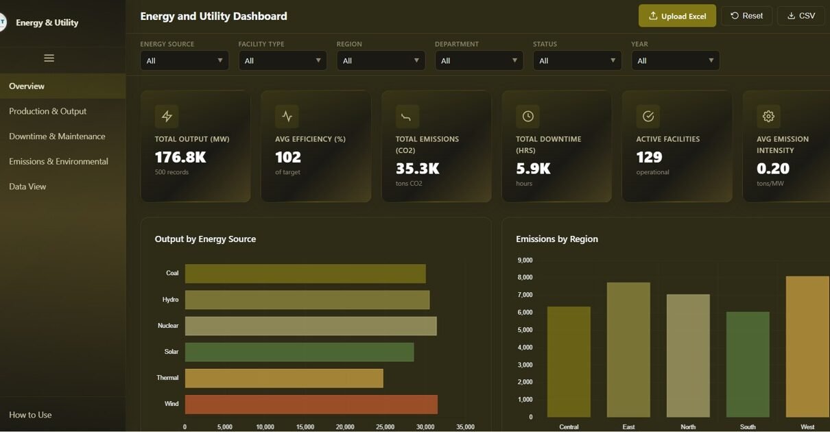
At the top of the Overview page, dynamic KPI cards display Total Output (MW), Avg Efficiency (%), Total Emissions (tons CO2), Total Downtime (hrs), Active Facilities, and Avg Emission Intensity — giving you an instant operational snapshot. The dashboard includes global filters and slicers that allow you to filter the entire dashboard by region, energy source, facility type, department, and other dimensions for focused analysis.
Interactive chart visualizations including bar charts, line trends, donut charts, and grouped comparisons update dynamically based on your filter selections. A built-in light and dark theme toggle ensures comfortable viewing in any environment. The Excel file upload feature lets you replace demo data with your own operational data instantly, while the CSV export function on the Data View page enables you to download filtered data for external reporting.
Dashboard Pages Explained
1. Overview Page
The Overview page serves as your command center for energy and utility operations. At the top, six high-level KPI cards display Total Output (MW), Avg Efficiency (%), Total Emissions (tons CO2), Total Downtime (hrs), Active Facilities, and Avg Emission Intensity. These cards provide an immediate snapshot of your entire energy portfolio’s health and performance status.
Below the KPI cards, you will find a rich collection of interactive charts. Output by Energy Source breaks down power generation across different fuel types and renewable sources. Emissions by Region highlights geographic differences in environmental impact. Facility Count by Status shows the operational readiness of your facility network. Output vs Target by Facility Type compares actual generation against planned targets. Efficiency by Department reveals which operational units are performing above or below expectations. Multiple slicers are available to apply filters and see the filtered dashboard quickly.
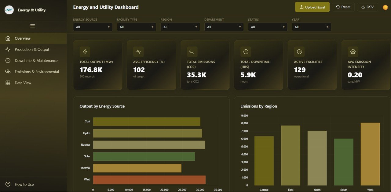
Energy and Utility Dashboard Overview
2. Production and Output Analysis
The Production and Output Analysis page dives deep into your energy generation performance. Monthly Output Trend by Year reveals seasonal patterns and year-over-year growth in power generation. Output by Region identifies geographic strengths and areas needing investment. Output by Facility Type compares generation across different plant categories such as thermal, solar, wind, and hydro.
Top 10 Facilities by Output highlights your best-performing generation assets, while Output Achievement by Energy Source measures how closely each fuel type meets its generation targets. Together, these analyses help operations teams optimize resource allocation and plan capacity expansions with data-driven confidence.
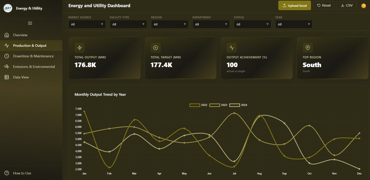
Production and Output Analysis
3. Downtime and Maintenance
The Downtime and Maintenance page helps you understand and minimize operational disruptions across your facility network. Downtime by Energy Source shows which generation types experience the most interruptions. Downtime by Region reveals geographic patterns in outage frequency. Monthly Downtime Trend tracks whether maintenance schedules are improving over time.
Status Distribution provides a clear picture of how many facilities are currently active, under maintenance, or offline. Downtime by Department identifies which operational teams are associated with the highest downtime incidents, enabling targeted improvements in maintenance planning and workforce allocation.
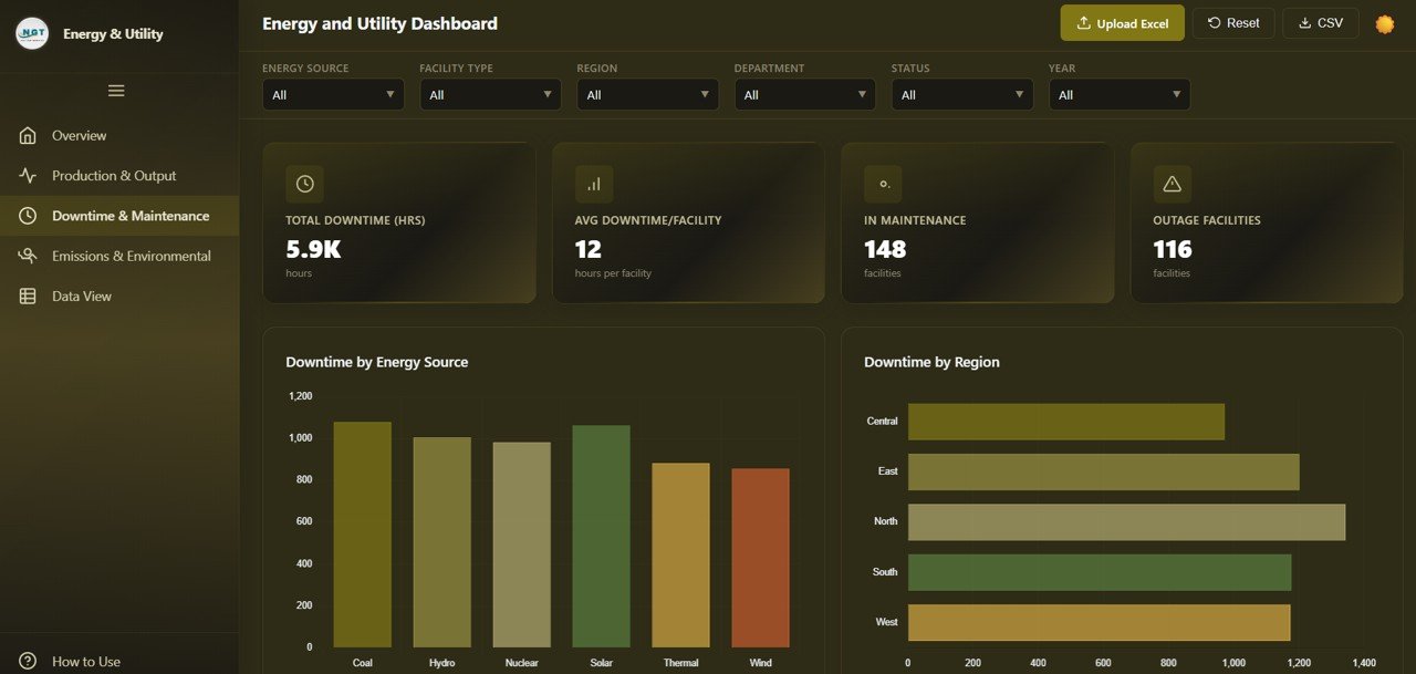
Downtime and Maintenance
4. Emissions and Environmental
The Emissions and Environmental page is essential for sustainability reporting and regulatory compliance. Emissions by Energy Source breaks down CO2 output by fuel type, helping you identify the biggest contributors to your carbon footprint. Emissions by Region shows geographic variation in environmental impact across your facility network.
Monthly Emissions Trend tracks your progress toward emission reduction goals over time. Emission Intensity by Facility Type compares the environmental efficiency of different generation methods. Emissions vs Output plots the relationship between energy production and carbon output, enabling you to identify facilities that generate more power with less environmental impact — a critical metric for data-driven sustainability strategies.
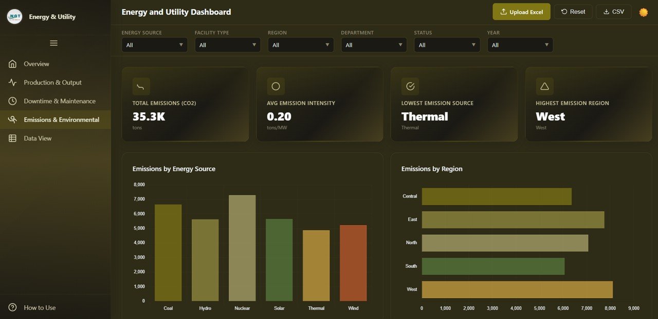
Emissions and Environmental
5. Data View
The Data View page is a detailed data table that displays all records from your energy and utility dataset. This page features search functionality to quickly find specific records, column sorting for organizing data by any field, and pagination for navigating through large datasets efficiently. You can also export the filtered data to CSV format for use in external reports, regulatory filings, or further analysis in other tools.
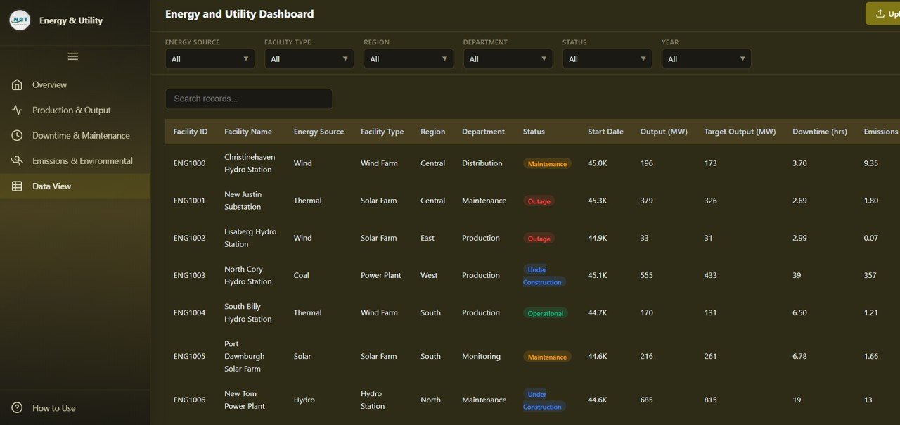
Data View
Advantages of the Energy and Utility Dashboard in HTML
This dashboard offers several significant advantages for energy and utility professionals. First, it requires zero software installation — simply open the HTML file in any modern browser and you are ready to analyze. This makes it ideal for teams that need quick access to analytics without IT overhead or licensing costs.
The multi-page structure with dedicated analysis pages for production, downtime, emissions, and raw data ensures that different stakeholders can find the insights most relevant to their role. The global filter system means that a single selection cascades across all charts and metrics, saving time and ensuring consistency in analysis.
The Excel upload feature makes this dashboard reusable — upload a new data file each month, quarter, or year and instantly see updated analytics without rebuilding anything. The light and dark theme toggle, CSV export, and responsive design add professional polish that makes this suitable for boardroom presentations and daily operational monitoring alike.
Opportunities for Improvement
While this dashboard provides excellent coverage of energy and utility analytics, there are areas where users might consider enhancements. Adding predictive analytics or forecasting models for output and emissions trends could help with long-term planning. Integration with real-time data feeds from SCADA or IoT systems would enable live monitoring rather than periodic data uploads.
A dedicated cost analysis page tracking fuel costs, maintenance expenditures, and revenue per megawatt would add a financial dimension to the operational data. Additionally, role-based access controls and scheduled report generation would benefit larger organizations with multiple stakeholder groups needing different views of the same data.
Best Practices for Using the Energy and Utility Dashboard
To get the most out of this Energy and Utility Dashboard in HTML, follow these recommended practices. Update your data regularly — monthly uploads ensure that your KPIs and trend analyses reflect current operational reality. Use the global filters strategically to isolate specific regions, energy sources, or facility types when investigating performance anomalies.
Start each analysis session on the Overview page to get a high-level pulse check, then drill into the specific analysis page that addresses your current question. Leverage the Emissions and Environmental page for quarterly sustainability reports and regulatory submissions. Use the Data View export feature to create backup datasets and feed data into complementary tools like Excel pivot tables or other analytics dashboards.
Share the dashboard file with team members via email or shared drives — since it is a standalone HTML file, anyone with a browser can open and explore the data independently. For additional guidance, check the official MDN Web Docs on HTML for customization tips.
Explore Relevant Templates
If you found this Energy and Utility Dashboard useful, you may also be interested in these related templates from our collection:
- E-commerce Dashboard in HTML — Track sales, revenue, customer satisfaction, and shipping performance with interactive analytics.
- Transportation and Logistics Dashboard in HTML — Monitor fleet operations, delivery performance, and logistics KPIs.
- Customer Satisfaction Dashboard in HTML — Analyze customer feedback, satisfaction scores, and service quality metrics.
- Inventory Management Dashboard in HTML — Track inventory levels, turnover rates, and stock movements across warehouses.
- Healthcare Analytics Dashboard in HTML — Visualize patient data, hospital performance, and clinical outcomes.
Frequently Asked Questions
What data format does the Energy and Utility Dashboard accept?
The dashboard accepts Excel (.xlsx) files. You can upload your own energy and utility data using the built-in file upload feature to replace the demo dataset instantly. The data structure should follow the same column format as the included sample file for best results.
Do I need any special software to use this HTML dashboard?
No special software or installation is required. Simply open the HTML file in any modern web browser such as Google Chrome, Microsoft Edge, Firefox, or Safari. The dashboard runs entirely in your browser using built-in JavaScript chart libraries.
Can I customize the charts and KPI cards in this dashboard?
Yes, since this is an HTML-based dashboard, anyone with basic knowledge of HTML, CSS, and JavaScript can customize the charts, colors, KPI metrics, and layout to match their specific organizational requirements and branding.
Is this dashboard suitable for tracking renewable energy sources?
Absolutely. The dashboard tracks output and emissions across all energy source types, including solar, wind, hydro, thermal, and biomass. The Output Achievement by Energy Source and Emissions by Energy Source charts are particularly useful for comparing renewable vs non-renewable generation performance.
Can I export data from the dashboard for use in other tools?
Yes, the Data View page includes a CSV export feature that lets you download the filtered dataset. You can then use this exported data in Excel, Power BI, Google Sheets, or any other analytics tool for further analysis or reporting.
How often should I update the data in this dashboard?
For operational monitoring, monthly data updates are recommended. For facilities with high-frequency reporting needs, weekly uploads can provide more granular trend insights. The upload process is quick — simply drag and drop your updated Excel file into the dashboard.
Conclusion
The Energy and Utility Dashboard in HTML is a powerful, ready-to-use analytics tool that brings clarity to complex energy operations. With five dedicated analysis pages covering production output, downtime tracking, emissions monitoring, and detailed data exploration, this dashboard equips energy professionals with the insights they need to optimize performance, reduce environmental impact, and make data-driven operational decisions.
Whether you are an energy company manager tracking facility output, a sustainability officer preparing emissions reports, or an operations analyst benchmarking performance against targets, this HTML dashboard delivers professional-grade analytics with zero installation and maximum flexibility.
Click here to Purchase the Energy and Utility Dashboard in HTML
Visit our YouTube channel for step-by-step video tutorials and dashboard walkthroughs:
Youtube.com/@NeoTechNavigators