Transportation operations teams need a fast way to understand shipments, delivery status, driver performance, fleet cost, route activity, and financial results. When this information sits only in raw rows, it becomes difficult to see which vehicles are driving revenue, which routes are creating delays, and where fuel or toll costs are affecting profit.Transportation Operations Dashboard in Google Sheets
The Transportation Operations Dashboard in Google Sheets is designed to turn shipment records into a clean reporting system. It includes dashboard pages for overview analysis, fleet analysis, route and delivery performance, financial tracking, shipment search, and structured data entry.
This template is especially useful for logistics Transportation Operations Dashboard in Google Sheets, transportation coordinators, dispatch teams, fleet operators, trucking businesses, and analysts who want a practical Google Sheets dashboard without building every chart and formula from scratch.
What This Transportation Operations Dashboard Helps You Track
- Total shipments, total revenue, total cost, and profit performance.
- On-time delivery rate, delayed shipments, and delivery status breakdown.
- Fleet performance by vehicle type, driver, fuel cost, and load.
- Route activity by origin city, destination city, distance, and delivery time.
- Monthly revenue, monthly cost, quarterly profit, and cost breakdowns.
- Individual shipment details through a built-in Shipment ID lookup page.
Dashboard Pages Included
Download the Transportation Operations Dashboard in Google Sheets from NextGenTemplates.
The workbook is organized into multiple pages so users can move from executive summary to detailed operational analysis quickly. Each page focuses on a different part of transportation reporting.
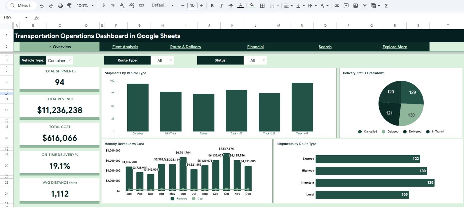
1. Overview Page
The Overview page gives a high-level snapshot of transportation performance. At the top, KPI cards show Total Shipments, Total Revenue, Total Cost, On-Time Delivery %, and Avg Distance (km), making it easy to understand the current state of operations in seconds.
The charts on this page include Shipments by Vehicle Type, Delivery Status Breakdown, Monthly Revenue vs Cost, and Shipments by Route Type. Together, these visuals show shipment mix, performance status, and the relationship between monthly revenue and operating cost.
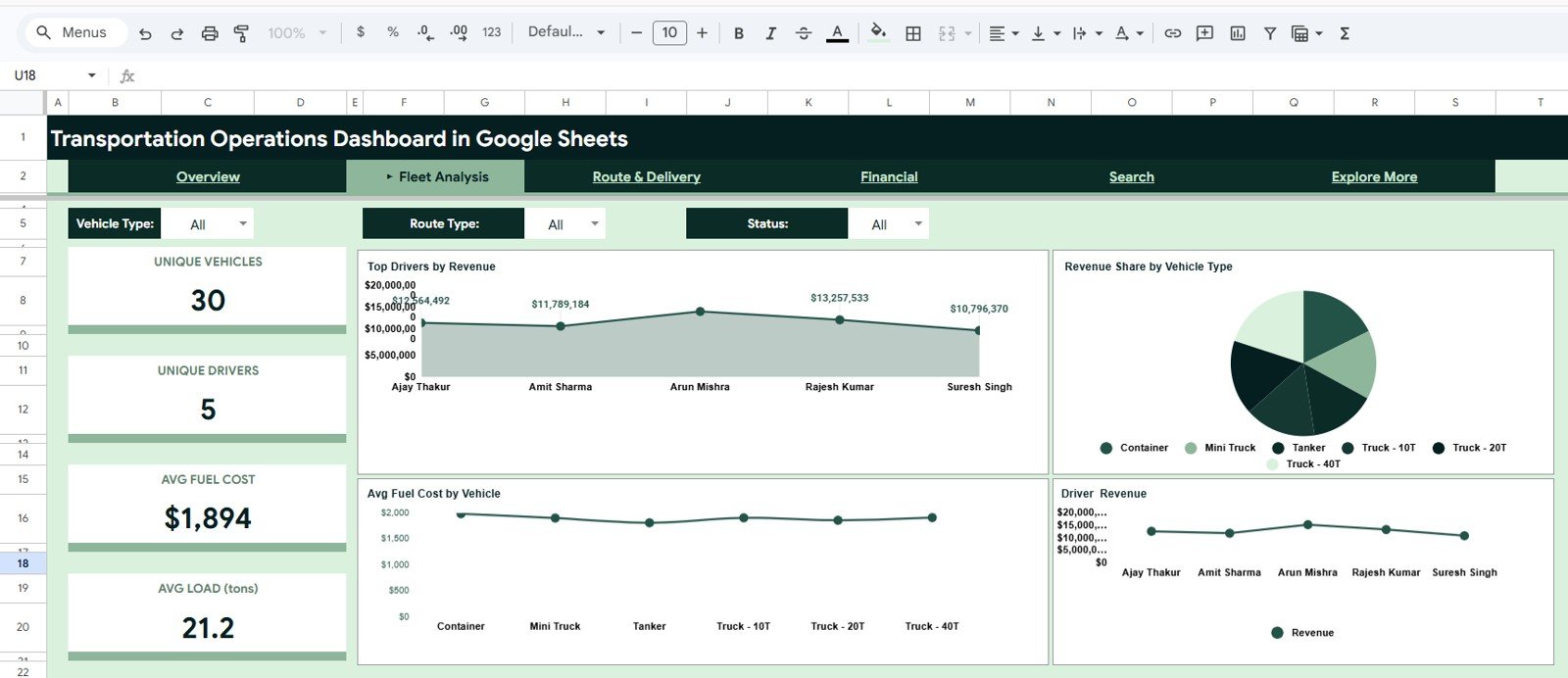
2. Fleet Analysis Page
The Fleet Analysis page helps users evaluate vehicles and drivers. KPI cards show Unique Vehicles, Unique Drivers, Avg Fuel Cost, and Avg Load (tons), which are useful for reviewing fleet utilization and operating patterns.
Charts such as Top Drivers by Revenue, Revenue Share by Vehicle Type, Avg Fuel Cost by Vehicle, and Driver Revenue help identify high-performing drivers, profitable vehicle categories, and cost-heavy vehicles that may need closer attention.
Download the Transportation Operations Dashboard in Google Sheets from NextGenTemplates.
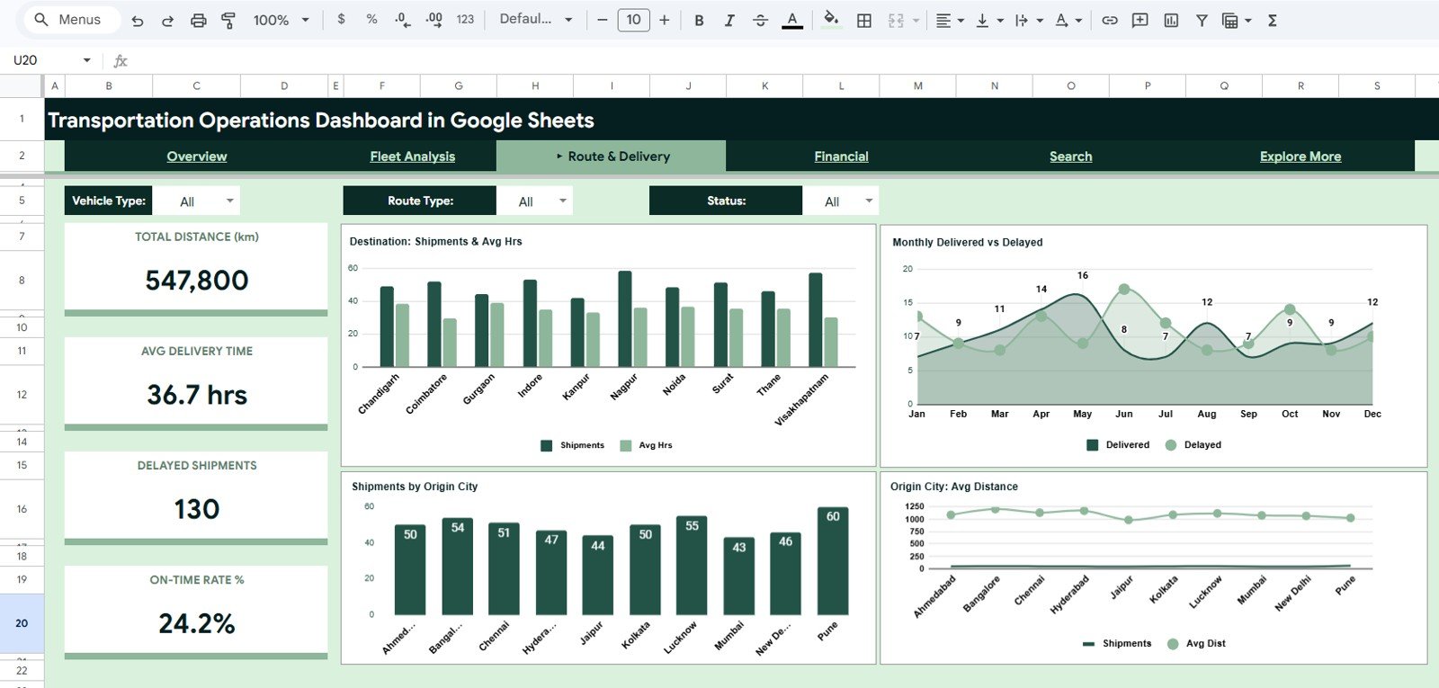
3. Route & Delivery Page
The Route & Delivery page focuses on delivery movement, distance, and delay trends. KPI cards include Total Distance (km), Avg Delivery Time, Delayed Shipments, and On-Time Rate %, giving managers a direct view of delivery reliability.
The charts compare destination shipment activity, monthly delivered versus delayed shipments, shipments by origin city, and average distance by origin city. This page is helpful when reviewing route bottlenecks, city-level shipment patterns, and delivery efficiency.
4. Financial Page
The Financial page converts transportation activity into financial insights. KPI cards show Total Revenue, Total Cost, Total Profit, Profit Margin %, and Avg Revenue per Trip.
Charts include Quarterly Revenue, Cost & Profit, Fuel & Toll Cost by Vehicle, Monthly Profit Trend, and Cost Breakdown by Vehicle Type. These views help transportation teams understand whether operational growth is translating into profitable performance.

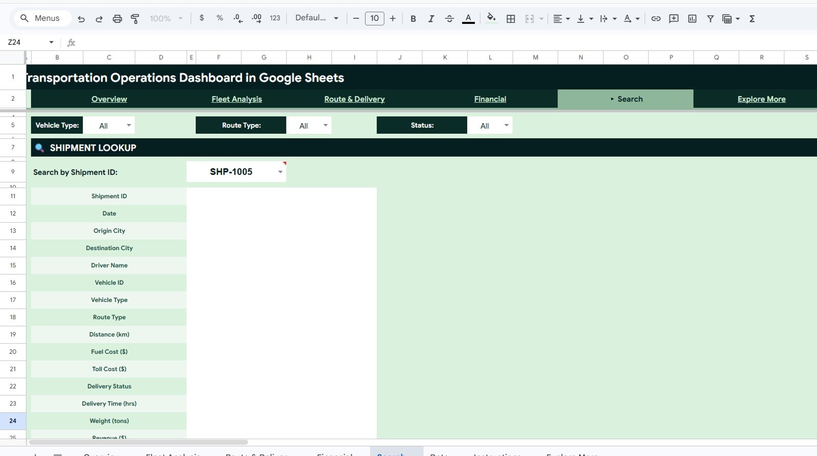
5. Search Sheet Tab
The Search sheet is built for quick shipment lookup. Users can enter a Shipment ID and instantly view the matching shipment details without manually filtering the full data table.
The lookup area displays fields such as Shipment ID, Date, Origin City, Destination City, Driver Name, Vehicle ID, Vehicle Type, Route Type, Distance (km), Fuel Cost, Toll Cost, Delivery Status, Delivery Time, Weight, Revenue, Cost, Month, Quarter, and Customer Type.
Download the Transportation Operations Dashboard in Google Sheets from NextGenTemplates.
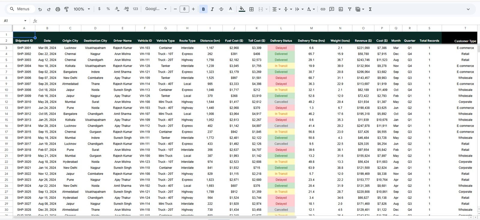
6. Data Sheet Tab
The Data sheet is the structured source table behind the dashboard. Users can replace the sample records with their own transportation data while keeping the same column format.
The data structure includes shipment, route, driver, vehicle, cost, revenue, delivery, and customer fields. Keeping this structure consistent helps the dashboard pages, charts, and lookup formulas continue working correctly.
Why This Dashboard Works Well for Transportation Reporting
A transportation dashboard should be easy to update, easy to filter, and clear enough for both operations and management teams. This template uses KPI cards, slicers, charts, and lookup fields to create a reporting flow that starts with summary performance and then moves into fleet, route, delivery, and financial details.
Because it is built in Google Sheets, the dashboard can be shared with team members, copied into your own Google Drive, and edited for your business process. Google also provides documentation for features such as slicers, which can filter charts and pivot-style reports in Sheets. You can learn more in the official Google help article on filtering charts and tables with slicers.
Manual Reporting vs Transportation Dashboard
Download the Transportation Operations Dashboard in Google Sheets from NextGenTemplates.
| Reporting Method | What Happens | Best For |
|---|---|---|
| Raw shipment spreadsheet | Users filter rows manually and calculate totals themselves. | Small datasets or one-time checks. |
| Static monthly report | Performance is summarized once, but drill-down is limited. | Basic management updates. |
| Google Sheets dashboard | KPIs, charts, slicers, and lookup areas update from structured data. | Recurring transportation operations analysis. |
Who Should Use This Template?
- Logistics managers who need shipment and delivery visibility.
- Fleet managers who want to compare vehicle and driver performance.
- Transportation business owners who need revenue, cost, and profit insights.
- Dispatch coordinators who need quick shipment status analysis.
- Operations analysts preparing recurring reports for leadership.
- Consultants building transportation reporting systems for clients.
Real-World Use Cases
- Review monthly shipment volume by vehicle type and route type.
- Track delayed shipments and on-time delivery percentage.
- Compare revenue contribution by driver or vehicle type.
- Identify origins and destinations with higher shipment concentration.
- Monitor fuel cost, toll cost, and total transportation cost.
- Look up a shipment quickly during customer or management discussions.
Advantages of Using This Google Sheets Dashboard
- No complex BI setup is required.
- The layout is familiar for users who already work in spreadsheets.
- Teams can update, share, and customize the workbook in Google Drive.
- Dashboard pages are separated by business question, making analysis easier.
- The search tab reduces time spent hunting for individual shipment records.
- The data tab gives users a clear format for adding new records.
Opportunities for Improvement
This template is a strong starting point for transportation operations reporting, but every business has its own process. You can improve it further by adding your own carrier names, branch locations, service levels, region fields, fuel efficiency metrics, cost-per-kilometer calculations, or customer-specific reporting views.
For more advanced workflows, teams can also connect Google Forms, CSV exports, Apps Script automation, or external systems to keep the data sheet updated more frequently.
Explore Related Templates
If you manage logistics, trucking, or transportation analytics, you may also find these templates useful:
- Trucking and Logistics Dashboard in Google Sheets
- Trucking and Logistics Dashboard in HTML
- Transportation and Logistics Dashboard in HTML
- Transportation Safety KPI Scorecard in Google Sheets
- Transportation KPI Scorecard in Google Sheets
Get the template: Download the Transportation Operations Dashboard in Google Sheets from NextGenTemplates.
Frequently Asked Questions
Is this dashboard made in Google Sheets?
Yes. The template is built for Google Sheets and can be copied into your own Google Drive for editing.
Can I replace the sample transportation data?
Yes. The Data sheet tab is designed so you can replace the sample shipment records with your own data using the same column structure.
Does the dashboard include delivery performance metrics?
Yes. It includes on-time delivery percentage, delayed shipment count, delivery status breakdown, average delivery time, and route-based delivery analysis.
Can I analyze fleet performance?
Yes. The Fleet Analysis page includes driver, vehicle, fuel cost, load, revenue share, and driver revenue views.
Is there a shipment lookup feature?
Yes. The Search sheet lets you enter a Shipment ID and view the full details of that shipment immediately.
About the Author
NeoTechNavigators publishes practical dashboard, automation, and business template tutorials for teams that want cleaner reporting systems without unnecessary complexity. Our goal is to help business users turn everyday spreadsheet data into useful operational insight.
Conclusion
Download the Transportation Operations Dashboard in Google Sheets from NextGenTemplates.
The Transportation Operations Dashboard in Google Sheets gives logistics and transportation teams a practical way to monitor shipments, fleet activity, delivery status, route performance, and financial results in one workbook. It is a strong fit for teams that want a reusable dashboard template with clear pages, slicers, charts, KPI cards, and a shipment lookup feature.
For more dashboard walkthroughs and spreadsheet automation tutorials, visit the NeoTechNavigators YouTube channel.