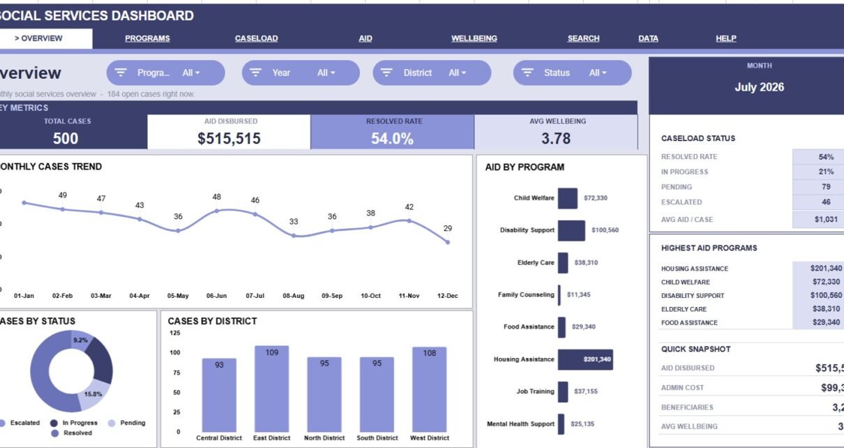
Social Services Dashboard in Google Sheets gives social service teams a structured way to track cases, aid disbursement, program performance, costs, workload, beneficiaries, and citizen wellbeing in one editable workbook. The reporting problem is real: the U.S. Administration for Children and Families Office of Community Services reported $8.64B appropriated and 36.7M individuals served across OCS programs in FY2023. When programs operate at that scale, even smaller local teams benefit from clean dashboards, consistent data entry, and quick filtering.
This article explains what is inside the dashboard, how each sheet tab works, and where the template fits compared with Microsoft Excel dashboards and paid case-management software. You can view the product here: Social Services Dashboard in Google Sheets.
Key Features of Social Services Dashboard in Google Sheets
- 7 worksheet tabs: Overview, Program Performance, Caseload Management, Aid & Costs, Citizen Wellbeing, Search Sheet, and Data Sheet.
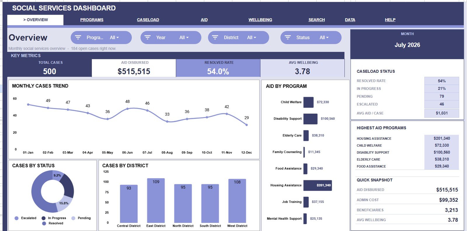
- 4 high-level cards: Total Cases, Aid Disbursed, Resolved Rate, and Avg Wellbeing.
- 20 analysis charts: Review monthly cases, district workload, program aid, team assignments, referral channels, cost movement, beneficiaries, and wellbeing trends.
- Multiple slicers: Apply filters quickly and review a focused dashboard without rebuilding formulas.
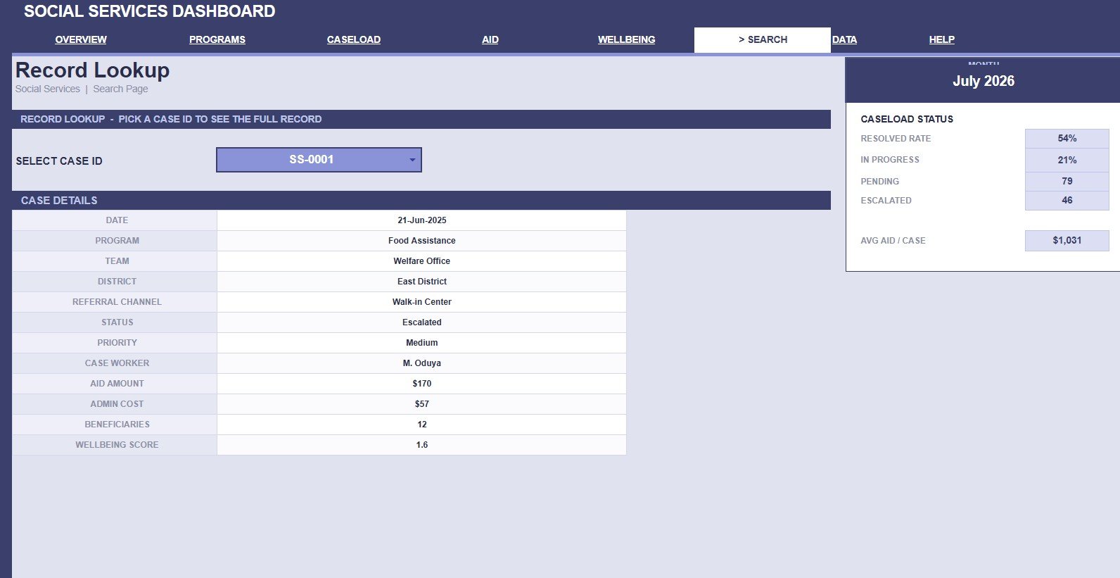
- Case ID lookup: Select one Case ID and display the complete case record on the Search Sheet.
- Editable Data Sheet: Replace the sample data with your own records while keeping the same structure.
- Google Sheets collaboration: Share the workbook with controlled permissions; Google’s official help explains how to manage spreadsheet sharing, links, comments, and collaborator access.
Dashboard Pages Explanation
1. Overview Page
The Overview page is the executive snapshot. At the top, the cards show Total Cases, Aid Disbursed, Resolved Rate, and Avg Wellbeing so managers can understand the service picture before opening detailed tabs.
Monthly Cases by Month: This chart shows case volume across the year. It helps teams spot demand peaks, seasonal changes, and months that may need staffing review.
Cases by Status: This chart breaks cases into status groups such as open, in progress, and resolved. It helps leaders see backlog pressure and whether the resolved share is improving.
Cases by District: This chart compares how many cases each district is carrying. It supports resource planning by showing which districts have the highest case demand.
Aid Disbursed by Program: This chart shows which programs receive the most aid funding. It helps finance and program teams review whether funding is aligned with service demand.
2. Program Performance
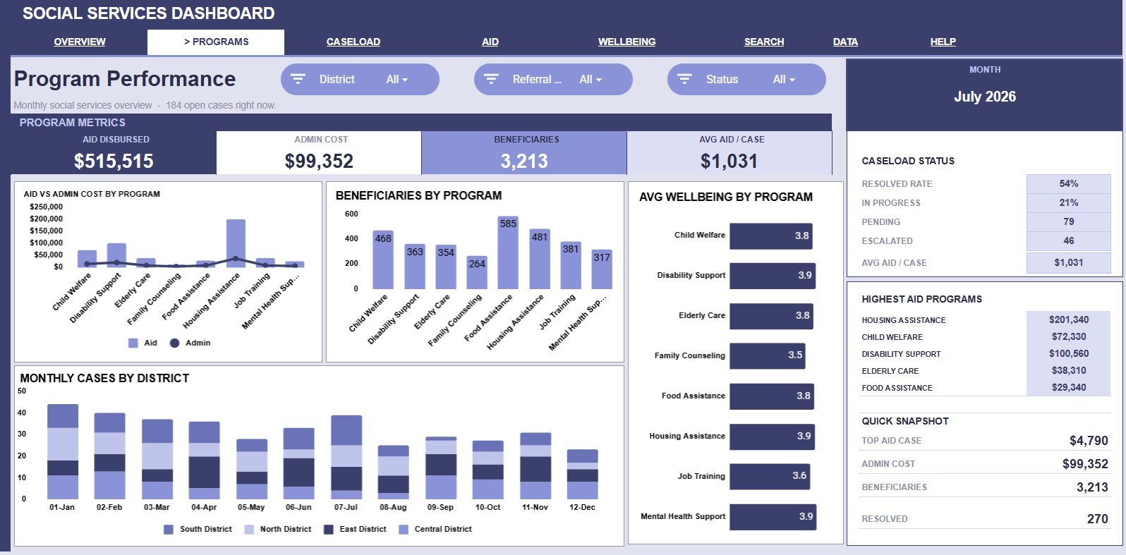
The Program Performance tab is designed for program managers and funding review meetings. It focuses on aid, administrative cost, beneficiaries, wellbeing, and district case trends.
Aid and Admin Cost by Program: This chart compares direct aid with administrative cost for each program. It helps users see which programs are support-heavy, cost-heavy, or balanced.
Beneficiaries by Program: This chart shows how many people are reached by each program. It helps leaders compare program reach against available funding and staffing.
Avg Wellbeing by Program: This chart compares wellbeing scores across programs. It helps identify where outcomes are stronger and where program design may need review.
Monthly Cases by District: This chart shows district case movement over time. It helps teams see whether demand is rising in one district while falling in another.
3. Caseload Management
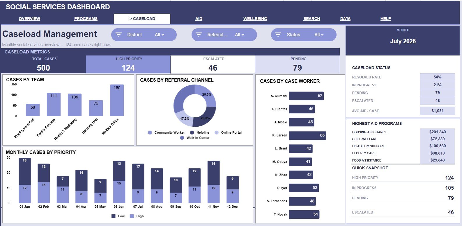
The Caseload Management tab helps supervisors understand how case work is distributed. It is useful for weekly check-ins, staffing reviews, referral source analysis, and workload balancing.
Cases by Team: This chart compares case volume by team. It helps supervisors see whether one team is carrying a heavier workload than others.
Cases by Referral Channel: This chart shows where cases are coming from, such as community referrals, online intake, partner agencies, or direct office contact. It helps leaders understand which entry channels drive the most work.
Cases by Case Worker: This chart compares case assignments by worker. It helps managers identify overload risk and support fair case distribution.
Monthly Cases by Priority: This chart shows how high, medium, and low priority cases change by month. It helps teams prepare for urgent-work spikes and escalation planning.
4. Aid & Costs
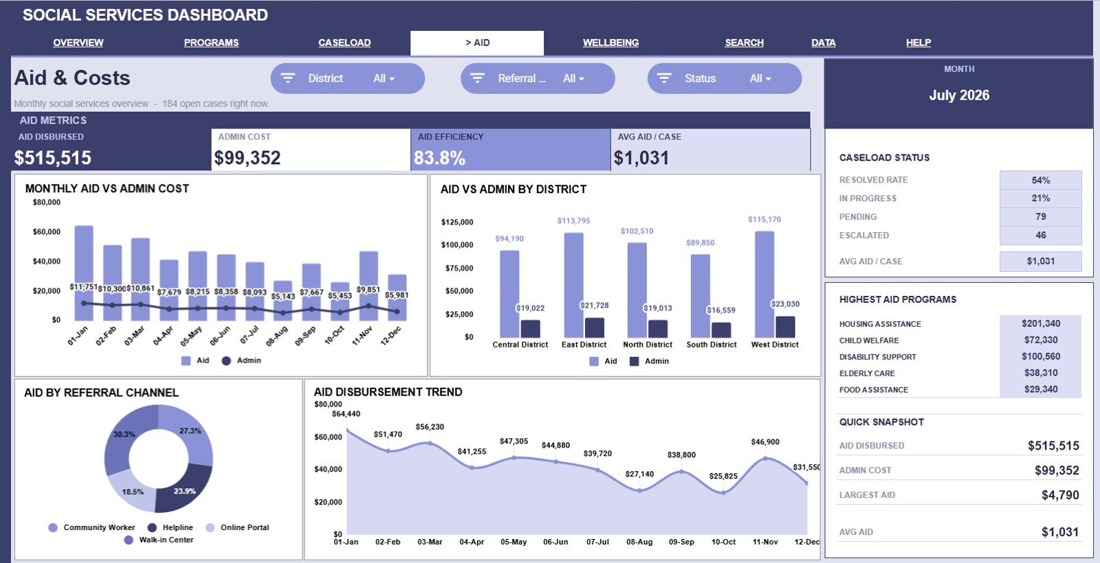
The Aid & Costs tab gives finance teams and program leads a view of direct aid and administrative cost. It helps connect funding activity with month, district, referral channel, and disbursement timing.
Aid and Admin Cost by Month: This chart tracks direct aid and administrative cost over time. It helps users see whether costs rise with aid or move independently.
Aid and Admin Cost by District: This chart compares cost and aid across districts. It helps reveal districts with higher support needs or higher administration patterns.
Aid Disbursed by Referral Channel: This chart shows how much aid is connected to each referral channel. It helps teams understand whether certain intake paths lead to larger disbursements.
Aid Disbursement by Month: This chart focuses on monthly aid movement. It helps finance teams prepare for seasonal funding needs and review monthly allocation patterns.
5. Citizen Wellbeing
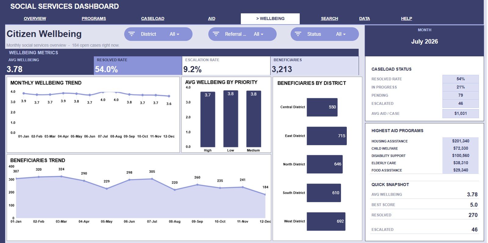
The Citizen Wellbeing tab helps teams connect activity to people served and outcome direction. It gives a wellbeing-centered view rather than only a workload or finance view.
Avg Wellbeing by Month: This chart tracks average wellbeing score over time. It helps leaders see whether outcomes are improving, declining, or staying flat.
Avg Wellbeing by Priority: This chart compares wellbeing scores across case priority levels. It helps teams review whether high-priority cases are associated with lower scores and need deeper intervention.
Beneficiaries by District: This chart shows how many beneficiaries are served in each district. It helps compare reach across locations and identify possible service gaps.
Beneficiaries by Month: This chart shows beneficiary counts over time. It helps teams plan outreach, staffing, and reporting around changes in monthly reach.
6. Search Sheet Tab
The Search Sheet is for individual record lookup. Users can select a Case ID and see date, program, team, district, referral channel, status, priority, case worker, aid amount, admin cost, beneficiaries, and wellbeing score.
This is helpful when a supervisor, analyst, or coordinator needs one full case row without filtering the entire Data Sheet. It also reduces the chance of missing a field during quick reviews.
7. Data Sheet Tab
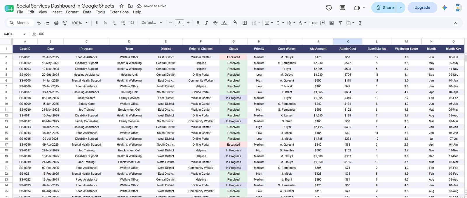
The Data Sheet is the source table. Users add records in the same format so the cards, charts, and slicers stay connected.
Consistent data entry is important. Program names, team names, districts, referral channels, statuses, priorities, case workers, aid amounts, admin costs, beneficiaries, and wellbeing scores should follow the same structure row by row.
Social Services Dashboard in Google Sheets vs. Microsoft Excel Dashboard vs. Paid CRM/SaaS – Feature Comparison
| Social Services Dashboard in Google Sheets | Microsoft Excel Dashboard | Paid CRM/SaaS Alternative |
|---|---|---|
| Cost: One-time template purchase. | Cost: Usually one-time file work, sometimes tied to Microsoft 365. | Cost: Monthly or annual subscription, often per user. |
| Setup time: Copy the sheet, replace sample data, and start reviewing charts. | Setup time: Quick for Excel users, but collaboration setup may take extra steps. | Setup time: Usually requires configuration, imports, roles, and onboarding. |
| Collaboration: Works well for teams already using Google Drive and shared files. | Collaboration: Strongest with Microsoft 365 and OneDrive/SharePoint. | Collaboration: Built in, but usually controlled by license seats. |
| Case lookup: Includes a dedicated Case ID Search Sheet. | Case lookup: Can be built with formulas or filters. | Case lookup: Usually included, but fields may be harder to customize. |
| Year-1 cost at 5 users: Template price plus your existing Google Workspace setup. | Year-1 cost at 5 users: Depends on Microsoft licensing and build effort. | Year-1 cost at 5 users: Can rise quickly with monthly per-seat pricing. |
| Best use case: Fast reporting for small agencies, NGOs, and program teams. | Best use case: Teams standardized on Excel files. | Best use case: Larger teams needing workflow automation and secure client record systems. |
Who Should Use This Template
This dashboard is useful for social service departments, NGOs, nonprofit program teams, public welfare coordinators, community outreach teams, case supervisors, finance analysts, and monitoring teams that already use spreadsheets. It works best when the team needs a practical reporting layer for cases, programs, districts, aid, costs, beneficiaries, and wellbeing.
It is not the right fit for teams that need a full client case-management database, regulated record storage, automated eligibility checks, document workflows, or system-level access controls. For sensitive production data, always follow your organization’s data privacy and security policies.
Real-World Use Cases
District services coordinator: A coordinator reviews Cases by District and Beneficiaries by District before monthly review meetings. When one location shows rising demand, the coordinator can prepare staffing and outreach questions.
Program finance analyst: An analyst uses Aid and Admin Cost by Program, Aid Disbursement by Month, and Aid and Admin Cost by District to prepare funding summaries. This makes budget discussions easier because program, district, and monthly views sit in one workbook.
Caseload supervisor: A supervisor checks Cases by Team and Cases by Case Worker every week. When one worker has too many open or high-priority cases, the supervisor can rebalance assignments before delays become larger.
Advantages of Social Services Dashboard in Google Sheets
Get the Social Services Dashboard in Google Sheets
The main advantage is speed. A team can start from a ready-made dashboard instead of designing charts, slicers, lookup formulas, and layouts from scratch.
The second advantage is transparency. Since it is a spreadsheet, users can inspect the source data, adjust formulas, and edit chart labels without waiting for a software vendor.
The third advantage is collaboration. Google’s official guide to sharing and collaborating on spreadsheets explains how users can share files, manage link access, comment, and work with collaborators.
Opportunities for Improvement
This dashboard is intentionally spreadsheet-based. It does not replace secure case-management systems, automated intake tools, eligibility workflows, or integrated payment systems.
The dashboard also depends on clean data entry. If teams change column names, use inconsistent district names, skip wellbeing scores, or mix formats in aid and admin cost fields, some charts may need adjustment.
A future version could add more automation, such as automated data validation, scheduled summaries, or PDF exports. Those features would depend on the organization’s preferred workflow and privacy rules.
Best Practices
- Keep the Data Sheet format stable: Add records in the same column order so formulas and charts continue to work.
- Standardize dropdown values: Use consistent names for programs, districts, teams, referral channels, statuses, priorities, and case workers.
- Review the Overview first: Start with cards and summary charts, then open detailed tabs for deeper questions.
- Use the Search Sheet for single records: Lookup by Case ID instead of scrolling through the raw table.
- Protect sensitive information: Avoid storing private client data unless your organization has approved the workbook setup, permissions, and retention process.
Explore Relevant Templates
For related public service and nonprofit reporting tools, explore the Google Sheets templates category and the Google Sheets dashboard category.
- Social Services Dashboard in Google Sheets
- Government Citizen Services Performance Dashboard in Google Sheets
- Nonprofit Organizations Dashboard in Google Sheets
- International Development Dashboard in Google Sheets
- Nonprofit Fundraising Dashboard in Google Sheets
- Social Services KPI Dashboard in Google Sheets
Frequently Asked Questions
Get the Social Services Dashboard in Google Sheets
What is the Social Services Dashboard in Google Sheets?
It is a ready-made Google Sheets dashboard for tracking social services cases, aid disbursement, administrative cost, program performance, caseload, beneficiaries, and citizen wellbeing.
How many sheets are included?
The workbook includes seven tabs: Overview, Program Performance, Caseload Management, Aid & Costs, Citizen Wellbeing, Search Sheet, and Data Sheet.
What KPI cards are shown on the Overview page?
The Overview page includes Total Cases, Aid Disbursed, Resolved Rate, and Avg Wellbeing.
Can I filter the dashboard?
Yes. The dashboard includes slicers so users can apply quick filters and review a focused view of the charts and cards.
What does the Search Sheet do?
The Search Sheet lets users select a Case ID and display full record details, including date, program, team, district, referral channel, status, priority, case worker, aid amount, admin cost, beneficiaries, and wellbeing score.
Can this dashboard replace case-management software?
No. It is a reporting dashboard, not a secure case-management platform. Organizations that need regulated client records, intake workflows, document storage, or permissions at scale should use approved systems.
Can I customize the workbook?
Yes. You can edit labels, formulas, charts, and sample data in Google Sheets. If you change the Data Sheet structure, you may need to update formulas and chart ranges.
About the Author
Built by PK – Microsoft Certified Professional with 15+ years of Excel, Google Sheets, and Power BI experience. Founder of NextGenTemplates, reaching 300K+ subscribers across YouTube channels. Every template is hand-built and tested before release.
Conclusion
The Social Services Dashboard in Google Sheets is a practical reporting template for teams that need visibility into cases, aid, costs, programs, districts, referrals, workload, beneficiaries, and citizen wellbeing. It gives managers a clean overview, focused analysis tabs, a Case ID search page, and a structured Data Sheet for ongoing updates.
Get the Social Services Dashboard in Google Sheets and start organizing your social services reporting in one shareable workbook. For more Google Sheets, dashboard, and automation tutorials, visit NeoTechNavigators on YouTube.
Last updated: July 21, 2026.