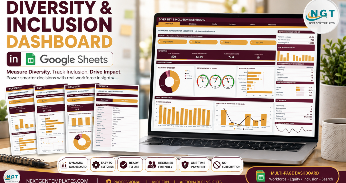
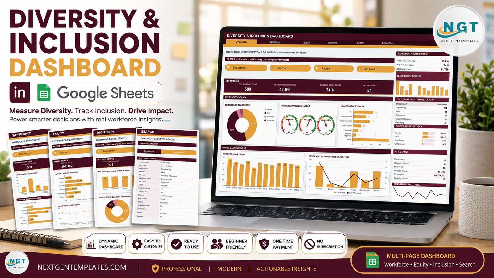
The Diversity & Inclusion Dashboard in Google Sheets is a six-tab reporting workbook that takes a flat employee list and charts representation, pay and inclusion-survey figures across the whole organisation. The sample file ships with 500 employee records covering 9 departments, 6 regions, 6 job levels and 5 age bands. Every chart on every page is fed by a native Google Sheets pivot table and filtered by a native slicer – 16 slicers in total, four per analysis page – so there are no add-ons to install and no helper formula columns hiding behind the visuals.Diversity & Inclusion Dashboard in Google Sheets
One thing to be clear about up front: this is a tracking and reporting tool. It draws charts from the data you put into it. It does not interpret your figures, score your organisation, or produce any statutory or regulatory return, and nothing in this article is HR or legal advice. What follows is a description of what the workbook contains and how it is built.Diversity & Inclusion Dashboard in Google Sheets
Get the Diversity & Inclusion Dashboard in Google Sheets
Key Features of the Diversity & Inclusion Dashboard in Google Sheets
- Six tabs – Overview, Workforce, Equity, Inclusion, Search and Instructions, connected by a navigation strip repeated at the top of every page.Diversity & Inclusion Dashboard in Google Sheets
- 16 native slicers, four on each of the four analysis pages, chosen to suit that page: Overview uses Department, Gender, Region and Job Level; Workforce swaps Gender for Age Group; Equity uses Gender, Ethnicity, Job Level and Department; Inclusion uses Department, Gender, Ethnicity and Status.
- 16 KPI cards, four per analysis page.Diversity & Inclusion Dashboard in Google Sheets
- 18 charts – donut charts, bar and column charts, a three-gauge cluster, a scatter plot, three combo charts and two trend lines.Diversity & Inclusion Dashboard in Google Sheets
- A sidebar panel set on each analysis page: a snapshot block, a 12-month hiring trend, a Top 5 ranking, a percentage-bar list and an At a Glance table.
- An employee lookup page that returns a single 16-field record by Employee ID.
- Pre-extended to 1,000 rows – pivots, slicers and formulas already cover row 1001, so pasted data is picked up without dragging anything down.Diversity & Inclusion Dashboard in Google Sheets
- A single-place theme change – the colour palette at the top of the bundled Apps Script controls the ink (#4A1526), accent (#E8A33D) and rose (#D9788F) shades used across all six tabs.
Dashboard Pages Explanation
1. Overview – workforce representation and belonging
The landing page reports company-wide figures. With the sample data loaded, the KPI strip reads Total Headcount 500, Women in Workforce 43.8%, Avg Inclusion Score 74.6 and Promotions 54. The Representation Mix band holds three charts: Headcount by Gender as a donut, a Representation vs Target gauge cluster covering Women %, Diverse % and Under 35 %, and Headcount by Ethnicity as a horizontal bar chart. Below that, the Hiring & Advancement band pairs a 12-Month Hiring Trend column chart with a Headcount vs Promotions by Job Level combo chart. The sidebar carries a Representation Snapshot, the hiring trend in miniature, Top 5 Departments by Headcount, a Gender Representation bar list, an At a Glance table reporting departments, regions covered, new hires, average salary, total payroll and disability disclosures, and a 12-month payroll trend line.Diversity & Inclusion Dashboard in Google Sheets
2. Workforce – composition by department, region and age
This page profiles the payroll. Its KPI cards are Total Headcount, Engineering Heads, Under 35 and Avg Training Hrs. The Department & Gender Profile band shows Headcount by Department and Headcount by Department & Gender, the second as a stacked column chart that splits every department by gender category. The Region & Age Profile band shows Headcount by Region and Workforce by Age Group. The sidebar adds a Workforce Snapshot with active employees, employees on leave and attrition rate, a Regional Share bar list, and an At a Glance table counting associates, specialists, managers, senior managers, directors and executives.Diversity & Inclusion Dashboard in Google Sheets
3. Equity – pay and progression across groups
Equity reports compensation and advancement. KPI cards read Average Salary, Median Salary, Women in Leadership and Total Promotions. The Pay Equity Analysis band holds Avg Salary by Job Level, Avg Salary by Gender and Avg Salary by Ethnicity. The Advancement & Sentiment band holds Salary vs Inclusion Score as a scatter plot, Promotions by Department as a bar chart, and Avg Salary vs Headcount by Age as a combo chart. The sidebar shows an Equity Snapshot with highest salary, lowest salary and promotion rate, Top 5 Departments by Payroll, and a Leadership Representation bar list covering female leaders, directors, executives and promoted employees.Diversity & Inclusion Dashboard in Google Sheets
4. Inclusion – belonging, training and retention
The Inclusion page reports survey scores and development activity. Its KPI cards are Avg Inclusion Score, Training Hours, Disability Disclosed and Scores Above 80. The Sentiment & Development band pairs Avg Inclusion Score by Department with Inclusion Score vs Training Hours. The Disclosure & Sentiment Trend band pairs Workforce by Disability Disclosure – a donut splitting No, Prefer Not to Say and Yes – with a Monthly Inclusion Sentiment line running across twelve months. The sidebar carries an Inclusion Snapshot with average training hours and the highest and lowest scores, Top 5 Departments by Training Hours, a Sentiment Band Mix that buckets the workforce into 85+, 75-84, 65-74 and below 65, and an At a Glance table with departmental averages, exited employees and new hires.Diversity & Inclusion Dashboard in Google Sheets
5. Search – one employee at a time
Pick an Employee ID and the page returns that person’s full record: hire date, department, gender, ethnicity, employee name, job level, salary, inclusion score, training hours, region, age group, status, disability status, promotions, month and quarter. It is the page you open when someone asks about a specific case rather than a trend.Diversity & Inclusion Dashboard in Google Sheets
6. Instructions – the ten-step user guide
The final tab documents the build: where the pivot tables sit (far to the right of each page, past a wide spacer column), how the slicers drive them, why the KPI cards and the At a Glance list use SUMIFS, COUNTIFS and AVERAGEIFS against the Data sheet and therefore stay unfiltered by design, how to replace the sample rows, how to raise DATA_ROWS past 1,000, and how to change the theme.Diversity & Inclusion Dashboard in Google Sheets
Google Sheets vs. Excel vs. Paid HR Analytics SaaS – Feature Comparison
| This template (Google Sheets) | Excel HR dashboard | Paid HR analytics SaaS | |
|---|---|---|---|
| Cost | $9.99 one time | One-time template cost | Recurring per-employee subscription |
| Platform | Google Sheets, browser only | Microsoft Excel desktop | Vendor-hosted web app |
| Setup time | Copy the sheet, paste your export | Download, open, paste | Implementation project |
| Real-time team collaboration | Yes, built in | Only via OneDrive co-authoring | Yes |
| Mobile access | Google Sheets app | Excel mobile app | Vendor app |
| Customisable fields | Every column and chart is editable | Yes | Limited to the vendor schema |
| Share with link | Yes | File send or cloud link | Seat-based access |
| Year-1 cost at 5 users | $9.99 total | Template plus a Microsoft 365 licence | Billed per employee, every year |
| Slicer-driven filtering | 16 native slicers | Slicers on Excel pivots | Built-in filters |
| Employee-level lookup | Dedicated Search tab | Depends on the template | Yes |
| Where your data lives | Your own Google Drive | Your own machine or drive | Vendor infrastructure |
Who Should Use This Template
The workbook suits an HR or people-operations team that already keeps headcount data in a spreadsheet and wants it charted without moving it into a third-party system. It fits comfortably at 50 to 1,000 employee records, and it works well for anyone who has to present figures live and wants to filter them in front of an audience rather than rebuild slides.
It is less suited to organisations that need a system of record with field-level permissions and audit trails, to headcounts in the tens of thousands, or to teams that want an automatic sync from an HRIS. It also will not tell you what your numbers mean – that judgement stays with you and your advisers.Diversity & Inclusion Dashboard in Google Sheets
Real-World Use Cases
A monthly leadership pack. An HR operations lead at a 400-person company exports headcount on the first Monday of each month, pastes it over the Data sheet, and screenshots the Overview page. The Top 5 Departments by Headcount panel and the 12-month hiring trend go straight into the deck.Diversity & Inclusion Dashboard in Google Sheets
A pay distribution summary. A people analytics contractor filters the Equity page by department, reads Avg Salary by Job Level and Avg Salary by Gender off the charts, and hands over the underlying pivot tables – parked to the right of the page – as the working behind the summary.
An annual survey debrief. An HR business partner loads engagement scores into the workbook and uses Avg Inclusion Score by Department together with the Sentiment Band Mix panel to give each site manager a department-level view of their own results.
Advantages of the Diversity & Inclusion Dashboard in Google Sheets
- Nothing to install. Pivot tables, slicers and charts are standard Google Sheets features, documented in Google’s own Sheets help centre. A free personal Google account is enough.
- The numbers are inspectable. Because every chart reads a visible pivot table rather than a hidden helper range, you can scroll right on any page and see exactly what a chart is plotting.Diversity & Inclusion Dashboard in Google Sheets
- It stays fast as data grows. No array of helper formulas sits behind the visuals, so adding rows does not slow the workbook down the way a formula-driven build would.
- Your data does not leave your Drive. The copy is created in your own account and nothing is transmitted onward.
- Rebranding is a one-place edit. Change three hex values at the top of the script and the whole workbook follows.
Opportunities for Improvement
A few honest limitations worth knowing before you buy:
- The KPI cards are not slicer-aware. This is a design decision documented on the Instructions tab – the cards use SUMIFS, COUNTIFS and AVERAGEIFS against the Data sheet so they always show unfiltered totals as a fixed reference. If you expect them to move with the slicers, they will not.
- 1,000 rows out of the box. Going further means opening the Apps Script file and raising DATA_ROWS, which is documented but is still a manual step.
- The gauge targets are sample values. The Representation vs Target gauges on the Overview page compare against targets set in the sample build; you will want to replace them with your own before showing the page to anyone.Diversity & Inclusion Dashboard in Google Sheets
- Slicers are per page. Filtering the Overview page does not carry through to Workforce, Equity or Inclusion. That keeps each page independent, but it means four selections if you want a consistent view.Diversity & Inclusion Dashboard in Google Sheets
- No data entry validation. The Data sheet is a plain table; if a category is misspelled it becomes its own slicer entry.Diversity & Inclusion Dashboard in Google Sheets
Best Practices
- Keep the column headers exactly as shipped. Pivots, slicers and every formula reference them by name. Rename a header and you will need to repoint the pivots.
- Paste values, not formatted cells. Use Paste special – values only when dropping in an export, so the workbook’s own formatting survives.
- Set the gauge targets before your first review. They are the only figures on the dashboard that are not derived from your data.
- Decide who can open the file. Employee-level records including salary and disability disclosure sit on the Data sheet. Share the copy with the smallest group that needs it, and consider whether identifying columns belong in the file at all.
- Take a copy before each monthly refresh so you keep a point-in-time version you can go back to.
- Clear a slicer with Select all rather than deleting it – a deleted slicer has to be rebuilt and re-linked to its pivot.
Explore Relevant Templates
- Diversity & Inclusion Dashboard in Google Sheets – the template described in this article.
- Employee Diversity Dashboard in Google Sheets – a lighter, single-page view of representation.
- Employee Experience and Insights Dashboard in Google Sheets – survey and engagement reporting.
- HR Employee Performance Analytics Dashboard in Google Sheets – performance and review tracking.
- Environmental, Social and Governance (ESG) Dashboard in Google Sheets – the wider ESG reporting picture.
- Investor Relations Dashboard in Google Sheets – for the reporting pack that goes outward.
- Employee Diversity Dashboard in Power BI – for teams already on Power BI Desktop.
Get the Diversity & Inclusion Dashboard in Google Sheets
Want to build people-analytics dashboards of your own? The Excel Pivot Tables & Dashboards course on NextGenTemplates Academy covers the pivots, slicers and layout behind builds like this, with practice files.
Frequently Asked Questions
Do I need an add-on or a paid Google Workspace plan?
No. Pivot tables, slicers, charts and the formulas used here all ship with Google Sheets. A free personal Google account is enough.
How many employee records can it handle?
Pivots, slicers and formulas are pre-extended to 1,000 rows. Beyond that, open the bundled Apps Script file, raise the DATA_ROWS constant and run main() again.
Why do the KPI cards ignore my slicer selection?
By design. The cards and the At a Glance list read the Data sheet directly through SUMIFS, COUNTIFS and AVERAGEIFS, so they always show unfiltered totals. The charts, pivot tables and Top 5 panels are the slicer-aware parts of each page.
Can I change the fields to match my own data?
Yes. Rename or add columns on the Data sheet, then update the pivot tables parked to the right of each page so they point at the new fields. The charts read from those pivots and will follow.
Does this template handle regulatory or statutory reporting?
No. It is a tracking and reporting workbook that charts the data you enter. It produces no statutory return and makes no claim about any reporting obligation. Check with your own advisers on what you are required to report and in what form.
Where is my employee data stored?
In your own Google Drive, under your own Google account. Nothing is sent to NextGenTemplates or any third party.
What do I actually download?
A PDF containing the Make a Copy link for the Google Sheet plus setup notes. Click the link and an editable copy is created in your Drive.
About the Author
Built by PK – Microsoft Certified Professional with 15+ years of Excel, Google Sheets, and Power BI experience. Founder of NextGenTemplates, reaching 300K+ subscribers across YouTube channels. Every template is hand-built and tested before release.
Conclusion
The Diversity & Inclusion Dashboard in Google Sheets is a straightforward piece of reporting machinery: six tabs, 16 slicers, 18 pivot-driven charts and an employee lookup, all built from features Google Sheets already gives you. It charts representation, pay and inclusion-survey figures from whatever data you paste in, and it stops there – the reading of those figures is yours to do.Diversity & Inclusion Dashboard in Google Sheets
If that is the job you need done, you can get the Diversity & Inclusion Dashboard in Google Sheets for $9.99 – normally $16.99, instant download, lifetime access and free updates.Diversity & Inclusion Dashboard in Google Sheets