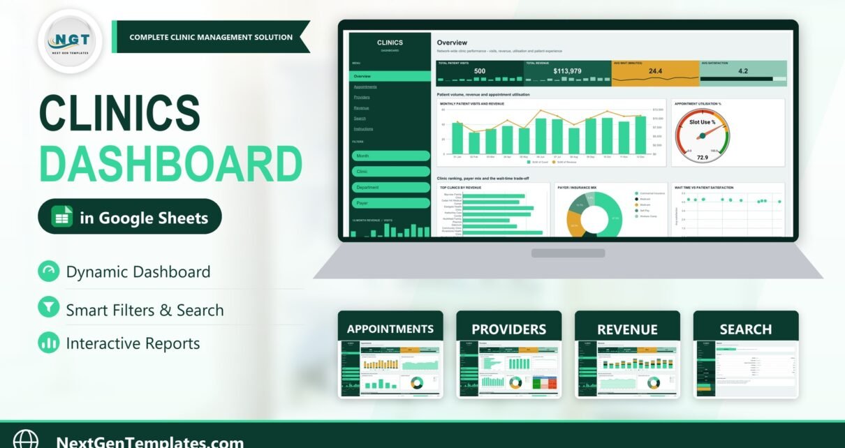
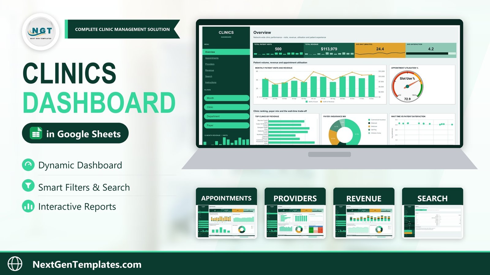
The Clinics Dashboard in Google Sheets is a seven-tab reporting workbook that turns a single visit log into four interactive report pages. It carries 18 linked charts, 15 slicers and 8 live metrics, and the sample file ships with 500 patient visits spread across 8 clinics, 6 departments and 12 named providers. The pivots are pre-sized to 1,000 visits, so most practices are reporting inside ten minutes of pasting an export.
Most small clinic groups already have the numbers. What they do not have is a place where no-show rate, slot utilisation, payer mix and provider workload sit on one screen without paying an analytics fee per provider per month. That is the gap the Clinics Dashboard in Google Sheets fills — and it fills it as a reporting layer, not as a system that touches patient records.
What the Clinics Dashboard in Google Sheets Actually Is (and Is Not)
This is a static reporting template. It has no live connection to an EMR, a booking platform or a billing system: you paste an export into the Data tab and the charts follow. It does not schedule appointments, send reminders or submit claims.
Its data model matters as much as its charts. The Data tab holds 16 columns — Visit ID, Date, Clinic, Department, Provider, Visit Type, Payer, Booking Channel, Status, Wait Minutes, Visit Minutes, Slot Utilisation, Revenue, Satisfaction, Month and Count. There is no patient name, date of birth, contact detail, diagnosis or clinical note anywhere in it. Every row is an anonymous Visit ID with operational fields attached.
That is a deliberate design point rather than an omission. A file that carries no identifiers is a file a practice manager can duplicate for a partner, email to a bookkeeper or drop into a board pack without a data-sharing conversation. What you choose to type into your own copy is your responsibility — but the template never asks you for an identifier, and nothing in it needs one.
Key Features of the Clinics Dashboard in Google Sheets
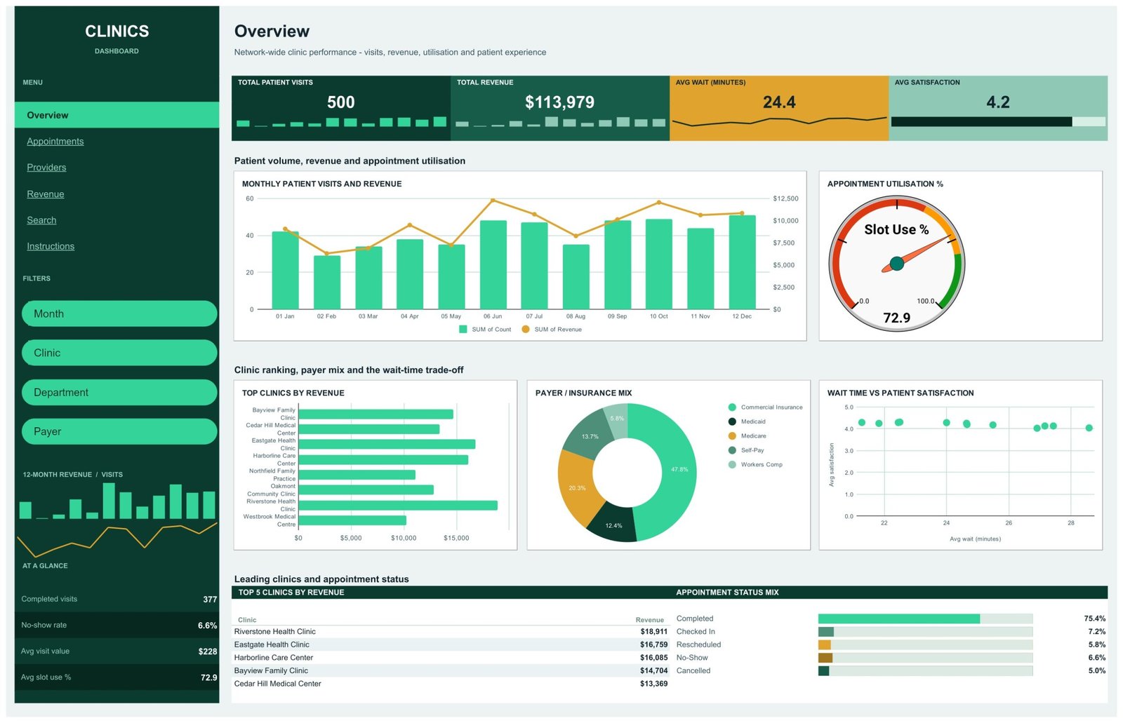
- Four KPI tiles on every report page. Total Patient Visits, Total Revenue, Avg Wait (Minutes) and Avg Satisfaction sit in a fixed band with inline sparklines. In the sample data they read 500, $113,979, 24.4 and 4.2.
- A second metrics block in the navigation rail. Completed visits (377), No-show rate (6.6%), Avg visit value ($228) and Avg slot use % (72.9), under a 12-month revenue-and-visits micro chart.
- Fifteen slicers scoped per page, so one page can sit on a single clinic while another shows the whole network.
- A Visit ID lookup built on INDEX / MATCH wrapped in IFERROR, which returns “Not found” rather than #N/A for an ID that does not exist.
- One flat data table. No helper sheets, no named-range maintenance — every chart, pivot and slicer reads the same 16-column range.
- Browser only. A free Google account, no add-ons, no Apps Script and no macros. It works on the Google Sheets mobile app as well.
Dashboard Pages Explanation
Page 1: Overview
Network-wide clinic performance: visits, revenue, utilisation and patient experience. Five charts sit under the KPI band — Monthly Patient Visits and Revenue, Appointment Utilisation % on a gauge reading 72.9, Top Clinics by Revenue, Payer / Insurance Mix and Wait Time vs Patient Satisfaction as a scatter. Underneath, a Top 5 Clinics by Revenue table (Riverstone Health Clinic leads on $18,911) sits beside an Appointment Status Mix panel where Completed holds 75.4%.
Page 2: Appointments
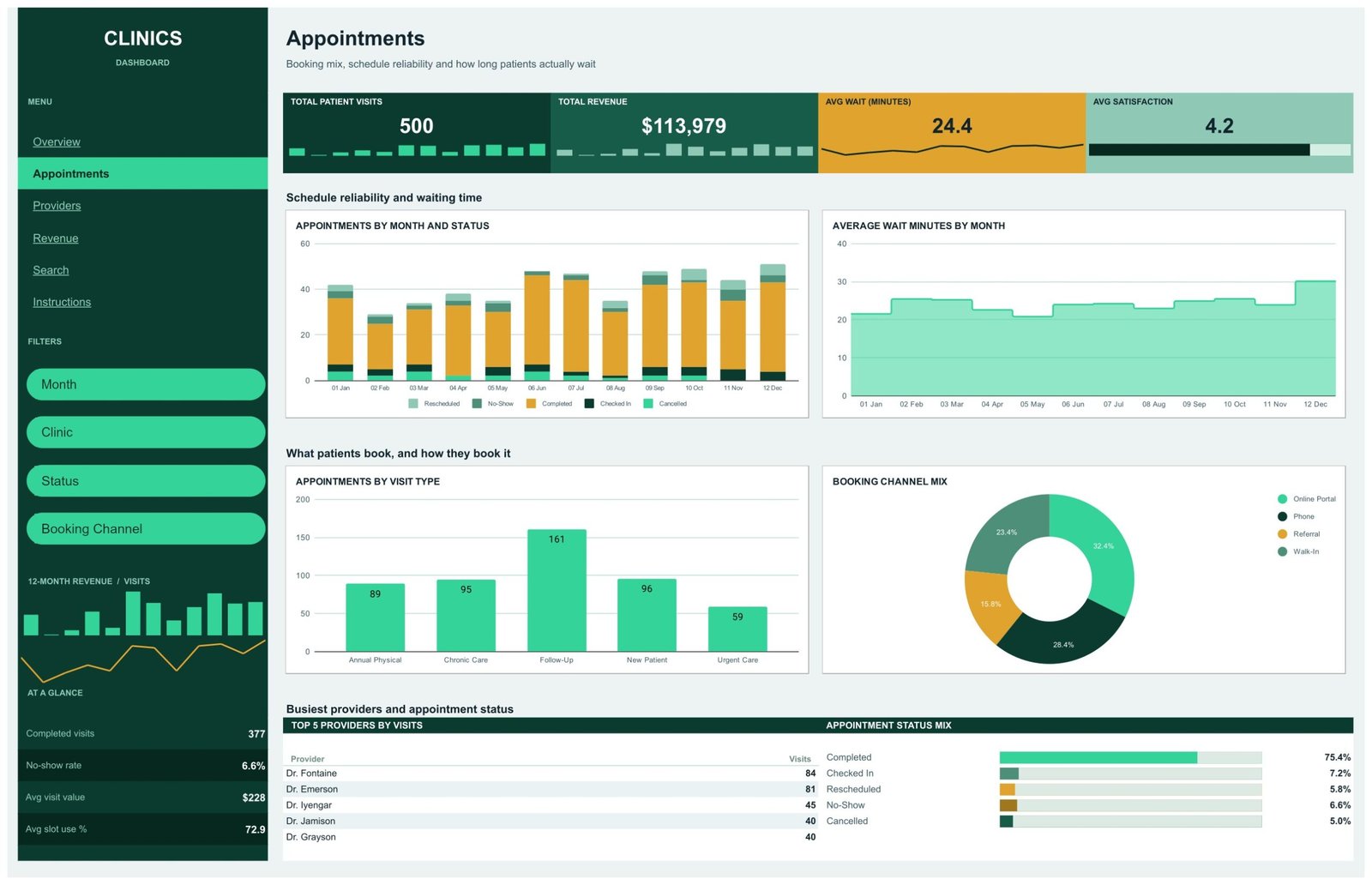
Booking mix, schedule reliability and how long patients actually wait. Appointments by Month and Status stacks the five statuses month by month; Average Wait Minutes by Month tracks the trend; Appointments by Visit Type ranks Follow-Up (161), New Patient (96), Chronic Care (95), Annual Physical (89) and Urgent Care (59); and Booking Channel Mix splits Online Portal 32.4%, Phone 28.4%, Walk-In 23.4% and Referral 15.8%. A Top 5 Providers by Visits table closes the page.
Page 3: Providers
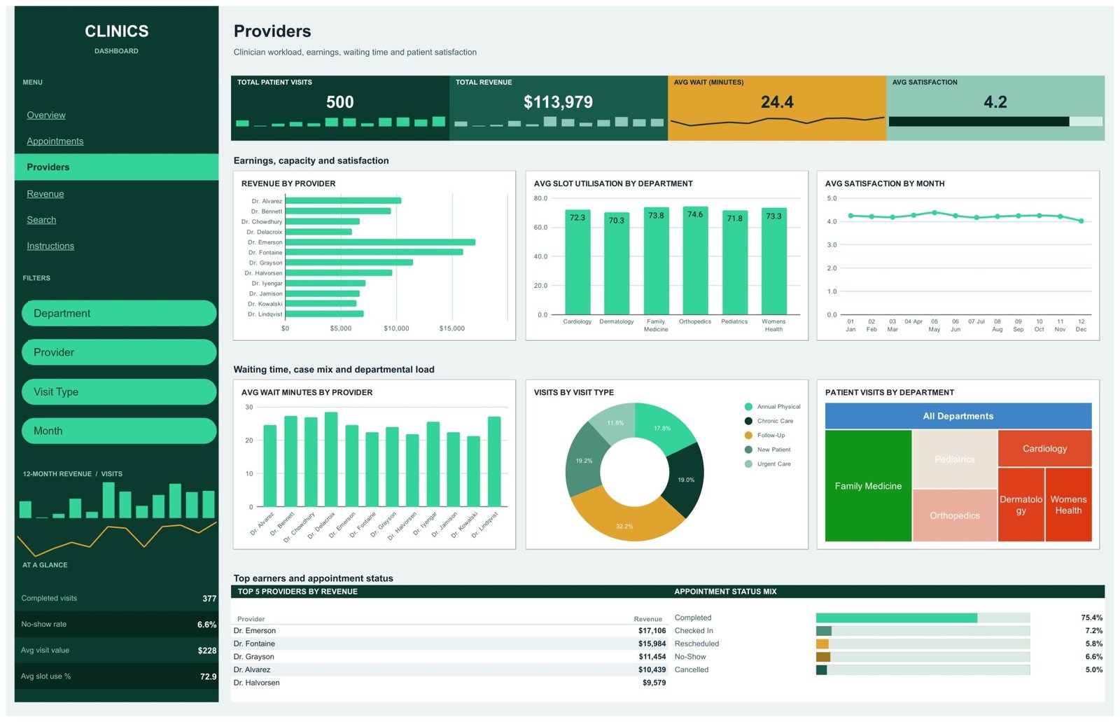
Clinician workload, earnings, waiting time and satisfaction across all 12 providers. Six charts: Revenue by Provider, Avg Slot Utilisation by Department, Avg Satisfaction by Month, Avg Wait Minutes by Provider, Visits by Visit Type and Patient Visits by Department drawn as a treemap. Dr. Emerson tops the Top 5 Providers by Revenue table at $17,106, and Orthopedics runs the hottest slot utilisation at 74.6.
Page 4: Revenue
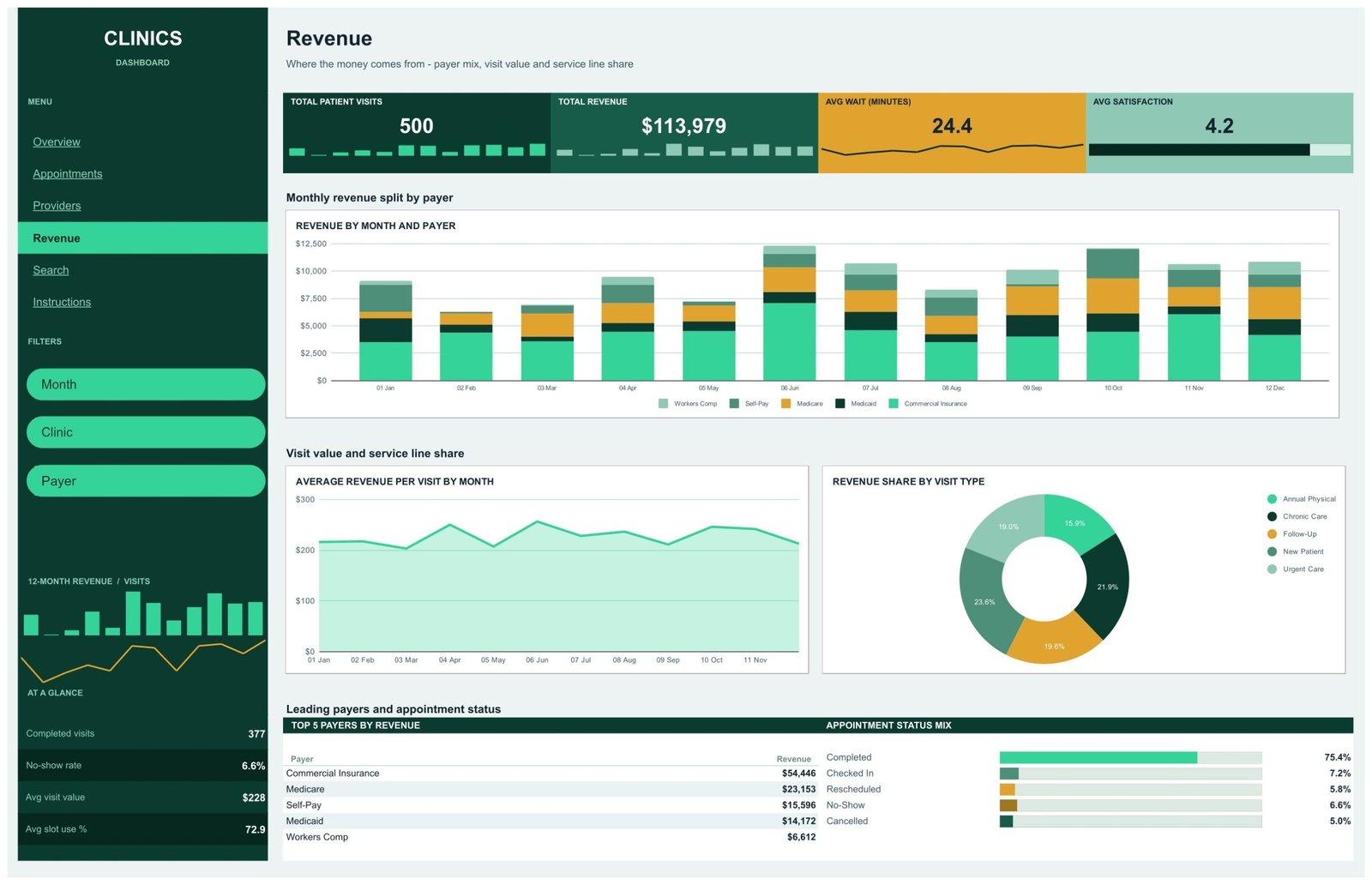
Where the money comes from. Revenue by Month and Payer stacks all five payer types; Average Revenue per Visit by Month tracks visit value against a $228 average; Revenue Share by Visit Type splits the service lines. The Top 5 Payers by Revenue table reads Commercial Insurance $54,446, Medicare $23,153, Self-Pay $15,596, Medicaid $14,172 and Workers Comp $6,612.
Page 5: Search
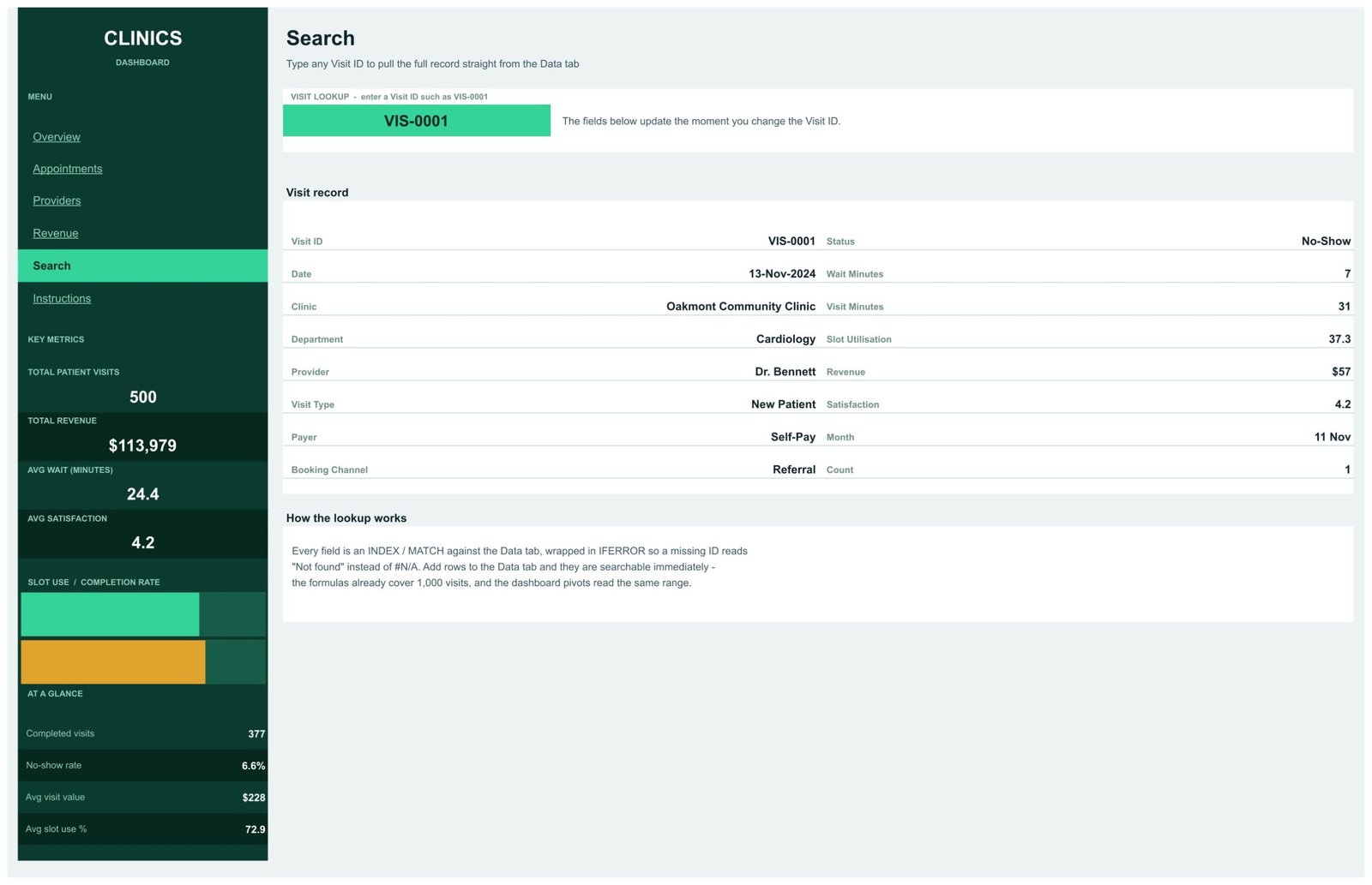
Type a Visit ID such as VIS-0001 and the full record appears — clinic, department, provider, visit type, payer, booking channel, status, wait minutes, visit minutes, slot utilisation, revenue and satisfaction — while the key metrics rail stays in view. Add rows to the Data tab and they are searchable immediately.
Page 6: Instructions
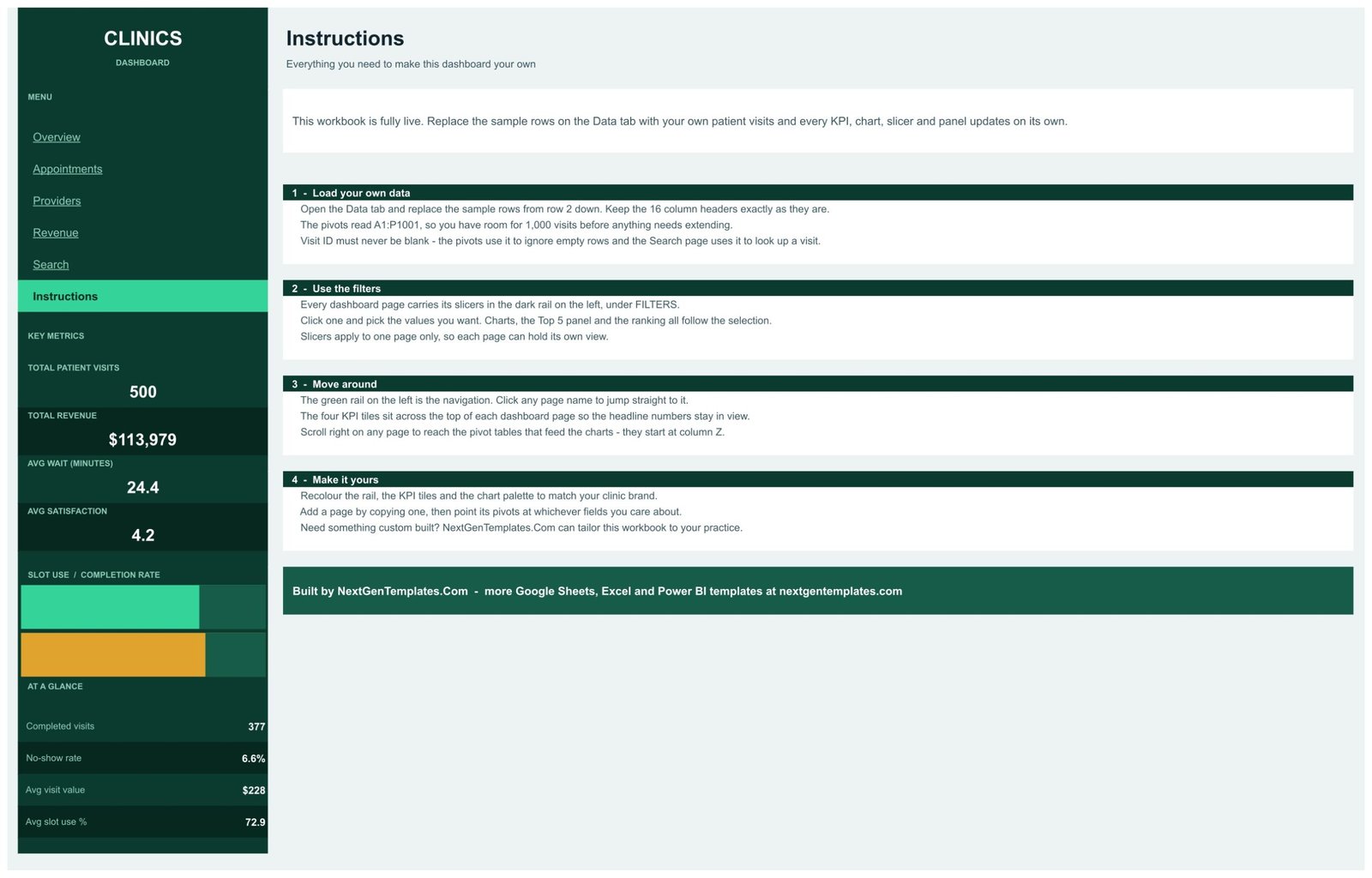
Four numbered sections: loading your own data, using the per-page slicers, moving around the workbook, and recolouring the rail, KPI tiles and chart palette to match your practice brand.
Data tab
The 16-column visit log everything reads. Replace the 500 sample rows from row 2 down, keep the headers exactly as they are, and never leave a Visit ID blank — the pivots use it to ignore empty rows and the Search page uses it to find a visit. If you are new to pivot tables in Sheets, Google’s own pivot table guide covers extending a source range.
Clinics Dashboard in Google Sheets vs. a Microsoft Excel Dashboard vs. Athenahealth / Kareo — Feature Comparison
| Feature | Clinics Dashboard in Google Sheets | Microsoft Excel Dashboard | Athenahealth / Kareo analytics |
|---|---|---|---|
| Cost | $9.99 one-time ✅ | $18-30 one-time | $140-700 / provider / month |
| Platform | Google Sheets, browser only ✅ | Desktop Excel licence | Vendor cloud platform |
| Setup time | Under 10 minutes ✅ | 15-20 minutes | Weeks of onboarding |
| Real-time team collaboration | Native Sheets sharing ✅ | Only via OneDrive co-authoring | Yes |
| Mobile access | Google Sheets app ✅ | Limited | Yes |
| Customisable charts and fields | Every chart, pivot and colour ✅ | Yes | Fixed vendor reports |
| Share with a link | Yes, view or edit ✅ | File attachment | Seat required |
| Stores patient identifiers | No — visit-level fields only ✅ | No | Yes, it is the record system |
| Year-1 cost at 5 users | $9.99 ✅ | $18-30 | $8,400-42,000 |
For a practice that wants clinic, provider and payer reporting without paying per provider per month for an analytics module, the Clinics Dashboard in Google Sheets sits in the sweet spot.
Who Should Use This Template
Perfect for:
- Practice managers running 1-10 outpatient clinics who can export a visit list from their booking system
- Clinic owners who want no-show rate, slot utilisation and payer mix reviewed monthly rather than annually
- Group practice partners comparing provider workload, earnings and patient satisfaction side by side
- Healthcare consultants and bookkeepers producing a monthly report pack for a client practice
Not a fit if:
- You need a live EMR or practice-management system — this reads a pasted export and connects to nothing
- You want clinical or diagnostic reporting; there is no clinical field in the data model and none should be added
- You need an audited, access-controlled store for identifiable patient data
- You expect automated reminders, e-prescribing or claim submission
Real-World Use Cases
Maria manages three suburban family practices. Every Monday she pastes the week’s visit export into the Data tab and reads no-show rate and slot utilisation straight off the rail. When no-shows crept past 6%, the Appointments page showed the problem sat in phone bookings rather than the online portal — a fixable, specific finding rather than a vague worry.
Dr. Osei runs a six-provider group practice. He puts the Providers page on screen at the quarterly partners’ meeting. Revenue by Provider next to Avg Wait Minutes by Provider settled a long-running argument about workload, and Avg Slot Utilisation by Department made the case for a second Orthopedics list.
Priya is a healthcare bookkeeper with nine clinic clients. She keeps one copy per client and emails the Revenue page as a monthly PDF. The payer mix chart is the one her clients always ask about, and because the workbook holds no patient identifiers, sending it is a two-minute job rather than a compliance question.
Advantages of the Clinics Dashboard in Google Sheets
The cost case is blunt: a one-time $9.99 against an analytics module billed per provider per month. For a five-provider practice that is the difference between one payment and roughly $8,400 a year at the low end of vendor pricing.
The time case is quieter but bigger. Because all four report pages read one flat table, there is no monthly rebuild — you replace rows and the 18 charts, 15 slicers, four Top 5 tables and eight metrics all follow. A monthly reporting pack that used to take an afternoon of copy-paste becomes a five-minute job.
And because it is Google Sheets, the file is shareable by link, works on a phone, and can be duplicated per clinic or per client without buying another seat.
Opportunities for Improvement
Honesty helps more than hype here. Three real limits:
- It is not connected. Data arrives by paste. If you want a nightly refresh you would need to add your own import step — the template does not provide one.
- The pivots cover 1,000 visits out of the box. A busy multi-site group will pass that quickly, and each pivot’s source range has to be extended once by hand before it keeps up.
- Slicers are per page, not global. That is useful when you want different views side by side, but it does mean setting the month filter four times if you want the whole workbook on one period.
Best Practices
- Keep the 16 headers exactly as shipped — renaming a column silently breaks the pivots that feed the charts.
- Give every row a Visit ID. Blank IDs are ignored by the pivots and are invisible to the Search page.
- Keep identifiers out of it. If your export includes patient names, delete that column before pasting; nothing in the dashboard needs it.
- Duplicate the file per clinic if you want permanently separate views, rather than fighting the slicers.
- Recolour once, at the start, using the Instructions page — the rail, KPI tiles and chart palette are all editable.
Explore Relevant Templates
Buy the template here: Clinics Dashboard in Google Sheets.
Also available as: Clinics Dashboard in Excel for practices that report from the desktop.
Related templates worth pairing with it: the Doctor Appointments & Medical History Tracker in Google Sheets for individual follow-up logging, the Nurse Duty Roster Calendar in Google Sheets for staffing the slots this dashboard measures, the Patient Follow-Up Visit Calendar in Google Sheets, and the Medical Expense & Claims Tracker in Google Sheets on the billing side. We have also covered the Medical Appointment Calendar in Google Sheets and the Doctor Appointments & Medical History Tracker in earlier posts.
Frequently Asked Questions
What KPIs does the Clinics Dashboard in Google Sheets track?
The Clinics Dashboard in Google Sheets tracks 8 metrics: Total Patient Visits, Total Revenue, Avg Wait Minutes and Avg Satisfaction as headline tiles, plus Completed visits, No-show rate, Avg visit value and Avg slot use % in the navigation rail. All eight recalculate when you replace the sample data.
Does this dashboard hold patient records?
No. The Clinics Dashboard in Google Sheets uses 16 operational columns keyed by an anonymous Visit ID — no names, dates of birth, contact details or clinical notes. It is a reporting template with no live connection to any clinical system, and it is designed so identifiers are never needed.
How long does setup take?
Under 10 minutes. Copy the file from the link in the download PDF, paste your visit export over the 500 sample rows on the Data tab keeping the 16 headers, and every chart, slicer and KPI across the four report pages updates. The pivots already cover 1,000 visits.
How does this compare to Athenahealth or Kareo?
Those are full practice-management platforms billed per provider per month, and they hold your records. The Clinics Dashboard in Google Sheets is a $9.99 one-time reporting layer you point at an export from whatever system you already run — much cheaper and fully editable, but with no booking, billing or EMR functionality.
Can I use it for more than one clinic?
Yes. The sample data in the Clinics Dashboard in Google Sheets covers 8 clinics, and the Clinic slicer appears on the Overview, Appointments and Revenue pages, so a multi-site group can compare sites or isolate one. Top Clinics by Revenue ranks them directly.
Do I need Excel or any add-on?
No. The Clinics Dashboard in Google Sheets runs entirely in a browser on a free Google account, with no add-ons, no Apps Script and no macros. An Excel version of the same topic is available separately if you prefer a desktop file.
About the Author
Built by PK — Microsoft Certified Professional with 15+ years of Excel, Google Sheets, and Power BI experience. Founder of NextGenTemplates, reaching 300K+ subscribers across YouTube channels. Every template is hand-built and tested before release.
Conclusion
If you run one clinic or ten, the reporting problem is rarely a shortage of data — it is that nobody has time to assemble it. The Clinics Dashboard in Google Sheets does the assembly once and keeps doing it: paste the visit log, and 18 charts, 15 slicers, four ranking tables and eight metrics update across four pages. It stays honest about what it is — a reporting template with no live connection and no patient identifiers — which is exactly what makes it easy to share.
👉 Click here to Purchase the Clinics Dashboard in Google Sheets
Instant download · One-time payment · No subscription
🎥 More Google Sheets walkthroughs: Youtube.com/@NeoTechNavigators
Last updated: September 2026