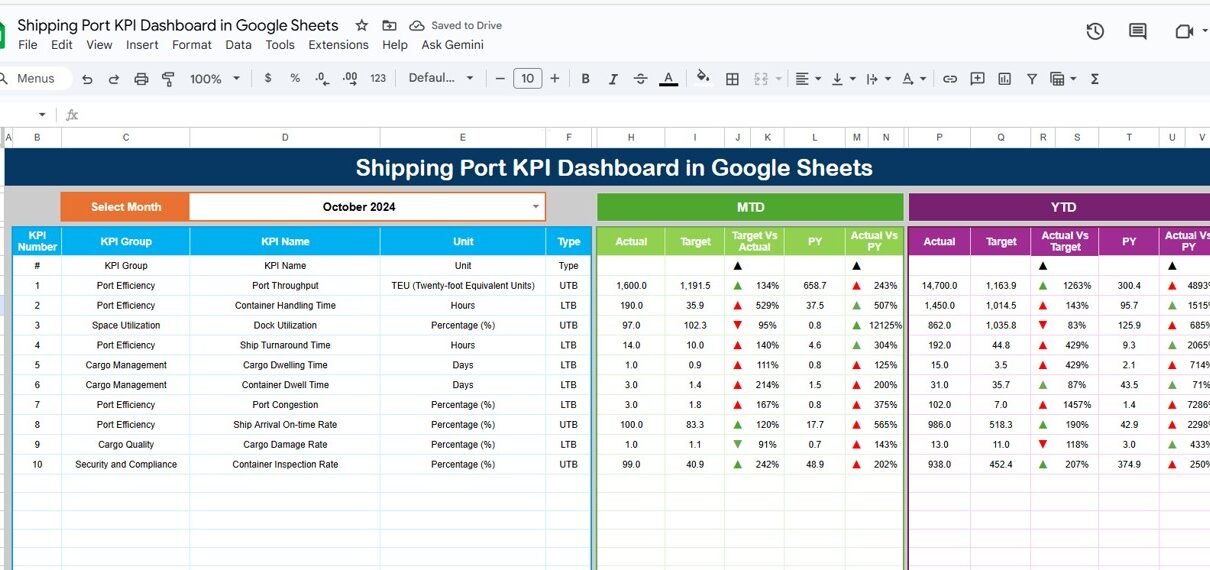
Managing port operations involves monitoring vessel movements, cargo throughput, and resource utilization to ensure smooth and efficient logistics. The Shipping Port KPI Dashboard in Google Sheets is a ready-to-use, data-driven solution that provides a complete overview of port performance — enabling port authorities, logistics managers, and terminal operators to make informed decisions.
This article explains the structure, key features, KPIs, advantages, improvement opportunities, best practices, and FAQs of the Shipping Port KPI Dashboard in Google Sheets.
What Is a Shipping Port KPI Dashboard in Google Sheets?
A Shipping Port KPI Dashboard is a visual performance management tool that tracks key metrics across terminal operations, vessel turnaround, cargo handling, and berth utilization.
Built entirely in Google Sheets, this dashboard enables:
-
Real-time tracking of operational efficiency.
-
Performance comparison between MTD (Month-to-Date), YTD (Year-to-Date), and previous year results.
-
Instant identification of trends using conditional formatting (up/down arrows and color indicators).
It’s fully customizable, cloud-based, and shareable — making it ideal for collaborative performance management.
Structure of the Dashboard
Click to Buy Shipping Port KPI Dashboard in Google Sheets
The Shipping Port KPI Dashboard in Google Sheets contains six main worksheets, each designed for specific analytical or data-entry functions.
Dashboard Sheet Tab
This is the main visualization sheet where all KPI values and charts are displayed.
Key Features:
-
Month Selection (Cell D3): Select any month to update all KPI numbers dynamically.
-
Automatic Comparison:
- MTD (Month-to-Date): Actual, Target, and Previous Year data with conditional arrows.
- YTD (Year-to-Date): Actual, Target, and Previous Year data for cumulative performance.
Visual Indicators:
- 🟢 Green Arrow = Improvement
- 🔴 Red Arrow = Decline
KPIs are color-coded to highlight performance levels, allowing port managers to identify underperforming areas instantly.

Click to Buy Shipping Port KPI Dashboard in Google Sheets
KPI Trend Sheet Tab
The KPI Trend Tab allows you to select a specific KPI (from dropdown in Cell C3) and view its historical trend.
This tab displays:
-
KPI Group
-
Unit of Measurement
-
Type (UTB – Upper the Better, LTB – Lower the Better)
-
Formula
-
KPI Definition
It helps analyze month-over-month progress for each key metric.

Click to Buy Shipping Port KPI Dashboard in Google Sheets
Actual Number Sheet Tab
This sheet records the Actual MTD and YTD data for each KPI.
-
Input actual numbers for each month.
-
Select the first month of the financial year in Cell E1 to define the YTD range.
-
The dashboard automatically updates to reflect these entries.

Target Sheet Tab
This sheet is used to record the Target values for each KPI.
-
Enter monthly and YTD targets for each KPI.
-
The dashboard compares these with actual values to calculate performance variances.

Click to Buy Shipping Port KPI Dashboard in Google Sheets
Previous Year Number Sheet Tab
This tab stores previous year’s data for the same KPIs.
It’s used for historical comparison and trend visualization.

KPI Definition Sheet Tab
This sheet defines all KPIs used in the dashboard, including their Group, Unit, Formula, Definition, and whether Lower the Better (LTB) or Upper the Better (UTB) applies.

Click to Buy Shipping Port KPI Dashboard in Google Sheets
Advantages of the Shipping Port KPI Dashboard
-
Comprehensive View: Tracks all port performance dimensions in one interface.
-
Real-Time Updates: Instantly reflects data changes and trends.
-
Visual Intelligence: Traffic lights and arrows make interpretation simple.
-
Comparative Insights: Displays Target vs Actual and Year-over-Year performance.
-
Accessible Anywhere: Google Sheets enables cloud collaboration and updates.
-
Scalable: Add or modify KPIs based on your port’s operational scope.
-
Decision Support: Helps management identify bottlenecks and improvement areas.
Opportunities for Improvement
You can enhance this dashboard further by integrating automation and analytics:
-
Google Forms Integration: Automate vessel and cargo data entry.
-
API Integration: Pull real-time data from port management systems.
-
Predictive Analytics: Use regression models to forecast cargo volumes and berth occupancy.
-
Safety Alerts: Set up automated triggers for safety incident thresholds.
-
Interactive Filters: Add filters for berth, location, or cargo type.
Best Practices for Using the Dashboard
Click to Buy Shipping Port KPI Dashboard in Google Sheets
-
Maintain Data Accuracy: Ensure data sources are validated before entry.
-
Set Performance Targets Realistically: Define achievable monthly and annual goals.
-
Regular Updates: Update Actual numbers weekly or monthly.
-
Use Color-Coding: Keep consistent conditional formatting for visual clarity.
-
Automate Where Possible: Link with other Google Sheets or APIs to reduce manual work.
-
Review Monthly: Conduct KPI reviews and performance discussions with stakeholders.
Conclusion
Click to Buy Shipping Port KPI Dashboard in Google Sheets
The Shipping Port KPI Dashboard in Google Sheets is an all-in-one solution for managing and monitoring port performance. It enables decision-makers to visualize data, track key metrics, and ensure operational excellence — without relying on expensive software.
With its real-time analytics, visual performance indicators, and customizable structure, it’s a must-have tool for any shipping port or logistics operator aiming to improve efficiency and profitability.
Frequently Asked Questions (FAQ)
1. Can this dashboard handle data from multiple terminals?
Yes, you can add a “Terminal” column in the data sheets to analyze multiple terminals.
2. Can I add more KPIs?
Absolutely. The KPI Definition Sheet is designed for easy expansion.
3. How does conditional formatting work?
Arrows and colors are triggered automatically based on performance against targets.
4. Can this connect with live data sources?
Yes, using Google Apps Script or port management APIs.
5. Can I generate printable monthly reports?
Yes, export the dashboard as a PDF report directly from Google Sheets.
Visit our YouTube channel to learn step-by-step video tutorials
Youtube.com/@NeotechNavigators