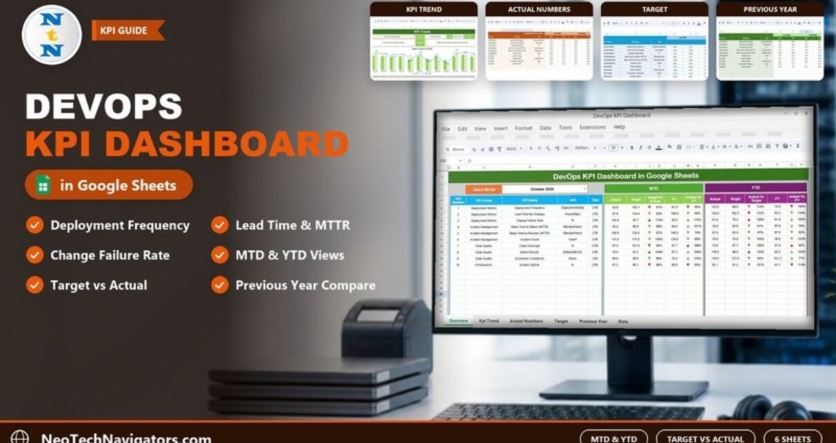
The DevOps KPI Dashboard in Google Sheets brings your delivery, incident, code quality and reliability metrics into one shared file: 10 KPIs including deployment frequency, lead time for changes, change failure rate, mean time to detect (MTTD), mean time to recover (MTTR), code coverage and system uptime. Pick a month and the dashboard compares each KPI with its target and with the previous year (PY), for both Month-to-Date (MTD) and Year-to-Date (YTD).
It is designed for DevOps leads, engineering managers, SRE and platform teams, and IT heads who report delivery performance every month but do not want to set up a full BI tool. The template has six worksheets (Dashboard, KPI Trend, Actual Numbers, Target, Previous Year and KPI Definition). Below we explain each one, the 10 KPIs with the formulas used in the template, how to load your own data, and where the template fits or does not fit.
Get the DevOps KPI Dashboard in Google Sheets
Why DevOps Teams Need a KPI Dashboard
DevOps data is spread across CI/CD pipelines, ticketing tools, monitoring systems, code analysis tools and incident logs. Each tool has its own report, but leadership usually wants one simple answer: are we shipping faster without breaking more things? A KPI dashboard answers that by putting speed metrics (deployment frequency, lead time) next to stability metrics (change failure rate, MTTD, MTTR, uptime) and code health (coverage, defect density, complexity), so you can see whether gains in one area cost you in another.
A monthly dashboard also helps teams:
- spot bottlenecks in the release process before they become habits,
- show the effect of improvements such as test automation or smaller releases,
- set realistic targets and compare against last year,
- keep everyone using the same KPI definitions.
The 10 DevOps KPIs in the Template
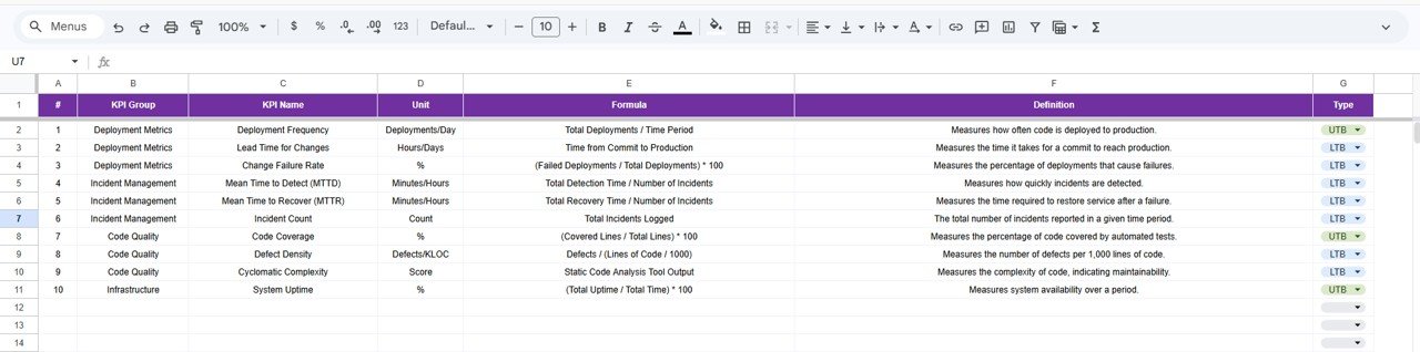
These KPIs, groups, units, formulas and types are copied from the template’s KPI Definition sheet. Type UTB means upper the better; LTB means lower the better.
| KPI | Group | Unit | Formula | Better when |
|---|---|---|---|---|
| Deployment Frequency | Deployment Metrics | Deployments/Day | Total Deployments / Time Period | Higher (UTB) |
| Lead Time for Changes | Deployment Metrics | Hours/Days | Time from Commit to Production | Lower (LTB) |
| Change Failure Rate | Deployment Metrics | % | (Failed Deployments / Total Deployments) × 100 | Lower (LTB) |
| Mean Time to Detect (MTTD) | Incident Management | Minutes/Hours | Total Detection Time / Number of Incidents | Lower (LTB) |
| Mean Time to Recover (MTTR) | Incident Management | Minutes/Hours | Total Recovery Time / Number of Incidents | Lower (LTB) |
| Incident Count | Incident Management | Count | Total Incidents Logged | Lower (LTB) |
| Code Coverage | Code Quality | % | (Covered Lines / Total Lines) × 100 | Higher (UTB) |
| Defect Density | Code Quality | Defects/KLOC | Defects / (Lines of Code / 1000) | Lower (LTB) |
| Cyclomatic Complexity | Code Quality | Score | Static Code Analysis Tool Output | Lower (LTB) |
| System Uptime | Infrastructure | % | (Total Uptime / Total Time) × 100 | Higher (UTB) |
Four of these (deployment frequency, lead time for changes, change failure rate and time to restore service, here MTTR) are the DORA metrics widely used to benchmark software delivery.
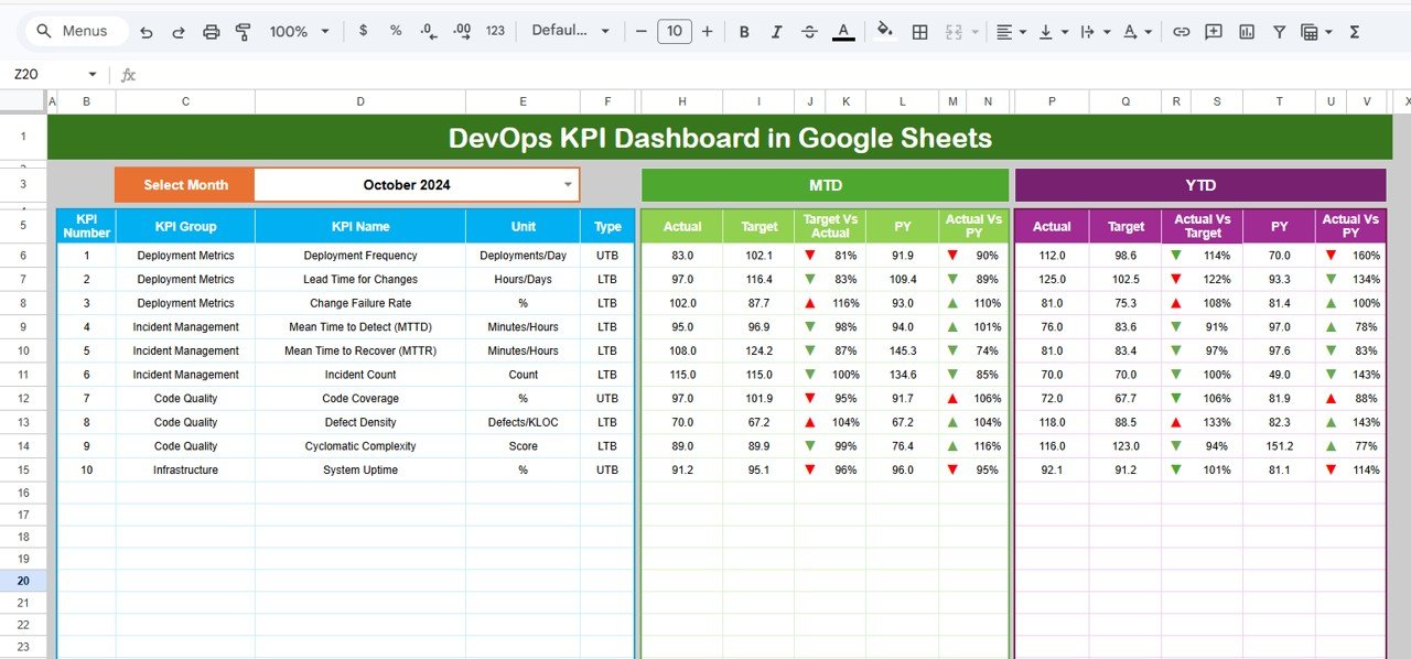
Worked example from the dashboard: for October 2024 MTD, Deployment Frequency shows an Actual of 83.0 against a Target of 102.1, so Target Vs Actual = 83.0 ÷ 102.1 = 81%, and against a PY of 91.9, Actual Vs PY = 90%. Because it is an upper-the-better KPI, both show a red down arrow. Lead Time for Changes shows 97.0 against a target of 116.4 (83%); as a lower-the-better KPI, being below target earns a green arrow.
Other DevOps KPIs worth tracking
These are not in the template, but some teams add them by editing the KPI Definition and data sheets: incident resolution time (average time to fully close an incident ticket), mean time between failures (MTBF) and pipeline success rate.
The Six Worksheets Explained
1. Dashboard
The Dashboard is the main reporting page, laid out as one table. Choose a month from the Select Month drop-down in cell D3 (October 2024 in the sample) and every row updates. For each of the 10 KPIs it shows KPI Number, KPI Group, KPI Name, Unit and Type, followed by two blocks:
- MTD: Actual, Target, Target Vs Actual, PY and Actual Vs PY
- YTD: Actual, Target, Target Vs Actual, PY and Actual Vs PY
The Target Vs Actual and Actual Vs PY columns are percentages (Actual ÷ Target and Actual ÷ PY) with conditional-format up and down arrows, coloured green or red according to whether the KPI is upper or lower the better.
2. KPI Trend
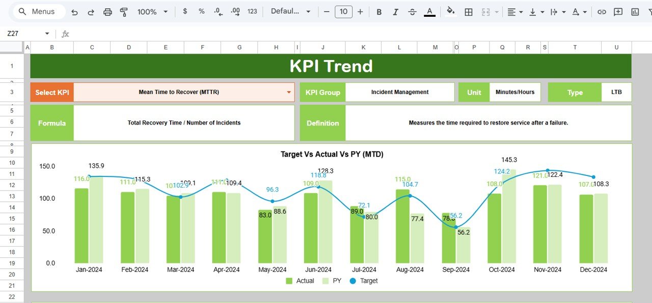
Select a KPI from the drop-down in cell C3 to see its KPI Group, Unit, Type, Formula and Definition, plus a Target Vs Actual Vs PY (MTD) chart that plots Actual and PY as bars and Target as a line for every month from Jan-2024 to Dec-2024. This is the sheet to open when a KPI is off target and you want to know whether it is a one-off or a pattern.
3. Actual Numbers
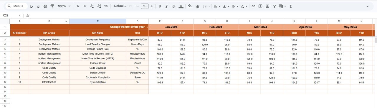
This is where you enter real performance data. Each KPI row (KPI Number, KPI Group, KPI Name, Unit) has an MTD and a YTD column for every month. Set the first month of your year in cell E1 (the sheet labels it “Change the first of the year”; Jan-2024 in the sample) and the month headers follow. Everything on the Dashboard and KPI Trend sheets reads from here, so accuracy matters most on this tab.
4. Target
Enter the monthly MTD and YTD targets for each KPI in the same layout. Remember that for lower-the-better KPIs such as lead time, MTTD or MTTR, the target is a ceiling, not a floor.

5. Previous Year
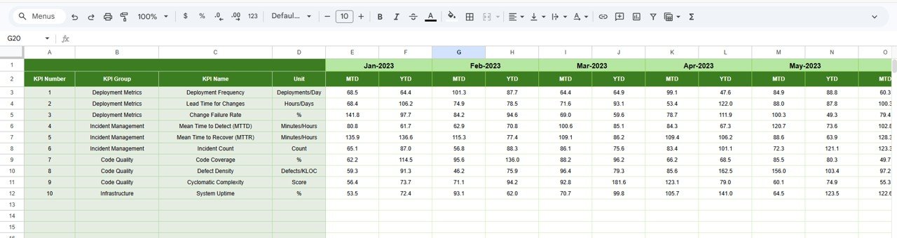
Store last year’s MTD and YTD numbers here (Jan-2023 onwards in the sample) so the dashboard can show the PY and Actual Vs PY columns. If you are just starting to measure, leave it blank for now and fill it in next year.
6. KPI Definition
The KPI Definition sheet holds each KPI’s #, KPI Group, KPI Name, Unit, Formula, Definition and Type (UTB or LTB). It is the single source of truth that keeps developers, operations and management reading the numbers the same way, and the Type tells the dashboard which arrow colour to use.
How to Use the Dashboard with Your Own Data
- Make your own copy of the Google Sheets file from the link included with your purchase.
- Review the KPI Definition sheet and adjust formulas or units so they match how your team measures, for example hours vs days for lead time.
- Set the first month of your reporting year in Actual Numbers > cell E1.
- Export monthly figures from your CI/CD, monitoring, code analysis and ticketing tools and enter MTD and YTD values in Actual Numbers.
- Enter your goals in Target and, if you have them, last year’s figures in Previous Year.
- On the Dashboard, select the month in cell D3 and review the MTD and YTD blocks.
- Use the KPI Trend sheet (cell C3) to investigate any KPI with a red arrow.
Real-World Use Cases
- Monthly engineering review: an engineering manager presents Deployment Frequency and Lead Time next to Change Failure Rate to show that faster releases did not raise failures.
- Platform improvement project: an SRE team tracks MTTD, MTTR and System Uptime before and after adding automated alerting and rollbacks to prove the impact.
- Code quality push: a team lead watches Code Coverage, Defect Density and Cyclomatic Complexity month by month while the team pays down technical debt.
Best Practices
- Agree how each KPI is measured before the first month, and record it in the KPI Definition sheet.
- Read speed and stability KPIs together; improving one at the cost of the other is not progress.
- Update data on a fixed day each month from the same sources.
- Set targets from your own baseline, not from benchmarks that do not fit your context.
- Use the dashboard to discuss process, not to rank individuals.
Limitations: When This Template Is Not Enough
This is a monthly reporting dashboard. It does not connect to GitHub, GitLab, Jenkins, Jira or monitoring tools automatically, so someone has to export and enter the numbers, including the YTD columns. It is not a real-time alerting or observability tool, and it is not built for per-service or per-team drill-down across many squads. Large engineering organisations usually feed a summary into a sheet like this from a dedicated engineering analytics platform. For a small or mid-sized team that wants a clear monthly view without new software, it fits well.
Related IT and Engineering Dashboards
Teams that also track sprint output can look at the Software Development KPI Dashboard in Google Sheets. For broader IT reporting, see the IT KPI Dashboard in Google Sheets, the IT Infrastructure KPI Dashboard and the scorecard-style IT KPI Scorecard in Google Sheets. Support teams handling tickets may also like the IT Support Request Tracker in Google Sheets.
Prefer another tool? The same topic is available as the DevOps KPI Dashboard in Power BI.
If you want to build KPI dashboards like this yourself, the Excel Pivot Tables and Dashboards course on NextGenTemplates Academy teaches the summary tables, charts and layout techniques step by step.
Frequently Asked Questions
Which KPIs does the DevOps dashboard track?
Ten: Deployment Frequency, Lead Time for Changes, Change Failure Rate, Mean Time to Detect (MTTD), Mean Time to Recover (MTTR), Incident Count, Code Coverage, Defect Density, Cyclomatic Complexity and System Uptime, grouped into Deployment Metrics, Incident Management, Code Quality and Infrastructure.
Does it include the DORA metrics?
Yes. Deployment frequency, lead time for changes, change failure rate and MTTR (time to restore service) are all included, alongside six further KPIs for detection, incidents, code quality and uptime.
Does the dashboard pull data from CI/CD tools automatically?
No. You export monthly figures from your tools and enter them in the Actual Numbers sheet. This keeps the template simple and tool-agnostic.
What is the difference between MTD and YTD on the dashboard?
MTD shows the selected month only. YTD covers the start of your reporting year up to the selected month, using the YTD columns you enter, so you can track progress against annual targets.
Can I add or change KPIs?
Yes. Update the KPI Definition sheet first, then make the matching change in the Actual Numbers, Target and Previous Year sheets.
Is this suitable for a small DevOps team?
Yes. It is a good fit for small and mid-sized teams that want clear monthly reporting without setting up a separate analytics platform, and Google Sheets lets the whole team view it at once.
Wrapping Up
Good DevOps reporting shows speed, stability and code health together. The DevOps KPI Dashboard in Google Sheets tracks 10 KPIs with MTD and YTD views, target and previous-year comparisons, a KPI Trend sheet and shared definitions. Start by agreeing your KPI definitions, load the last few months of data and take the dashboard to your next engineering review.
Get the DevOps KPI Dashboard in Google Sheets
📅 Last updated: October 2026