Most benefits reporting dies in the same place: a carrier portal export, a broker PDF and an HRIS report, all with different date ranges, stitched together by hand into a slide the week before the leadership meeting. The Employee Benefits Utilization KPI Dashboard in Google Sheets replaces that with a fixed monthly scorecard – 15 KPIs across 5 groups, spread over 9 tabs, with month-to-date and year-to-date shown side by side for all 12 months of the year. Pick a month from one dropdown and the whole workbook re-bases: tiles, traffic lights, trend charts and rankings.Employee Benefits Utilization KPI Dashboard in Google Sheets
Get the Employee Benefits Utilization KPI Dashboard in Google Sheets
One thing to be clear about up front: this is the KPI scorecard template, not an analytics dashboard and not a benefits administration system. Nobody enrols in a plan here, no claim is filed here, and nothing connects to a carrier. You type monthly summary numbers into three input sheets and the workbook does the arithmetic, the comparisons and the colour coding. It is a manual tracking and visualisation tool, and nothing in it is benefits, insurance, tax or legal advice.
Key Features of the Employee Benefits Utilization KPI Dashboard
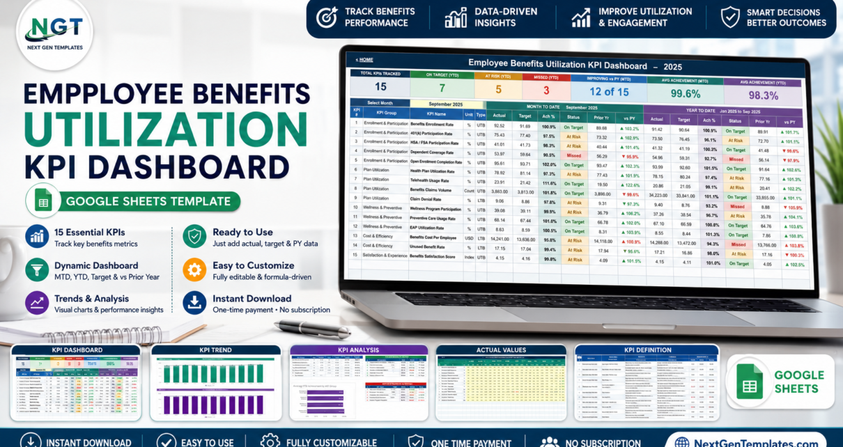
- 15 KPIs in 5 groups. Enrollment & Participation (5 KPIs), Plan Utilization (4), Wellness & Preventive (3), Cost & Efficiency (2) and Satisfaction & Experience (1).
- A single month picker. The dropdown on the KPI Dashboard sheet drives the scorecard, the KPI Trend page and the KPI Analysis page together. No refresh button and no query to run.
- MTD and YTD in the same row. Actual, Target, Achievement %, Status, Prior Yr and vs PY – twice, once for the month and once for the year so far.
- Direction-aware scoring. Every KPI is typed UTB (upper the better) or LTB (lower the better). Achievement is Actual divided by Target for UTB and Target divided by Actual for LTB, so beating a cost or denial-rate target scores above 100%.
- Traffic lights you can move. On Target from 100%, At Risk 95% to 99%, Missed below 95%. All three thresholds live in the Status formulas on the KPI Dashboard sheet.
- Editable KPI master list. Rename a KPI, change its owner or add a whole new KPI group on the KPI Definition sheet and every other page follows it automatically.
- Formula-driven throughout. Native Google Sheets formulas and native charts. Nothing to install, no Apps Script to authorise, and it runs on a free Google account.Employee Benefits Utilization KPI Dashboard in Google Sheets
Dashboard Pages Explanation
Home
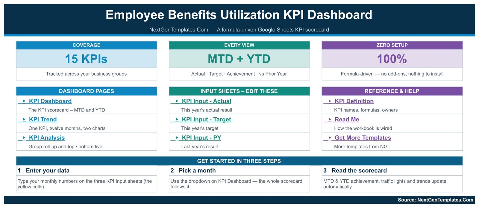
The cover page is a navigation panel. Three cards summarise the build (15 KPIs, MTD + YTD, 100% formula-driven), three columns link to the dashboard pages, the input sheets and the reference sheets, and a three-step Get Started strip tells a first-time user exactly what to do: enter your data, pick a month, read the scorecard.
KPI Dashboard – the scorecard
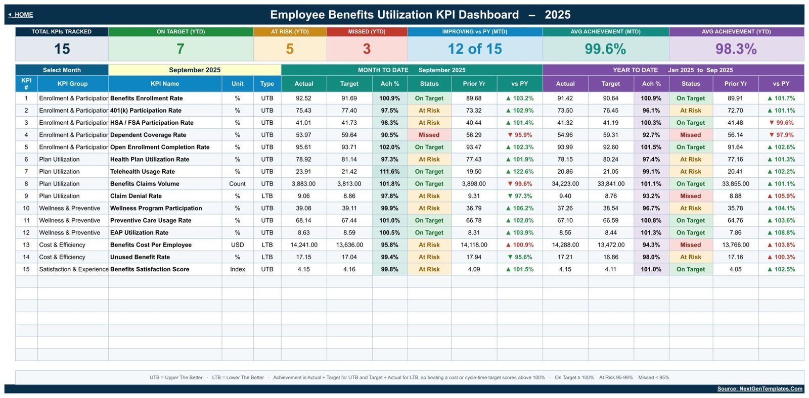
Seven header tiles run across the top: Total KPIs Tracked, On Target (YTD), At Risk (YTD), Missed (YTD), Improving vs PY (MTD), Avg Achievement (MTD) and Avg Achievement (YTD). Below them, the Select Month dropdown and a 15-row table split into a Month to Date block and a Year to Date block. The sample file opens on September 2025 showing 7 On Target, 5 At Risk and 3 Missed on the year, 12 of 15 KPIs improving against prior year, and average achievement of 99.6% MTD and 98.3% YTD. A footnote strip at the bottom restates the UTB/LTB rule and the three status thresholds, so a reader who has never seen the file can interpret a red cell without asking.Employee Benefits Utilization KPI Dashboard in Google Sheets
KPI Trend – one KPI, twelve months
Choose a KPI from the yellow dropdown and the header row fills in its group, unit, type, owner, priority and frequency, along with the formula and the plain-English definition from the master list. Beneath that sits a Jan-to-Dec table with MTD and YTD actual, target, prior year, achievement and status for every month, then two charts: MTD Trend for Benefits Enrollment Rate and YTD Trend for Benefits Enrollment Rate, each plotting actual columns against a target line and a prior-year line. This is the page that answers whether a red month is a blip or a pattern.Employee Benefits Utilization KPI Dashboard in Google Sheets
KPI Analysis – where the problems are
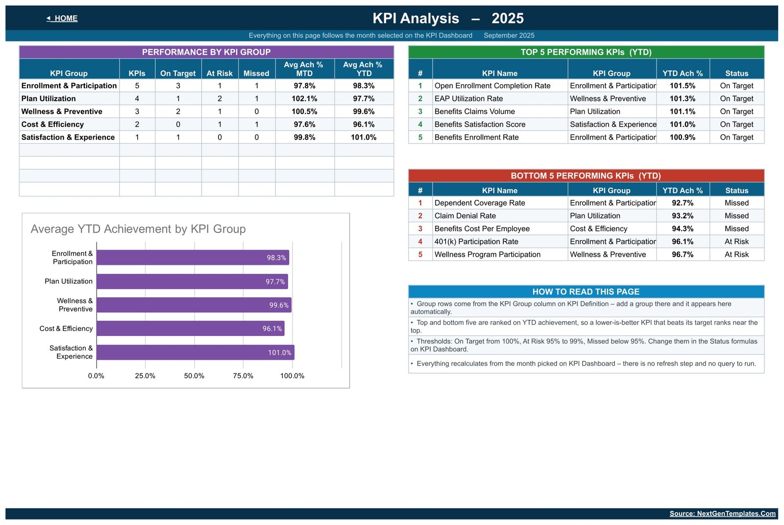
A Performance by KPI Group table counts On Target, At Risk and Missed per group and averages MTD and YTD achievement, so you can see at a glance that Cost & Efficiency is running at 96.1% YTD while Satisfaction & Experience sits at 101.0%. Next to it, Top 5 and Bottom 5 Performing KPIs ranked on YTD achievement, and an Average YTD Achievement by KPI Group bar chart. A How to Read This Page box explains that group rows come from the KPI Definition sheet and that everything recalculates from the month picked on the scorecard.Employee Benefits Utilization KPI Dashboard in Google Sheets
KPI Input – Actual, Target and PY
Three plain grids, one row per KPI and one column pair per month. You type into the yellow cells only; the YTD column beside each month is calculated. Cell E3 on the Actual sheet sets the first month of the reporting year, so a July-to-June financial year works without touching a formula.
KPI Definition, Read Me and Get More Templates
The master list holds KPI number, group, name, unit, formula, definition, type, owner, priority and frequency for all 15 metrics – from Benefits Enrollment Rate through Telehealth Usage Rate and EAP Utilization Rate to Benefits Satisfaction Score. Read Me documents how the workbook is wired, and Get More Templates links back to the catalogue.
Google Sheets vs. Excel vs. Paid Benefits Platforms – Feature Comparison
| This template (Google Sheets) | Excel KPI scorecard | Paid benefits analytics platform | |
|---|---|---|---|
| Cost | One-time template price | File price plus a Microsoft 365 licence | Per employee, per month, billed annually |
| Platform | Any browser, free Google account | Desktop Excel | Vendor cloud with onboarding |
| Setup time | Minutes – copy and type | Minutes, once Excel is installed | Weeks, including data feeds |
| Real-time team collaboration | Yes, native multi-user editing | Only through OneDrive co-authoring | Yes, with seat licences |
| Mobile access | Free Google Sheets app | Excel mobile app | Vendor app |
| Customisable KPIs | Yes – edit the master list | Yes, with formula edits | Limited to the vendor’s metric catalogue |
| Share with a link | Yes, view or edit per person | File send or cloud link | Named seats only |
| Year-1 cost at 5 users | The template price, once | Template plus five Microsoft 365 seats | Typically the largest of the three by a wide margin |
| Month picker with MTD + YTD | Built in | Built in | Usually a report filter |
| Reads raw claims or enrolment records | No – monthly summary numbers only | No | Yes, via carrier feeds |
Who Should Use This Template
Benefits managers and Total Rewards teams who already receive monthly numbers and need a consistent way to present them. Small HR teams with no BI tool and no appetite for one. HR consultants who report on several client programmes and want the same scorecard shape each month. Finance partners who care about Benefits Cost Per Employee and Unused Benefit Rate but do not want a full analytics platform to see them.Employee Benefits Utilization KPI Dashboard in Google Sheets
It is the wrong tool if you need enrolment workflow, claims processing, carrier integration or compliance reporting – none of that exists here. It also expects summary figures rather than record-level exports; if you have a row-per-transaction table and want charts over it, the analytical Employee Benefits Dashboard in Google Sheets is the better fit.
On data handling: real enrolment, claims and wellness numbers are confidential personal information about your employees. This is an ordinary spreadsheet with ordinary Google Drive sharing, so keeping figures aggregated, restricting who the file is shared with and following your organisation’s own data rules is the file owner’s responsibility.
Real-World Use Cases
Open enrolment that actually closes. A benefits manager at a 900-person firm watches Open Enrollment Completion Rate against a 95% target through November. The MTD cell turning amber is the trigger for the second reminder – sent before the window shuts, not after.Employee Benefits Utilization KPI Dashboard in Google Sheets
The quarterly cost conversation. Benefits Cost Per Employee is typed LTB, so coming in under target reads green. Pairing that achievement figure with the vs PY column shows whether a saving is genuine or just a light claims month.
Finding the quiet failures. Bottom 5 Performing KPIs surfaces Dependent Coverage Rate and Claim Denial Rate long before anyone would have spotted them in a 15-row table. One click to KPI Trend shows whether each has been drifting all year.
Multi-client reporting. A consultant keeps one copy per client, renames the KPI master list to match each plan design, and delivers an identical scorecard every month with no rebuild.
Advantages of the Employee Benefits Utilization KPI Dashboard
- Everything follows one list. The KPI Definition sheet is the single source of truth. Change a group there and the analysis page grows a row by itself.
- No hidden machinery. Every number is a visible formula. There is no macro, no add-on and no script, so nothing to authorise and nothing to break when Google updates something.
- Both time windows, always. Monthly noise and annual direction sit next to each other, which stops the usual argument about which one the meeting is looking at.
- Honest about direction. Lower-is-better metrics are scored properly instead of being eyeballed, so a cost KPI cannot look bad simply because it is a small number.
- Shareable the way teams actually work. View access for leadership, edit access for the benefits team, one link, no seats to buy.
Opportunities for Improvement
Two honest limitations worth knowing before you buy.
Long text clips in narrow columns. On the KPI Dashboard, KPI Analysis, Actual Values and KPI Definition sheets, the KPI Group column is sized for short labels. Longer values such as “Enrollment & Participation” and “Satisfaction & Experience” are visually cut off at the column edge in the shipped file. The underlying cell values are complete and every formula reads them correctly – it is purely a column-width issue, and dragging the column wider or turning on text wrapping fixes it in seconds. The same applies to long Owner names and unusually long KPI names.
Manual entry is the trade-off. There is no import step. If you already have a clean monthly export, pasting twelve columns takes a minute; if your numbers live in five systems, the collection work is still yours to do. That is the price of a template with no connectors, no credentials and no subscription.
Best Practices
- Set the reporting year first. Change cell E3 on KPI Input – Actual before you type anything, so the twelve monthly columns line up with your calendar.
- Prune the KPI list before the first month. Delete metrics you cannot source. A scorecard with 9 reliable KPIs beats one with 15 where a third are guesses.
- Set targets once a year, not monthly. Moving the target to match the actual is the fastest way to make a scorecard meaningless.
- Name an owner for every row. The Owner column on KPI Definition is what turns an amber cell into somebody’s action.
- Keep the data aggregated. Monthly counts and rates are all the workbook needs – there is no reason to put individual employee or claim records into it.
- Adjust thresholds deliberately. If 95% is the wrong At Risk floor for your programme, change it in the Status formulas once and document it in Read Me.
- Learn the chart tools. The trend charts are native Google Sheets charts, so anything in the official Google Sheets chart documentation applies if you want to restyle them.
Explore Relevant Templates
- Employee Wellness KPI Scorecard in Google Sheets – deeper coverage of the Wellness & Preventive group.
- Internal Communications KPI Dashboard in Google Sheets – measure whether benefits messaging reaches people.
- Workplace Safety KPI Dashboard in Google Sheets – the same scorecard mechanics for safety metrics.
- Leadership Development KPI Dashboard in Google Sheets and Conflict Resolution KPI Dashboard in Google Sheets – two more HR scorecards in the same family.
If you would like to go deeper on the reporting techniques behind these scorecards, the Excel Pivot Tables & Dashboards course on NextGenTemplates Academy covers them step by step with practice files.
Get the Employee Benefits Utilization KPI Dashboard in Google Sheets
Frequently Asked Questions
Do I need an add-on, a script or a paid Google account?
No. The workbook uses ordinary Google Sheets formulas and native charts. It opens and calculates on a free personal Google account with nothing installed and nothing to authorise.
Can I change the KPIs to match our plan design?
Yes. The KPI Definition sheet is the master list. Rename a KPI, change its unit, owner, priority or direction, delete the rows you do not track, or add a new KPI group – the dashboard, trend and analysis pages all follow that list automatically.
Does it connect to our HRIS, carrier portal or claims system?
No. It is a manual tracking and visualisation template. You type monthly summary numbers into three input sheets. There is no import, no API and no live feed.
Is this a benefits administration or enrolment system?
No. Nobody enrols, elects or files a claim in this file, and it makes no compliance or regulatory claim of any kind. It reports on figures you have already produced elsewhere.
Our financial year starts in July – will that work?
Yes. Cell E3 on the KPI Input – Actual sheet sets the first month of the reporting year, and the monthly columns, MTD and YTD all shift with it.
How are On Target, At Risk and Missed decided?
Achievement is Actual divided by Target for upper-the-better KPIs and Target divided by Actual for lower-the-better ones. On Target starts at 100%, At Risk covers 95% to 99%, and below 95% is Missed. All three cut-offs are editable in the Status formulas.
What do I actually download?
A PDF walkthrough containing a Make a copy link for the Google Sheets file. Clicking it creates an editable copy in your own Google Drive; the original is untouched.
About the Author
Built by PK – Microsoft Certified Professional with 15+ years of Excel, Google Sheets, and Power BI experience. Founder of NextGenTemplates, reaching 300K+ subscribers across YouTube channels. Every template is hand-built and tested before release.
Conclusion
Benefits data is rarely missing – it is usually scattered, and it arrives in a different shape every month. The Employee Benefits Utilization KPI Dashboard in Google Sheets gives it one fixed shape: 15 KPIs, five groups, a month picker, MTD beside YTD, and a status colour that everyone in the room reads the same way. It will not enrol anyone, process a claim or file a report for you, and it is not advice of any kind – but it will turn a monthly scramble into a five-minute update.
Get the Employee Benefits Utilization KPI Dashboard in Google Sheets – one-time payment, instant download, no subscription.