Tracking employee productivity is crucial for every organization. A clear and concise way to do this is by using a well-organized dashboard. In this article, we will explain how to create an Employee Productivity Dashboard in Google Sheets that not only makes it easy to visualize key metrics but also helps improve overall performance by identifying areas for growth.
The Employee Productivity Dashboard template we are about to explore includes two main sheets: the Data Sheet and the Dashboard Sheet. Each part of the template will allow you to track important productivity metrics and display them in visually appealing charts and cards. Let’s walk you through the entire process, from data entry to final visual representation.
Click to buy Employee Productivity Dashboard in Google Sheets
What is an Employee Productivity Dashboard?
An Employee Productivity Dashboard is a visual representation of an employee’s performance over a specific time frame. It can include several key metrics, such as the number of tasks completed, hours worked, productivity scores, overtime hours, and more. This dashboard helps managers, team leaders, and HR professionals assess individual and team performance and identify trends.
Why Use Google Sheets for Your Employee Productivity Dashboard?
Google Sheets is a powerful tool for creating dashboards due to its flexibility and ease of use. Some reasons why you should use Google Sheets for tracking employee productivity include:
- Easy Collaboration: Multiple team members can update and view the data simultaneously.
- Cloud-based: You can access the data from anywhere, on any device.
- Customizable: You can tailor your dashboard to suit your specific needs, adding formulas, charts, and conditional formatting.
- Integration: Google Sheets integrates easily with other Google tools like Google Forms, Google Data Studio, and more.
Key Features of the Employee Productivity Dashboard Template
The Employee Productivity Dashboard template includes several important sections to provide a comprehensive view of your team’s performance.
Click to buy Employee Productivity Dashboard in Google Sheets
1. Data Sheet: Input for Key Metrics
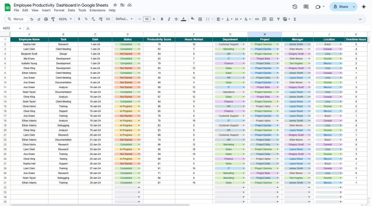
The Data Sheet serves as the backend where all relevant information is entered. Here’s what each column in the data sheet tracks:
- Employee Name: The name of the employee.
- Task: The task or project assigned to the employee.
- Date: The date the task was completed.
- Status: The current status of the task (e.g., completed, in progress, pending).
- Productivity Score: A calculated score that reflects the employee’s efficiency in completing the task.
- Hours Worked: The total number of hours worked by the employee for the task.
- Department: The department to which the employee belongs.
- Project: The specific project the employee is working on.
- Manager: The supervisor or manager overseeing the employee.
- Location: The employee’s work location (remote, on-site, hybrid, etc.).
- Overtime Hours: The extra hours worked by the employee beyond their regular hours.

Click to buy Employee Productivity Dashboard in Google Sheets
2. Dashboard Sheet: Visual Representation of Data
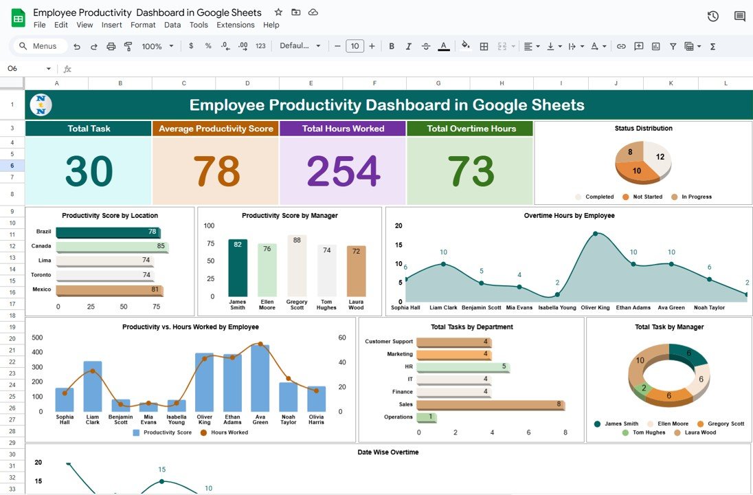
The Dashboard Sheet uses the data entered in the Data Sheet and displays it in the form of cards and charts. Let’s dive into each component.
Cards
Cards are the summary sections of the dashboard. Each card represents a specific metric and gives a quick snapshot of the overall performance.
- Total Tasks: The total number of tasks completed by employees in a given time period.
- Average Productivity Score: The average productivity score of all employees, helping you assess overall team efficiency.
- Total Hours Worked: The total number of hours worked by all employees, providing insight into workload distribution.
- Total Overtime Hours: The cumulative number of overtime hours worked by employees, showing how much extra time is being spent.

Charts
Click to buy Employee Productivity Dashboard in Google Sheets
Charts in the dashboard help visualize various aspects of employee productivity, making it easier to identify trends and patterns. Here are the different charts included in the template:
- Status Distribution (Pie Chart): This chart shows the distribution of tasks by their status. You can see the proportion of tasks that are completed, in progress, or pending. This chart helps assess how many tasks are completed on time and how many are delayed.
- Productivity Score by Location (Bar Chart): This bar chart displays the productivity scores for employees based on their work location. It helps determine if remote or on-site employees are more productive and helps pinpoint any location-specific challenges.
- Productivity Score by Manager (Column Chart): This column chart shows the average productivity scores of employees managed by different supervisors. It allows you to compare how different teams or departments are performing under different managers.
- Overtime Hours by Employee (Area Chart): The area chart visualizes the overtime hours worked by each employee. It provides an easy way to identify employees who are working extra hours and helps assess whether overtime is being properly distributed.
- Productivity vs. Hours Worked by Employee (Combo Chart): This combo chart combines both productivity scores and hours worked. By comparing these two variables, you can analyze how much effort each employee puts into their work and how it correlates with their output.
- Total Tasks by Department (Bar Chart): This chart shows the total number of tasks completed by each department. It helps identify which departments are handling the most work and can highlight whether certain teams are overburdened.
- Total Tasks by Manager (Donut Chart): The donut chart displays the total number of tasks completed by employees under each manager. This gives insight into which managers are handling the most work and the performance of their teams.
- Date Wise Overtime (Line Chart): The line chart tracks overtime hours by date, helping you see when employees are working the most overtime. This is useful for identifying patterns of excessive overtime during particular periods.
Advantages of Employee Productivity Dashboards
Employee productivity dashboards offer several key benefits to managers and businesses:
- Centralized Information: All important employee productivity data is consolidated into one easy-to-access location.
- Informed Decision Making: With the help of charts and data visualizations, managers can make better, data-driven decisions.
- Time-Saving: Dashboards eliminate the need to manually compile reports, saving valuable time for HR and management.
- Transparency: Employees can view their performance metrics, leading to greater transparency and accountability.
- Identifying Trends: Dashboards allow managers to spot trends in productivity over time, such as periods of low output or excessive overtime.
- Click to buy Employee Productivity Dashboard in Google Sheets
Opportunities to Improve Employee Productivity
While productivity dashboards provide a great way to track and improve performance, there are always areas for improvement. Here are some opportunities:
- Refine Productivity Scoring: The productivity score system could be further refined by incorporating more detailed metrics, such as task complexity or time spent on each task.
- Address Overtime: If employees are consistently working overtime, it may be a sign of understaffing or inefficient task allocation. Managers can use the data to redistribute workloads more effectively.
- Manager Performance: If certain managers are consistently getting lower productivity scores from their teams, they may require additional training or support.
- Location-based Adjustments: If remote employees are showing lower productivity, the company might need to invest more in virtual collaboration tools or offer additional support.
Best Practices for Employee Productivity Dashboards
To get the most out of your Employee Productivity Dashboard, follow these best practices:
- Regular Updates: Ensure that the data in your dashboard is updated regularly to provide an accurate view of employee performance.
- Set Clear Goals: Use the dashboard to set and track goals for individual employees and departments.
- Use Conditional Formatting: Highlight critical data points such as low productivity or excessive overtime using conditional formatting.
- Provide Feedback: Use the insights from the dashboard to provide constructive feedback to employees and help them improve.
- Customize for Specific Needs: Customize the dashboard for your company’s unique needs. For example, include specific KPIs that align with your business goals.
Conclusion
The Employee Productivity Dashboard in Google Sheets is a powerful tool that helps organizations track employee performance, identify trends, and make informed decisions. By using this dashboard, managers can assess key productivity metrics such as task completion, overtime hours, and productivity scores. With visual charts and summary cards, Google Sheets makes it easy to monitor employee performance in real-time.
Regular use of this dashboard helps improve overall productivity, ensures better resource allocation, and promotes transparency. Whether you’re tracking tasks by department, manager, or location, this dashboard template provides the insights needed to enhance workforce efficiency.
Frequently Asked Questions with Answers
What key metrics should be tracked in an Employee Productivity Dashboard?
The essential metrics to track include task completion, hours worked, productivity scores, overtime hours, and manager performance.
How can I improve my team’s productivity based on dashboard data?
Use the dashboard to identify trends such as overtime or low productivity, redistribute tasks, set clear goals, and offer additional training or support as needed.
Can I use this template for multiple departments?
Yes! The template is fully customizable, allowing you to track productivity for multiple departments or teams.
How often should the data be updated in the dashboard?
Ideally, the dashboard should be updated regularly, at least once a week, to keep the data current and relevant for decision-making.
Visit our YouTube channel to learn step-by-step video tutorials
Youtube.com/@NeotechNavigators
Watch the step-by-step video tutorial:
Click to buy Employee Productivity Dashboard in Google Sheets


