Managing freight costs remains one of the biggest challenges in logistics and supply chain operations. Transport rates change often, fuel prices rise without warning, and delays create additional expenses. When teams track this information manually, they struggle to identify trends, compare monthly performance, and take quick action.
However, a Freight Cost KPI Dashboard in Google Sheets solves this challenge. It gives your team a simple and powerful way to track all transport expenses, analyze performance, and measure cost efficiency. You view all KPIs in one place, compare MTD and YTD performance, check targets, and review previous year’s data instantly. As a result, you make faster and more confident decisions.
What Is a Freight Cost KPI Dashboard in Google Sheets?
A Freight Cost KPI Dashboard in Google Sheets is a ready-to-use digital tool that helps logistics managers, supply chain teams, warehouse operators, and business owners track all freight-related performance indicators. This dashboard displays month-to-date (MTD) and year-to-date (YTD) values, compares them with targets, and shows previous year (PY) performance.
Key Features of the Freight Cost KPI Dashboard in Google Sheets
Click to Buy Freight Cost KPI Dashboard in Google Sheets
This dashboard includes six powerful worksheets, each with a specific purpose. Together, they form a complete performance-tracking system.
Let’s explore each sheet with details.
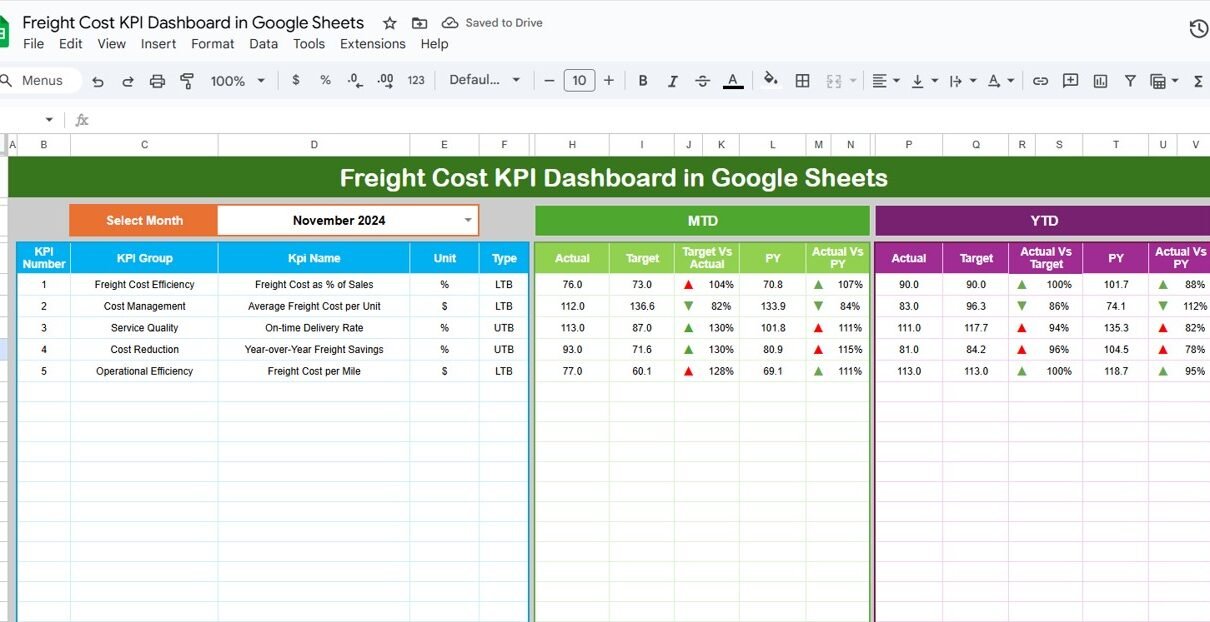
1. Dashboard Sheet Tab – The Main View
The Dashboard sheet is the most important part of the system. You can select the month from a dropdown available in Cell D3, and the entire dashboard updates automatically.
This page displays:
-
MTD Actual
-
MTD Target
-
MTD Previous Year
-
Target vs Actual
-
PY vs Actual
You also see:
-
YTD Actual
-
YTD Target
-
YTD Previous Year
-
YTD Target vs Actual
-
YTD PY vs Actual
Up and down arrows show performance status using conditional formatting.
This visual design allows you to understand performance instantly.

Click to Buy Freight Cost KPI Dashboard in Google Sheets
2. KPI Trend Sheet Tab – All KPI Details in One Place
In the KPI Trend sheet, you can select any KPI from a dropdown in Cell C3. When you select a KPI, the sheet displays:
-
KPI Group
-
KPI Unit
-
KPI Type (LTB – Lower the Better, UTB – Upper the Better)
-
Formula
-
KPI Definition
This helps users understand how each KPI is calculated and what it represents. It also encourages data-driven discussions within the team.

Click to Buy Freight Cost KPI Dashboard in Google Sheets
3. Actual Number Sheet Tab – Enter Actual Monthly Data
In this sheet, you enter the actual MTD and YTD numbers for each KPI. You can change the month in Cell E1.
You only need to enter numbers for the current month; everything else updates automatically on the dashboard.
This ensures clean, reliable, and real-time data availability.

4. Target Sheet Tab – Set Monthly KPI Targets
Every KPI needs a clear goal. This sheet allows you to enter:
-
Monthly MTD Targets
-
Monthly YTD Targets
You set the expected performance for each KPI, and the dashboard compares actuals against these targets.

Click to Buy Freight Cost KPI Dashboard in Google Sheets
5. Previous Year Number Sheet Tab – Enter Last Year’s Data
This sheet stores data for the previous year in the same format as the current year.
The dashboard uses this information to calculate PY vs Actual results.
It helps you understand whether performance is improving or declining year over year.
. KPI Definition Sheet Tab – Full KPI Dictionary
This sheet is the reference library for all KPIs. Here you enter:
-
KPI Name
-
KPI Group
-
KPI Unit
-
KPI Formula
-
KPI Definition
This helps new users understand the meaning and purpose of each KPI.
It also ensures everyone uses the same calculation method.

Click to Buy Freight Cost KPI Dashboard in Google Sheets
Advantages of a Freight Cost KPI Dashboard in Google Sheets
1. Real-Time Cost Visibility
You view live freight cost data whenever the team updates the sheets.
2. Better Budget Control
MTD and YTD comparisons show whether you are overspending.
3. Faster Decision-Making
Instant charts and conditional formatting guide decisions quickly.
4. Improved Accountability
Every KPI has ownership—teams understand expectations clearly.
5. Easy to Share
Google Sheets offers real-time collaboration.
6. Accurate Target Comparison
The dashboard shows the exact performance gap.
7. Clear Trend Analysis
You understand monthly patterns, cost spikes, and improvements.
Opportunities for Improvement in the Freight Cost KPI Dashboard
Click to Buy Freight Cost KPI Dashboard in Google Sheets
Even a good dashboard can become great with the right enhancements.
1. Add More Carrier Analytics
Including carrier scorecards can improve vendor negotiation.
2. Include Route Optimization Metrics
Distance-based KPIs help reduce route inefficiency.
3. Use Automated Data Import
Connected Sheets or Apps Script can reduce manual entry.
4. Add Alerts and Notifications
Highlight high-cost KPIs with color alerts.
5. Add Forecasting Models
Predictive trends show future freight behavior.
6. Build a Regional Breakdown
Cost per region gives deeper insights.
Adding these improvements makes your dashboard more advanced and future-ready.
Best Practices for Using the Freight Cost KPI Dashboard
Click to Buy Freight Cost KPI Dashboard in Google Sheets
To get maximum benefit, follow these practices:
1. Update Data Daily or Weekly
Timely updates keep dashboards relevant.
2. Assign KPI Owners
Each KPI must have a responsible team member.
3. Set Realistic Targets
Targets should align with historical trends.
4. Review Carrier Contracts Regularly
Carrier performance impacts freight KPIs directly.
5. Automate Repetitive Tasks
Use formulas and scripts to save time.
6. Keep KPI Definitions Consistent
Consistent formulas avoid confusion.
7. Use Visualization for Quick Insights
Arrows, bars, and colors make analysis easier.
Conclusion
Click to Buy Freight Cost KPI Dashboard in Google Sheets
The Freight Cost KPI Dashboard in Google Sheets is a powerful tool for every logistics or supply chain team. It brings clarity, reduces manual work, and helps teams make data-driven decisions. With its structured worksheets, KPI definitions, trend views, MTD/YTD analysis, and previous year comparison, the dashboard allows you to control freight costs and improve operational efficiency.
When you track the right KPIs and follow best practices, this dashboard becomes a strategic advantage for your business. It reduces risk, increases transparency, and supports better financial planning.
Frequently Asked Questions (FAQs)
1. What is a Freight Cost KPI Dashboard?
It is a Google Sheets-based tool that tracks freight cost performance using KPIs like freight cost per shipment, transit time, and carrier performance.
2. Who should use this dashboard?
Logistics managers, supply chain teams, warehouse operations, transport companies, and business owners.
3. Can I customize the KPIs?
Yes. You can add or remove KPIs in the KPI Definition sheet.
4. Is Google Sheets good for logistics dashboards?
Yes. It is cloud-based, shareable, and easy to automate.
5. How often should I update the actual data?
Daily or weekly updates provide the best accuracy.
6. How do MTD and YTD work in the dashboard?
You select the month, and the dashboard pulls MTD and YTD values automatically.
7. Can I compare with the previous year?
Yes. The dashboard includes PY numbers for comparison.
8. Do I need advanced skills to use it?
No. Anyone with basic Google Sheets knowledge can use it.
Visit our YouTube channel to learn step-by-step video tutorials