Managing student enrollment effectively is vital for every educational institution. From tracking new admissions to analyzing conversion rates and academic engagement, having a centralized tool to monitor key metrics ensures better decision-making. The Student Enrollment KPI Dashboard in Google Sheets provides a ready-to-use solution to visualize and track all enrollment-related KPIs in one place.Student Enrollment KPI Dashboard in Google Sheets
In this article, we will explore the key features, benefits, KPIs, and best practices of using this dashboard.Student Enrollment KPI Dashboard in Google Sheets
What Is a Student Enrollment KPI Dashboard?
A Student Enrollment KPI Dashboard is an interactive reporting tool that consolidates essential enrollment data into one visual platform. It helps schools, colleges, and universities monitor performance indicators such as applications received, conversion rates, dropout percentages, scholarship allocations, and student satisfaction.
By using Google Sheets, institutions can benefit from:
-
Real-time collaboration between departments
-
Automatic updates when data changes
-
Dynamic visualization with interactive charts
-
Cost-effective and flexible reporting
Key Features of the Student Enrollment KPI Dashboard
Click to Buy Student Enrollment KPI Dashboard in Google Sheets
This Google Sheets dashboard includes six main worksheets, each designed for clear and data-driven insights.
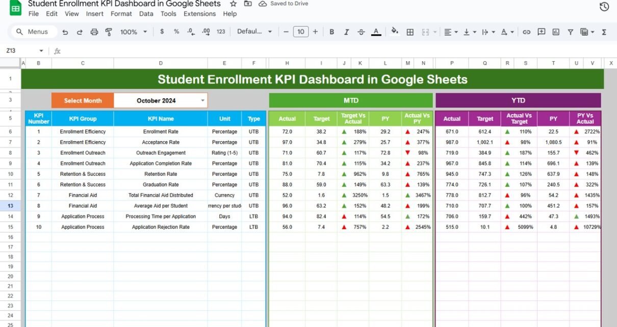
1. Dashboard Sheet Tab
This is the main page where all KPIs are summarized.
Month Selector (Range D3): Choose any month to view data dynamically.
MTD (Month-to-Date) and YTD (Year-to-Date) KPIs:
- MTD Actual
- MTD Target
- Previous Year Comparison (PY vs CY)
- YTD Aggregation for performance tracking
Conditional Formatting: Green and red arrows automatically indicate whether the KPI performance meets or misses targets.

Click to Buy Student Enrollment KPI Dashboard in Google Sheets
2. KPI Trend Sheet Tab
The KPI Trend Sheet provides detailed trend analysis for each KPI.
-
Dropdown in Range C3 to select a KPI
-
Displays KPI group, unit, formula, definition, and performance type (Upper-the-Better or Lower-the-Better)
-
Shows historical performance trends for long-term analysis

Click to Buy Student Enrollment KPI Dashboard in Google Sheets
3. Actual Numbers Sheet Tab
This sheet records the actual monthly values for all KPIs.
-
Input both MTD and YTD numbers
-
Automatically recalculates based on the month entered in Range E1

4. Target Sheet Tab
The Target Sheet contains your institution’s target values for each KPI.
-
Enter MTD and YTD targets
-
Compare actual vs. target values across months

Click to Buy Student Enrollment KPI Dashboard in Google Sheets
5. Previous Year Numbers Sheet Tab
Enter previous year’s performance data to monitor growth.
-
Enables year-over-year (YoY) comparisons
-
Helps identify patterns and performance improvements

6. KPI Definition Sheet Tab
This sheet defines every KPI for clarity and consistency.
-
KPI Group – Admission, Retention, Academics, or Financial
-
KPI Name – e.g., Enrollment Rate, Dropout %, Scholarship Utilization
-
Unit – %, Count, $, or Score
-
Formula – Aggregation method used in calculations
-
Definition – Explanation of each metric
-
Type – LTB (Lower-the-Better) or UTB (Upper-the-Better)

Click to Buy Student Enrollment KPI Dashboard in Google Sheets
Advantages of the Student Enrollment KPI Dashboard
-
Centralized Performance Monitoring: View all KPIs in one place
-
Data Accuracy: Automated formulas reduce manual errors
-
Real-Time Updates: Changes in data instantly reflect in dashboards
-
Strategic Decision-Making: Compare trends with targets and previous years
-
Customizable Metrics: Add institution-specific KPIs easily
-
Visual Representation: Conditional formatting and charts make data interpretation simple
Best Practices for Using the Dashboard
-
Update Data Monthly: Ensure accurate insights by maintaining up-to-date figures.
-
Set Realistic Targets: Align goals with historical performance and institutional capacity.
-
Segment Data by Program: Analyze KPIs for undergraduate, postgraduate, or short-term courses separately.
-
Track Trends, Not Just Numbers: Focus on long-term patterns in enrollment and retention.
-
Encourage Collaboration: Allow departments (Admissions, Finance, Academic) to contribute real-time data updates.
-
Use Conditional Formatting Effectively: Green arrows indicate improvement; red indicates areas needing attention.
How This Dashboard Helps Educational Institutions
Click to Buy Student Enrollment KPI Dashboard in Google Sheets
-
Improves Admission Efficiency: Identify bottlenecks in application and enrollment processes
-
Monitors Student Success: Track retention, satisfaction, and scholarship effectiveness
-
Supports Financial Planning: Analyze cost per enrollment and scholarship utilization
-
Enhances Data Transparency: Share interactive dashboards with decision-makers
-
Enables Continuous Improvement: Use data to adjust marketing, recruitment, and academic programs
Frequently Asked Questions (FAQs)
Q1: Can I customize the KPIs for my institution?
Yes, you can add new KPIs or modify existing ones in the KPI Definition Sheet.
Q2: Does the dashboard auto-update when I change data?
Yes, once the actual, target, or previous year numbers are updated, the dashboard recalculates automatically.
Q3: Can I analyze performance by department or program?
Yes, you can categorize KPIs by academic department, program type, or level of study.
Q4: Can this be shared with multiple users?
Absolutely. As it’s built in Google Sheets, multiple users can collaborate simultaneously.
Q5: What are “Upper-the-Better” and “Lower-the-Better” KPIs?
UTB means higher values are good (e.g., Enrollment Rate), while LTB means lower values are good (e.g., Dropout Rate).
Conclusion
Click to Buy Student Enrollment KPI Dashboard in Google Sheets
The Student Enrollment KPI Dashboard in Google Sheets provides a comprehensive, interactive, and data-driven way to manage and analyze enrollment metrics. With structured data inputs, real-time visualizations, and easy customization, institutions can enhance performance tracking, improve admissions, and make better strategic decisions.
Visit our YouTube channel to learn step-by-step video tutorials
Youtube.com/@NeotechNavigators
Watch the step-by-step video Demo:
Click to Buy Student Enrollment KPI Dashboard in Google Sheets