Healthcare organizations generate massive amounts of operational, financial, and patient data every day. Hospitals track admissions, discharges, patient outcomes, department performance, insurance billing, patient satisfaction, and many more metrics. However, when this information stays scattered across systems and spreadsheets, decision-makers struggle to analyze it quickly.
Therefore, healthcare institutions increasingly rely on analytics dashboards to transform complex data into meaningful insights.
The Healthcare Analytics Dashboard in HTML is a modern web-based dashboard designed to help healthcare organizations monitor key performance indicators, analyze hospital performance, and improve operational decision-making. This dashboard uses HTML, CSS, and JavaScript to create an interactive and visually appealing analytics interface that runs directly in a web browser.
Because it combines powerful charts, KPI cards, filters, and detailed patient records, the dashboard provides a complete healthcare performance monitoring system.
In this article, we will explore the Healthcare Analytics Dashboard in HTML, including its features, dashboard pages, advantages, best practices, and frequently asked questions.
What is a Healthcare Analytics Dashboard in HTML?
A Healthcare Analytics Dashboard in HTML is a browser-based reporting system that displays healthcare data using interactive charts, cards, tables, and filters.
Unlike traditional spreadsheets, this dashboard provides a web-style user interface that makes healthcare analytics easier to understand.
The dashboard allows healthcare managers to analyze:
- Patient admissions and discharges
- Revenue performance
- Department performance
- Bed occupancy rates
- Patient satisfaction scores
- Readmission rates
- Clinical outcomes
- Insurance payer mix
Because the dashboard runs in HTML, users can open it in any browser without installing special software.
Key Features of the Healthcare Analytics Dashboard
The Healthcare Analytics Dashboard in HTML includes multiple advanced analytics features that make healthcare reporting easier.
Major features include
- Interactive KPI cards
- Multiple analytics pages
- Dynamic filters
- Department and ward analysis
- Time trend analysis
- Clinical outcome monitoring
- Patient records management
- Export and Excel upload options
- Interactive charts and tables
Because of these features, healthcare teams can monitor performance quickly and accurately.
Dashboard Navigation Structure
The Healthcare Analytics Dashboard includes several analytical pages accessible through the navigation menu.
The main pages include:
- Overview Page
- Department & Ward Analysis
- Time & Trends Analysis
- Clinical Outcomes Analysis
- Patient Records
Each page provides a different perspective on healthcare performance.
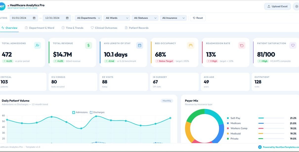
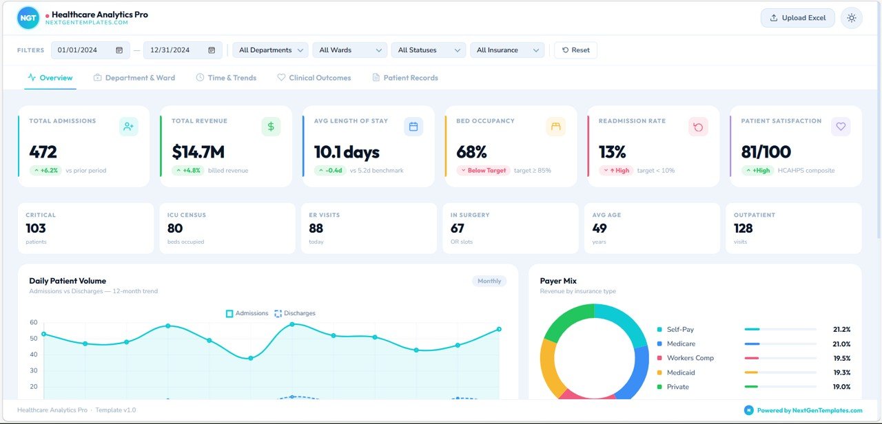
Overview Page – Healthcare Performance Snapshot
The Overview Page acts as the main dashboard where healthcare leaders can quickly review key hospital performance indicators.
At the top of the page, users can apply filters such as:
- Date range
- Department
- Ward
- Patient status
- Insurance type
These filters allow users to customize the analytics view.
Key KPI Cards on the Overview Page
The dashboard displays several KPI cards that summarize hospital performance.
These include:
- Total Admissions – Number of patients admitted
- Total Revenue – Revenue generated from healthcare services
- Average Length of Stay – Average patient stay duration
- Bed Occupancy Rate – Percentage of hospital beds occupied
- Readmission Rate – Percentage of patients readmitted
- Patient Satisfaction Score – Average satisfaction rating
These cards allow hospital administrators to understand performance instantly.
Operational Metrics
Below the main KPIs, the dashboard displays operational indicators such as:
- Critical Patients
- ICU Census
- ER Visits
- Patients in Surgery
- Average Patient Age
- Outpatient Visits
These metrics provide a quick view of hospital activity.
Daily Patient Volume Analysis
This chart shows the trend of:
- Admissions
- Discharges
over a 12-month period.
This helps hospitals analyze patient flow patterns.
Payer Mix Analysis
The payer mix chart shows the revenue distribution by insurance type.
Examples include:
- Medicare
- Medicaid
- Private Insurance
- Self Pay
- Workers Compensation
Understanding payer mix helps healthcare organizations monitor revenue sources.
Department & Ward Analysis
The Department & Ward Analysis page focuses on operational performance across different hospital departments.
Admissions by Department
This chart shows how many patients each department handles.
Example departments include:
- Cardiology
- Emergency
- Orthopedics
- Oncology
- Neurology
- Pediatrics
- Surgery
- OB/GYN
This analysis helps hospital administrators allocate resources effectively.
Revenue by Department
This chart displays the revenue generated by each department.
It helps management understand which departments contribute the most revenue.

Staff-to-Patient Ratio
This metric monitors staffing coverage for departments.
Maintaining an appropriate staff-to-patient ratio is essential for patient safety and service quality.
Ward Capacity Utilization
This chart shows how hospital wards use their available bed capacity.
It compares:
- Occupied beds
- Available beds
Hospital managers use this data to manage capacity efficiently.
Department Performance Radar
The radar chart compares multiple KPIs across departments.
It allows healthcare leaders to identify high-performing and underperforming departments.
Time & Trends Analysis
The Time & Trends page helps healthcare analysts understand how hospital performance changes over time.
12-Month Admission & Revenue Timeline
This chart compares:
- Monthly admissions
- Monthly revenue
- Moving averages
This analysis helps hospitals understand seasonal patterns.
Quarterly Patient Volume
This chart shows patient admissions and discharges by quarter.
It helps organizations evaluate workload trends.
Day-of-Week Admission Patterns
This chart displays average admissions by weekday.
Hospitals use this information for workforce scheduling.
Clinical Outcomes Dashboard
The Clinical Outcomes page focuses on healthcare quality and patient outcomes.
Readmission Rate by Department
This chart compares the 30-day readmission rate across departments.
High readmission rates may indicate quality issues or treatment gaps.
Patient Satisfaction Scores
This radar chart shows patient satisfaction across categories such as:
- Communication
- Responsiveness
- Pain Management
- Cleanliness
- Discharge Information
- Overall Rating
Hospitals use this data to improve patient experience.
Discharge Outcome Mix
This visualization shows different discharge types.
Examples include:
- Home discharge
- Transfer to another facility
- Rehabilitation
- Other outcomes
Mortality & Complication Rate
This metric tracks clinical risks per 1,000 patients.
Monitoring these rates helps hospitals improve care quality.
Patient Acuity Distribution
This chart shows patient severity levels across hospital admissions.
It helps hospitals allocate resources to high-acuity patients.
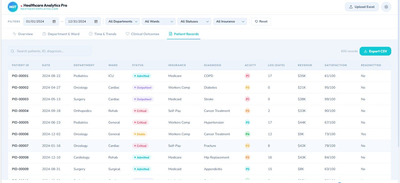
Patient Records Page
The Patient Records page displays detailed patient-level data.
The table includes fields such as:
- Patient ID
- Date
- Department
- Ward
- Patient Status
- Insurance
- Diagnosis
- Acuity Level
- Length of Stay
- Revenue
- Satisfaction Score
- Readmission Status
Users can search patient records and export the dataset to CSV.
This page supports operational analysis and patient tracking.
Advantages of Healthcare Analytics Dashboard in HTML
Implementing a healthcare analytics dashboard provides several benefits.
Centralized Healthcare Analytics
Hospitals can monitor all performance indicators in a single platform.
Better Decision-Making
Visual insights allow administrators to identify issues quickly.
Improved Patient Care
Tracking clinical outcomes helps healthcare teams improve treatment quality.
Efficient Resource Management
Hospitals can monitor bed occupancy, staff utilization, and patient flow.
Financial Performance Tracking
Revenue dashboards help organizations understand department profitability.
Interactive Data Exploration
Filters allow users to analyze specific departments, wards, or patient groups.
Best Practices for the Healthcare Analytics Dashboard
To maximize the value of healthcare dashboards, organizations should follow best practices.
Maintain Accurate Data
Healthcare analytics depends on reliable data.
Ensure all patient records and financial information are accurate.
Monitor KPIs Regularly
Hospital leaders should review dashboard metrics frequently to identify trends.
Focus on Critical Indicators
Readmission rates, patient satisfaction, and mortality rates require close monitoring.
Train Staff on Dashboard Usage
Healthcare teams should understand how to interpret dashboard insights.
Integrate Data Sources
Hospitals should integrate EHR, billing systems, and operational data sources.
Who Can Use the Healthcare Analytics Dashboard?
Many healthcare professionals can benefit from this dashboard.
Examples include:
- Hospital administrators
- Healthcare data analysts
- Clinical quality teams
- Healthcare consultants
- Operations managers
- Healthcare IT teams
Any organization focused on improving healthcare performance can use this dashboard.
Conclusion
The Healthcare Analytics Dashboard in HTML provides a powerful and modern solution for healthcare performance monitoring.
Instead of relying on scattered reports and manual analysis, hospitals can track operational metrics, financial performance, and clinical outcomes in a single interactive dashboard.
Moreover, the web-based interface makes the dashboard accessible and easy to use.
Because healthcare organizations must continuously improve efficiency, patient outcomes, and financial performance, analytics dashboards have become essential tools for modern healthcare management.
By implementing a healthcare analytics dashboard, organizations can transform raw healthcare data into meaningful insights that support better decision-making and improved patient care.
Watch the step-by-step video tutorial:
Visit our YouTube channel to learn step-by-step video tutorials