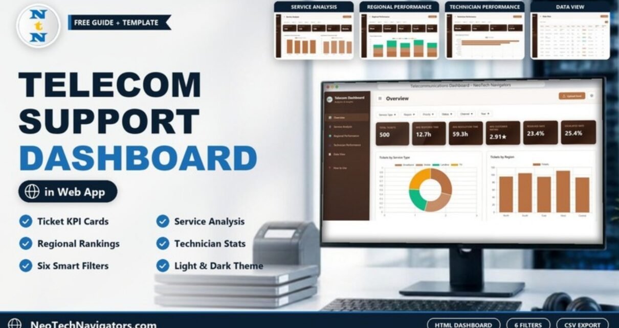
The Telecommunications Dashboard in HTML is a browser-based analytics template for telecom support teams. It turns a list of customer tickets into KPI cards and charts that show how many tickets you receive, how fast they are answered and resolved, how customers rate the service, and which regions, services and technicians need attention.
It is built for telecom operations managers, customer support leads, regional managers and analysts at broadband, mobile, landline and TV providers. There is nothing to install: the dashboard opens in Chrome, Edge or Firefox and has five analysis pages (Overview, Service Analysis, Regional Performance, Technician Performance and Data View) plus a built-in How to Use page.
🎥 Watch the Video Tutorial
Get the Telecommunications Dashboard in HTML
What Problem Does This Telecom Dashboard Solve?
A telecom support desk can log hundreds of tickets a month across several services, regions and channels. The raw ticket export tells you very little on its own. Questions like “Which region escalates the most tickets?”, “Is TV slower to resolve than broadband?” or “Which technician is carrying the most work?” usually mean an afternoon of filtering and pivoting.
This dashboard answers those questions the moment the data is loaded. Every page shares the same filter bar, so you can narrow the whole view to, for example, high-priority broadband tickets from the call center, and every card and chart recalculates instantly.
Key Metrics at a Glance
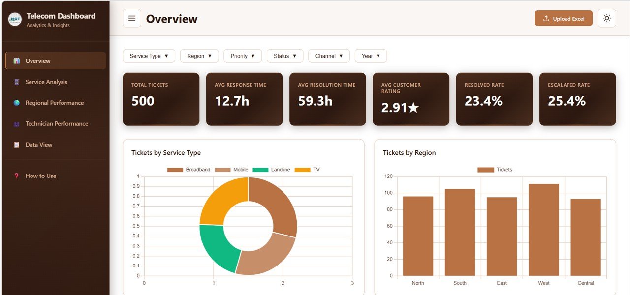
The values below come from the included sample data of 500 tickets with no filters applied.
| Page | KPI card | Sample value | What it tells you |
|---|---|---|---|
| Overview | Total Tickets | 500 | All tickets in the current filter |
| Overview | Avg Response Time | 12.7h | Average hours before the first response |
| Overview | Avg Resolution Time | 59.3h | Average hours to resolve a ticket |
| Overview | Avg Customer Rating | 2.91★ | Average customer rating on a star scale |
| Overview | Resolved Rate | 23.4% | Share of tickets with Resolved status |
| Overview | Escalated Rate | 25.4% | Share of tickets that were escalated |
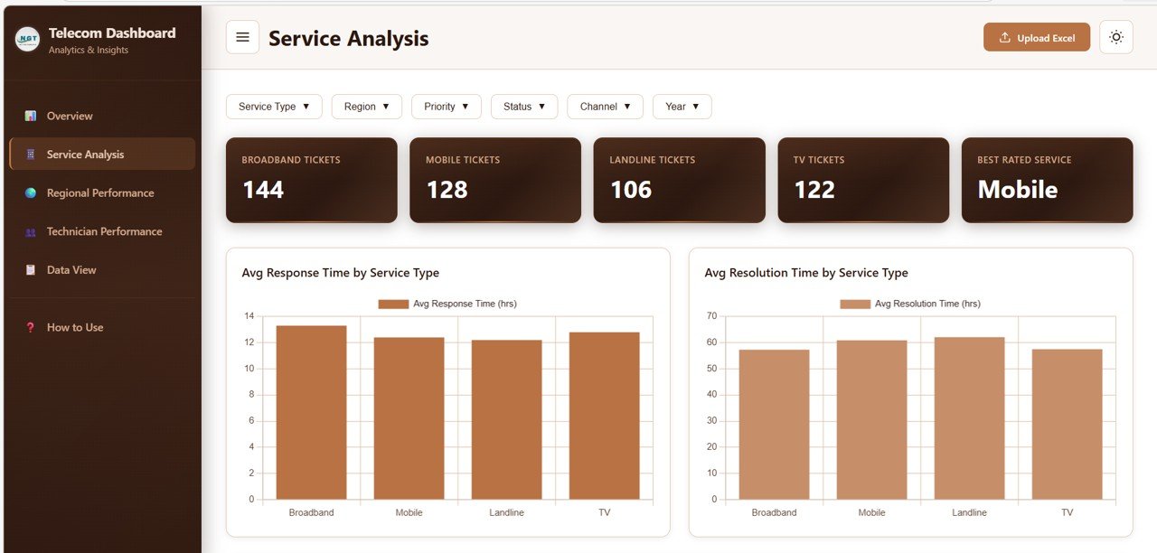
| Service Analysis | Broadband / Mobile / Landline / TV Tickets | 144 / 128 / 106 / 122 | Ticket volume per service (adds up to 500) |
| Service Analysis | Best Rated Service | Mobile | Service with the highest average rating |
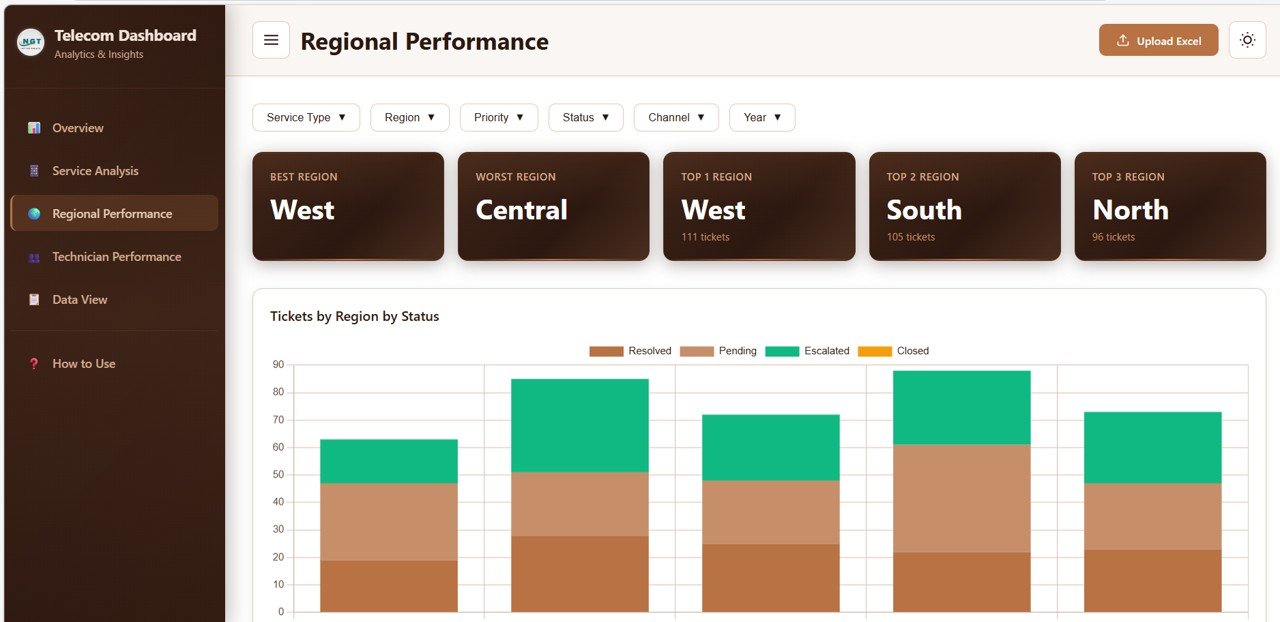
| Regional Performance | Best Region / Worst Region | West / Central | Strongest and weakest regions |
| Regional Performance | Top 1 / Top 2 / Top 3 Region | West 111 / South 105 / North 96 | Regions with the most tickets |
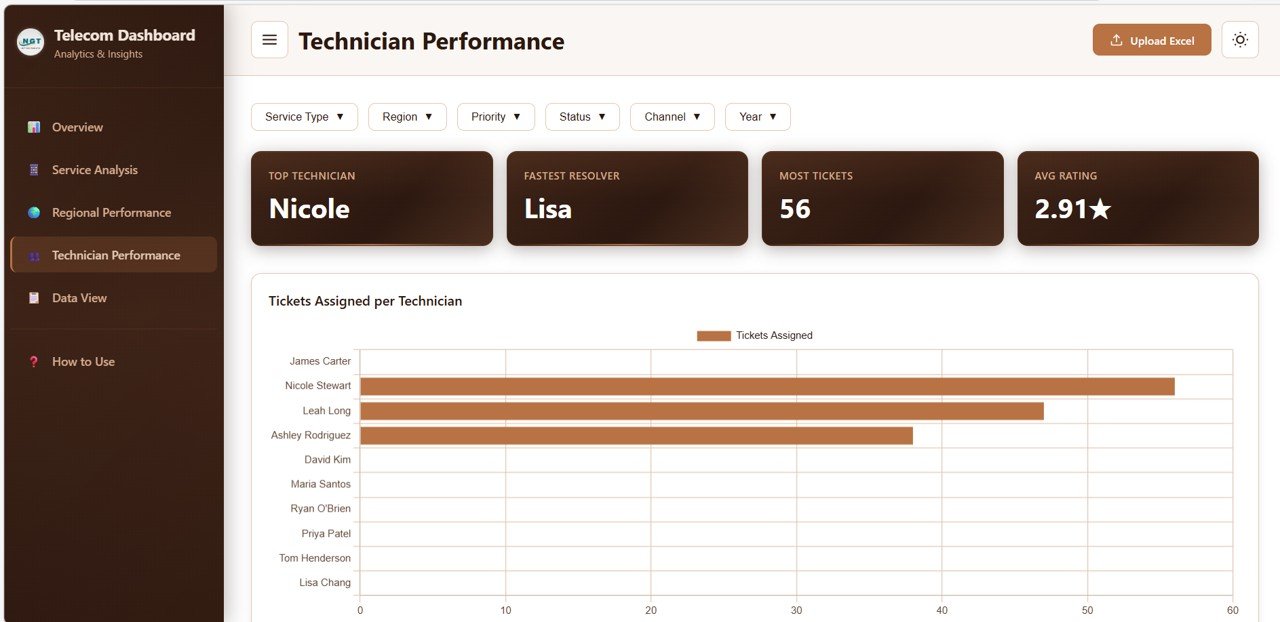
| Technician Performance | Top Technician / Fastest Resolver | Nicole / Lisa | Best performer and quickest resolver |
| Technician Performance | Most Tickets / Avg Rating | 56 / 2.91★ | Highest workload and average rating |
In plain numbers, a 23.4% Resolved Rate on 500 tickets is about 117 resolved tickets, and a 25.4% Escalated Rate is about 127 escalations. In the sample data, more tickets are escalated than resolved, which is exactly the kind of signal this dashboard is meant to surface.
Filters and Toolbar
Six multi-select filters sit at the top of every analysis page: Service Type, Region, Priority, Status, Channel and Year. The header also has an Upload Excel button for loading your own ticket file and a sun/moon icon that switches between light and dark themes.
Telecommunications Dashboard in HTML: Pages Explained
1. Overview
The six headline KPI cards sit above the main charts: Tickets by Service Type (a donut chart split into Broadband, Mobile, Landline and TV), Tickets by Region (North, South, East, West and Central), Tickets by Status, Tickets by Priority and the Monthly Ticket Trend. This is the page for a daily health check.
2. Service Analysis
Compares the four services side by side. Cards show the ticket count for each service and the Best Rated Service. The charts are Avg Response Time by Service Type, Avg Resolution Time by Service Type, Customer Rating Distribution by Service Type and Issue Type Breakdown by Service Type. Use it to see whether one service is consistently slower or rated lower than the others.
3. Regional Performance
Ranks the five regions. Cards name the best and worst region and the top three regions by ticket count. The Tickets by Region by Status stacked chart splits each region’s tickets by status (its legend shows Resolved, Pending, Escalated and Closed). The page also includes Average Customer Rating by Region, Response Time by Region and Channel Distribution by Region, which shows how customers contact you in each area.
4. Technician Performance
Built for team leads. Cards show the Top Technician, Fastest Resolver, Most Tickets and Avg Rating. The charts are Tickets Assigned per Technician, Average Rating by Technician, Average Resolution Time by Technician and Status Distribution by Technician. Together they show who is overloaded, who resolves quickly and who has a pile of escalations.
5. Data View
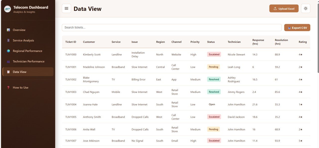
The full ticket list with a Search tickets box, sortable columns, pagination and an Export CSV button. The columns are Ticket ID, Customer, Service, Issue, Region, Channel, Priority, Status, Technician, Response (hrs), Resolution (hrs) and Rating. In the sample data, statuses include Escalated, Pending, Resolved and Open, issues include Installation Delay, Slow Internet, Billing Error, Dropped Calls and No Signal, and channels include Website, Call Center, App, Retail Store and Email.
6. How to Use
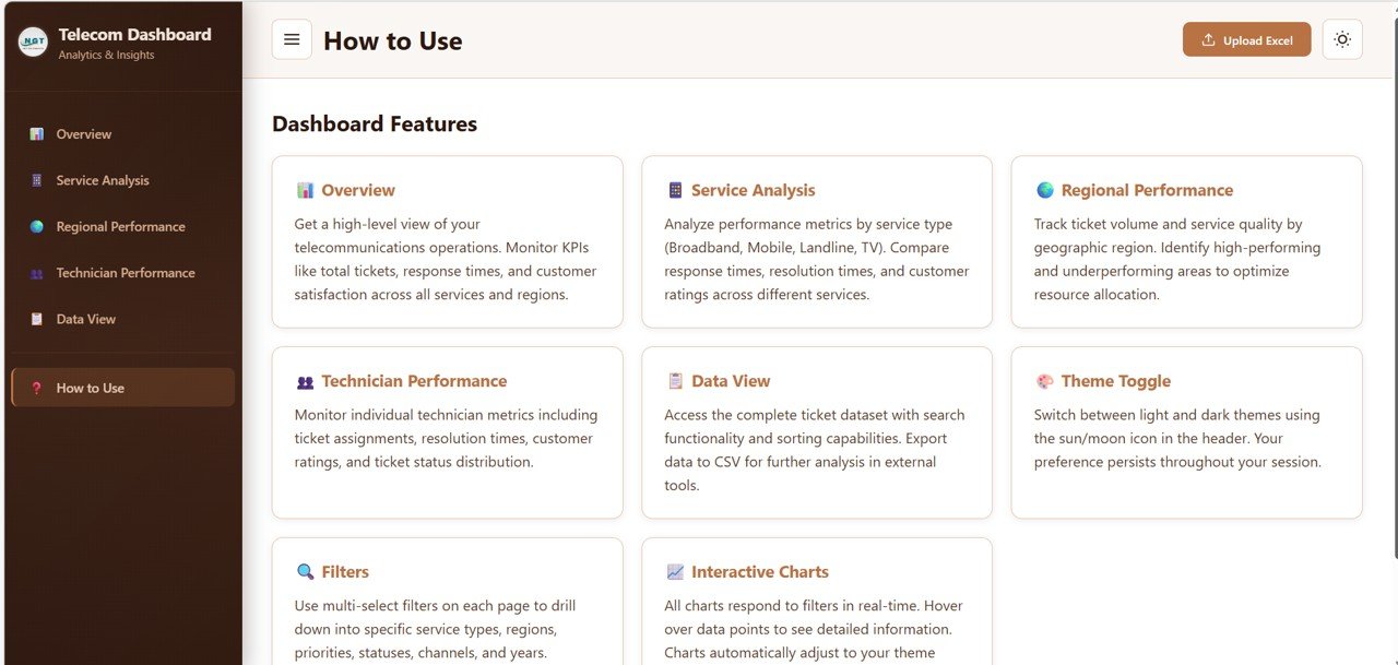
A help page inside the dashboard that explains each page, the theme toggle, the filters and the interactive charts, so new users can find their way without a separate manual.
How to Use It with Your Own Data
- Open the downloaded dashboard file in Chrome, Edge or Firefox.
- Click through the pages with the sample data so you know what each chart shows.
- Export your tickets from your helpdesk or CRM and arrange the columns to match the sample file (ticket ID, customer, service, issue, region, channel, priority, status, technician, response hours, resolution hours and rating).
- Click Upload Excel and load your file. All cards, charts and the Data View refresh.
- Use the filter bar to focus on one region, service, priority or channel and note anything unusual.
- Use Search tickets in Data View to find specific records, and Export CSV when you need to share the ticket list or follow up outside the dashboard.
If you want to build similar reports yourself, the Excel Pivot Tables & Dashboards course on NextGenTemplates Academy covers the summarising and charting skills behind dashboards like this one.
Three Real-World Use Cases
- Weekly support review: the support manager uploads the latest ticket export, checks the Escalated Rate and the Tickets by Region by Status chart, and brings the worst region to the meeting.
- Field service planning: a regional lead filters to one region and reads the Issue Type Breakdown by Service Type chart to see how many Installation Delay and No Signal tickets need field technicians.
- Coaching technicians: a team lead compares Average Rating and Average Resolution Time by Technician to decide who needs training and who can mentor others.
Best Practices
- Keep category names consistent. “Call Center” and “Call centre” will appear as two channels.
- Record response and resolution in hours so the averages are comparable month to month.
- Look at escalations next to ratings. A region with high escalations and low ratings is the first place to act.
- Use the Year filter for like-for-like comparisons when your file covers more than one year.
- Refresh on a schedule, for example every Monday, so the numbers people discuss are current.
Limitations: Who Should Not Use It
- It does not connect live to your helpdesk. You load a file, so the data is only as fresh as your last upload.
- It is a ticket and service dashboard, not a network monitoring tool. It does not track uptime, bandwidth or tower performance.
- Changing the layout or adding charts needs basic HTML, CSS and JavaScript knowledge.
- If your team already reports in Power BI or another BI platform, a browser file may duplicate what you have.
Related Templates and Guides
For a spreadsheet version, read about the Telecommunications Dashboard in Google Sheets, or track monthly targets with the Telecommunications KPI Dashboard in Google Sheets and the Telecom Network KPI Dashboard. Other browser dashboards for support teams include the IT Support Ticket Dashboard in HTML and the Customer Service Dashboard in HTML. If your company uses Power BI, there is also a Telecommunications Dashboard in Power BI.
Frequently Asked Questions
Do I need any software to use the Telecommunications Dashboard in HTML?
No. It runs in a modern web browser such as Chrome, Edge or Firefox. There are no plugins or installs.
Can I load my own ticket data?
Yes. Use the Upload Excel button with a file that follows the same column structure as the sample data, and every page updates.
Which filters are available?
Service Type, Region, Priority, Status, Channel and Year. They are multi-select and apply to the cards and charts on the page.
Can I export the data?
Yes. The Data View page has an Export CSV button for the ticket records, which you can open in Excel or Google Sheets.
What is the difference between response time and resolution time?
Response time is how long a customer waits for the first reply. Resolution time is how long it takes to fix the issue completely. The sample data averages 12.7 hours and 59.3 hours.
Is there a dark mode?
Yes. The sun/moon icon in the header switches between light and dark themes.
Wrapping Up
The Telecommunications Dashboard in HTML gives a telecom support team one place to see ticket volume, speed, customer ratings and escalations by service, region and technician. Load last month’s ticket export, check the Regional Performance and Technician Performance pages, and you have a clear agenda for your next operations review.
Get the Telecommunications Dashboard in HTML
📅 Last updated: October 2026