In today’s data-driven insurance landscape, making fast and informed decisions is not optional — it’s essential. Whether you are managing premium collections, monitoring claim approvals, or evaluating agent performance, having clear and real-time visibility into your data can make all the difference.Insurance Analytics Dashboard in HTML
That’s exactly what the Insurance Analytics Dashboard by NextGenTemplates delivers. Built as a single, standalone HTML file powered by Chart.js and SheetJS, this premium dashboard transforms raw insurance data into powerful visual insights — with zero server dependencies, zero installations, and 100% browser-based privacy.
In this post, we’ll walk you through every feature of this dashboard, page by page, so you understand exactly what it does and how it can supercharge your insurance analytics workflow.
What Is the Insurance Analytics Dashboard?
Click to Buy Insurance Analytics Dashboard in HTML
The Insurance Analytics Dashboard is a fully self-contained, single HTML file designed for insurance professionals, analysts, and business owners who want to visualize and analyze their policy and claims data without relying on expensive software or complex setups.
Built with a sleek teal and gold color scheme (#1a6b5a, #d4a843), it features a collapsible sidebar, six dedicated pages, 20+ interactive charts, global filters, and an Excel upload system — all running locally in your browser. Your data never leaves your device.
Global Dashboard Features
Before diving into individual pages, here are the powerful features available throughout the entire dashboard:
- Dark / Light Theme Toggle: Instantly switch between dark and light mode using the moon/sun icon in the top bar. Your preference is saved automatically.
- Global Filter Bar: Filter all charts and data simultaneously by Date Range, Policy Type, Claim Status, Region, and Sales Agent. All filters update every page in real time.
- Excel File Upload (SheetJS): Upload your own .xlsx file using drag-and-drop or click-to-browse. Multi-sheet workbooks are supported — simply choose the sheet you want to analyze.
- CSV Export: Download filtered data as a CSV file directly from the top bar or the Detailed Data page.
- Collapsible Sidebar: The left navigation bar can be collapsed to icons only, freeing up screen space for your charts.
- Tooltip Navigation: When the sidebar is collapsed, hovering over each icon shows a tooltip label, so navigation remains intuitive.
- Demo Data Preloaded: The dashboard ships with 500 sample insurance records, so you can explore all features instantly without uploading a file.
- Privacy First: 100% client-side. No cookies, no tracking, no server calls. All data processing happens locally on your device.
Key Features — Page-by-Page Breakdown
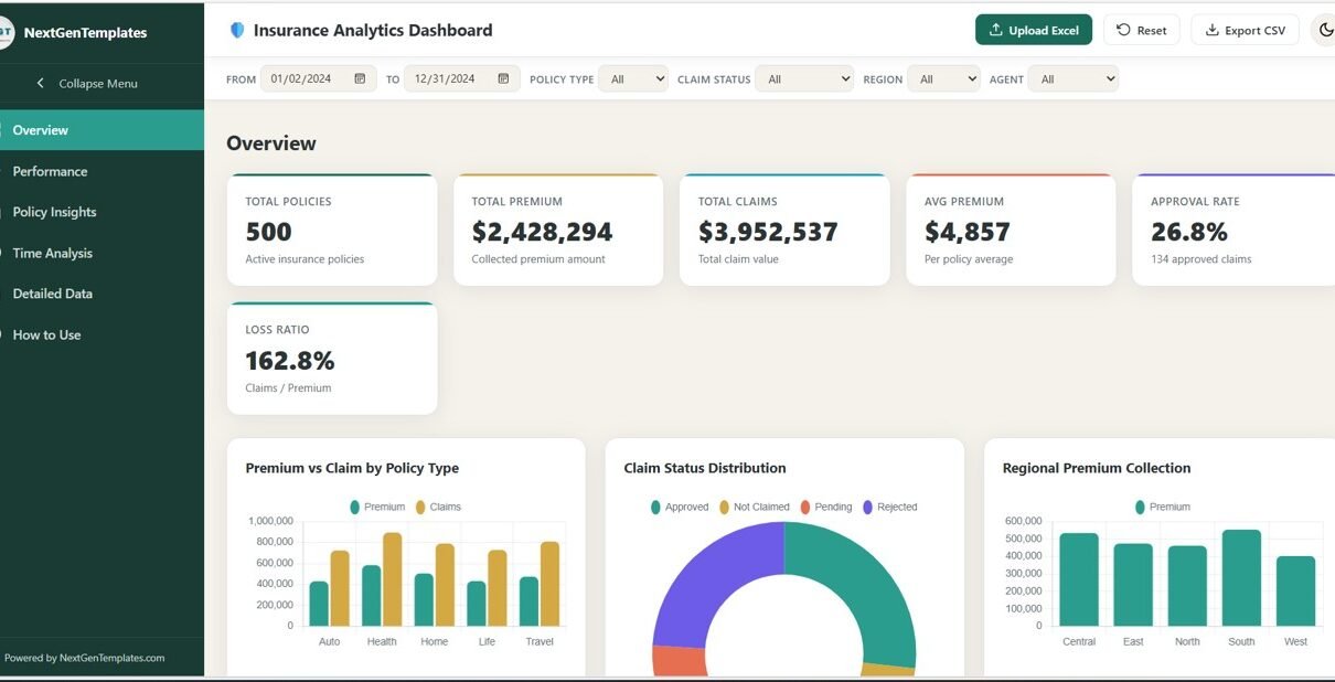
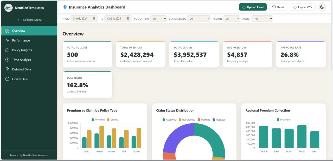
1. Overview Page
The Overview page is the first thing you see when you open the dashboard. It gives you a high-level snapshot of your entire insurance portfolio at a glance.Ke Performance Indicators (KPIs):
- Total Policies — Total number of active insurance policies
- Total Premium — Total collected premium amount in dollars
- Total Claims — Total claim value filed across all policies
- Avg Premium — Average premium amount per policy
- Approval Rate — Percentage of claims that were approved
- Loss Ratio — Claims-to-Premium ratio expressed as a percentage
Charts on this page:
- Premium vs Claim by Policy Type: A grouped bar chart comparing the total premium collected against total claim amounts across each policy type (Health, Auto, Life, Home, Travel).
- Claim Status Distribution: A doughnut chart showing the percentage breakdown of claim statuses — Approved, Rejected, Pending, and Not Claimed.
- Regional Premium Collection: A bar chart visualizing total premium collected across different geographic regions (East, West, North, South, Central).
- Monthly Premium Trend: A line chart tracking how premium collection changes month by month throughout the year.
- Top 10 Sales Agents by Premium: A full-width horizontal bar chart ranking the top 10 performing agents by their total premium generated.
Click to Buy Insurance Analytics Dashboard in HTML
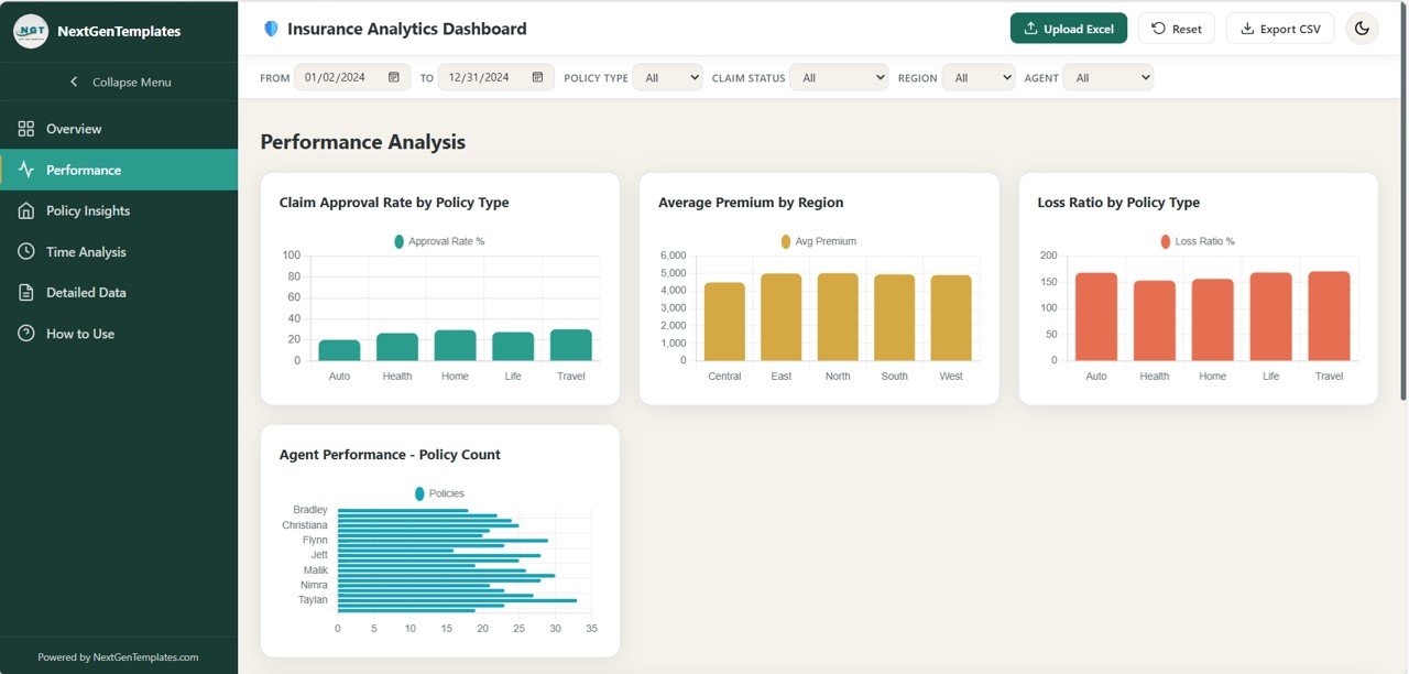
2. Performance Analysis Page
The Performance Analysis page digs deeper into how different segments of your portfolio are performing. It’s ideal for managers and analysts who need to benchmark agents, regions, and policy categories.
- Claim Approval Rate by Policy Type: A bar chart showing what percentage of claims were approved for each type of insurance policy.
- Average Premium by Region: A bar chart comparing average premium values across all regions, helping identify high-value geographic markets.
- Loss Ratio by Policy Type: A visual breakdown of how much is being paid out in claims relative to premiums collected, organized by policy type.
- Agent Performance — Policy Count: A bar chart ranking sales agents by the number of policies they have sold, giving a clear view of productivity.
- Premium vs Claim Scatter (Age): A scatter chart that plots each policy on a grid of premium amount vs. claim amount, with age as a contextual dimension — perfect for spotting risk patterns by customer age group.
Click to Buy Insurance Analytics Dashboard in HTML
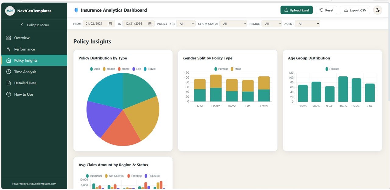
3. Policy Insights Page
The Policy Insights page focuses on the demographic and structural makeup of your insurance portfolio. It helps you understand who your customers are and how different types of policies perform across various segments.
- Policy Distribution by Type: A pie or doughnut chart showing how your total policies are split across Health, Auto, Life, Home, and Travel categories.
- Gender Split by Policy Type: A stacked bar chart revealing the male/female distribution of policyholders for each policy type.
- Age Group Distribution: A histogram or bar chart grouping policyholders into age brackets, revealing which customer segments are most active.
- Avg Claim Amount by Region & Status: A grouped bar chart showing the average claim amount broken down by both region and claim status — useful for identifying high-risk areas.
- Policy Type Premium Heatmap by Region: A full-width heatmap showing premium intensity for each combination of policy type and region, making regional product strategy easy to visualize.
Click to Buy Insurance Analytics Dashboard in HTML
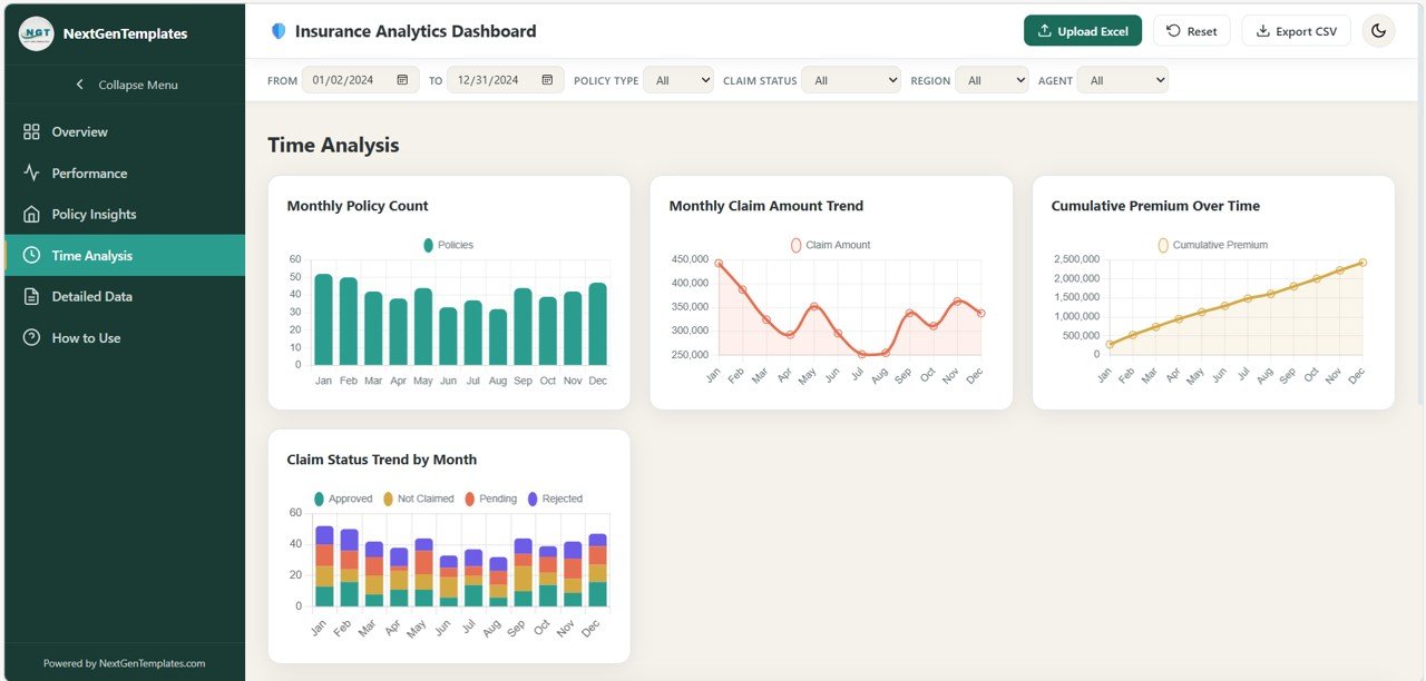
4. Time Analysis Page
The Time Analysis page is all about trends over time. Whether you need to review monthly performance, spot seasonal spikes, or compare year-over-year growth, this page provides it all.
- Monthly Policy Count: A bar chart showing how many new policies were issued each month, helping identify peak sales periods.
- Monthly Claim Amount Trend: A line chart tracking the total claim value filed each month, useful for identifying high-claim seasons.
- Cumulative Premium Over Time: A running total line chart showing how total premium builds up progressively across the months.
- Claim Status Trend by Month: A stacked bar or multi-line chart showing how the distribution of claim statuses (Approved, Rejected, Pending) shifts from month to month.
- Year-over-Year Comparison: A full-width chart comparing key metrics across different calendar years, enabling straightforward performance benchmarking.
Click to Buy Insurance Analytics Dashboard in HTML
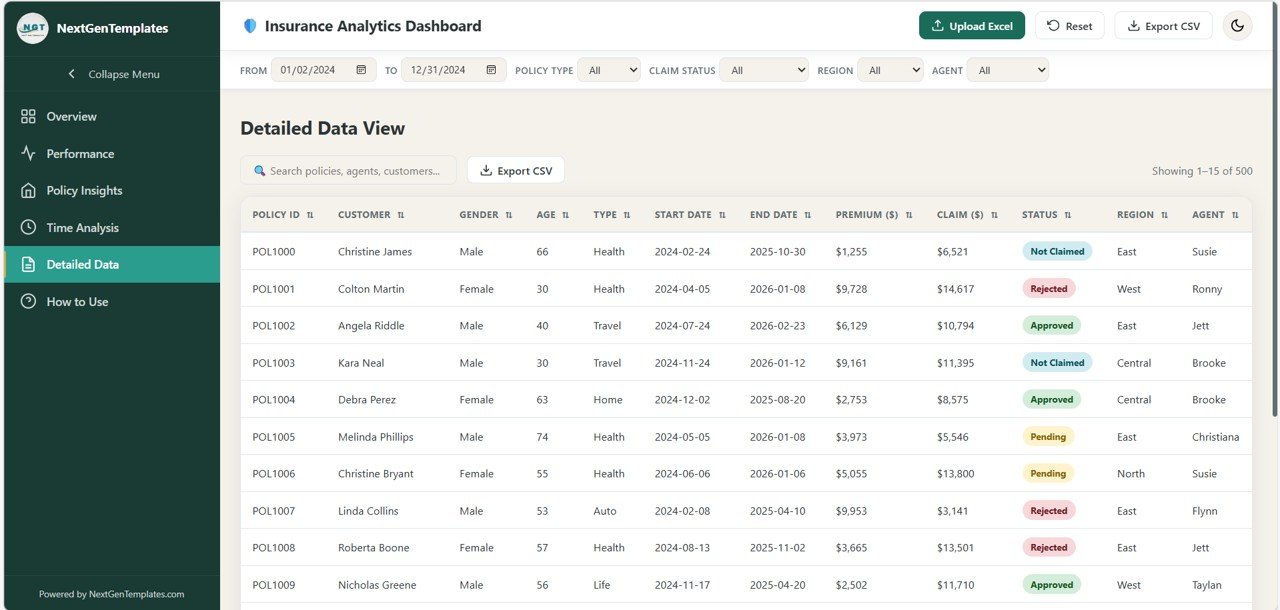
5. Detailed Data Page
The Detailed Data page gives you full access to the underlying records behind all your charts. It’s built for users who need to review, search, and export individual policy records.
- Searchable Data Table: A full-text search box lets you instantly filter records by policy ID, customer name, agent name, or any other field.
- Sortable Columns: Click any column header to sort records ascending or descending by that field.
- Color-Coded Claim Status Badges: Each row displays the claim status (Approved, Rejected, Pending, Not Claimed) as a styled badge for quick visual scanning.
- Pagination: Records are displayed 15 per page with smart pagination controls, keeping the interface fast and clean even with large datasets.
- CSV Export: Export the currently filtered and searched dataset as a CSV file with a single click.
Click to Buy Insurance Analytics Dashboard in HTML
6. How to Use Page
The How to Use page is a built-in guide that helps new users get up and running quickly, without needing any external documentation.
- Upload Instructions: Step-by-step guidance on how to upload an .xlsx Excel file, including multi-sheet workbook support.
- Required Column Reference: A complete list of all column names and formats needed for your Excel data to work perfectly with the dashboard (Policy ID, Customer Name, Gender, Age, Policy Type, Policy Start/End Date, Premium Amount, Claim Amount, Claim Status, Region, Sales Agent).
- Filter Guidance: Explains how global filters work and how they apply across all pages simultaneously.
- Page Summary: A quick reference list of what each page does, so users can navigate purposefully.
- Theme & Privacy Information: Explains how dark/light mode preference is saved and confirms that no data ever leaves the user’s browser.
Who Is This Dashboard For?
The Insurance Analytics Dashboard is designed for a wide range of professionals in the insurance and financial services industry:
- Insurance managers who need a bird’s-eye view of portfolio health
- Claims analysts tracking approval rates and loss ratios
- Sales team leaders monitoring agent performance and premiums
- Finance teams comparing monthly and yearly premium trends
- Consultants and freelancers who need a ready-to-use analytics solution for clients
- Small insurance agencies that can’t afford enterprise BI tools
Why Choose a Single-File HTML Dashboard?
Click to Buy Insurance Analytics Dashboard in HTML
The single-file HTML format is one of this dashboard’s greatest strengths. Here’s why it matters:
- No Installation Required: Just open the file in any modern browser and you’re ready to go.
- Works Offline: No internet connection needed after you have the file. Perfect for secure or air-gapped environments.
- Easy to Share: Send it as an email attachment or save it to a shared drive. Anyone with a browser can use it.
- No Database or Server: SheetJS handles all Excel reading inside the browser. There’s no backend, no API, and no cloud dependency.
- Fully Customizable: Since it’s all contained in one HTML file, developers can easily customize the color scheme, add new charts, or modify the layout.
Get Started Today
Click to Buy Insurance Analytics Dashboard in HTML
The Insurance Analytics Dashboard by NextGenTemplates is the smartest way to turn your raw insurance data into actionable insights — without spending thousands on enterprise software. With 20+ interactive charts, real-time filtering, Excel upload support, and a beautiful responsive design, it’s everything your team needs in a single file.
Whether you’re tracking claim approval rates, analyzing agent performance, or reviewing year-over-year premium growth, this dashboard puts the answers right in front of you.
Visit our YouTube channel to watch the demo.
Watch the step-by-step video tutorial: