Delivering a smooth onboarding experience directly impacts customer satisfaction, product adoption, and long-term retention. However, without clearly defined KPIs and a structured dashboard, onboarding teams often struggle to measure performance accurately. That is exactly why an Onboarding Experience KPI Dashboard in Google Sheets becomes an essential performance management tool.
In this detailed guide, you will clearly understand what an Onboarding Experience KPI Dashboard in Google Sheets is, how it works, which KPIs it tracks, how each KPI is calculated, and how every worksheet supports accurate onboarding analytics. Moreover, this article explains KPI definitions, aggregation formulas, measurement units, and performance direction (Lower the Better or Upper the Better) in a simple and actionable manner.
What Is an Onboarding Experience KPI Dashboard in Google Sheets?
An Onboarding Experience KPI Dashboard in Google Sheets is a structured performance tracking system designed to measure onboarding efficiency, customer engagement, completion speed, satisfaction, and adoption success.
Instead of using disconnected sheets or manual status updates, this dashboard centralizes onboarding KPIs into a single interactive Google Sheets file. As a result, onboarding managers, CX teams, and product owners gain real-time visibility into onboarding performance.
Most importantly, Google Sheets allows dynamic dropdowns, formulas, conditional formatting, and trend analysis without complex BI tools.
Why Track Onboarding KPIs?
Click to Buy Onboarding Experience KPI Dashboard in Google Sheets
Onboarding sets the foundation for the entire customer journey. If onboarding fails, customers disengage quickly. Therefore, tracking onboarding KPIs helps teams:
-
Identify onboarding delays
-
Reduce drop-offs
-
Improve customer satisfaction
-
Increase product adoption
-
Optimize onboarding resources
Because of this visibility, teams move from assumptions to data-driven improvements.
Key Features of Onboarding Experience KPI Dashboard in Google Sheets
In this dashboard, we have 6 structured worksheets, each designed for a specific purpose.
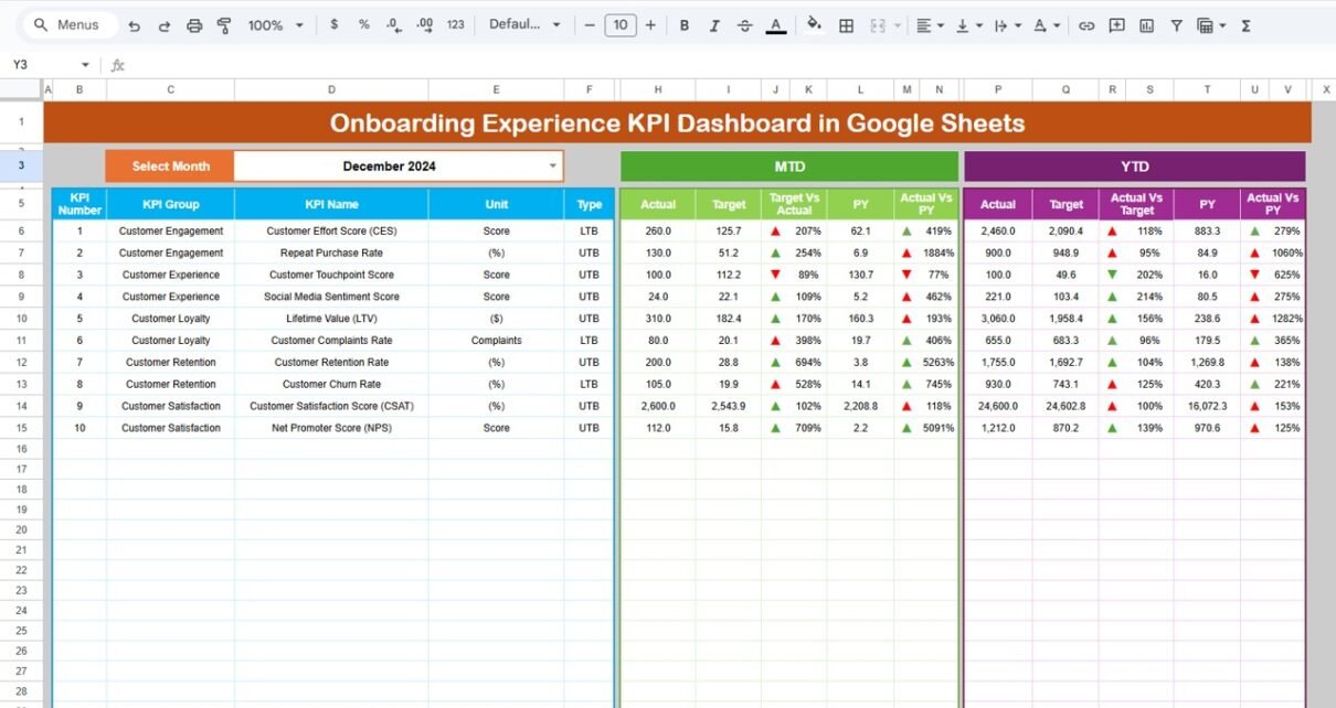
Dashboard Sheet Tab – How Does the Main Dashboard Work?
The Dashboard sheet is the main control center of the Onboarding Experience KPI Dashboard.
Key Features:
Month selection dropdown on Cell D3
Automatic refresh of all KPIs based on selected month
Clear comparison between:
- MTD Actual vs Target
- MTD Actual vs Previous Year
- YTD Actual vs Target
- YTD Actual vs Previous Year
Conditional formatting with up/down arrows for performance trends
KPIs Displayed:
Each KPI displays:
-
Actual value
-
Target value
-
Previous year value
-
Variance %
-
Performance direction (UTB / LTB)

Click to Buy Onboarding Experience KPI Dashboard in Google Sheets
KPI Trend Sheet – How Do KPI Trends Work?
The KPI Trend Sheet helps users understand KPI behavior over time.
Key Features:
KPI dropdown selector on Cell C3
Auto-display of:
- KPI Group
- KPI Unit
- KPI Type (UTB / LTB)
- KPI Formula
- KPI Definition
This sheet provides complete transparency on what each KPI means and how it is calculated.

Click to Buy Onboarding Experience KPI Dashboard in Google Sheets
Actual Number Sheet – How Do You Enter Actual Values?
In the Actual Number Sheet:
-
Month selector available on Cell E1
-
Users enter:
-
MTD Actual values
-
YTD Actual values
-
-
YTD updates automatically based on cumulative logic
This structure ensures clean separation between raw data and reporting.

Click to Buy Onboarding Experience KPI Dashboard in Google Sheets
Target Sheet – How Are Targets Managed?
The Target Sheet stores planned performance targets.
Key Inputs:
-
Monthly MTD targets
-
YTD cumulative targets
-
One row per KPI
Targets automatically reflect on dashboard and trend analysis sheets.

Previous Year Number Sheet – Why Is YoY Comparison Important?
This sheet captures previous year onboarding KPI values.
Because year-over-year comparison highlights improvement or decline, this sheet enables trend benchmarking and realistic goal-setting.

Click to Buy Onboarding Experience KPI Dashboard in Google Sheets
KPI Definition Sheet – Why Is This the Most Important Sheet?
The KPI Definition Sheet acts as the backbone of the entire dashboard.
It contains:
-
KPI Name
-
KPI Group
-
Unit
-
Formula
-
KPI Definition
All dashboard logic pulls metadata from this sheet.

How Does This Dashboard Help Decision-Making?
This dashboard empowers teams to:
-
Improve onboarding efficiency
-
Reduce onboarding delays
-
Increase early product adoption
-
Identify weak onboarding steps
-
Improve customer onboarding experience
Because all KPIs connect dynamically, leadership gains actionable insights in seconds.
Advantages of Onboarding Experience KPI Dashboard in Google Sheets
Click to Buy Onboarding Experience KPI Dashboard in Google Sheets
-
No expensive BI tools required
-
Easy monthly KPI tracking
-
Clear UTB vs LTB visibility
-
Built-in YoY and target comparison
-
Fully customizable KPI framework
Best Practices for the Onboarding Experience KPI Dashboard in Google Sheets
-
Maintain a standardized KPI definition sheet
-
Update actuals regularly
-
Review KPI trends monthly
-
Align targets with product growth phases
-
Keep dashboard visuals clean and focused
Conclusion
Click to Buy Onboarding Experience KPI Dashboard in Google Sheets
The Onboarding Experience KPI Dashboard in Google Sheets provides a powerful, structured way to monitor onboarding performance end-to-end. Because it combines KPI definitions, actuals, targets, trends, and comparisons in one place, onboarding teams gain clarity, control, and confidence.
When implemented correctly, this dashboard transforms onboarding from a reactive process into a measurable growth engine.
Frequently Asked Questions (FAQs)
Is this dashboard suitable for SaaS onboarding?
Yes, it works perfectly for SaaS, apps, and digital platforms.
Can I add more KPIs later?
Yes, the KPI Definition Sheet allows easy scalability.
Does this dashboard support MTD and YTD tracking?
Yes, it fully supports both MTD and YTD performance.
Can non-technical users use this dashboard?
Yes, Google Sheets keeps it simple and user-friendly.
How often should onboarding data be updated?
Weekly or monthly updates deliver the best results.
Visit our YouTube channel to learn step-by-step video tutorials
Youtube.com/@NeotechNavigators
Watch the step-by-step video tutorial:
Click to Buy Onboarding Experience KPI Dashboard in Google Sheets