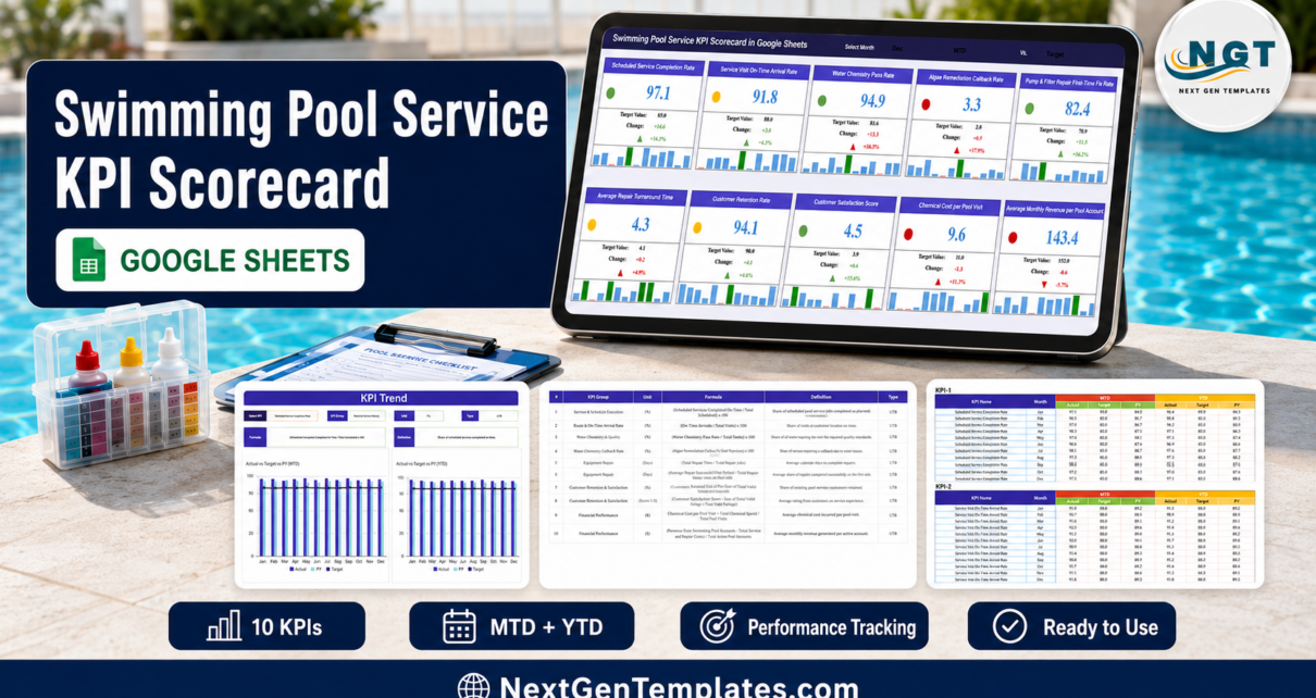
Ask a pool service owner how last month went and you will usually get a story about the weather. Ask for the numbers and most of them reach for a route app, a chemical invoice and a bank balance. The Swimming Pool Service KPI Scorecard in Google Sheets replaces that with one screen: ten pool-service KPIs, each with an actual, a target, the gap in units and in percent, an arrow, a red / amber / green light and a twelve-month mini bar strip. In the December sample that ships with the file, four KPIs are green, three amber and three red – and the reds are the ones costing money.Swimming Pool Service KPI Scorecard in Google Sheets
Get the Swimming Pool Service KPI Scorecard in Google Sheets

It is a month-picker scorecard, built on eight Google Sheets tabs of which four are the ones you look at, and 120 rows of editable monthly data. It is not an analytics dashboard with slicers and pivot pages, and it is not the KPI Dashboard family – a distinction worth making, because near-identical names exist across all three lines in the shop. This post walks through what is actually on each page, where the sheet stops, two build quirks worth knowing about before you copy it, and how to run a monthly numbers meeting off it.Swimming Pool Service KPI Scorecard in Google Sheets
Key Features of the Swimming Pool Service KPI Scorecard
- Ten pool KPIs in five groups – Route & Service Delivery, Water Chemistry & Quality, Equipment Repair, Customer Retention & Satisfaction and Financial Performance, two metrics each.
- Three header pickers – month, MTD or YTD basis, and whether the comparison column shows Target or prior year. All three drive every card at once.
- Traffic lights with a published rule – the RAG bands live on a Color Settings tab you can edit: for an upper-is-better KPI, a variance at or below 0% is red, up to 10% is amber and above 10% is green, and lower-is-better mirrors that.Swimming Pool Service KPI Scorecard in Google Sheets
- Direction-aware scoring – seven KPIs are flagged UTB and three LTB, so Algae Remediation Callback Rate, Average Repair Turnaround Time and Chemical Cost per Pool Visit are scored as things you want to go down.Swimming Pool Service KPI Scorecard in Google Sheets
- Twelve-month bar strip per card – the highest month of the year is picked out in dark green and the lowest is marked in red underneath, so you see the shape of the year without leaving the card.Swimming Pool Service KPI Scorecard in Google Sheets
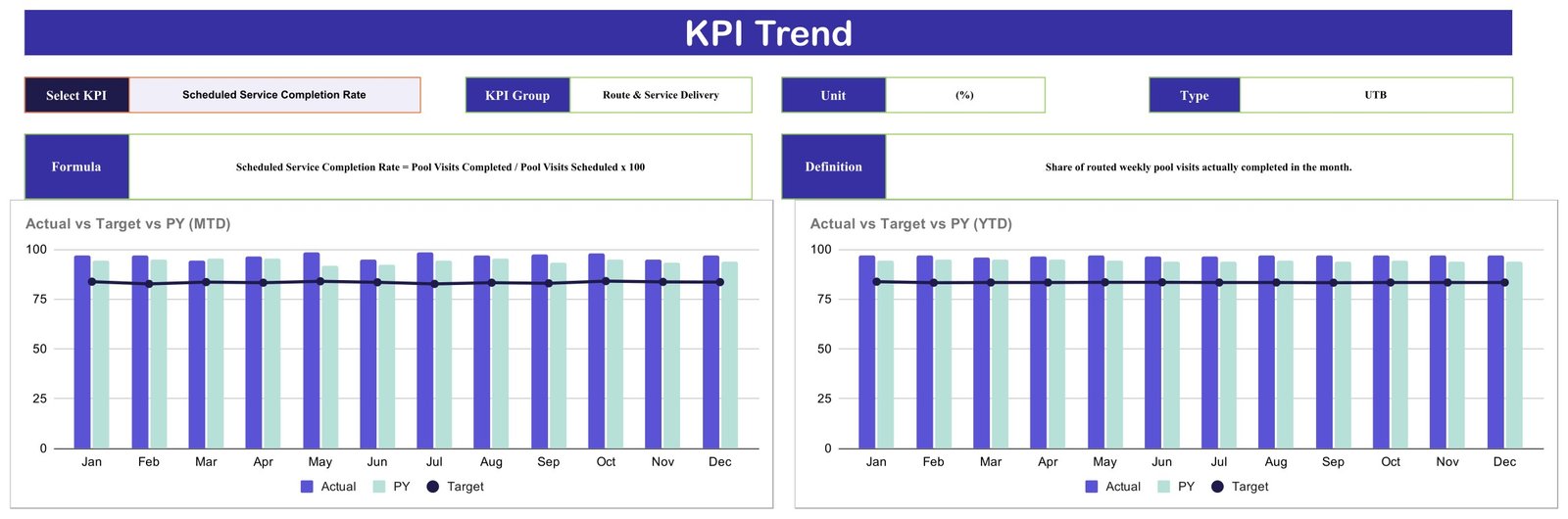
- A KPI Trend page – one dropdown, then the selected KPI’s group, unit, type, formula and definition, plus MTD and YTD charts of Actual vs Target vs PY across twelve months.
- Written formulas and definitions – all ten, on their own page, in plain English.
- Google Sheets, free account, no add-ons – a copy link creates the file in your own Drive.
The Four Pages, Explained
Page 1 – the Scorecard
The header row carries the title, a Select Month cell, an MTD / YTD cell and a Vs. Target cell. Under it, ten cards in two rows of five. Here is exactly what the December sample shows, in the order the cards appear:
| # | KPI | Group | Type | Dec actual | Target | Light |
|---|---|---|---|---|---|---|
| 1 | Scheduled Service Completion Rate | Route & Service Delivery | UTB | 97.1% | 83.5% | Green |
| 2 | Service Visit On-Time Arrival Rate | Route & Service Delivery | UTB | 91.8% | 88.1% | Amber |
| 3 | Water Chemistry Pass Rate | Water Chemistry & Quality | UTB | 94.9% | 81.6% | Green |
| 4 | Algae Remediation Callback Rate | Water Chemistry & Quality | LTB | 3.3% | 2.8% | Red |
| 5 | Pump & Filter Repair First-Time Fix Rate | Equipment Repair | UTB | 82.4% | 70.9% | Green |
| 6 | Average Repair Turnaround Time | Equipment Repair | LTB | 4.3 days | 4.1 days | Amber |
| 7 | Customer Retention Rate | Customer Retention & Satisfaction | UTB | 94.1% | 90.3% | Amber |
| 8 | Customer Satisfaction Score | Customer Retention & Satisfaction | UTB | 4.5 / 5 | 3.9 / 5 | Green |
| 9 | Chemical Cost per Pool Visit | Financial Performance | LTB | $9.6 | $8.3 | Red |
| 10 | Average Monthly Revenue per Pool Account | Financial Performance | UTB | $143.4 | $152.0 | Red |
Four green, three amber, three red. Notice how the bands work in practice: Customer Retention Rate is above target and still amber, because +4.2% variance falls in the amber band rather than the green one. That is the point of a banded light rather than a pass/fail tick – beating a target by a whisker is not the same as beating it comfortably.
Page 2 – KPI Trend
A Select KPI dropdown, then read-only fields that fill themselves in: KPI Group, Unit, Type, Formula and Definition. With Scheduled Service Completion Rate chosen, the page reports the Route & Service Delivery group, a (%) unit, UTB type, the formula Pool Visits Completed / Pool Visits Scheduled x 100 and the definition “share of routed weekly pool visits actually completed in the month”. Two clustered column charts sit below – Actual vs Target vs PY (MTD) on the left and the YTD version on the right – each with Jan to Dec on the axis, Actual and PY bars and a Target line running across.

Page 3 – the KPI definitions
One table, ten rows, columns for #, KPI Group, KPI Name, Unit, Formula, Definition and Type. Units run (%), (Days), (Score 1-5) and ($). This is the page you edit if you want different metrics – change the name, the group, the unit, the formula text, the definition and the UTB / LTB flag, and the scorecard and trend pages follow, because both look a KPI up by name.
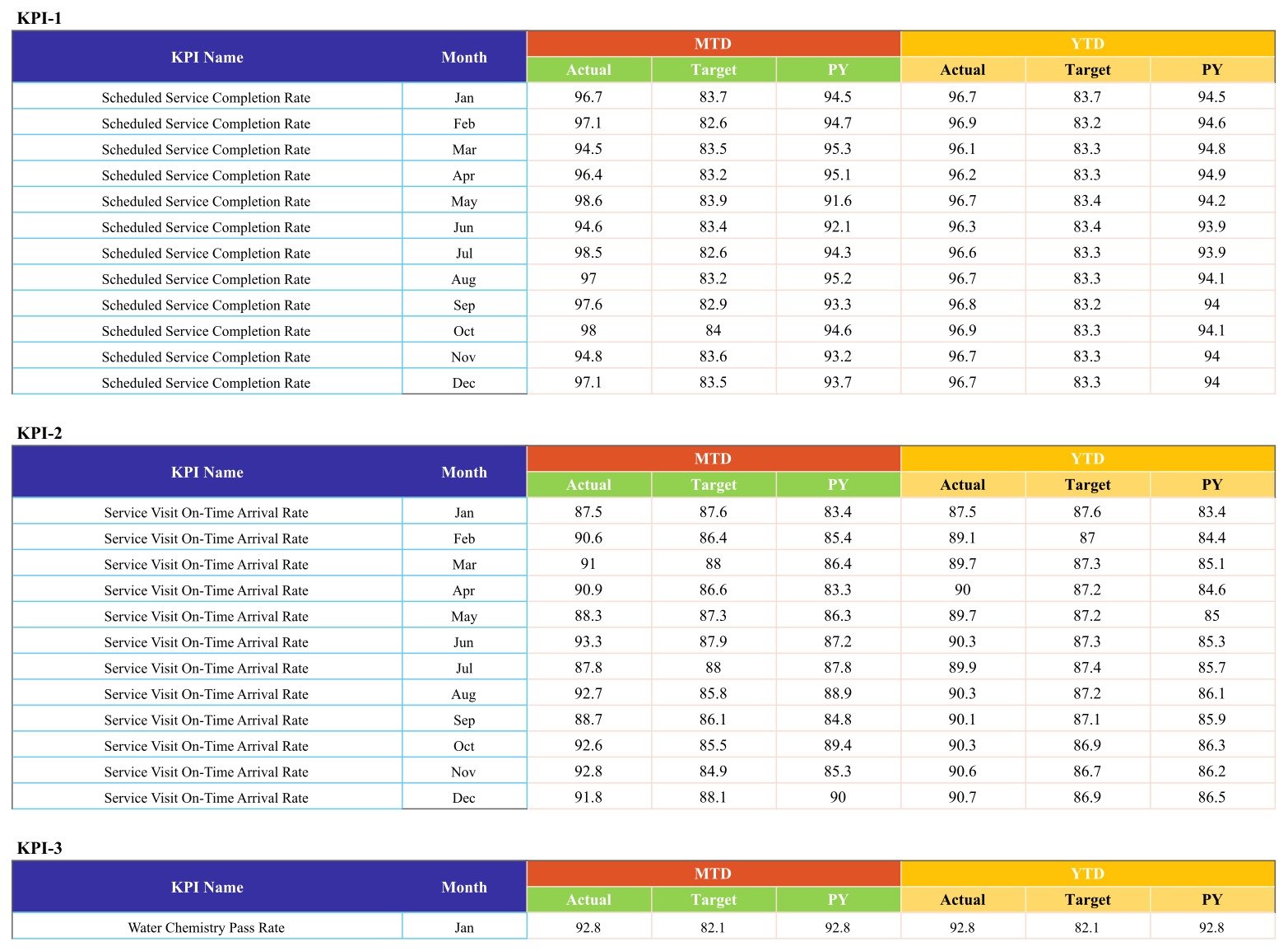
Page 4 – the monthly data
One block per KPI, headed KPI-1 to KPI-10, twelve rows each. Every row carries MTD Actual, Target and PY, then YTD Actual, Target and PY, in colour-coded column groups. 120 rows in total and the only page you type into. The sample figures genuinely vary month to month – Scheduled Service Completion Rate, for instance, runs 96.7, 97.1, 94.5, 96.4, 98.6, 94.6, 98.5, 97.0, 97.6, 98.0, 94.8, 97.1 across the year – so switching the month picker produces a different board rather than the same numbers with a new label.
Two further tabs sit behind these: Color Settings, holding the RAG variance table, and a pair of calculation tabs (Support and Trend_Support) that do the lookups. You do not need to touch either, but the bands on Color Settings are worth a look if your business runs to tighter tolerances.
Swimming Pool Service KPI Scorecard vs. Excel vs. Paid Pool Software – Feature Comparison
| This Google Sheets scorecard | The Excel edition | Paid pool service software | |
|---|---|---|---|
| Cost | One-time 13.99 (8.99 on sale) | One-time purchase | Roughly 50-300 per month |
| Platform | Any browser, free Google account | Excel desktop | Vendor web and mobile app |
| Setup | Copy the sheet, replace 120 rows | Open the workbook, replace the data | Route and customer import, days to weeks |
| Works offline | No | Yes | Partly, via the mobile app |
| Share with a link | Yes | No | Per-seat login |
| KPI set | Ten, all editable | Ten – a different ten, see below | Vendor-defined |
| Routing, dispatch, invoicing | No | No | Yes |
| Pulls data automatically | No – typed in | No – typed in | Yes |
How the Google Sheets and Excel Editions Differ
There is a companion listing, the Swimming Pool Service KPI Scorecard in Excel, and it is worth being clear that it is not this file converted. Both editions ship ten KPIs in five groups with seven upper-is-better and three lower-is-better, a month picker, traffic lights and MTD/YTD – but the metrics themselves are different, and not one KPI name is shared between them.
- Only in the Google Sheets edition: Scheduled Service Completion Rate, Service Visit On-Time Arrival Rate, Water Chemistry Pass Rate, Average Repair Turnaround Time and a 1-5 Customer Satisfaction Score.
- Only in the Excel edition: Pools Serviced, Route Density, Avg Response Time, Technician Utilisation and Water Balance Compliance.
- Close cousins with different wording: Callback Rate there is narrowed to Algae Remediation Callback Rate here; First-Visit Fix Rate there is narrowed to Pump & Filter Repair First-Time Fix Rate here; Revenue per Pool and Chemical Cost per Pool become Average Monthly Revenue per Pool Account and Chemical Cost per Pool Visit.
- The group names differ entirely – Operations / Service Quality / Workforce / Financial / Customer in Excel, against Route & Service Delivery / Water Chemistry & Quality / Equipment Repair / Customer Retention & Satisfaction / Financial Performance here.
- Different shape: eight tabs and ten KPI card slots here; an eleven-sheet workbook with twenty KPI slots, and offline use, there.
Neither edition carries a safety or incident KPI. Pick the one whose metric list matches how you already describe the business – or take both if you want the volume and workforce numbers alongside the scheduling and repair ones.
Who Should Use This Template
Owner-operators and small-to-mid pool service companies running weekly or fortnightly routes; office managers who rebuild the same monthly summary by hand; operations leads who want scheduling, water quality, repair-desk and money numbers on one page. It is a management reporting page, so it suits anyone who already holds a monthly review and wants a fixed board to hold it against.
It is the wrong tool if you need live data from your route or accounting software, alerts when something turns red, per-technician or per-pool drilldown, or a record an inspector would accept.
Real-World Use Cases
Nina runs 340 residential accounts across four routes. Her recurring argument was whether the crew was finishing the week. Scheduled Service Completion Rate at 97.1 against an 83.5 target settled it. What was actually red on the same board was Average Monthly Revenue per Pool Account – 143.4 against a 152.0 target, down 5.7% with a down arrow – which moved the conversation from crew performance to pricing.
Marcos runs the repair desk. Pump & Filter Repair First-Time Fix Rate was green at 82.4 against 70.9, but Average Repair Turnaround Time was amber at 4.3 days against 4.1 and drifting up. Both sit in the Equipment Repair group, side by side, and that adjacency is the whole read: the repairs were right first time, the wait to get to them was not. He changed how repair jobs were slotted into the route instead of retraining anyone.
Priya reviews the money side. Chemical Cost per Pool Visit came in red at 9.6 against 8.3, up 15.7%, in a month when Water Chemistry Pass Rate was green at 94.9. She pulled the twelve-month line on the KPI Trend page, saw a steady climb rather than one bad month, and took it to the supplier rather than the technicians.
Advantages of the Swimming Pool Service KPI Scorecard
- One board, one meeting. Ten numbers, one screen, roughly fifteen minutes a month.
- The scoring rule is visible and editable. The RAG bands are cells on a tab, not hidden conditional formatting you cannot reason about.
- Direction is handled properly. Metrics you want to fall are marked LTB and scored that way, which is where most home-made scorecards quietly go wrong.
- Every KPI is documented in the file. Formula and definition on their own page, so a new office manager reads the number the same way as the last one.
- No lock-in. A one-time price, a copy in your own Drive, no seats and no renewal.
Opportunities for Improvement
Three honest notes from going through the live sheet page by page, so nothing is a surprise after you copy it:
- The month dropdown has two labels that do not match the data. The Select Month list on the Scorecard offers “June” and “July” in full, while the Month column on the Input Data page stores the short forms “Jun” and “Jul” like every other month. The cards match a month by exact text, so choosing June or July from the dropdown returns no match and blanks every card. The fix takes a few seconds in your own copy: select the month cell, open Data > Data validation, and change “June” to “Jun” and “July” to “Jul” in the list. The other ten months work as expected.
- The Read Me tab ships empty. There is a tab named Read Me in the file and it has nothing on it. Nothing else depends on it, so you can delete it or write your own house notes there.
- One card renders its change figure in red when the light is green. On the December view, Water Chemistry Pass Rate shows +13.3 and +16.3% in red with a red arrow even though the traffic light is correctly green and the sheet’s own formula computes a green arrow. It is a rendering quirk on that one card of ten and the underlying numbers and light are right.
Beyond those, the usual boundaries apply: no integrations, no imports, no alerts, no per-pool drilldown, and ten card slots on the scorecard page rather than an unlimited list.
Best Practices
- Set targets you would actually defend. The lights are only as meaningful as the Target column – soft targets produce a green board that tells you nothing.
- Fill the prior-year columns. The Vs. cell lets you flip every card from Target to PY, which is the fastest way to separate “we are behind plan” from “we are behind last year”.
- Change the UTB / LTB flag whenever you rename a KPI. If you swap a rate for a cost and leave the flag on UTB, the sheet will cheerfully mark the wrong direction green.
- Lead the meeting with the trend page, not the card. A red card tells you where to look; the twelve-month MTD and YTD charts tell you whether it is a blip or a slope.
- Keep the month labels consistent across the picker and the data page – see the note above.
- Share it view-only with anyone who only needs to read it, so the formula pages stay intact.
Explore Relevant Templates
- Swimming Pool Service KPI Scorecard in Excel – the companion edition with its own ten KPIs and twenty slots.
- Pool Maintenance Checklist in Google Sheets – the per-visit list that generates the numbers this board reports.
- Plumbing Business KPI Scorecard in Google Sheets – the closest service-trade neighbour on the same template line.
- HVAC Contractor KPI Scorecard in Google Sheets – handy if you run pools and mechanical work under one roof.
Want to build skills like this step by step? The Excel Pivot Tables & Dashboards course on NextGenTemplates Academy walks you through it with practice files.
Get the Swimming Pool Service KPI Scorecard in Google Sheets
Frequently Asked Questions
Is this the KPI Scorecard, the KPI Dashboard or the analytical Dashboard?
The KPI Scorecard line – a month-picker board with ten KPI cards, traffic lights, a KPI Trend page and a definitions page. The analytical Dashboard family is chart-and-slicer driven and the KPI Dashboard family is a different template again. All three carry near-identical names, so check that the title ends in KPI Scorecard in Google Sheets.
Does it connect to my route, chemical-logging or accounting software?
No. No integrations, no imports, no API, no sync. You type the monthly values into the Input Data page. That is the trade-off that keeps it a one-time 13.99 sheet.Swimming Pool Service KPI Scorecard in Google Sheets
Will it alert me when a KPI goes red?
No. No alerts, no notifications, no scheduled emails. The lights are visual only, on the sheet.Swimming Pool Service KPI Scorecard in Google Sheets
Is the Water Chemistry Pass Rate a testing or compliance record?
No. It is a summary percentage you work out and type in yourself. It is not a chemical log, not a test record, not evidence for a health department, and the template offers no dosing, testing, water-safety or public-health guidance at all. Keep whatever testing and record-keeping your local rules require exactly as you do today.Swimming Pool Service KPI Scorecard in Google Sheets
Can I swap in my own KPIs?
Yes. Name, group, unit, formula text, definition and UTB / LTB type are all editable cells on the definitions page, with a matching twelve-month block on the data page. Keep the row structure and everything downstream follows. The scorecard shows ten cards.Swimming Pool Service KPI Scorecard in Google Sheets
Do I need a paid Google Workspace account?
No. A free Google account is enough. The copy link puts the file in your own Drive and it stays yours.Swimming Pool Service KPI Scorecard in Google Sheets
How long does setup take?
Copying the sheet is instant. Replacing 120 rows of sample data takes as long as it takes you to pull twelve months of figures together – most people do the current year in an hour and add a month at a time after that.
About the Author
Built by PK – Microsoft Certified Professional with 15+ years of Excel, Google Sheets, and Power BI experience. Founder of NextGenTemplates, reaching 300K+ subscribers across YouTube channels. Every template is hand-built and tested before release.Swimming Pool Service KPI Scorecard in Google Sheets
Conclusion
Pool service is a business of small recurring margins across a lot of accounts, which makes it exactly the kind of operation where a monthly board beats a monthly feeling. Ten numbers, five groups, one screen, and a rule for the colours that you can see and change. Fix the two-month dropdown label in your copy, replace the sample data, set targets you would defend, and you have a review meeting that runs itself.Swimming Pool Service KPI Scorecard in Google Sheets
Get the Swimming Pool Service KPI Scorecard in Google Sheets – one-time payment, instant download, no subscription.