
Hey there! Ready to turn your Google Sheets into a powerful dashboard? Well, you’re in luck because today we’re diving into the world of Ultimate Gauge Chart Guide in Google Sheet! These charts are not just cool to look at; they’re incredibly useful for visualizing data like service levels. So, let’s get started and show you how to set one up, step by step.
Ultimate Gauge Chart Guide in Google Sheet
Setting Up Your Data
First things first, let’s lay the groundwork with your data:
Step 1: Prepare Your Workspace
- Open a New Sheet: Create a clean slate for your project.
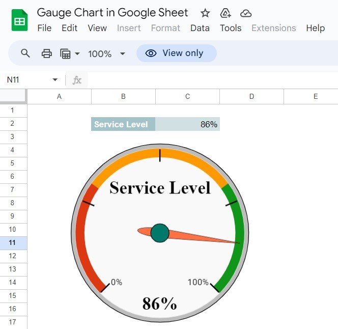
- Input Your Data: Type in your KPIs. For instance, if we’re tracking service level, it might look something like this:
This will be the foundation of our gauge chart.
Step 2: Inserting the Gauge Chart
Next up, let’s bring this data to life with a chart:
- Select Your Data: Highlight the cells where you’ve input your service level.
- Go to Insert: From the menu, choose ‘Chart’ and then morph it into a gauge chart. This is where the magic happens!
Why Use a Gauge Chart?
Now, you might wonder why go through all this trouble? Here are some quick wins:
- Instant Insights: Gauge charts make it super simple to see where you stand at a glance.
- Real-Time Updates: With dynamic setups, your chart reflects changes the moment your data does.
- Visually Appealing: Let’s be honest, they just look great on reports and dashboards!
Best Practices for Gauge Charts
To make your gauge chart truly useful, keep these tips in mind:
- Simplicity is Key: Don’t overload your chart. Keep it focused on key info.
- Vivid Colors: Use strong, contrasting colors for clarity and quick insights.
- Regular Reviews: Check in on your chart settings regularly to ensure they still meet your needs as your data evolves.
Wrapping Up
And there you have it! You’re now ready to create gauge charts in Google Sheets that not only look good but also provide valuable insights at a glance. Dive in, experiment with your settings, and watch how your data visualization skills skyrocket!
Frequently Asked Questions
Q. How do I ensure my gauge chart reflects accurate changes?
To keep your chart accurate, use dynamic formulas that update based on your data inputs. This way, your chart always shows the latest info.
Q. Can I track more than one KPI with a gauge chart?
Absolutely! While each gauge chart represents one KPI, you can set up multiple charts in a dashboard to track different metrics simultaneously.
Q. What if my gauge chart isn’t displaying as expected?
Double-check your selected data and the chart setup. Make sure your ranges and conditions are correctly defined in the chart properties.
Visit our YouTube channel to learn step-by-step video tutorials
Youtube.com/@NeotechNavigators


