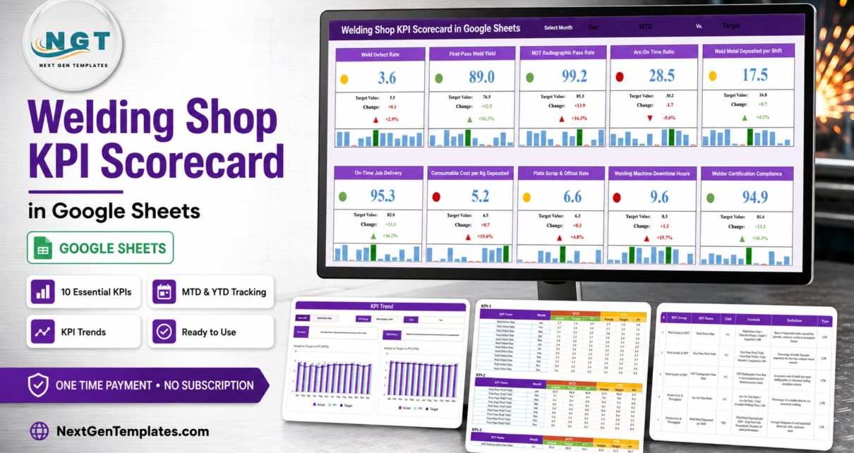
Most welding and fabrication shops measure exactly two things well: whether the job went out, and whether the invoice got paid. Everything in between – how many welds came back for rework, how much of a paid welder hour the arc was actually burning, what a kilogram of deposited weld metal really costs in wire and gas – lives in a notebook, a foreman’s head, or nowhere at all. The Welding Shop KPI Scorecard in Google Sheets is a four-sheet template that closes that gap with 10 KPIs on one page, each one scored red, amber or green against a target you set yourself.
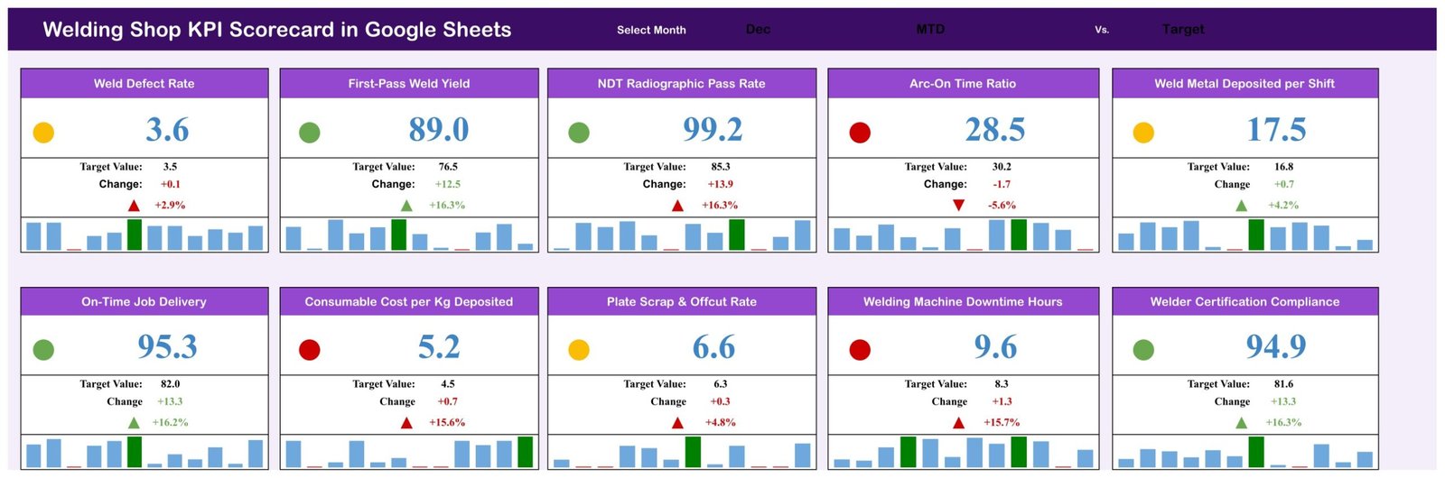
It is deliberately small. Ten numbers a month, typed into one data sheet, produce a scorecard you can screenshot straight into a management pack. In the December sample data that ships with it, Weld Defect Rate sits at 3.6% against a 3.5% target, First-Pass Weld Yield at 89.0% against 76.5%, Arc-On Time Ratio at 28.5% against 30.2%, and Welding Machine Downtime at 9.6 hours against 8.3. Four of the ten cards are green, three amber, three red – which is roughly what an honest shop scorecard should look like.
Get the Welding Shop KPI Scorecard in Google Sheets
Key Features of the Welding Shop KPI Scorecard in Google Sheets
- 10 KPIs in 4 groups. Weld Quality & NDT (Weld Defect Rate, First-Pass Weld Yield, NDT Radiographic Pass Rate); Productivity & Throughput (Arc-On Time Ratio, Weld Metal Deposited per Shift, On-Time Job Delivery); Cost & Consumables (Consumable Cost per Kg Deposited, Plate Scrap & Offcut Rate); Safety, Equipment & Compliance (Welding Machine Downtime Hours, Welder Certification Compliance).
- A month picker in the header. Change the month and all ten cards recalculate together – there is nothing to refresh or rebuild.
- Traffic-light status per KPI. A coloured dot on every card compares the month’s actual against your target and shows green, amber or red.
- Target, absolute change and percentage change on every card, with an up or down arrow. Consumable Cost per Kg Deposited reads 5.2 against a 4.5 target: +0.7, +15.6%, arrow up, dot red.
- A 12-month bar strip on each card with the selected month highlighted, so a single bad month is instantly distinguishable from a slide.
- Direction-aware scoring. Each KPI carries a type – LTB (lower the better) or UTB (upper the better) – so Weld Defect Rate and Plate Scrap are judged the right way round instead of being penalised for falling.
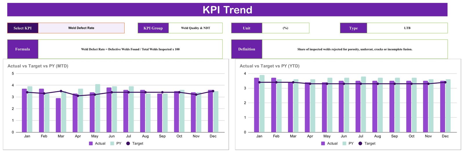
- A dedicated KPI Trend page with a Select KPI dropdown, the KPI’s group, unit, type, formula and definition, and two Jan-to-Dec charts.
- A printable KPI Analysis table documenting all ten formulas and definitions.
- Plain Google Sheets. No add-ons, no scripts to authorise, no subscription. Share it by link, open it on a phone in the shop, rename anything you like.
Scorecard Pages Explained
Page 1 – KPI Scorecard
The header runs Select Month plus two switches: one sets the period (MTD) and one sets what you are comparing against (Target). Underneath, ten cards sit in two rows of five. Each card gives you the KPI name, the status dot, the big current value, the target value, the change in absolute terms, the change as a percentage, and the twelve-month bar strip. It is the only page most people will look at.
Page 2 – KPI Trend
Choose one KPI from the dropdown and the page fills in its KPI Group, Unit and Type, then its formula and definition in full. Weld Defect Rate, for instance, reads Defective Welds Found / Total Welds Inspected x 100, defined as the share of inspected welds rejected for porosity, undercut, cracks or incomplete fusion. Below sit two charts – Actual vs Target vs PY (MTD) and Actual vs Target vs PY (YTD) – each plotting January to December with this year’s actual as a column, last year as a lighter column, and the target as a line. The MTD chart shows month-by-month volatility; the YTD chart smooths it into a cumulative picture.
Page 3 – KPI Analysis
One table, ten rows, seven columns: number, KPI group, KPI name, unit, formula, definition and type. This is the page that stops arguments. When your estimator and your QA lead disagree about what “first-pass yield” counts, you point at row 2 – Welds Accepted on First Inspection / Total Welds Completed x 100 – and move on.
Page 4 – Data
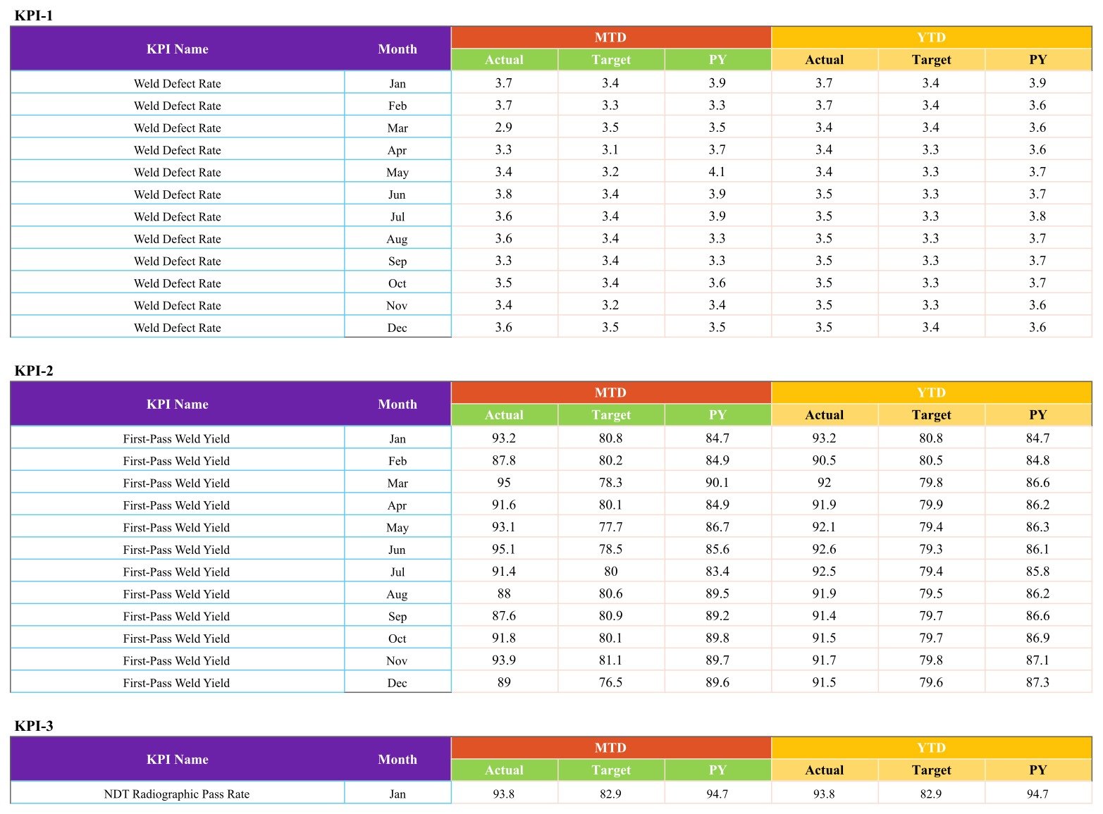
One block per KPI, twelve monthly rows each, with MTD and YTD columns holding Actual, Target and PY. This is the only sheet you type into, and everything on the other three pages traces back to it.
Welding Shop KPI Scorecard vs. an Excel Scorecard vs. Paid Shop-Floor Software – Feature Comparison
| This Google Sheets scorecard | The same scorecard in Excel | Paid shop-floor / MES software | |
|---|---|---|---|
| Cost | $8.99 one time | $9.99-$15.99 one time | $60-$250 per user per month |
| Platform | Google Sheets, any browser | Excel for Windows or Mac | Vendor cloud or on-premise server |
| Setup time | About a minute to copy, then type your numbers | Download and open | Weeks of configuration and training |
| Real-time team collaboration | Yes, built in | Only through OneDrive or SharePoint | Yes |
| Mobile access | Yes, via the Google Sheets app | Limited | Usually yes |
| Rename KPIs, formulas and targets | Yes, all editable | Yes, all editable | Often locked to the vendor’s model |
| Share with a link | Yes | No | Seat-based logins |
| Year-1 cost at 5 users | $8.99 | $9.99-$15.99 | $3,600-$15,000 |
| KPIs supplied out of the box | 10, grouped into 4 themes | 10, same structure | Hundreds, most of which you will not use |
| Where the numbers come from | You type them in monthly | You type them in monthly | Machine and ERP feeds |
The last row is the real dividing line, and it is worth being blunt about it. This is a reporting sheet, not a data-collection system. Nothing is read off your welding sets, your ERP or your accounting package. If you want automated capture, you want the third column and its price tag. If you want ten numbers a month turned into a defensible one-page review, you want the first.
Who Should Use This Template
It fits best in a welding, fabrication or structural steel shop with roughly 3 to 40 welders – big enough that the owner can no longer hold every number in their head, small enough that a full MES would be absurd. It also works well for a job shop that already records defects and downtime somewhere but has never put them next to each other, for a shop manager who has to produce a monthly review for an owner or board, and for a fabricator preparing for a customer audit who wants a tidy history of self-reported quality figures.
It is the wrong tool if you need live machine-level data, job-by-job or welder-by-welder costing, document control for weld procedures or welder qualification records, or anything that raises an alert on its own. It does none of those, and pretending otherwise would only waste your money.
Real-World Use Cases
The rework argument, settled. A 14-welder structural shop suspected rework was eating margin but could not size it. Four quality numbers a month later, the Weld Defect Rate card sits amber at 3.6% against a 3.5% target, and the MTD trend chart shows it has stayed within half a point of target all year. The conversation shifts from “is rework a problem” to “3.6 is close enough – Arc-On Time at 28.5 against 30.2 is where the money is”.
The quarterly board pack. A pressure-vessel shop manager screenshots the scorecard page plus two KPI Trend pages into her deck. Ten minutes of work, and the board sees actual against target against prior year rather than a wall of raw figures.
The three-KPI owner. A working owner-welder with three staff cares about On-Time Job Delivery, Consumable Cost per Kg Deposited and Welding Machine Downtime Hours and nothing else. He renamed the other seven KPIs to suit his own jobs; the scorecard took the renames without breaking, because every label reads from the Data sheet.
Advantages of the Welding Shop KPI Scorecard in Google Sheets
- It takes about a minute to start. Click “Make a copy” from the PDF in your download and the sheet is in your own Drive.
- Ten KPIs is a sustainable number. Scorecards die from being too big. Ten is small enough that someone will actually fill it in every month.
- The definitions travel with the template. Every KPI carries its formula and its plain-English definition, so the numbers mean the same thing next year and to the next manager.
- Direction-aware scoring avoids the classic bug where cost and defect KPIs are marked down for improving.
- Prior-year comparison is built in, not bolted on – the Data sheet holds PY alongside Actual and Target for both MTD and YTD.
- One payment, no seats. Share the link with as many people as you like.
Opportunities for Improvement
Being fair about the limits: entry is manual, so the sheet is only as current as the last person who typed into it. There is no alerting, no email, no scheduled refresh – you open it and look. The sample data covers a single twelve-month year, so multi-year history means extending the Data sheet yourself. The scorecard is shop-level: it will not break a KPI down by welder, customer or job without work. And because the KPI cards are laid out as a fixed grid of ten, adding an eleventh KPI means copying a card block rather than typing one row. None of these are defects – they are the price of a template that stays this simple – but they are worth knowing before you buy.
Best Practices
- Fix the definitions before the first entry. Read the KPI Analysis page with your foreman and QA lead and reword anything that does not match how the shop already counts. Changing a definition in month seven ruins the trend.
- Set targets you actually believe. The sample targets are placeholders. A target nobody expects to hit turns the whole page red and the scorecard gets ignored.
- Book a fixed slot. First Monday of the month, twenty minutes, one person types. Consistency beats precision here.
- Protect the Data sheet. Give the shop view-only access and keep editing with one or two people – Google’s protected sheets and ranges handle this in a couple of clicks.
- Screenshot the scorecard each month and keep the images. A year of scorecard snapshots is a surprisingly good audit trail of how you managed the shop.
- Do not chase every red. Pick the one red card with the biggest financial consequence and work on it until it is amber.
Explore Relevant Templates
- Equipment Maintenance Log Tracker in Google Sheets – the day-to-day log that feeds your Welding Machine Downtime Hours figure.
- Daily Production Output Tracker in Google Sheets – daily output behind the monthly throughput numbers.
- Workplace Safety KPI Dashboard in Google Sheets – the safety side of the same shop, in the KPI Dashboard format.
- Operational Efficiency KPI Dashboard in Google Sheets – the chart-led alternative if you want to slice rather than score.
- Plumbing Business KPI Scorecard in Excel – the same scorecard engine for a different trade, in Excel.
- Steel & Metals Dashboard in Power BI – for a metals operation that has outgrown a spreadsheet.
Want to build skills like this step by step? The Excel Pivot Tables & Dashboards course on NextGenTemplates Academy walks you through it with practice files.
Get the Welding Shop KPI Scorecard in Google Sheets
Frequently Asked Questions
Does this template certify welders, qualify weld procedures, or manage inspection records?
No – to all three. Welder Certification Compliance and NDT Radiographic Pass Rate are numbers you type in each month, exactly like the other eight. The sheet holds no qualification records, tracks no procedure qualification, stores no inspection reports, and makes no claim about any code, standard or regulator. Keep using whatever system you already use for those. This is a management scoreboard that sits on top of them.
Does it connect to my welding machines, ERP or accounting software?
No. There is no import, no connector, no sync and no scheduled refresh. Ten numbers a month go into the Data sheet by hand.
Can I change the KPIs?
Yes. KPI names, units, formulas, definitions, types and targets all live in the sheet and are yours to edit. Rename Plate Scrap & Offcut Rate to Nesting Efficiency if that is the number your shop actually watches.
Do I need a paid Google Workspace account?
No. A free Google account is enough to make a copy and use it.
How is a KPI Scorecard different from a KPI Dashboard?
The scorecard is a one-page grid of KPI cards with traffic lights, plus a Trend page and an Analysis page – it answers “are we on target”. A KPI Dashboard is chart-led and slices data by dimension – it answers “where is the variation coming from”. Plenty of shops end up owning one of each.
Will it alert me when something goes red?
No. Nothing is emailed, notified or scheduled. You open the sheet and look at the dots.
Can several people use it at once?
Yes. It is an ordinary Google Sheet, so link sharing, comments and simultaneous editing all behave normally.
About the Author
Built by PK – Microsoft Certified Professional with 15+ years of Excel, Google Sheets, and Power BI experience. Founder of NextGenTemplates, reaching 300K+ subscribers across YouTube channels. Every template is hand-built and tested before release.
Conclusion
A welding shop does not need a hundred metrics. It needs ten that are defined the same way every month, scored against a target somebody believes in, and visible on one page that fits in a screenshot. That is the whole idea behind the Welding Shop KPI Scorecard in Google Sheets: four sheets, ten KPIs, twelve months, and a red-amber-green dot that tells the truth about each one. Type your numbers in, set the month, and the review pack builds itself.
Get the Welding Shop KPI Scorecard in Google Sheets – one payment, lifetime access, and every formula editable.