The Community Support Impact Dashboard in Google Sheets is a ready-to-use reporting template for nonprofits, NGOs, charities, relief teams, social service programs, and local community support organizations. It brings 7 sheet tabs, 4 high-level KPI cards, 15 analysis charts, slicers, a Case ID search sheet, and a structured data sheet into one editable Google Sheets file.Community Support Impact Dashboard in Google Sheets
Community support teams often need to answer practical questions quickly: how many cases are open, how much aid has been disbursed, which districts need attention, which programs are serving the most beneficiaries, and whether wellbeing scores are improving. This dashboard is designed for those review meetings. Instead of rebuilding charts every week, you can add case records to the Data Sheet, use slicers, and review program, caseload, aid, cost, and wellbeing performance in one place.Click here to purchase the Community Support Impact Dashboard in Google Sheets.
Because the template runs in Google Sheets, it is easy to share with program managers, finance coordinators, field supervisors, and leadership teams. Google also provides native collaboration and sharing features for Sheets, which you can review in the official Google Sheets sharing help.
Click here to purchase the Community Support Impact Dashboard in Google Sheets.
Key Features of Community Support Impact Dashboard in Google Sheets
- 7 sheet tabs for Overview, Program Performance, Caseload Management, Aid and Costs, Wellbeing, Search Sheet, and Data Sheet.
- 4 executive KPI cards showing Total Cases, Aid Disbursed, Resolved Rate, and Avg Wellbeing.
- 15 pre-built charts across program, district, referral, team, worker, priority, cost, and wellbeing analysis.
- Multiple slicers for fast filtering during management reviews.
- Case ID search sheet to retrieve a complete case record without scrolling through raw data.
- Structured source data tab for maintaining case records in a consistent format.
- Editable Google Sheets design so labels, fields, charts, formulas, and formatting can be customized.
Dashboard Pages Explanation
Overview Page
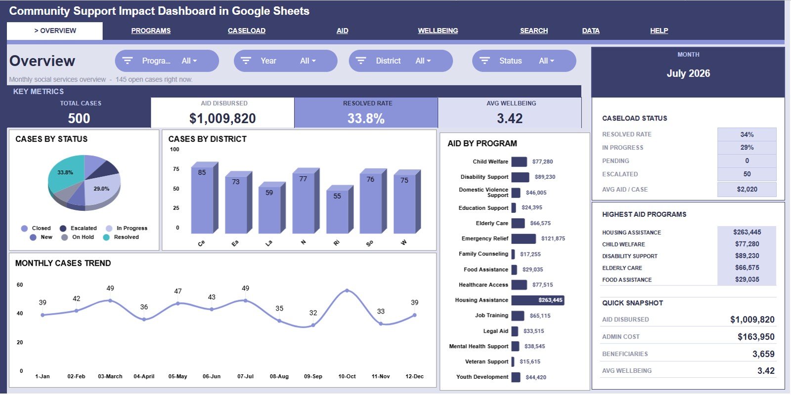
The Overview page gives leadership a fast snapshot of community support activity. The top cards show Total Cases, Aid Disbursed, Resolved Rate, and Avg Wellbeing, so the most important numbers are visible before reviewing the charts.
Cases by Status: This chart shows how cases are distributed by current status. It helps teams understand whether cases are being resolved or building up in pending and active queues.
Cases by District: This chart compares case volume by district. It is useful for identifying areas with heavier demand and planning outreach, staffing, or district-level support.
Aid by Program: This chart shows aid distribution by program. It helps program managers and finance teams compare where direct support money is going.
Cases by Month: This trend shows how case volume changes month by month. It helps reveal seasonal pressure, campaign effects, or emerging community needs.
Click here to purchase the Community Support Impact Dashboard in Google Sheets.
Program Performance
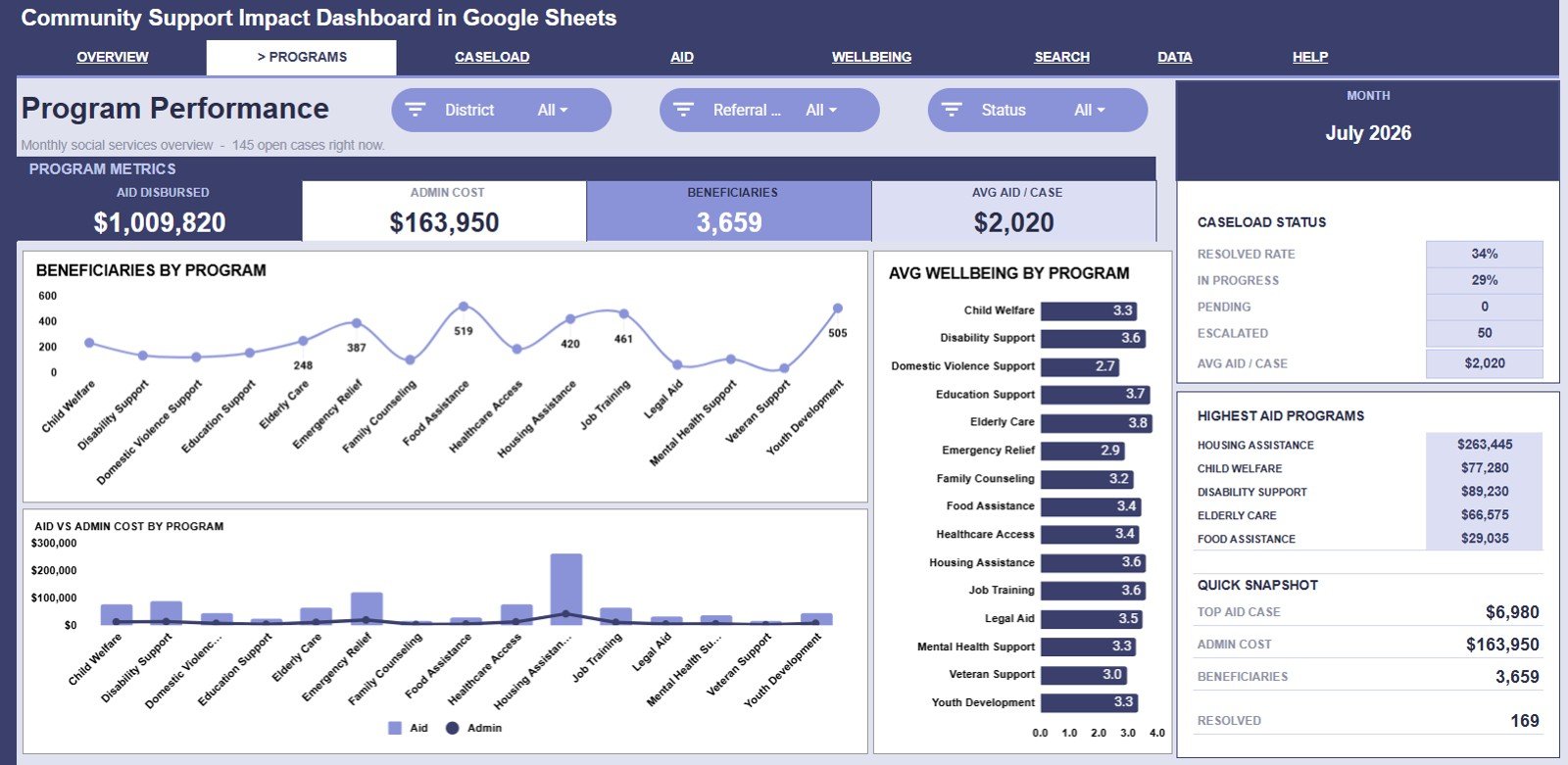
The Program Performance tab compares how support programs perform across beneficiary reach, aid, cost, and wellbeing. Beneficiaries by Program shows which programs serve the most people. Aid and Admin Cost by Program compares direct support against administrative delivery cost. Avg Wellbeing by Program helps teams see where participant wellbeing scores are stronger or weaker.
Caseload Management
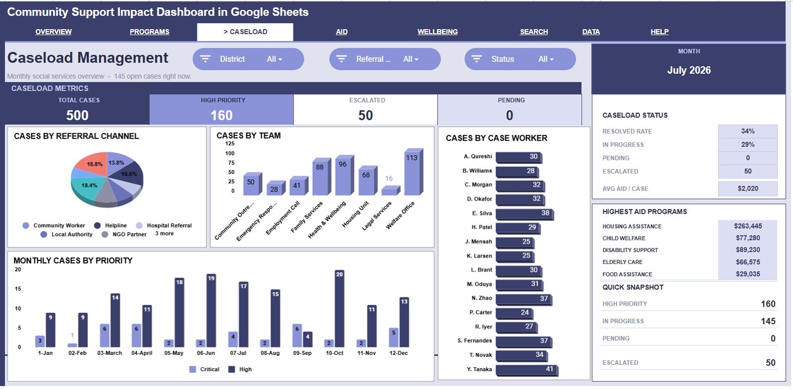
The Caseload Management tab is built for operational supervisors. Cases by Referral Channel shows where cases are coming from, such as partner referrals, walk-ins, community outreach, or online intake. Cases by Team compares workload across teams. Cases by Case Worker helps supervisors balance assignments. Cases by Priority and Month shows how urgent work changes over time.
Click here to purchase the Community Support Impact Dashboard in Google Sheets.
Aid and Costs
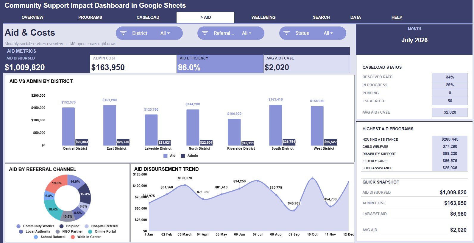
The Aid and Costs tab focuses on financial visibility. Aid and Admin Cost by District compares support distribution and delivery cost geographically. Aid by Referral Channel connects disbursement patterns to intake sources. Aid Disbursement by Month shows how support spending moves over time.
Wellbeing
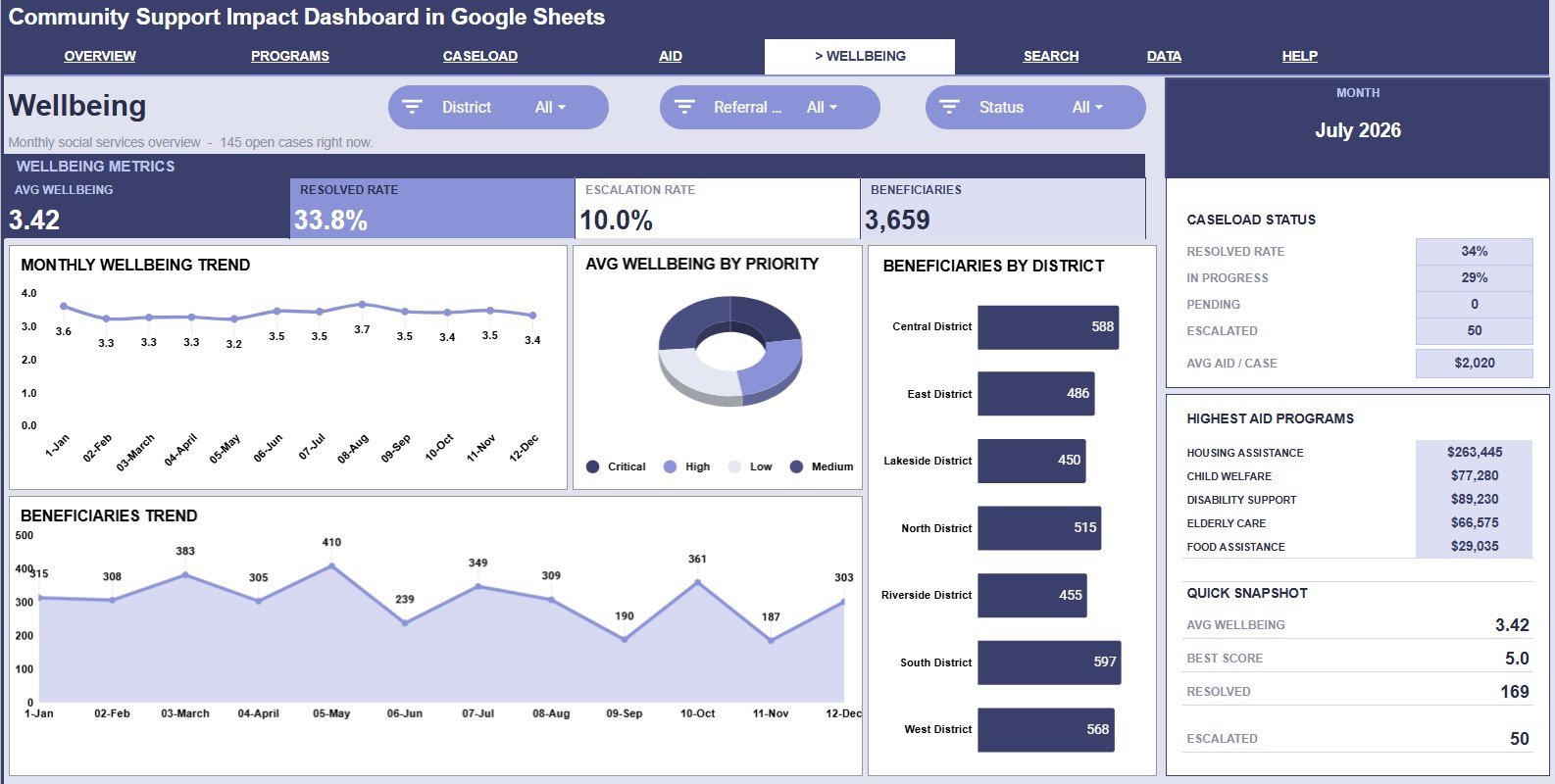
The Wellbeing tab helps teams review impact signals. Avg Wellbeing by Month shows whether wellbeing scores are improving, declining, or staying flat. Avg Wellbeing by Priority compares outcomes across urgency levels. Beneficiaries by District shows where people are being served, and Beneficiaries by Month tracks service reach over time.
Click here to purchase the Community Support Impact Dashboard in Google Sheets.
Search Sheet Tab
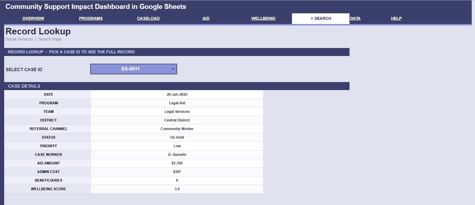
The Search Sheet is useful when a manager, coordinator, or case worker needs a quick record lookup. Select a Case ID from the dropdown and the sheet displays date, program, team, district, referral channel, status, priority, case worker, aid amount, admin cost, beneficiaries, and wellbeing score.
Data Sheet Tab
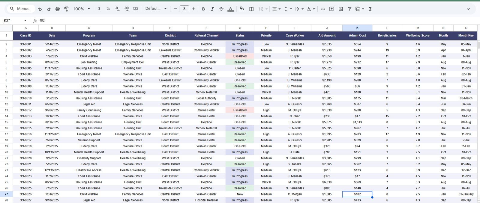
The Data Sheet is where case records should be entered in the same format. Keeping the structure consistent helps the dashboard pages, charts, slicers, and search view stay connected as new rows are added.
Click here to purchase the Community Support Impact Dashboard in Google Sheets.
Community Support Impact Dashboard in Google Sheets vs. Excel vs. Paid Case Management SaaS – Feature Comparison
| Feature | This Google Sheets Template | Microsoft Excel Dashboard | Paid Case Management SaaS |
|---|---|---|---|
| Cost | $9.99 one-time | One-time template cost | Monthly or annual subscription |
| Platform | Google Sheets in browser | Excel desktop or web | Vendor cloud platform |
| Setup time | Copy template and replace data | Open workbook and replace data | Configuration and onboarding |
| Real-time team collaboration | Built into Google Sheets | Requires shared cloud file | Usually included |
| Mobile access | Browser or Sheets app | Excel mobile support varies | Usually included by plan |
| Customizable fields | Editable sheet, labels, formulas, charts | Editable workbook | Often limited by vendor settings |
| Share with link | Yes, using Google sharing permissions | Requires OneDrive or SharePoint | Login controlled |
| Case lookup | Included Search Sheet | Possible with formulas | Included |
| Year-1 cost at 5 users | $9.99 plus Google account access | Template cost plus Microsoft access | Often hundreds or thousands |
Who Should Use This Template
- Nonprofit and NGO teams tracking support cases, aid, beneficiaries, and outcomes.
- Community outreach programs that need district, referral, and team-level reporting.
- Casework supervisors who want a quick view of workload by team and case worker.
- Finance coordinators reviewing aid amount, admin cost, and disbursement trends.
- Grant-funded programs preparing simple monthly or quarterly impact reports.
Real-World Use Cases
Meera, Program Director: Meera opens Program Performance before her funder meeting to compare beneficiaries, aid, cost, and wellbeing by program.
James, Casework Supervisor: James reviews Caseload Management every week to see whether one case worker or team is carrying too much work.
Ana, Finance Coordinator: Ana checks Aid and Costs to understand whether admin cost is rising faster than aid disbursed in any district.
Advantages of Community Support Impact Dashboard in Google Sheets
- Simple adoption: The dashboard works inside Google Sheets, so teams do not need a separate BI tool.
- Practical case visibility: The Search Sheet connects dashboard reporting with case-level lookup.
- Program and finance alignment: Aid, admin cost, beneficiaries, and wellbeing are reviewed together.
- Flexible sharing: Managers can share the file with view or edit permissions based on role.
- Low cost: A one-time template purchase avoids a recurring dashboard subscription.
Opportunities for Improvement
This is a dashboard template, not a secure case management database. Teams handling highly sensitive personal data should follow their own privacy, consent, access-control, and data-retention policies before using any spreadsheet. Very large case datasets may also need a database or BI platform instead of a spreadsheet. Advanced teams may extend the file with automated imports, form intake, data validation lists, or Apps Script refresh workflows.
Best Practices
- Keep the Data Sheet column order intact so charts and lookup formulas remain connected.
- Use consistent names for districts, programs, teams, statuses, priorities, and referral channels.
- Limit edit access to staff responsible for updating data.
- Review aid, admin cost, and wellbeing together instead of treating them as separate reports.
- Make a copy at month-end or quarter-end for audit and grant reporting archives.
Explore Relevant Templates
- Community Support Impact Dashboard in Google Sheets – the product page for this dashboard.
- Nonprofit Organizations Dashboard in Google Sheets – donation, beneficiary, and impact reporting.
- Non-Profit KPI Scorecard in Excel – scorecard-style nonprofit KPI tracking.
- Community Development KPI Dashboard in Excel – community development KPI monitoring.
- Membership Growth and Churn Analysis Dashboard in Google Sheets – useful for community membership and retention reporting.
Frequently Asked Questions
Click here to purchase the Community Support Impact Dashboard in Google Sheets.
What is included in the Community Support Impact Dashboard in Google Sheets?
It includes Overview, Program Performance, Caseload Management, Aid and Costs, Wellbeing, Search Sheet, and Data Sheet tabs.
What KPI cards are shown on the Overview page?
The Overview page shows Total Cases, Aid Disbursed, Resolved Rate, and Avg Wellbeing.
Can I search for an individual case?
Yes. The Search Sheet lets you select a Case ID and view the full case record details.
Can this dashboard be customized?
Yes. It is built in Google Sheets, so you can edit labels, charts, fields, formulas, and formatting.
Does this replace case management software?
No. It is a reporting dashboard for structured case data, not a secure client database, intake system, or workflow automation platform.
Do I need paid BI software?
No. The template runs in Google Sheets and does not require Power BI, Tableau, or a paid dashboard platform.
About the Author
Built by PK – Microsoft Certified Professional with 15+ years of Excel, Google Sheets, and Power BI experience. Founder of NextGenTemplates, reaching 300K+ subscribers across YouTube channels. Every template is hand-built and tested before release.
Conclusion
The Community Support Impact Dashboard in Google Sheets gives community support teams a clear way to monitor cases, aid, resolved rate, wellbeing, programs, caseload, costs, and case-level details in one editable spreadsheet. It is best for teams that already collect structured case data and want a practical dashboard for recurring reviews.
Click here to purchase the Community Support Impact Dashboard in Google Sheets.
For step-by-step spreadsheet dashboard tutorials, visit YouTube.com/@NeoTechNavigators.
Last updated: July 25, 2026.