Ask an operations lead how the fleet performed last month and you get availability and outage hours. Ask finance the same question and you get revenue per MWh and net margin. Both are right, both come from the same unit-month log, and in most organisations they live in two different spreadsheets that nobody reconciles until quarter end.
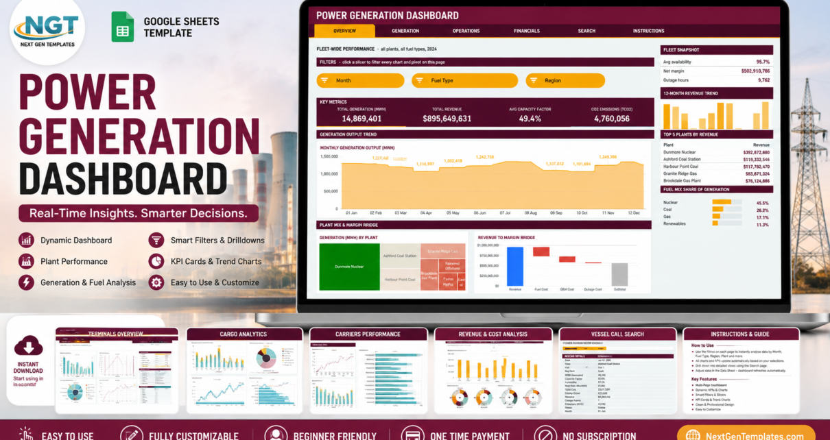
The Power Generation Dashboard in Google Sheets puts both answers in one file. Six linked pages carry 16 KPI cards, 18 charts, five sidebar panels and a record-lookup screen, all driven by native Google Sheets pivot tables and slicers rather than a maze of helper formulas. It arrives pre-loaded with demo rows so every visual is already drawing, and it is pre-sized for 1,000 unit-month records so you can paste a full year of readings for a mid-size fleet without touching a single range.
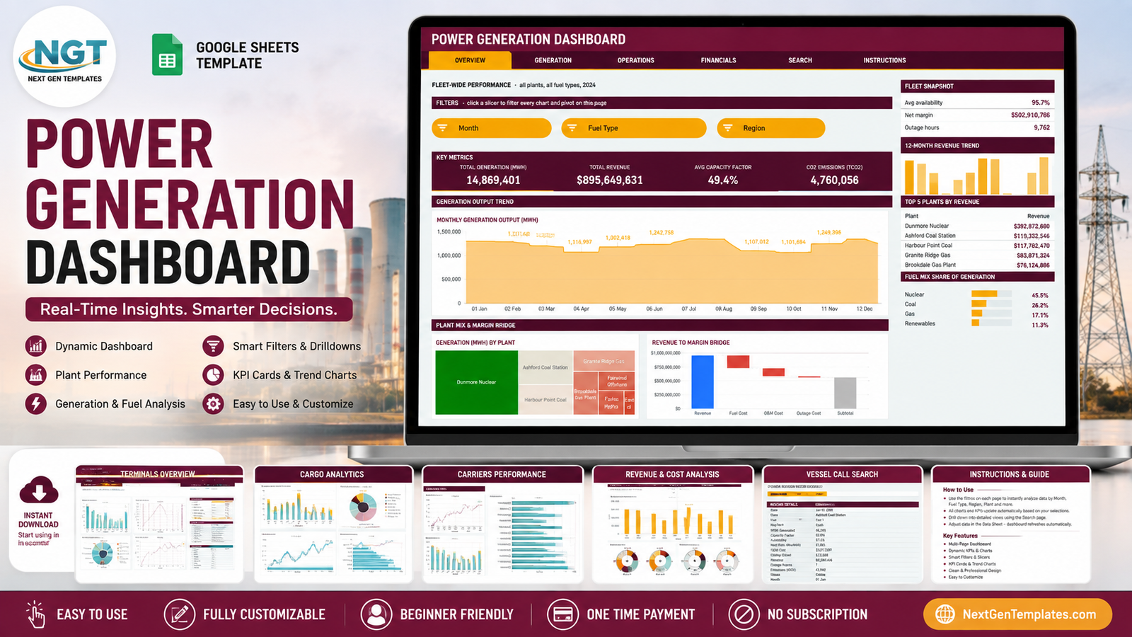
One thing to be clear about before anything else: the numbers you see in the screenshots below are demo data. They were generated to make the charts legible, not measured at any plant. They are not real generation figures and should never be quoted or reported. Everything you see updates the moment you drop your own readings in.
Key Features of the Power Generation Dashboard in Google Sheets
- Six pages in one file – Overview, Generation, Operations, Financials, Search and Instructions, linked by a tab strip that sits across the top of every page.
- Native pivot tables behind every chart. Each visual reads a real pivot parked to the right of the page, past a wide spacer column. Scroll across and you can audit the numbers behind any chart.
- Slicers, not dropdown hacks. Overview carries three slicers – Month, Fuel Type, Region – and the three analysis pages carry four each, adding Plant, Unit or Status. Clicking one re-filters every pivot, chart and Top 5 panel on that page at once.
- Chart types matched to the question – a stepped-area output trend, a plant treemap, a revenue-to-margin waterfall, fuel and region donuts, two scatter plots and six capacity-factor gauges.
- A consistent sidebar on each analysis page: a three-line snapshot, a 12-month revenue trend, a Top 5 table, a share-of-total bar list, an At a Glance table and a 12-month generation sparkline.
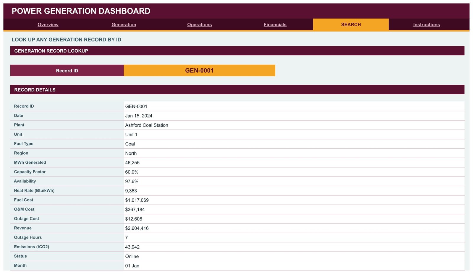
- Record lookup. The Search page takes any Record ID and prints all 17 fields for that unit-month.
- 1,000-row headroom. Pivots, slicers and formulas are all pre-sized, so pasting up to row 1001 needs no edits. Raising DATA_ROWS in the Apps Script file takes it further.
- One-place theming. The whole design runs off a single contrast pair plus one secondary chart colour, all declared at the top of the script.
Dashboard Pages Explanation
Page 1 – Overview: fleet-wide performance
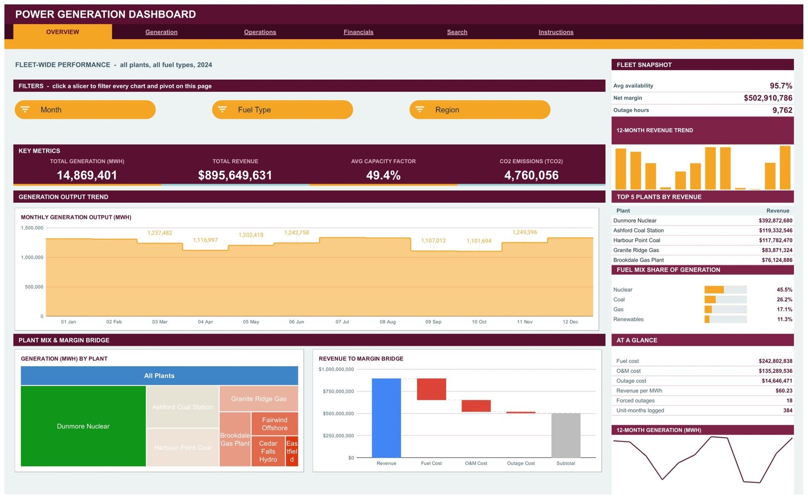
The landing page answers “how did the whole fleet do?” in four cards: Total Generation (MWh), Total Revenue, Avg Capacity Factor and CO2 Emissions (tCO2). Underneath, a Monthly Generation Output (MWh) stepped-area chart shows the shape of the year, a Generation (MWh) by Plant treemap shows which assets carry the load, and a Revenue to Margin Bridge waterfall walks revenue down through fuel cost, O&M cost and outage cost to a subtotal. The sidebar adds a Fleet Snapshot, a Top 5 Plants by Revenue table, a Fuel Mix Share of Generation list and an At a Glance block covering per-MWh revenue, forced outages and unit-months logged.
Page 2 – Generation: output by fuel, region and plant
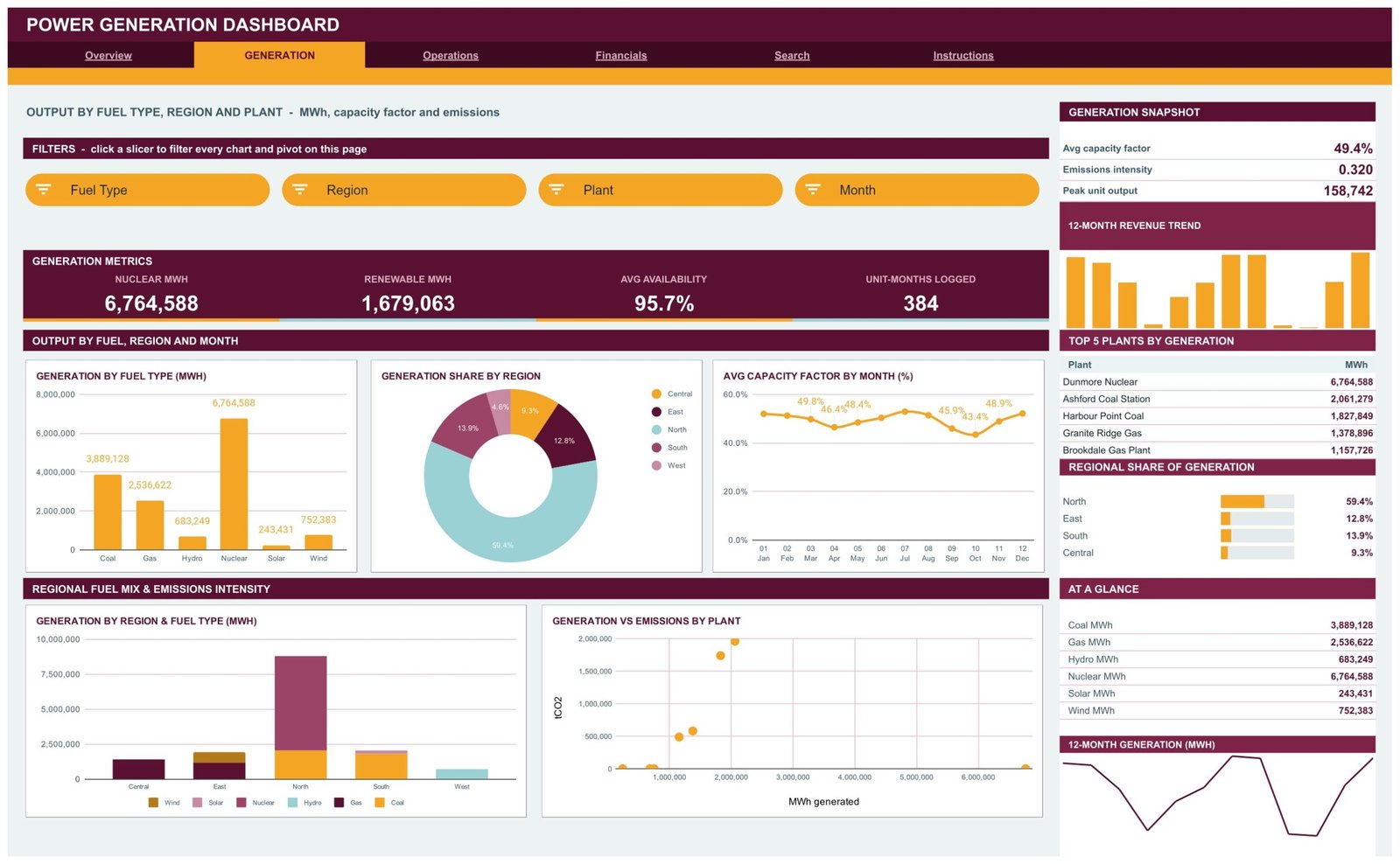
This is the page for a generation planner. Nuclear MWh, Renewable MWh, Avg Availability and Unit-Months Logged head the page, followed by Generation by Fuel Type (MWh), Generation Share by Region, Avg Capacity Factor by Month (%), a stacked Generation by Region and Fuel Type (MWh), and a Generation vs Emissions by Plant scatter that puts output and tCO2 on the same axes. Four slicers – Fuel Type, Region, Plant, Month – drive everything, and the sidebar keeps a Generation Snapshot, Top 5 Plants by Generation and Regional Share of Generation in view.
Page 3 – Operations: availability, outages and unit reliability
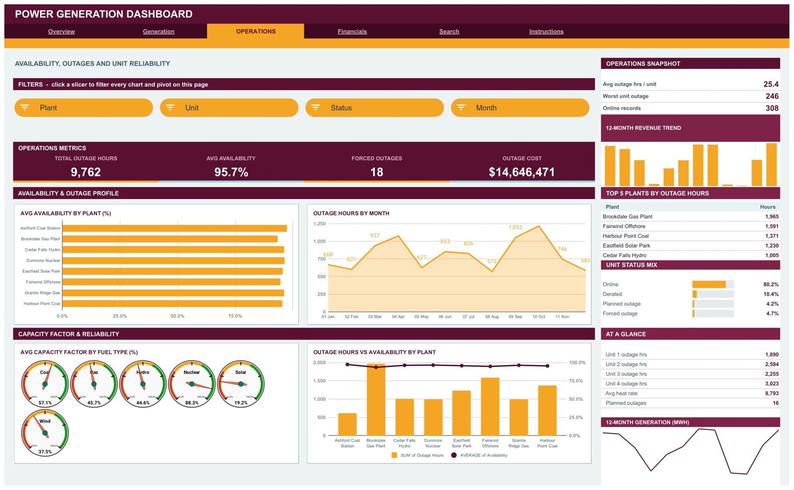
Total Outage Hours, Avg Availability, Forced Outages and Outage Cost lead into Avg Availability by Plant (%), Outage Hours by Month, six Avg Capacity Factor by Fuel Type (%) gauges and an Outage Hours vs Availability by Plant combo chart that puts hours as bars against availability as a line. The gauges are the fastest read on the whole workbook – one glance separates baseload from intermittent fuels. The sidebar adds Top 5 Plants by Outage Hours and a Unit Status Mix split across Online, Derated, Planned outage and Forced outage.
Page 4 – Financials: revenue, cost and margin
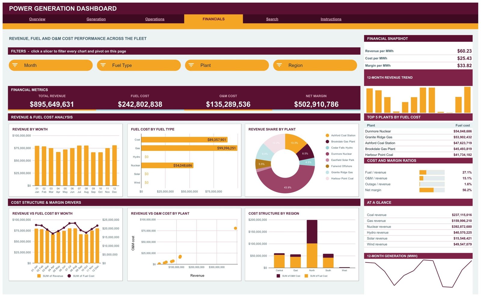
Total Revenue, Fuel Cost, O&M Cost and Net Margin sit above Revenue by Month, Fuel Cost by Fuel Type, Revenue Share by Plant, Revenue vs Fuel Cost by Month, Revenue vs O&M Cost by Plant and Cost Structure by Region. The Financial Snapshot reduces the entire fleet to three numbers – revenue per MWh, cost per MWh and margin per MWh – while the Cost and Margin Ratios panel expresses fuel, O&M and outage cost as a percentage of revenue. That ratio panel is usually where a conversation about an underperforming plant actually starts.
Page 5 – Search: one record, every field
Pick a Record ID from the dropdown and the page prints the complete unit-month record: date, plant, unit, fuel type, region, MWh generated, capacity factor, availability, heat rate in Btu/kWh, fuel cost, O&M cost, outage cost, revenue, outage hours, emissions in tCO2, status and month. When a chart looks wrong, this is where you go to find out whether the data or the chart is at fault.
Page 6 – Instructions: the ten-step guide
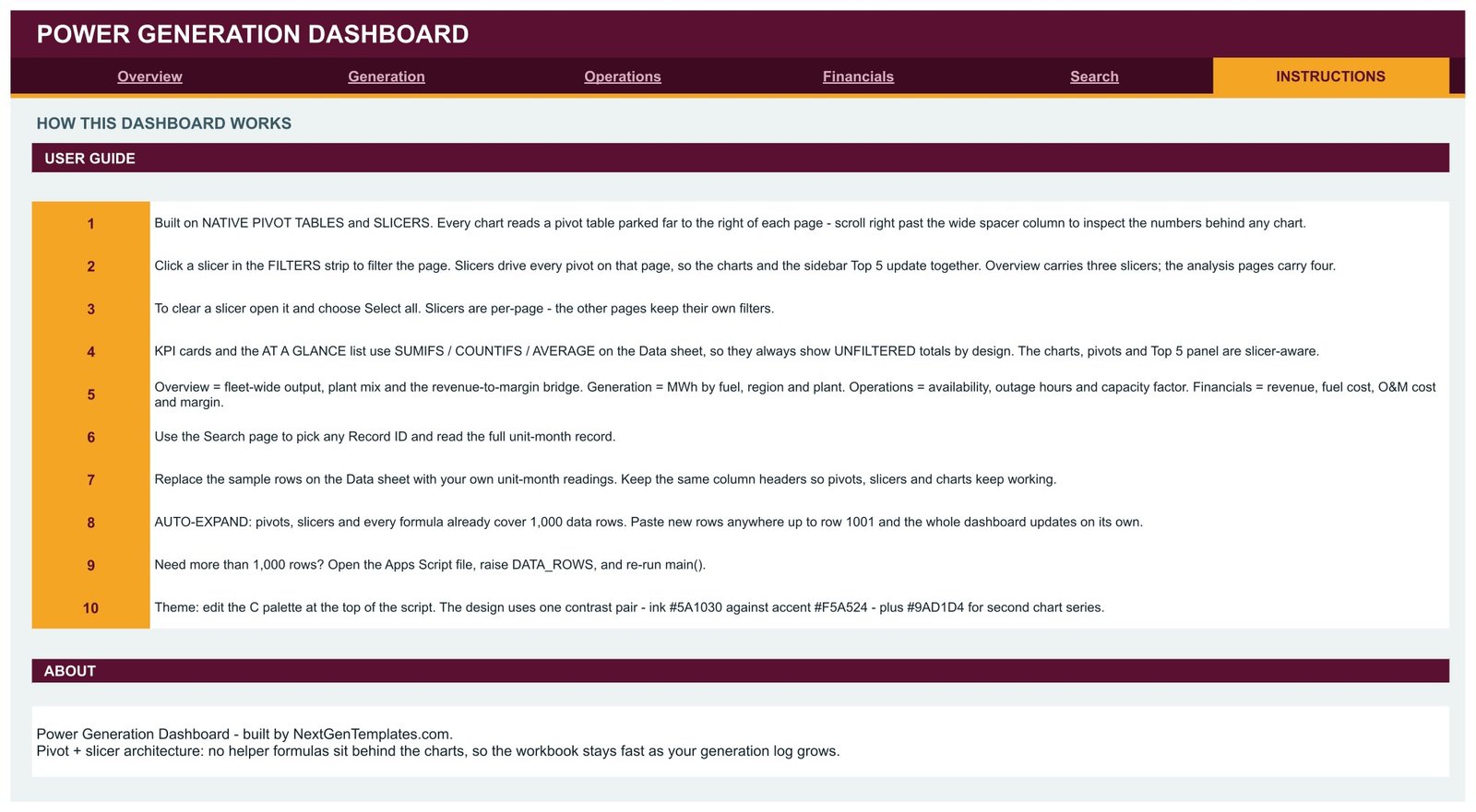
The last page is documentation that ships inside the product. Ten numbered steps cover the pivot-and-slicer architecture, how to clear a slicer, why the KPI cards deliberately show unfiltered totals while the charts are slicer-aware, what each analysis page is for, how to replace the demo rows, the 1,000-row auto-expand, raising DATA_ROWS and editing the colour palette.
Power Generation Dashboard vs. an Excel Build vs. Paid Asset-Performance SaaS – Feature Comparison
| Feature | This Google Sheets dashboard | Excel dashboard build | Paid APM / energy analytics SaaS |
|---|---|---|---|
| Cost | One-off, under 10 | One-off, or your own build hours | Typically four figures a year and up |
| Platform | Google Sheets, any browser | Desktop Excel | Vendor cloud |
| Setup time | Minutes | Hours if you build the pivots yourself | Weeks, usually with onboarding |
| Real-time team collaboration | Native | Shared drive or 365 only | Yes |
| Mobile access | Sheets mobile app | Excel mobile, limited | Vendor app |
| Customizable fields | Full – it is your spreadsheet | Full | Limited to the vendor data model |
| Share with link | Yes | No | Seat-based |
| Year-1 cost at 5 users | Under 10 | Template price plus Office | Commonly thousands |
| Unit-month grain | Built in, 1,000 rows out of the box | Built in | Often sensor-level |
| Live plant telemetry | No – you paste readings | No | Yes |
Who Should Use This Template
It suits anyone who already produces a monthly unit-level log and wants it charted rather than re-pivoted by hand: fleet performance analysts at independent power producers, finance teams reconciling MWh against revenue and cost across a small portfolio, asset managers who report availability and outage hours to a board, and energy consultants who need a working model to hand a client at the end of an engagement. It is also a genuinely good teaching artefact – the pivot layout is visible rather than hidden, so students can see exactly how each chart is fed.
It is not the right tool if you need live SCADA or historian feeds, dispatch or grid-reliability decisions, regulatory or emissions-disclosure filings, plant-safety or engineering-fitness assessments, or any kind of energy price forecasting or trading guidance. This is an internal reporting layer over data you already trust, and nothing more.
Real-World Use Cases
Monthly fleet review. An analyst exports the unit-month log on the first working day of the month, pastes it into the Data sheet, filters Operations to the two plants with the worst outage hours and takes the availability chart straight into the review deck. What used to be an afternoon of rebuilding pivots becomes a paste and a screenshot.
Margin triage across a four-plant portfolio. A finance manager works the Financials page top down: revenue per MWh against cost per MWh identifies which asset carries the margin, then Cost Structure by Region shows whether fuel or O&M is the reason a region underperforms, before anyone opens the ledger.
Client deliverable for a consultant. One copy of the sheet per engagement, twelve months of the client’s own readings pasted in, palette swapped to their brand colours in a single place, and the client keeps a living dashboard instead of a static deck.
Advantages of the Power Generation Dashboard
- Auditable. Every chart traces back to a visible pivot table, so a disputed number can be checked in seconds rather than reverse-engineered from a formula.
- Fast as the log grows. No SUMPRODUCT or QUERY chains sit behind the visuals, so adding rows does not slow the file down the way a formula-driven build does.
- Operations and finance in one place. Availability, outage hours, revenue and margin are three clicks apart instead of two files apart.
- No software to install. It runs in a browser on a free Google account – no add-ons, no licences, no desktop dependency.
- Documented inside the file. The Instructions page means a new colleague can pick it up without a handover call.
Opportunities for Improvement
Worth knowing before you buy. The KPI cards and the At a Glance lists use SUMIFS, COUNTIFS and AVERAGE against the Data sheet, which means they deliberately show unfiltered totals – the charts, pivots and Top 5 panels are the slicer-aware parts. That is a design decision documented on the Instructions page, but it does surprise people the first time they click a slicer and watch a card stay put.
Slicers are also per-page, so filtering Generation to one region does not filter Operations. Again intentional – it lets two people look at different cuts in the same file – but it is worth saying out loud. And the row budget is 1,000 out of the box; a large fleet logging several hundred units monthly will need the DATA_ROWS bump described in step 9 fairly quickly. Finally, there is no data connector: readings are pasted or imported, not streamed.
Best Practices
- Keep the column headers exactly as shipped. The pivots, slicers and lookup formulas are bound to those names – rename a header and the page it feeds goes blank.
- Delete the demo rows in one go rather than overwriting them a few at a time, so no sample figures survive into a report.
- Paste values, not formatted cells, when the export comes from another system. It keeps the sheet’s own number formats intact.
- Clear a slicer with Select all before reading a page. Half the “the numbers are wrong” reports are a slicer left on from last week.
- Use the Search page as your first debugging step. If a plant looks odd on a chart, pull one of its records and check the raw fields.
- Take a copy before you re-theme or raise DATA_ROWS – both re-run the script, and a copy costs nothing.
- Fix the grain first. One row per plant, per unit, per month is what the whole model assumes; mixing daily and monthly rows will quietly double-count.
If pivot tables and slicers are new to you, Google’s own guide to creating and using pivot tables in Google Sheets is the best 10-minute primer, and everything in this template is built on those standard features.
Explore Relevant Templates
Prefer a different tool for the same subject? The Power Generation Dashboard in Power BI gives you a full semantic model, and the Power Generation Dashboard in Excel covers the same ground on the desktop.
Broadening the energy portfolio, there is the Renewable Energy Dashboard in Google Sheets and the Solar Energy Dashboard in Google Sheets. On the wider industrial side, the Oil & Gas Dashboard in Google Sheets and the Railways Dashboard in Google Sheets share the same pivot-and-slicer architecture, so anything you learn here transfers directly.
Or browse the whole Google Sheets Dashboards catalogue.
Frequently Asked Questions
Are the figures in the screenshots real generation data?
No. They are demo rows created so every chart, pivot and slicer is visibly working the moment you open the file. They are illustrative only, they do not describe any real plant or fleet, and they should be deleted and replaced with your own readings before you report anything.
Does this template make my organisation compliant with any energy regulation?
No. It is an internal reporting template. It produces no regulatory filings, no grid-reliability certification and no emissions disclosure, and it makes no engineering or safety judgement about any asset.
Can it read from our SCADA system, historian or meters?
Not directly. You paste or import unit-month readings onto the Data sheet. Teams that want this hands-off usually schedule an export from their source system into the same sheet.
Why do the KPI cards not change when I click a slicer?
By design. The cards and the At a Glance lists show unfiltered totals so you always have a fleet-level reference point; the charts, pivots and Top 5 panels are the slicer-aware parts. Step 4 of the Instructions page explains this.
What if I have more than 1,000 records?
Everything is pre-sized to 1,000 rows, so you can paste up to row 1001 with no edits at all. Beyond that, open the Apps Script file, raise the DATA_ROWS value and re-run main().
Do I need to know Apps Script?
No. The script only matters if you want to re-theme the workbook or extend the row count. Everyday use is ordinary Google Sheets.
Can I change the plants, fuel types and regions?
Yes – they come straight from your own Data sheet. The pivots, slicers and charts pick up whatever categories your rows contain, so a hydro-only fleet or a fifteen-plant portfolio both work without redesign.
About the Author
Built by PK – Microsoft Certified Professional with 15+ years of Excel, Google Sheets, and Power BI experience. Founder of NextGenTemplates, reaching 300K+ subscribers across YouTube channels. Every template is hand-built and tested before release.
Conclusion
Most generation reporting problems are not analysis problems – they are assembly problems. The log already exists; what is missing is a place where operations and finance read it the same way. This dashboard is that place: six pages, one grain, visible pivots, and slicers that make a fleet-wide view drill down to a single unit-month in two clicks.
Copy the sheet, delete the demo rows, paste your own readings, and the whole thing builds itself. Get the Power Generation Dashboard in Google Sheets for instant download and lifetime access.
For video walkthroughs of this and other Google Sheets dashboards, subscribe at youtube.com/@NeotechNavigators.