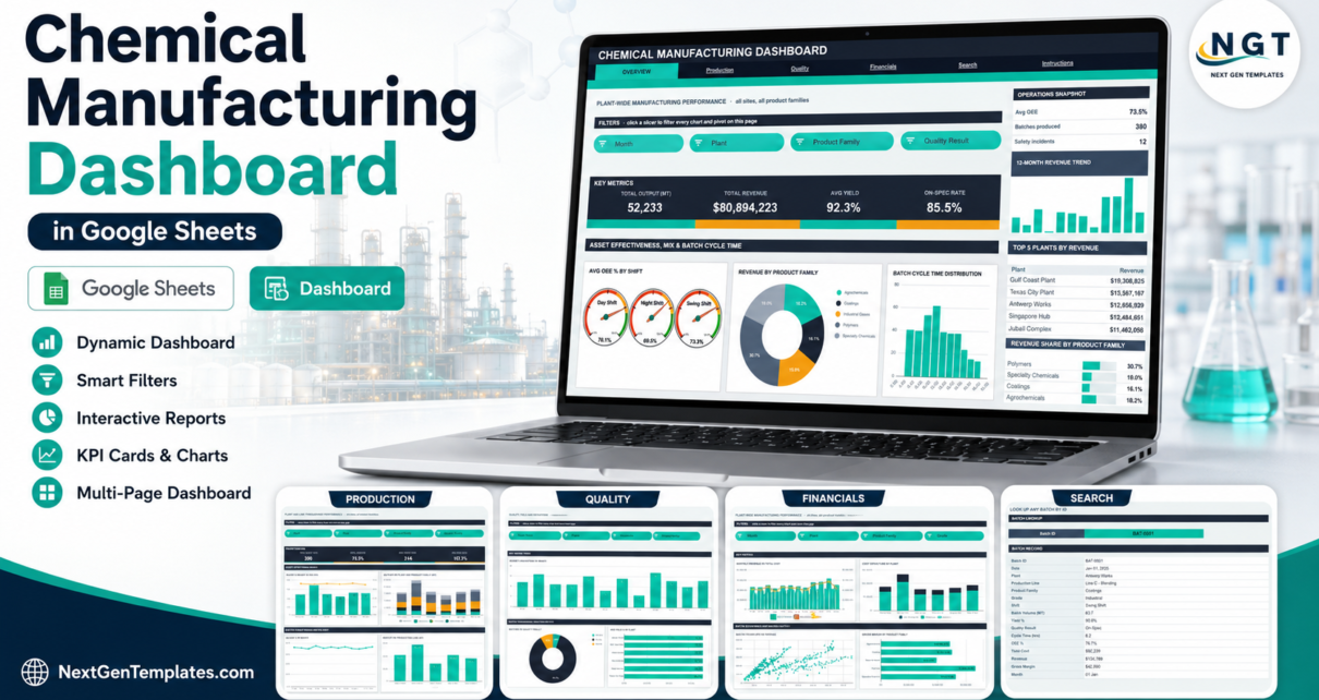
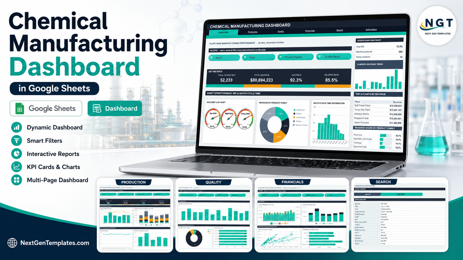
The Chemical Manufacturing Dashboard in Google Sheets reports 16 headline KPIs across four analysis pages, using 18 native charts and 15 slicers, on a 380-batch demo dataset that ships inside the file. Pivots, slicers and every formula are pre-sized to 1,000 batch rows, and the whole thing runs in a browser tab with no add-ons, no macros and no scripts.
Most plant teams already have the numbers. What they do not have is a place to put them that produces the same monthly view every time. Output in metric tonnes lives in one export, yield and disposition in another, cost per tonne in a third, and somebody rebuilds the same pivot table on the first working day of every month. This template is the standing version of that report: paste the batch log, click a slicer, read the answer.
Scope note, up front: this is a production-reporting template fed by your own records. It is not a safety, hazard, environmental, quality-assurance or regulatory system, and it makes no claim about any standard or regulation. The sample rows inside the file are demo data, not real plant records. The “Who should use this” section below is explicit about what it does not do.
Key Features of the Chemical Manufacturing Dashboard
- 16 KPI cards across four pages – Total Output (MT), Total Revenue, Avg Yield % and On-Spec Rate on Overview; Batches Run, Avg OEE %, Avg Cycle Time (h) and MT per Batch on Production; On-Spec Batches, Off-Spec Rate, Quality Deviations and Avg Yield % on Quality; Total Revenue, Total Cost, Gross Margin and Margin % on Financials.
- 15 slicers across the four analysis pages, covering Month, Plant, Production Line, Product Family, Grade, Shift and Quality Result. Slicers are per-page, so each page keeps its own filter state.
- Native pivot tables behind every chart. Scroll right past the spacer column on any page to inspect the exact pivot feeding a visual. No hidden helper-formula blocks means the file stays quick as the batch log grows.
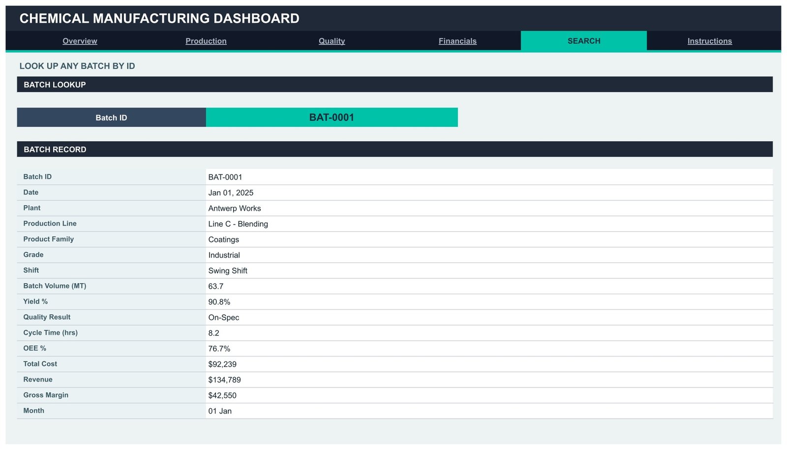
- A batch lookup page that returns 16 fields for any Batch ID you pick from the dropdown.
- A 380-row demo dataset spanning 6 plants, 5 production lines and 5 product families, so every chart is populated the moment you open the file.
- Sidebar panels on every page – a snapshot block, a 12-month revenue trend, a Top 5 ranking, a share-of-total bar list and an At a Glance table.
Dashboard Pages Explanation
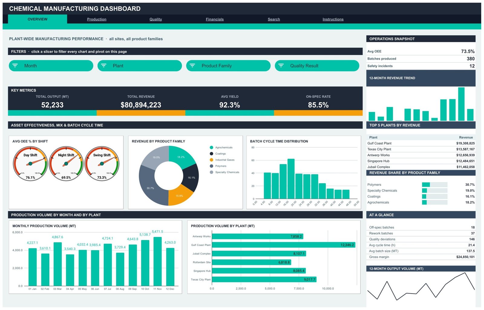
Page 1: Overview – Plant-Wide Manufacturing Performance
The landing page carries the four headline numbers – Total Output (MT), Total Revenue, Avg Yield % and On-Spec Rate – with an operations snapshot showing average OEE, batches produced and a recorded safety-incident count carried in the data. Charts cover Avg OEE % by Shift as three gauges, Revenue by Product Family, Batch Cycle Time Distribution, Monthly Production Volume by Month and Production Volume by Plant. The sidebar ranks Top 5 Plants by Revenue and shows Revenue Share by Product Family. Four slicers – Month, Plant, Product Family and Quality Result – drive the whole page.
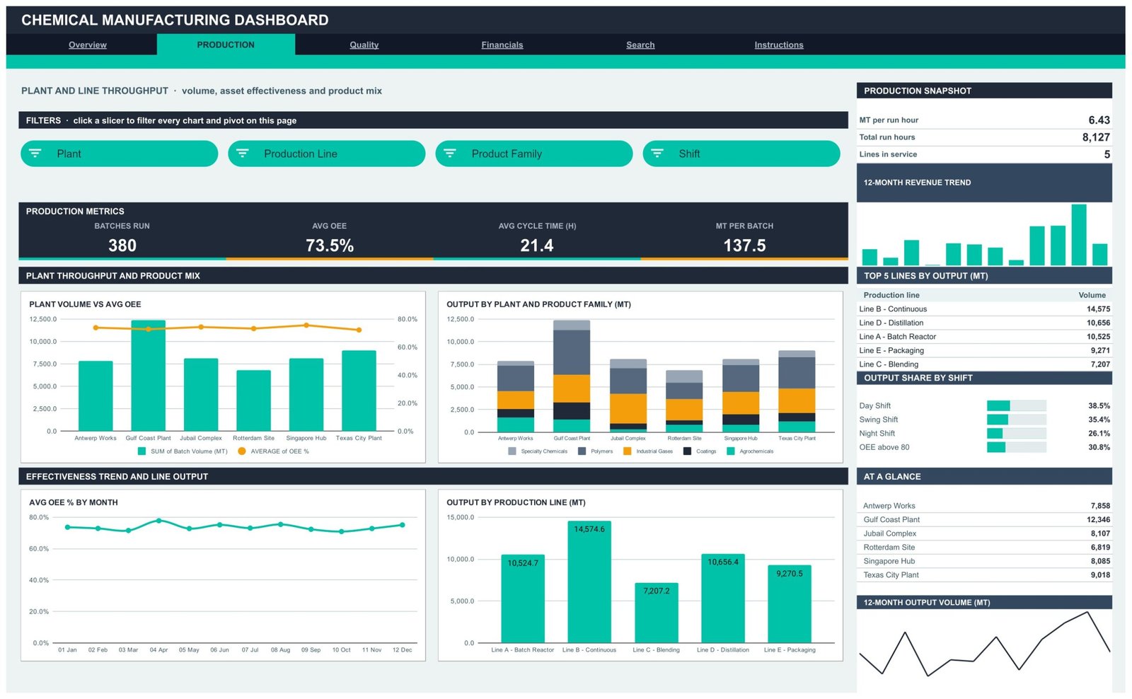
Page 2: Production – Plant and Line Throughput
This page answers throughput questions. Batches Run, Avg OEE %, Avg Cycle Time (h) and MT per Batch sit across the top, with MT per run hour, total run hours and lines in service in the sidebar. Plant Volume vs Avg OEE puts volume columns against an OEE line so a high-volume, low-effectiveness site stands out immediately. Output by Plant and Product Family stacks the mix per site, Avg OEE % by Month gives the trend, and Output by Production Line ranks the five lines. Slicers: Plant, Production Line, Product Family and Shift.
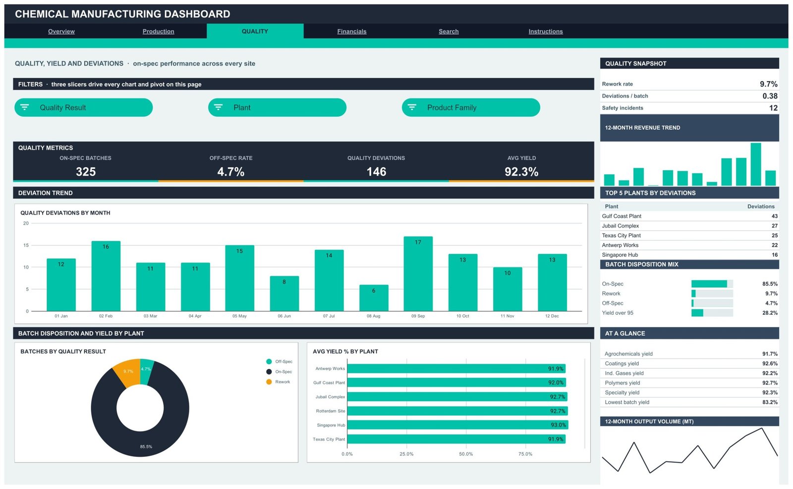
Page 3: Quality – Yield, Disposition and Deviations
This page summarises what your own records say about batch outcomes: On-Spec Batches, Off-Spec Rate, Quality Deviations and Avg Yield %, with rework rate and deviations per batch in the sidebar. Quality Deviations by Month shows whether the count is drifting, Batches by Quality Result splits on-spec, rework and off-spec, and Avg Yield % by Plant compares sites on a like-for-like basis. Top 5 Plants by Deviations ranks where the count concentrates. It reports the dispositions you enter – it does not assess, approve or release any batch, and it is not a quality management system.
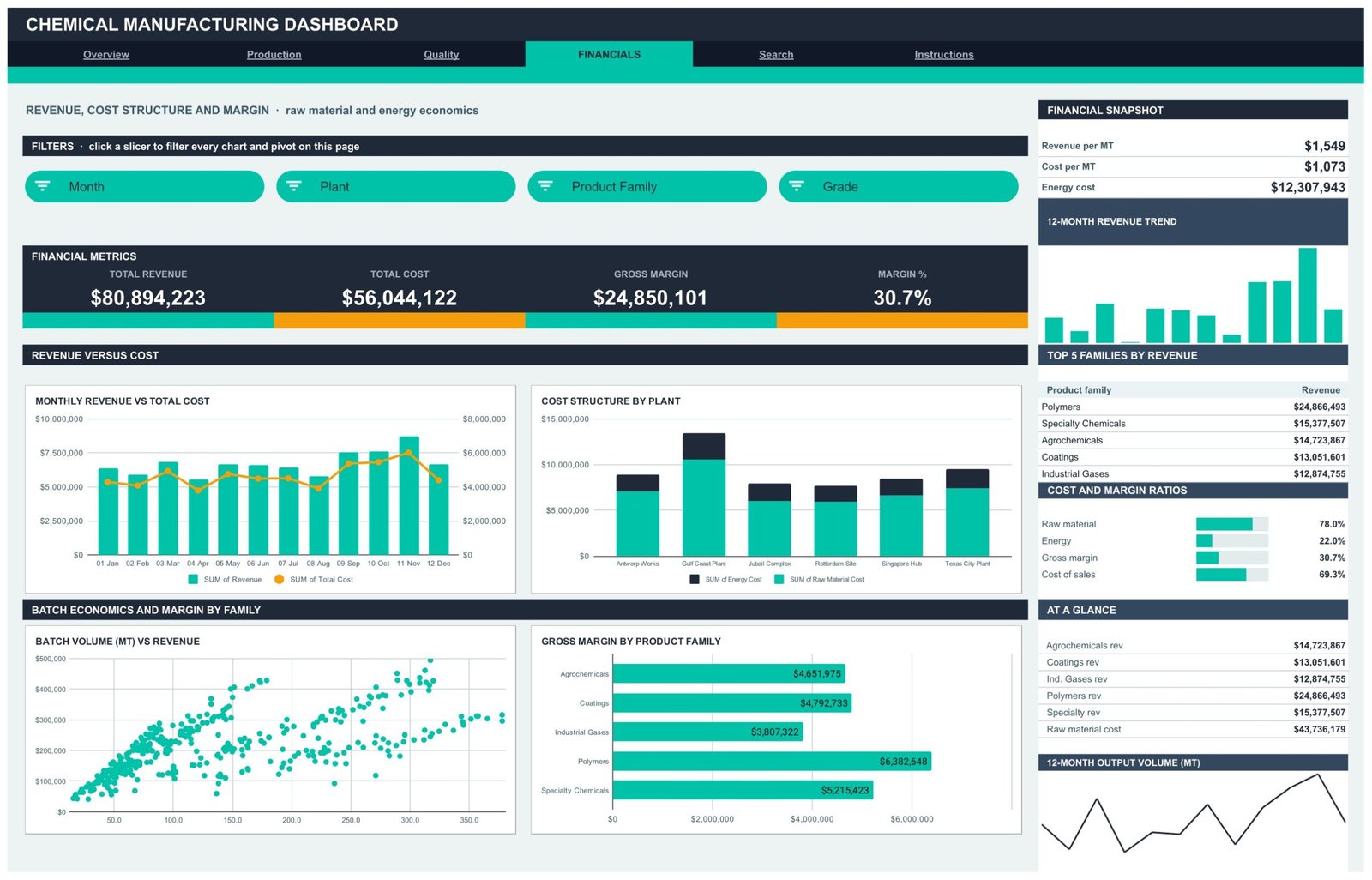
Page 4: Financials – Revenue, Cost Structure and Margin
Total Revenue, Total Cost, Gross Margin and Margin % lead the page, with revenue per MT, cost per MT and energy cost in the sidebar. Monthly Revenue vs Total Cost overlays the two series, Cost Structure by Plant splits raw material against energy cost per site, Batch Volume vs Revenue plots every batch as a scatter point so outliers are visible, and Gross Margin by Product Family ranks the five families. A ratio panel shows raw material and energy as a share of cost alongside gross margin. Slicers: Month, Plant, Product Family and Grade.
Page 5: Search – Batch Lookup
Pick a Batch ID from the dropdown and the full record appears: date, plant, production line, product family, grade, shift, batch volume, yield %, quality result, cycle time, OEE %, total cost, revenue, gross margin and month. This is the page you open when a review meeting stops on one specific batch.
Page 6: Instructions – How the File Works
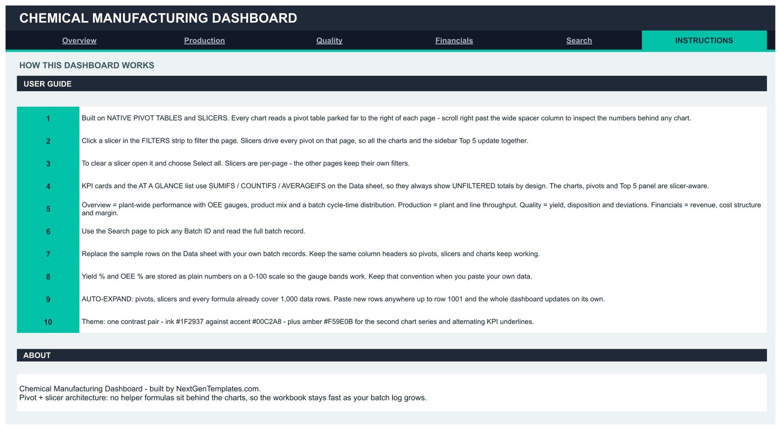
A 10-step user guide explains the pivot-and-slicer architecture, how to clear a slicer with Select all, why the KPI cards use SUMIFS on the Data sheet and therefore stay unfiltered by design, how to paste your own rows, and the 0-100 number convention that keeps the OEE gauge bands rendering correctly.
The Data Sheet
One flat table holds every batch record under 16 column headers. It arrives with 380 rows of demo data covering plants such as Antwerp Works, Gulf Coast Plant, Jubail Complex, Rotterdam Site, Singapore Hub and Texas City Plant, and product families from Agrochemicals to Specialty Chemicals. Delete the demo rows, paste your own under the same headers, and every page follows. If you want to understand the machinery underneath, Google’s own documentation on pivot tables in Google Sheets and on slicers covers both features.
Chemical Manufacturing Dashboard vs. an Excel Build vs. Paid Manufacturing Analytics SaaS – Feature Comparison
| Feature | Chemical Manufacturing Dashboard in Google Sheets | Excel dashboard build | MES / manufacturing analytics SaaS |
|---|---|---|---|
| Cost | $9.99 one-time | $20-40 one-time, or days of internal build time | $50-200 / user / month |
| Platform | Google Sheets, any browser | Desktop Excel | Vendor cloud + plant connectors |
| Setup time | Under 10 minutes | 15-30 minutes | Weeks of implementation |
| Real-time team collaboration | Built in | Requires OneDrive / SharePoint | Yes |
| Mobile access | Sheets app, free | Limited | Yes, paid seat |
| Customisable fields and charts | Fully editable | Fully editable | Vendor-defined |
| Share with a link | Yes | File copy or cloud link | Paid seat per viewer |
| Batch-level drill-down | Yes – Search page, 16 fields | Depends on build | Yes |
| Year-1 cost at 5 users | $9.99 | $20-40 | $3,000-12,000 |
For plants that want batch, yield, OEE and margin reporting on a spreadsheet they already own, without a plant-systems project, the Chemical Manufacturing Dashboard sits in the sweet spot.
Who Should Use This Template
Perfect for:
- Production and operations managers at small and mid-size chemical, coatings, polymer or specialty plants
- Plant controllers and finance analysts reporting revenue, cost per MT and gross margin by plant and product family
- Continuous-improvement teams watching OEE, cycle time and rework rates by line and shift
- Consultants and contract manufacturers who report plant performance to a client and want a shareable, editable file
- Anyone rebuilding the same monthly production summary by hand
Not a fit if you need:
- Chemical safety or hazard work – no hazard classification, no Safety Data Sheets, no GHS labelling
- Regulatory registration or reporting – nothing here supports REACH registration, OSHA Process Safety Management, EPA reporting, emissions inventories or waste-handling records
- Quality assurance or certification evidence – it is not a QMS, not a batch record, and produces no evidence for ISO 9001, ISO 14001 or any audit or conformance assessment
- Incident management – the safety-incident figure is a plain count carried in your data, with no investigation or corrective-action workflow behind it
- Live machine, SCADA or historian monitoring – this reads a batch log you maintain
- SSO, audit trails and role-based permissions beyond Google Workspace sharing
Real-World Use Cases
Anita, production manager at a two-site coatings plant. On the first working day of the month she pastes the previous month’s batch log into the Data sheet, filters the Production page to her own site, and takes the OEE-by-shift gauges and the output-by-line ranking straight into the Monday review. What used to be an afternoon of pivot-building is now a paste and a click.
Marcus, cost controller for a specialty chemicals group. He works from the Financials page, comparing revenue per MT against cost per MT by product family and watching the Cost Structure by Plant chart to see whether raw material or energy is driving a move. The figures come from an ERP export he already produces monthly.
Priya, independent consultant to mid-size manufacturers. She keeps one copy of the dashboard per client, loads their batch history, and hands over a link. Nothing to install, no licence to negotiate, and the client can keep using it after the engagement ends.
Advantages of the Chemical Manufacturing Dashboard
The obvious advantage is cost: $9.99 once against $3,000-12,000 for a year of a manufacturing analytics platform at five seats. The less obvious one is time. Because the pivots, slicers and formulas already reach row 1001, a monthly refresh is a paste rather than a rebuild – realistically ten minutes instead of an afternoon.
The pivot-and-slicer architecture matters too. Dashboards built on long chains of SUMPRODUCT or QUERY formulas get slower with every row. Here each chart reads a native pivot table, so growth in the batch log costs you almost nothing in responsiveness, and anyone can audit a number by scrolling right and reading the pivot that produced it.
And because it is ordinary Google Sheets, sharing is a link, mobile access is the free Sheets app, and version history is built in. No seat licences, no vendor lock-in, no export negotiations.
Opportunities for Improvement
Being straight about the limits: the KPI cards and the At a Glance lists use SUMIFS, COUNTIFS and AVERAGEIFS on the Data sheet, so they show unfiltered totals by design. Only the charts, pivots and Top 5 panels respond to slicers. That is deliberate – the cards are meant to be a constant reference point – but it does surprise people the first time they click a slicer and the top row does not move.
The file is pre-sized to 1,000 batch rows. Past that you extend the pivot and formula ranges once; it is a five-minute job, not a rebuild, but it is not automatic. There is also no data connection: this reads a batch log you paste or import, so plants wanting live equipment feeds need a different class of tool. Finally, the dashboard reports what you record – it will not detect a mis-keyed yield figure or a batch someone forgot to log.
Best Practices
- Keep Yield % and OEE % as plain numbers on a 0-100 scale, exactly as the demo data does, or the gauge bands will not render.
- Never change the Data sheet column headers – the pivots, slicers and formulas all resolve by header.
- Paste new batches directly under the existing rows rather than inserting rows in the middle, and stay within row 1001 until you extend the ranges.
- Use Select all to clear a slicer rather than deleting it, and remember filters are per-page.
- Take a copy of the file each year and archive the old one, so a single sheet never carries several years of history.
- Keep the demo rows in a spare copy until you are comfortable with the layout – they are a useful reference for the expected format of each column.
Explore Relevant Templates
The same topic ships on two other platforms if your team is not on Sheets: the Chemical Manufacturing Dashboard in Excel and the Chemical Manufacturing Dashboard in Power BI.
Across heavy industry, the Oil & Gas Dashboard in Google Sheets and the Steel & Metals Dashboard in Google Sheets use the same pivot-and-slicer layout, and the Power Generation Dashboard in Google Sheets covers the energy side. For shop-floor logging rather than monthly reporting, the Daily Production Output Tracker in Google Sheets is the simpler companion, and the Transportation Services Dashboard in Google Sheets covers outbound movement. Browse the whole Google Sheets Dashboard collection for more.
Frequently Asked Questions
Does this dashboard make my plant compliant with chemical safety or environmental regulations?
No. The Chemical Manufacturing Dashboard in Google Sheets is a production-reporting template only. It provides no hazard classification, no SDS or GHS content, and no REACH, OSHA PSM, EPA or emissions functionality, and it produces no evidence for any audit, certification or regulatory submission.
What KPIs does the Chemical Manufacturing Dashboard track?
It reports 16 headline KPIs including total output in MT, total revenue, avg yield %, on-spec rate, batches run, avg OEE %, avg cycle time, MT per batch, off-spec rate, quality deviations, total cost, gross margin and margin %, plus revenue and cost per MT in the sidebars.
Is the sample data real plant data?
No. The 380 batch rows shipped with the Chemical Manufacturing Dashboard are demo data generated for illustration, covering six fictional plants and five product families. Delete them and paste your own records; every chart, pivot and slicer follows your data automatically.
How long does setup take?
Under 10 minutes. Copy the file from the link in the PDF, open the Data sheet, replace the demo rows with your own batch log using the same column headers, and every page recalculates. There is nothing to install and no add-on to authorise.
How many rows can the Chemical Manufacturing Dashboard handle?
Pivots, slicers and formulas are pre-sized to 1,000 batch rows, so you can paste anywhere up to row 1001 with no edits. Beyond that you extend the pivot and formula ranges once, and everything continues to work as before.
How does this compare to manufacturing analytics SaaS?
A manufacturing analytics platform connects to plant equipment and costs $50-200 per user per month. The Chemical Manufacturing Dashboard is $9.99 once, reads a batch log you maintain by hand or from an ERP export, and runs in a browser tab your team already has open.
Can I add my own metrics and charts?
Yes. Everything is standard Google Sheets – native pivot tables, native charts and native slicers. Add a column to the Data sheet, extend a pivot, and build another chart the normal way. Nothing is locked, and there are no macros or scripts to maintain.
About the Author
Built by PK – Microsoft Certified Professional with 15+ years of Excel, Google Sheets, and Power BI experience. Founder of NextGenTemplates, reaching 300K+ subscribers across YouTube channels. Every template is hand-built and tested before release.
Conclusion
If your plant reporting currently lives in a rebuilt pivot table and a handful of exports, the Chemical Manufacturing Dashboard in Google Sheets turns it into a standing file: six tabs, 16 KPI cards, 18 charts, 15 slicers and a batch lookup, all fed by one flat table you control. It reports production, yield, effectiveness and margin – and nothing beyond that, which is exactly the point.
👉 Click here to Purchase the Chemical Manufacturing Dashboard in Google Sheets
Instant download · One-time payment · No subscription
For step-by-step video walkthroughs, visit Youtube.com/@NeoTechNavigators.
Last updated: August 2026