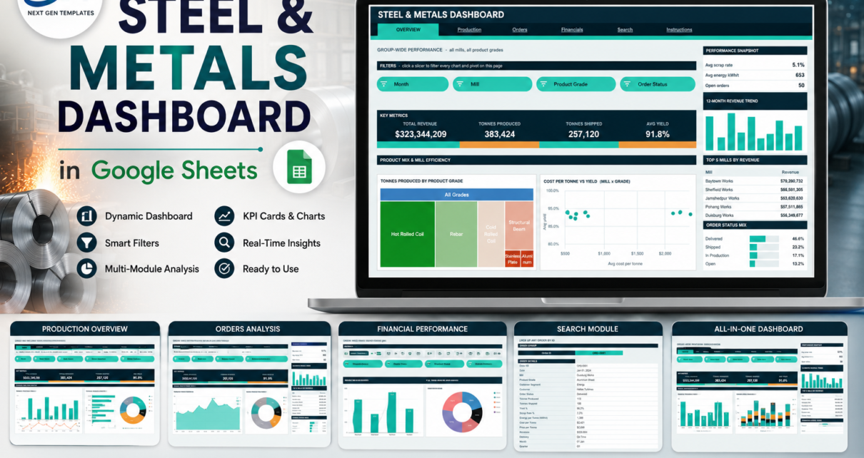
A steel or metals group generates a row of data for every order it books – mill, product grade, tonnes produced, tonnes shipped, yield, scrap rate, energy per tonne, cost, price, delivery outcome. Most of it lands in one long export and is never looked at again. The Steel & Metals Dashboard in Google Sheets is a reporting layer for exactly that export: 6 pages, 16 KPI cards, 14 charts, 16 slicers and an order-level lookup, all built on native Google Sheets pivot tables rather than formula chains. The build you download ships with 380 demo orders spanning 5 mills, 6 product grades, 4 customer segments and 12 months, and everything is pre-sized for 1,000 rows.Steel
Get the Steel & Metals Dashboard in Google Sheets
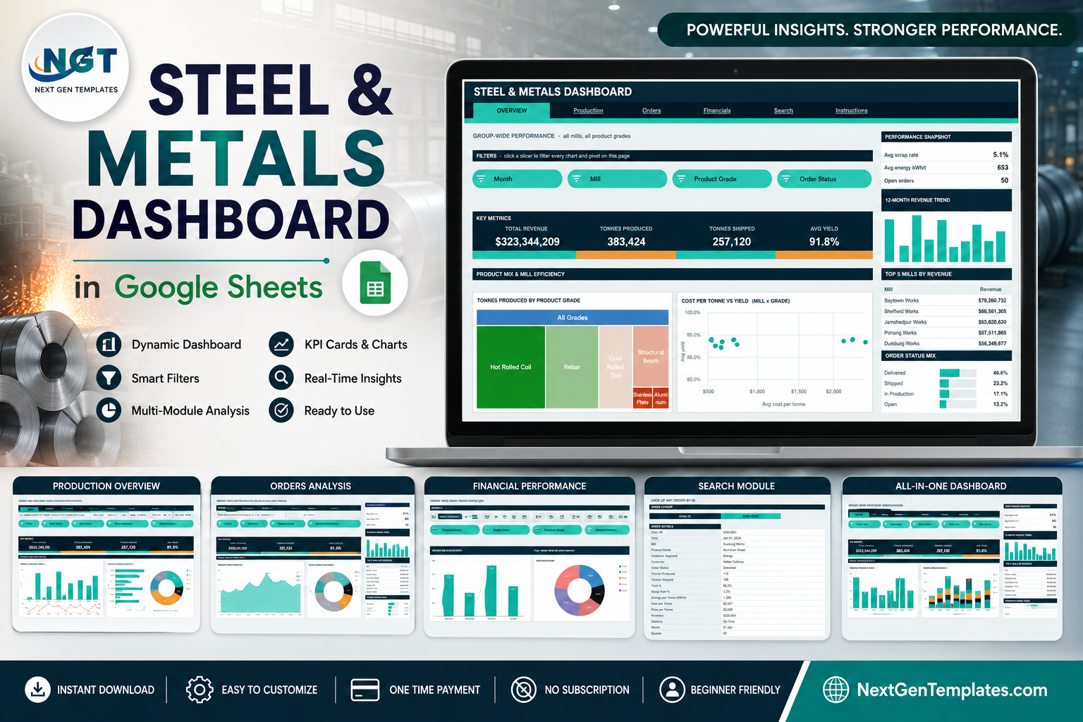
Everything below is described from the shipped build. All figures quoted are from the demo data, not from a real producer.
Key Features of the Steel & Metals Dashboard in Google Sheets
- Native pivot tables and slicers. Every chart reads a pivot parked to the right of its page, past a wide spacer column. Scroll right and you can inspect the numbers behind any visual.Steel & Metals Dashboard in Google Sheets
- Four slicers per analysis page. Mill, Product Grade, Month, Order Status, Customer Segment and Delivery appear in different combinations per page, and slicers are scoped per page so the other tabs keep their own filters.
- 16 KPI cards across four pages, plus a sidebar on each page holding a snapshot strip, a 12-month revenue trend, a Top 5 league table, a share bar and an At a Glance list.
- An order-level Search page that returns all 17 fields for a single Order ID.
- Auto-expand to row 1001 – paste new orders anywhere in that range and the pivots, slicers and formulas pick them up.
- Three-value theming – ink #0E2A38, accent #00B39F and amber #F2A03D recolour the entire workbook.
Dashboard Pages Explanation
1. Overview – group-wide product mix and mill efficiency
The landing page opens with Month, Mill, Product Grade and Order Status slicers, then a KPI strip: Total Revenue $323,344,209, Tonnes Produced 383,424, Tonnes Shipped 257,120 and Avg Yield 91.8% on the demo data. Underneath, Tonnes Produced by Product Grade is drawn as a treemap – Hot Rolled Coil the largest block, then Rebar, Cold Rolled Coil, Structural Beam, Stainless Plate and Aluminium Sheet – beside Cost per Tonne vs Yield (Mill x Grade) as a scatter, which is where an expensive-but-low-yield combination shows itself. A second band adds Monthly Tonnes Shipped and Order Status Mix by Month. The sidebar carries the group scrap rate (5.1%), average energy intensity (653 kWh/t), open orders (50), Top 5 Mills by Revenue and the order status split – Delivered 46.6%, Shipped 23.2%, In Production 17.1%, Open 13.2%.
2. Production – tonnage, yield, scrap and energy intensity
The operations page. KPI cards read Tonnes Produced, Avg Yield, Avg Scrap Rate and Avg Energy kWh/t, and five charts sit below: Tonnes Produced by Mill (Baytown 94,030, Jamshedpur 89,085, Sheffield 81,748, Duisburg 60,317, Pohang 58,244), Average Yield by Month with the monthly figure labelled on each point, Output Share by Grade as a donut, Tonnes Produced vs Shipped by Month as a combo, and Average Energy per Tonne by Mill. That last one is the page’s most useful chart in practice: on the demo data Duisburg runs at 790 kWh/t against Jamshedpur’s 509, a gap you would never spot in the export. The sidebar reports a shipped-to-produced ratio of 67.1%, average tonnes per order of 1,009 and Top 5 Grades by Tonnage.
3. Orders – order book, customer segment and delivery performance
Slicers here are Order Status, Customer Segment, Delivery and Month. KPI cards give Total Orders 380, Delivered 177, Open Orders 50 and On-Time Delivery 84.9%. The charts are Orders by Status, Orders by Customer, Tonnes Shipped by Segment (Construction 39.5%, Energy 26.4%, Appliance 25.5%, Automotive 8.6%), Monthly Order Volume, Grade Mix by Segment and Orders by Delivery Outcome – On Time 225, Not Shipped 115, Late 40. The sidebar adds average order value, late deliveries, tonnage awaiting shipment and Top 5 Customers by Revenue.
4. Financials – revenue, price and cost per tonne
Total Revenue, Avg Price / Tonne $1,191, Avg Cost / Tonne $954 and Avg Margin / Tonne $236 head the page. Monthly Revenue and Revenue vs Average Price per Tonne by Grade sit above Revenue by Customer Segment and Revenue Share by Mill. The grade combo chart is the one worth learning: revenue as columns against average price per tonne as a line, so a grade that is large in revenue but thin in price is immediately visible. The sidebar reports revenue per tonne, gross margin 19.8% and shipped revenue.
5. Search – one order, all its fields
Pick an Order ID and the page returns date, mill, product grade, customer segment, customer, status, tonnes produced and shipped, yield %, scrap rate %, energy per tonne, cost per tonne, price per tonne, revenue, delivery outcome, month and quarter. It is the page you use when someone in a meeting asks about one specific job.
6. Instructions – the 10-step user guide
A built-in guide covering where the pivots live, how slicers scope per page, which figures are deliberately unfiltered, the treemap caveat, how to substitute your own data and how to recolour the workbook.
Steel & Metals Dashboard in Google Sheets vs. Excel vs. Paid Manufacturing BI – Feature Comparison
| This template (Google Sheets) | Excel dashboard equivalent | Paid manufacturing BI / ERP module | |
|---|---|---|---|
| Cost | $9.99 one-time | $13.99-$19.99 one-time | $70-$200 per user / month |
| Platform | Google Sheets, any browser | Excel desktop | Vendor cloud |
| Setup time | About 10 minutes | 15-30 minutes | Weeks, with data mapping |
| Real-time collaboration | Yes, native | Via OneDrive only | Yes |
| Mobile access | Sheets app | Excel mobile, limited slicers | Vendor app |
| Customisable fields | Yes, edit the Data sheet | Yes | Usually admin-gated |
| Share with a link | Yes | No | Seat required |
| Year-1 cost at 5 users | $9.99 | $13.99-$19.99 | $4,200-$12,000 |
| Yield, scrap and energy per tonne on one page | Yes | Yes | Often split across modules |
| Order-level lookup | Yes | Varies | Yes |
Who Should Use This Template
Mill operations managers who want tonnage, yield, scrap and energy intensity side by side. Commercial teams reviewing the order book, delivery performance and customer concentration. Finance teams tracking price, cost and margin per tonne. Group functions comparing several mills on the same measures. Service centres and stockists that need a shared browser file rather than a workbook emailed round.
It is not a safety system, an emissions or environmental compliance return, a material-grading or metallurgical certification tool, a quality-certification system, or a source of commodity price forecasts or trading advice – see the FAQ below for the detail.
Real-World Use Cases
Weekly mill review. Filter Production to last month and read Tonnes Produced by Mill next to Average Energy per Tonne by Mill. The mill producing well but consuming heavily is the conversation.
Order book triage. On Orders, slice Delivery to Late and read Top 5 Customers by Revenue – that tells you not just how many orders slipped but whose.
Month-end margin walk. On Financials, slice by grade and compare revenue against average price per tonne to separate a price move from a mix move.
Advantages of the Steel & Metals Dashboard in Google Sheets
- Pivot-driven, so the workbook does not slow down as the order log grows.
- Slicers are visible controls anyone can use – no formula editing to change a view.
- Operations, commercial and finance views live in one file, so nobody reconciles two versions.
- Runs in a browser on any device, and shares by link.
- Recolouring is a three-value edit, so it can carry your own brand quickly.
- The Instructions page documents its own quirks rather than leaving you to find them.
Opportunities for Improvement
Two behaviours are worth knowing before you buy, and both are stated on the Instructions page. First, the KPI cards and the At a Glance lists use SUMIFS, COUNTIFS and AVERAGEIF against the whole Data sheet, so they show unfiltered totals by design and do not move when you click a slicer – the charts, pivots and Top 5 panels are the slicer-aware parts. Second, treemap charts are not slicer-aware in Google Sheets, so the Overview treemap always shows the full portfolio; use the grade slicer with the other charts instead. Beyond that, the ranges cover 1,000 rows, so a longer order log needs the pivot ranges extended manually, and there is no live connection to an MES or ERP – this is periodic reporting from an export.
Best Practices
- Read the Instructions page before editing anything.
- Keep the Data sheet headers exactly as shipped – the pivots, slicers and charts all resolve by header name.
- Replace the demo rows rather than appending to them, so no sample order survives into your reporting.
- Refresh on a fixed cadence – weekly for operations, monthly for finance – so the trend charts stay comparable.
- Use Select all to clear a slicer rather than leaving a page filtered for the next reader.
- If your log will exceed 1,000 rows, extend the pivot source ranges first, then paste.
- If you are new to the underlying feature, Google’s own guide to pivot tables and slicers in Google Sheets is worth ten minutes.
Explore Relevant Templates
- Chemical Manufacturing Dashboard in Google Sheets – the nearest industrial-production neighbour.
- Cement and Steel Dashboard in Google Sheets – heavy materials with a cement-side view.
- Power Generation Dashboard in Google Sheets – a natural companion where energy intensity matters.
- Oil & Gas Dashboard in Google Sheets – the same pivot-and-slicer build upstream.
- Same topic, other platforms: Steel & Metals Dashboard in Excel and Steel & Metals Dashboard in Power BI.
If you want to go further with dashboards like this, the Excel Pivot Tables & Dashboards course on NextGenTemplates Academy teaches the pivot and charting skills behind them, with practice files.
Get the Steel & Metals Dashboard in Google Sheets
Frequently Asked Questions
Does this dashboard certify material grades or replace mill test certificates?
No. Product Grade here is a product family label – Hot Rolled Coil, Cold Rolled Coil, Rebar, Structural Beam, Stainless Plate, Aluminium Sheet. The template does not issue, validate or substitute for mill test certificates, ASTM or EN conformance records or any metallurgical certification. Nor is it an ISO 9001 or ISO 14001 quality or environmental management system, an emissions or environmental compliance report, or a workplace safety system, and it offers no commodity price forecasting or trading advice. It reports the data you put into it.
Is the sample data real?
No. The 380 orders, 5 mills, 12 customers and every number in the screenshots are demo data created to show the layout. Replace them with your own records.
Do I need Excel or Power BI?
No. It runs entirely in Google Sheets in a browser.Steel & Metals Dashboard in Google Sheets
Why did my KPI cards not change when I clicked a slicer?
They are deliberately unfiltered – see Opportunities for Improvement above. The charts, pivots and Top 5 panels do respond.Steel & Metals Dashboard in Google Sheets
Can I add more mills or product grades?
Yes. They are values in the Data sheet, so new names appear in the pivots and slicers on refresh.
How many rows can it hold?
1,000 out of the box, covered by pre-sized pivots, slicers and formulas. Extend the pivot source ranges for a longer log.Steel & Metals Dashboard in Google Sheets
How do I get my copy?
The download is a PDF that carries the Make a copy link. Click it and the dashboard is created in your own Google Drive.Steel & Metals Dashboard in Google Sheets
About the Author
Built by PK – Microsoft Certified Professional with 15+ years of Excel, Google Sheets, and Power BI experience. Founder of NextGenTemplates, reaching 300K+ subscribers across YouTube channels. Every template is hand-built and tested before release.Steel & Metals Dashboard in Google Sheets
Conclusion
If your mill data already exists as one long order export, the gap is not more data – it is a place to read it. The Steel & Metals Dashboard in Google Sheets gives you four analysis pages, an order lookup and a documented instructions tab for $9.99, with instant download and lifetime access. Paste your log in, keep the headers, and the reporting is done. For video walkthroughs of this and other Google Sheets dashboards, subscribe at youtube.com/@NeotechNavigators.Steel & Metals Dashboard in Google Sheets