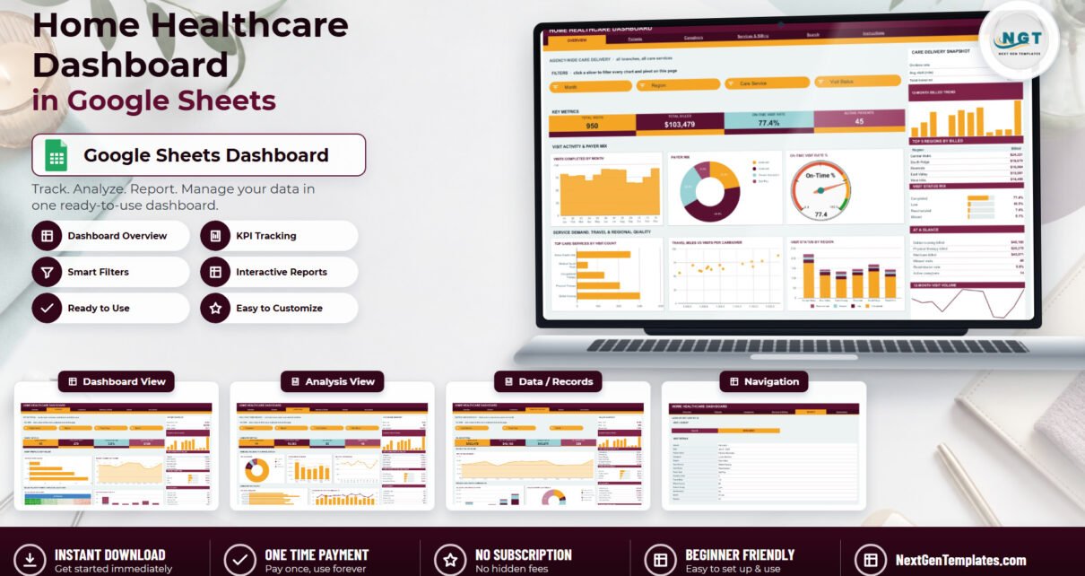
The Home Healthcare Dashboard in Google Sheets turns a home care agency’s visit log into a six-page report: 950 sample visits, 16 KPI cards, 18 charts and 15 slicers, all driven by native Google Sheets pivot tables. The sample agency covers 45 patients, 14 caregivers, 6 service regions, 5 care services and 4 payer types across the 2024 calendar year, and every pivot, slicer and formula already reaches 1,000 data rows.
Most home care agencies already have the data. It is sitting in a visit log — one row per visit, filled in by whoever does the scheduling — and nobody has the time to turn it into a picture. This Google Sheets dashboard template does that in one paste: swap your rows in for the sample rows, keep the 17 column headers, and every chart on every page redraws itself.
Get the Home Healthcare Dashboard in Google Sheets
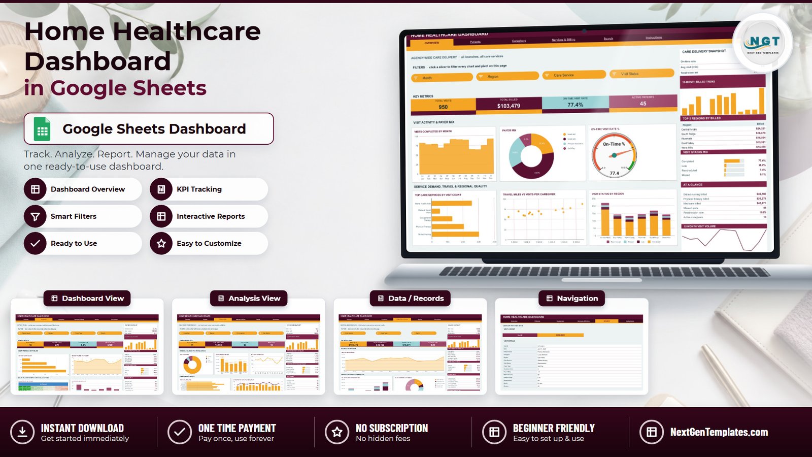
Key Features of the Home Healthcare Dashboard in Google Sheets
- Sixteen KPI cards across four pages. Total Visits, Total Billed, On-Time Visit Rate, Active Patients, High Acuity Visits, Readmission Rate, Avg Billed / Visit, Active Caregivers, Total Travel Miles, Avg Visit (min), Missed Visits, Skilled Nursing Billed, Medicare Billed and Billed per Hour.
- Built on pivot tables and slicers, not helper formulas. Each chart reads a pivot table parked to the right of its page, so the workbook stays fast as the visit log grows. Fifteen slicers sit in the FILTERS strip across the four analysis pages.
- KPI cards are deliberately unfiltered. The cards and the AT A GLANCE lists use SUMIFS and COUNTIFS on the Data sheet and always show agency-wide totals; the charts, pivots and Top 5 panels respond to the slicers. The built-in Instructions page says so in plain language.
- A visit-level Search page. Enter any Visit ID and read the full 15-field record — date, patient, caregiver, region, care service, visit status, payer type, duration, travel miles, billed amount, acuity, readmission flag, month and quarter.
- Auto-expanding to 1,000 rows. Paste new visits anywhere up to row 1001 and nothing needs re-ranging. Beyond that, raise the DATA_ROWS constant in the bundled Apps Script and re-run main().
- One-place re-theming. The build ships in a Rose / Amber scheme (ink #5A1030 with #F5A524 and #9AD1D4 accents). Edit the palette at the top of the script and the whole workbook follows.
What This Template Is — and What It Is Not
Be clear about this before anything else, because home care touches people in their own homes. The Home Healthcare Dashboard in Google Sheets is a business reporting template. It summarises visits, schedule reliability, travel burden, payer mix and billed value. It is not a care-planning tool, not a scheduling or rostering engine, not electronic visit verification, not a medication record and not a safeguarding system. It makes no clinical, diagnostic, treatment-outcome, care-quality or patient-safety judgement. “Patient Acuity” and “Readmission” are columns you populate yourself — the dashboard counts them, it does not assess them.
What the data model actually contains
The Data sheet has 17 columns and 950 sample rows. Two of those columns hold people’s names: Patient Name (45 fictional patients) and Caregiver (14 fictional staff). The Patients page charts billed value by patient name, and the Search page prints a named record. Nothing in the file holds a home address, postcode, GPS coordinate, phone number, date of birth, diagnosis, medication or clinical note — Region is a broad service-area label (Central Metro, East Valley, North County, Riverside, South Ridge, West Hills) and Travel Miles is a distance figure, not a route or a location.
That matters. If you paste real patient names into that column, you have put identifiable health information into a plain Google Sheet whose only protection is your Drive sharing settings. The practical fix takes ten seconds: use your internal patient code instead of the name. Every chart, every pivot and the Search lookup behave identically, because nothing in the build depends on a name format. There is also no live connection to any EHR, billing platform or scheduling system — this is a static sheet you paste into — and no HIPAA, GDPR or accreditation compliance is claimed or implied. Compliance rests on your own Google Workspace configuration and policies, never on a spreadsheet template.
Dashboard Pages Explanation
Page 1: Overview — agency-wide care delivery
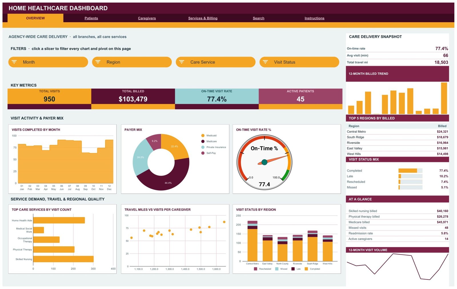
Four KPI cards (Total Visits 950, Total Billed $103,479, On-Time Visit Rate 77.4%, Active Patients 45) sit beneath Month, Region, Care Service and Visit Status slicers. Charts are Visits Completed by Month, Payer Mix, On-Time Visit Rate %, Top Care Services by Visit Count, Travel Miles vs Visits per Caregiver, and Visit Status by Region. The right sidebar carries a Care Delivery Snapshot, a 12-Month Billed Trend, Top 5 Regions by Billed, a Visit Status Mix and an At a Glance panel.
Page 2: Patients — acuity, payer coverage, readmissions and billed value
KPI cards report Active Patients, High Acuity Visits, Readmission Rate and Avg Billed / Visit under Patient Acuity, Region, Payer Type and Month slicers. Charts are Visits by Patient Acuity, Monthly Patient Visit Volume, Billed Amount by Patient, and Visits by Region & Acuity. The sidebar adds a Patient Snapshot, Top 5 Patients by Billed and a Patient Acuity Mix split across Low, Moderate, High and Critical.
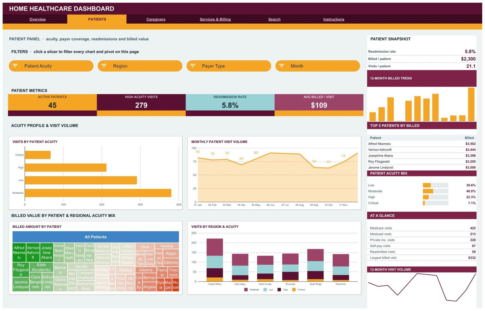
Page 3: Caregivers — visit load, travel burden and schedule reliability
KPI cards report Active Caregivers, Total Travel Miles, Avg Visit (min) and Missed Visits under Caregiver, Region, Care Service and Visit Status slicers. Charts are Visit Status Mix, Travel Miles by Region, Monthly Travel Miles, Visits by Caregiver, and Caregiver Visits vs Avg Visit Length. The sidebar shows a Caregiver Snapshot, Top 5 Caregivers by Billed and Care Service Workload Share.
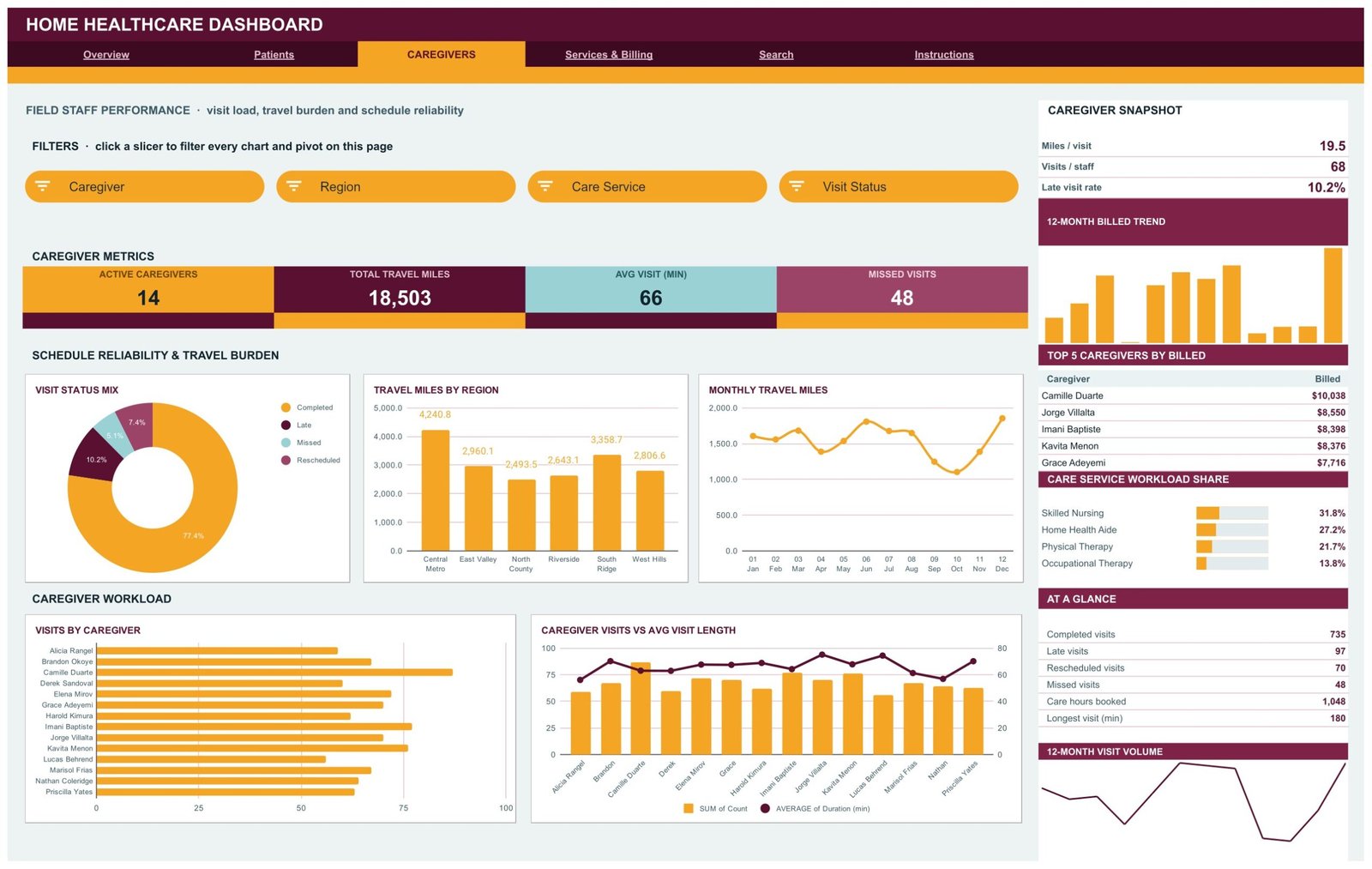
Page 4: Services & Billing — service line economics
KPI cards report Total Billed, Skilled Nursing Billed, Medicare Billed and Billed per Hour under Care Service, Payer Type and Month slicers — three slicers here, not four. Charts are Monthly Billed Amount, Billed by Care Service & Payer, and Billed Share by Care Service. The sidebar carries a Billing Snapshot, Top 5 Services by Billed and a Payer Billed Share list covering Medicare, Private Insurance, Medicaid and Self-Pay.
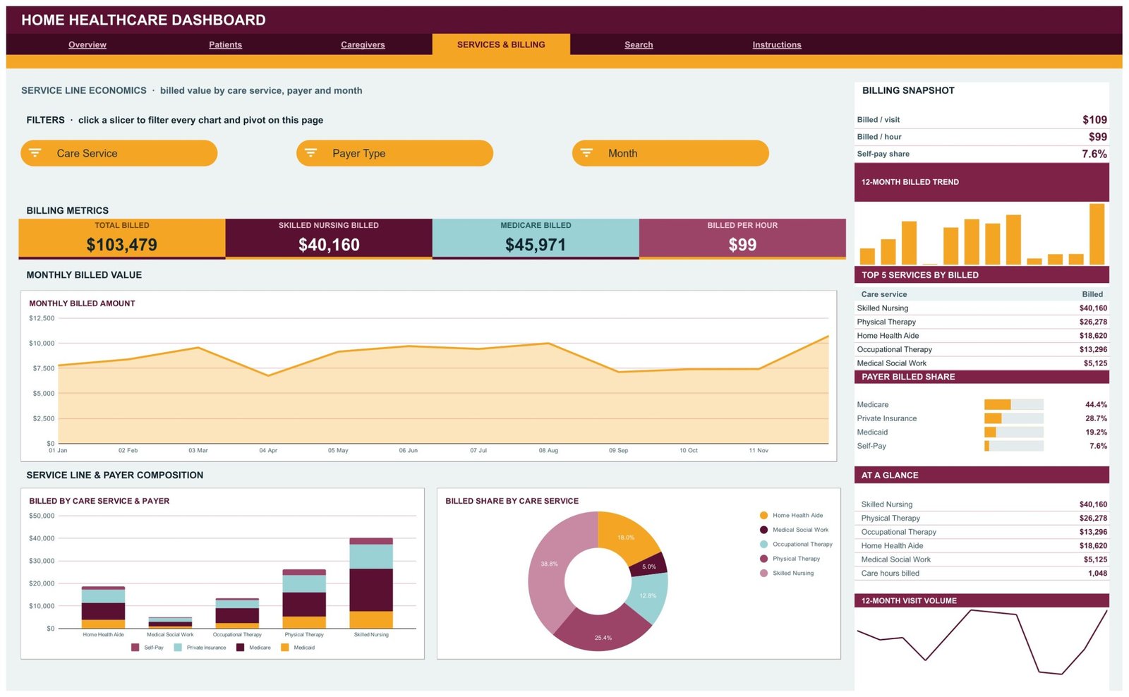
Page 5: Search — look up any visit by ID
Type a Visit ID into the input cell and the Visit Details table returns that visit’s whole record, field by field, straight from the Data sheet. It is the fastest way to answer “what actually happened on that visit” without scrolling the log.
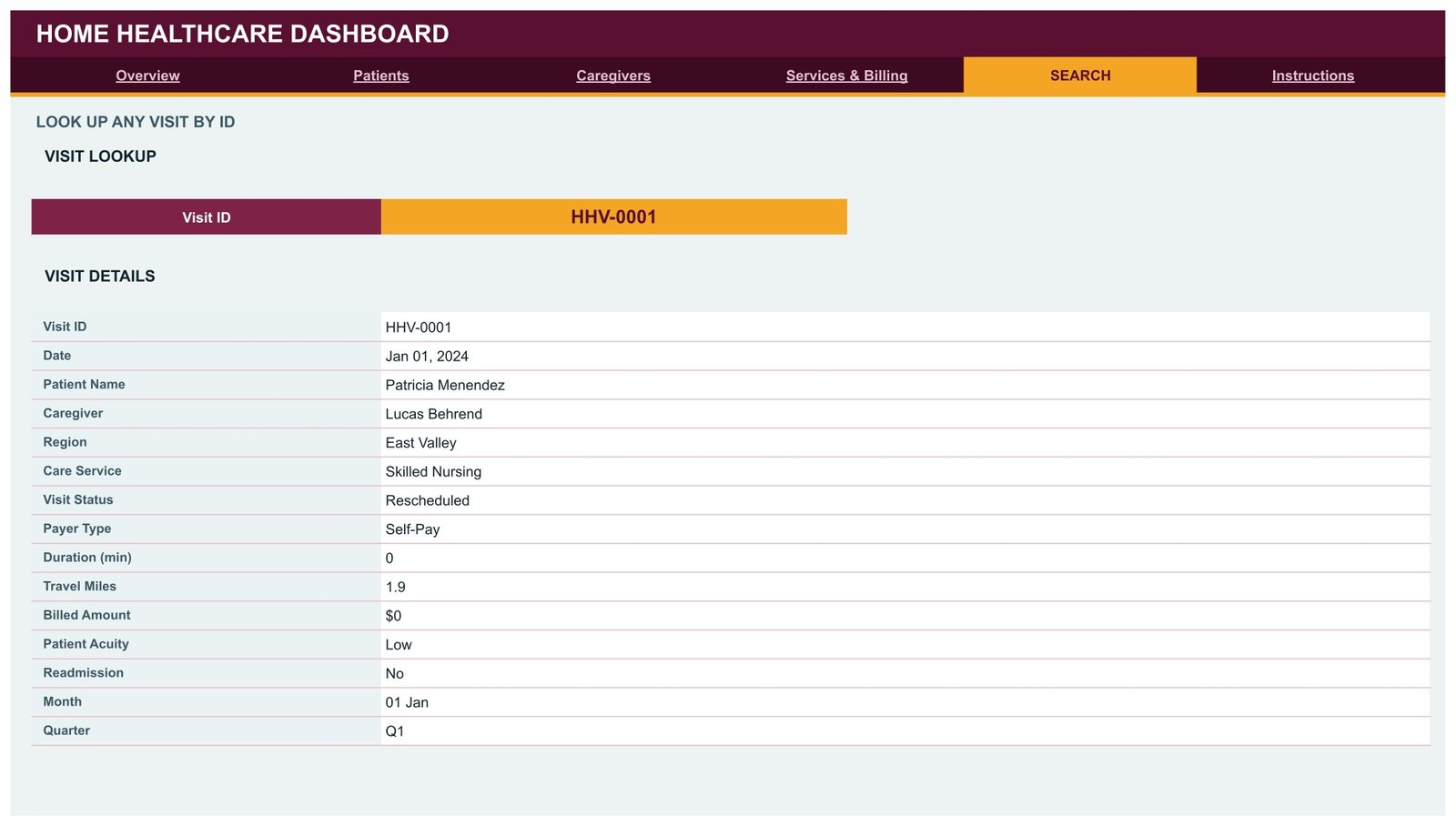
Page 6: Instructions — the user guide inside the file
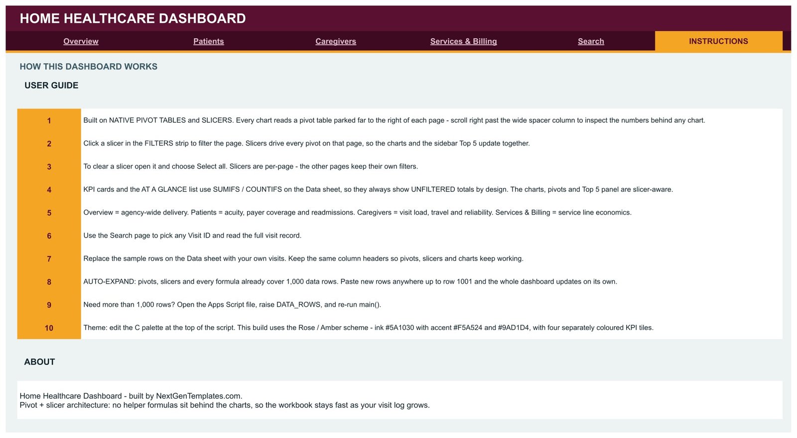
Ten numbered notes explain the pivot-and-slicer architecture, how to clear a slicer with Select all, why the KPI cards stay unfiltered, how the 1,000-row auto-expand works and how to re-theme the build from the script.
Home Healthcare Dashboard in Google Sheets vs. an Excel Dashboard vs. a Paid BI Suite — Feature Comparison
| Feature | Home Healthcare Dashboard in Google Sheets | Microsoft Excel dashboard | Power BI Pro / Tableau Creator |
|---|---|---|---|
| Cost | $9.99 one-time ✅ | $13.99 one-time + Microsoft 365 | $14-75 / user / month |
| Platform | Google Sheets, browser only ✅ | Desktop Excel | Desktop authoring + service |
| Setup time | Under 10 minutes ✅ | Under 15 minutes | Days — model, publish, licence |
| Real-time team collaboration | Built in ✅ | Only via OneDrive co-authoring | Yes, per seat |
| Mobile access | Google Sheets app ✅ | Excel mobile, limited slicers | Vendor app, per seat |
| Customisable fields | Edit columns and re-run the script ✅ | Edit columns, refresh pivots | Remodel and republish |
| Share with a link | Any Google account ✅ | File send or OneDrive link | Viewers need a licence |
| Year-1 cost at 5 users | $9.99 ✅ | $13.99 + 5 Microsoft 365 seats | $840-4,500 |
| Visit-level record lookup | Search page, no add-ons ✅ | Needs a lookup sheet | Drillthrough page |
| Row capacity out of the box | 1,000 visits, raise in the script | Excel row limit | Millions ✅ |
For a home care agency that wants its visit log summarised without paying per-seat BI licences, the Home Healthcare Dashboard in Google Sheets sits in the sweet spot.
Who Should Use This Template
Perfect for:
- Owners and operations managers at home care or home health agencies running roughly 10-60 caregivers
- Billing and revenue-cycle staff who need payer mix, billed per hour and service-line splits in one view
- Scheduling coordinators tracking missed, late and rescheduled visits by region and by caregiver
- Franchise and multi-branch operators reporting consistently across up to six service regions
Not a fit if:
- You need an EHR, care-planning, e-prescribing or electronic visit verification system — this reads a log, it does not run care
- You need HIPAA-scoped hosting, audit trails, SSO or a signed BAA; a plain Google Sheet provides none of those
- You want a live feed from a billing or scheduling platform — this is a static sheet you paste into
- You run well past 1,000 visits a period and would rather not edit one constant in an Apps Script file
Real-World Use Cases
Dana runs a 22-caregiver home care agency across three counties. Each Monday she opens the Caregivers page, filters Visit Status to Missed and Late, and sees which region is absorbing the reliability problem before her scheduling call — instead of reconciling three spreadsheets by hand.
Marcus handles billing for a home health group. He works from the Services & Billing page: Billed Share by Care Service shows which line is carrying revenue, and Payer Billed Share shows how exposed the agency is to a single payer. His quarterly board slide is two screenshots.
Priya coordinates a six-region franchise. She reads the Overview page’s Travel Miles vs Visits per Caregiver scatter to find branches where staff drive a long way for comparatively few visits, then sizes the mileage cost on the Caregivers page’s Travel Miles by Region chart.
Advantages of the Home Healthcare Dashboard in Google Sheets
The obvious one is cost: $9.99 once against $14-75 per user per month for a BI seat, and viewers need nothing but a Google account. The less obvious one is maintenance. Because the charts read native Google Sheets pivot tables rather than a wall of helper formulas, there is nothing fragile to break when you paste a new month of visits in. Slicers handle the filtering natively too, so the file behaves the same on a laptop and on the Sheets mobile app.
It also saves the reconciliation hour. Travel miles, visit duration, billed amount and visit status all live on the same row, so mileage cost and schedule reliability come out of the same paste as the revenue numbers — no second workbook, no VLOOKUP bridge between systems.
Opportunities for Improvement
Three honest limitations. First, the KPI cards ignore the slicers by design: filter to one region and the cards still show agency totals. That is documented on the Instructions page, but it surprises people on day one. Second, the 1,000-row ceiling is a real ceiling — going past it means opening the Apps Script file, changing DATA_ROWS and re-running main(), which is easy but is not a spreadsheet skill. Third, the Data sheet ships with a Patient Name column, and a template that charts billed value by patient name invites you to paste real names into it. Swap in an internal code on day one and that risk disappears.
Best Practices
- Replace Patient Name with your internal patient code before the first real paste, not after.
- Keep all 17 column headers exactly as shipped — the pivots, slicers and Search lookup key off them.
- Keep one row per visit. Do not merge cells or leave blank rows inside the range.
- Fill Visit Status and Payer Type from a fixed list; free text fragments the pivots.
- Clear slicers with Select all before you screenshot a page for a report, so nobody reads a filtered chart as an agency total.
- Share the file view-only, and review who has access whenever a caregiver leaves.
Explore Relevant Templates
The same subject is built on two other platforms: the Home Healthcare Dashboard in Power BI for a modelled version with drillthrough, and the Home Healthcare Dashboard in Excel for the desktop build. The Home Healthcare KPI Dashboard in Excel is a different product again — a month-picker scorecard with traffic lights and trend pages rather than an analytical dashboard.
To cover the rest of the operation, pair it with the Nurse Duty Roster Calendar in Google Sheets, the Patient Follow-Up Visit Calendar in Google Sheets or the Medical Expense & Claims Tracker in Google Sheets. The full range sits under Google Sheets Dashboards.
More related walkthroughs on this blog: Healthcare Insurance KPI Scorecard In Google Sheets, Healthcare Services Dashboard in Google Sheets Template and Healthcare Management Dashboard in Google Sheets Template. Each is a separate template with its own layout and sample data.
Once your visit log is in place, the Excel Pivot Tables & Dashboards course on NextGenTemplates Academy shows how to read and extend this kind of report, with practice files to work from.
Get the Home Healthcare Dashboard in Google Sheets
Frequently Asked Questions
What KPIs does the Home Healthcare Dashboard in Google Sheets track?
The Home Healthcare Dashboard in Google Sheets tracks 16 KPI cards across four pages: Total Visits, Total Billed, On-Time Visit Rate, Active Patients, High Acuity Visits, Readmission Rate, Avg Billed / Visit, Active Caregivers, Total Travel Miles, Avg Visit (min), Missed Visits, Skilled Nursing Billed, Medicare Billed and Billed per Hour.
Does this template hold patient names or home addresses?
It holds names, not addresses. The Data sheet has a Patient Name column and a Caregiver column, filled with fictional samples. There are no addresses, postcodes, GPS coordinates, phone numbers, dates of birth, diagnoses or clinical notes. Replace Patient Name with an internal code before pasting real records — everything works identically with codes.
Is the Home Healthcare Dashboard in Google Sheets HIPAA compliant?
No, and it does not claim to be. The Home Healthcare Dashboard in Google Sheets is an ordinary Google Sheets file with no hosting, encryption, audit-trail or access-control guarantees of its own. Compliance depends entirely on your own Google Workspace configuration, agreements and internal policies — not on this template.
How does this compare to Power BI or Tableau?
The Home Healthcare Dashboard in Google Sheets is a $9.99 one-time purchase that opens in a browser and needs no licence for viewers. Power BI Pro and Tableau Creator run $14-75 per user per month and require a published data model. Choose BI for millions of rows; choose this for a visit log.
How long does setup take?
Under 10 minutes. Make your copy from the link in the PDF, swap Patient Name for your internal code, then paste your visits over the sample rows keeping all 17 headers intact. Every pivot, chart and slicer in the Home Healthcare Dashboard in Google Sheets updates automatically.
How many visits can it hold?
Pivots, slicers and formulas cover 1,000 data rows out of the box, and the sample fills 950 of them. To go further, open the bundled Apps Script file, raise the DATA_ROWS constant and re-run main() — the workbook rebuilds at the new size.
Can it schedule visits or verify caregiver arrivals?
No. The Home Healthcare Dashboard in Google Sheets is a reporting template only. It has no scheduling engine, no electronic visit verification, no GPS or clock-in capture, no care plans and no medication records. It reads a visit log you maintain elsewhere and summarises it into charts.
About the Author
Built by PK — Microsoft Certified Professional with 15+ years of Excel, Google Sheets and Power BI experience. Founder of NextGenTemplates, reaching 300K+ subscribers across YouTube channels. Every template is hand-built and tested before release.
Conclusion
If your agency already keeps a visit log, the Home Healthcare Dashboard in Google Sheets is the shortest distance between that log and a report you can actually show someone. Six pages, 16 KPI cards, 18 charts, 15 slicers, a visit-level Search page and a user guide built into the file — with a clear line drawn around what it is not, which for anything touching people’s homes matters more than another feature.
Instant download · One-time payment · No subscription
Last updated: September 2026