Healthcare service teams often need to review patient volume, completed visits, revenue, cost, satisfaction, department performance, service mix and doctor activity from one reporting file. The Healthcare Services Dashboard in Google Sheets turns those signals into a multi-page dashboard: Overview, Departments, Performance, Engagement and Details pages, each with four KPI cards and filter controls, plus a Visit ID Search sheet and a structured Data Sheet.
Because it runs in Google Sheets, your team can work from one browser-based copy shared through Google Drive permissions. Below, every page is explained using the real cards and charts in the template, followed by setup steps, use cases and honest limitations.
🎥 Watch the Video Tutorial
Get the Healthcare Services Dashboard
Key Features of the Healthcare Services Dashboard in Google Sheets
- Executive KPI cards: the Overview page shows Total Patients, Completed Visits, Total Revenue and Avg Satisfaction; every other analysis page has its own set of four cards.
- Five analysis pages plus lookup and data: Overview, Departments, Performance, Engagement and Details, a Search sheet and the Data Sheet, with a sidebar menu for navigation.
- Filter controls: each analysis page has three filter controls at the top for quick monthly or departmental reviews.
- Department and doctor reporting: compare patients, visits, revenue, cost and satisfaction by department and by doctor.
- Visit ID search: select a Visit ID and see the full visit record on one screen.
Dashboard Pages Explained
1. Overview
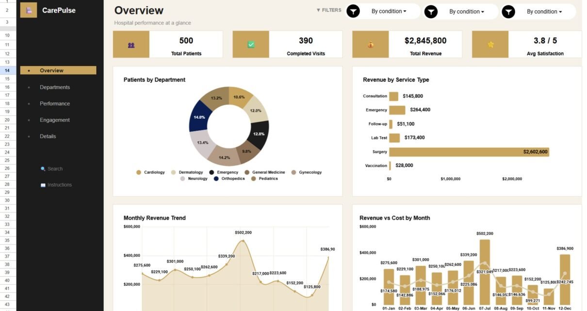
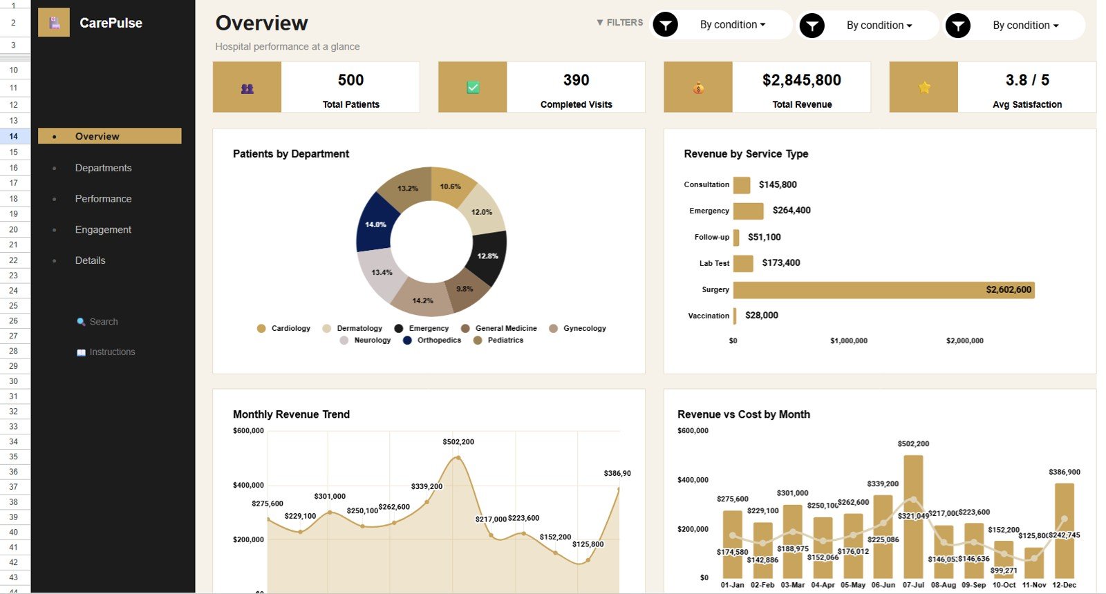
The Overview page (“Hospital performance at a glance”) shows four cards — Total Patients, Completed Visits, Total Revenue and Avg Satisfaction (rated out of 5). Below them are four charts:
- Patients by Department — a donut showing the share of patients across Cardiology, Dermatology, Emergency, General Medicine, Gynecology, Neurology, Orthopedics and Pediatrics.
- Revenue by Service Type — Consultation, Emergency, Follow-up, Lab Test, Surgery and Vaccination compared side by side.
- Monthly Revenue Trend — revenue by month, useful for spotting seasonal peaks and dips.
- Revenue vs Cost by Month — monthly revenue bars with a cost line, showing whether costs keep pace with income.
2. Departments (Department Analysis)
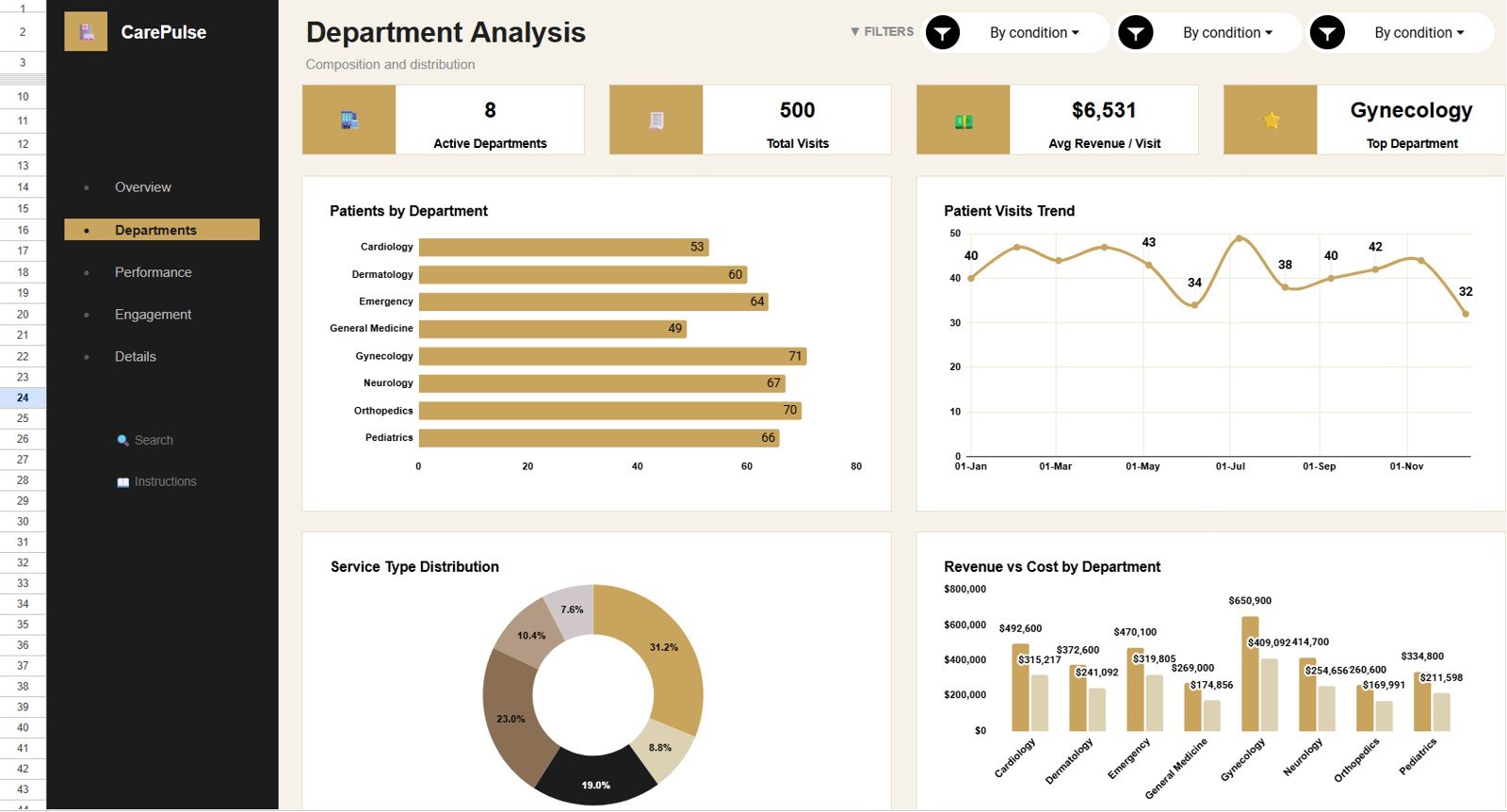
This page (“Composition and distribution”) has four cards — Active Departments, Total Visits, Avg Revenue / Visit and Top Department — and four charts: Patients by Department (a bar chart of patient counts), Patient Visits Trend (visits by month), Service Type Distribution (share of visits by service type) and Revenue vs Cost by Department. It is the page for administrators and service-line leaders who need to see where demand and cost concentrate.
3. Performance
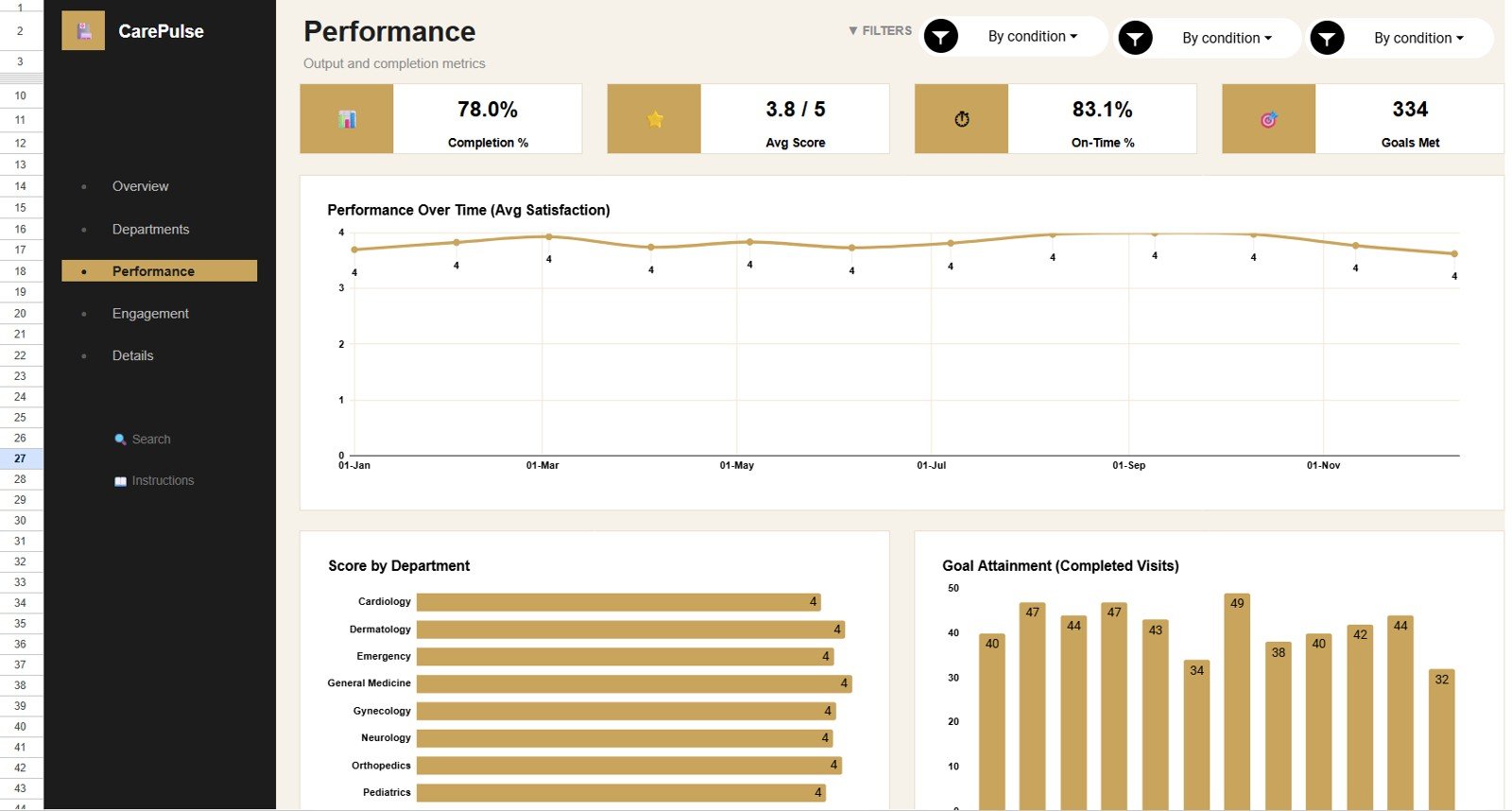
The Performance page (“Output and completion metrics”) shows Completion %, Avg Score, On-Time % and Goals Met, plus three charts: Performance Over Time (Avg Satisfaction), Score by Department and Goal Attainment (Completed Visits) by month. Use it to review quality signals alongside throughput.
4. Engagement
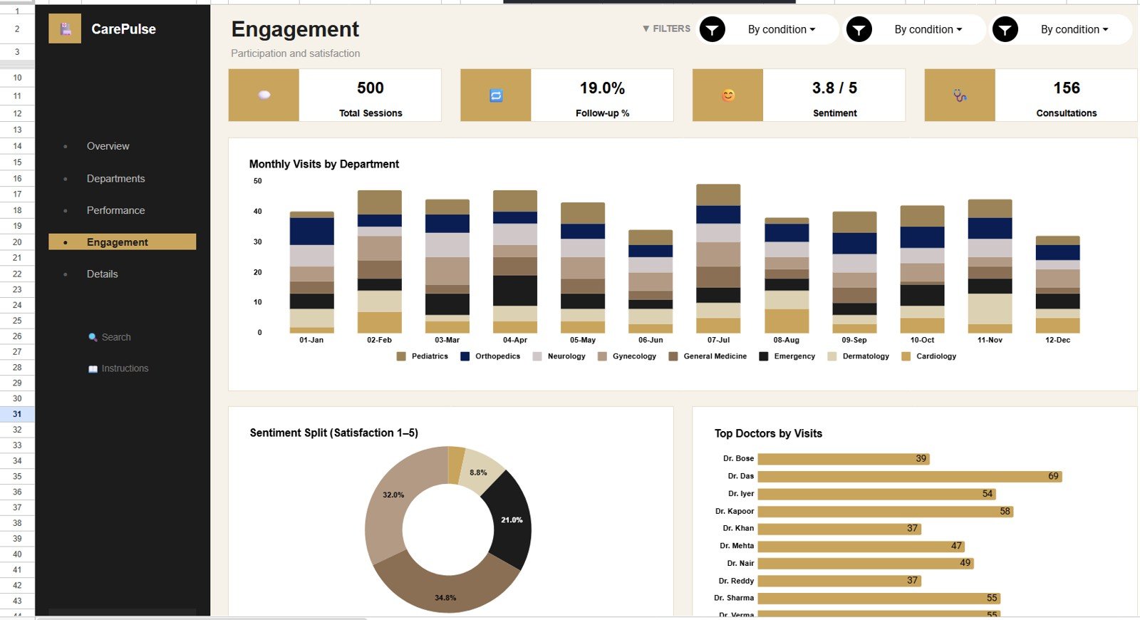
The Engagement page (“Participation and satisfaction”) shows Total Sessions, Follow-up %, Sentiment and Consultations, with three charts: Monthly Visits by Department (stacked by department), Sentiment Split (Satisfaction 1–5) and Top Doctors by Visits. It helps you see how visit patterns and feedback change by month, department and doctor.
5. Details
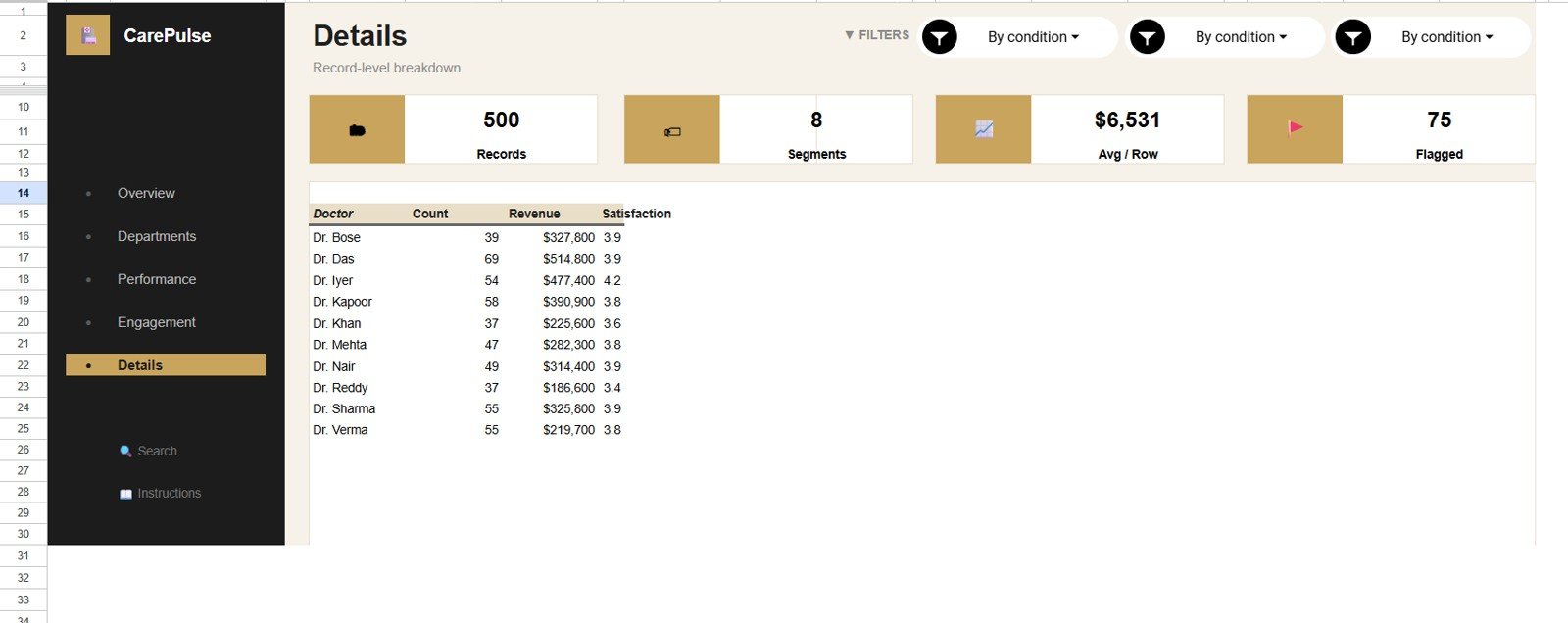
The Details page (“Record-level breakdown”) has four cards — Records, Segments, Avg / Row and Flagged — and a doctor summary table listing each doctor’s visit Count, Revenue and average Satisfaction. It is useful for management reviews where workload, financial contribution and patient experience need to be read together.
6. Search
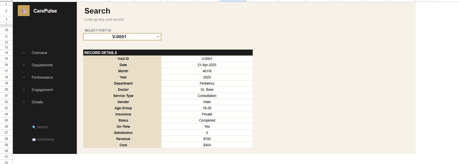
Select a Visit ID from the dropdown and the Search sheet returns the full record: Visit ID, Date, Month, Year, Department, Doctor, Service Type, Gender, Age Group, Insurance, Status, On-Time, Satisfaction, Revenue and Cost. It is handy for billing questions, follow-ups and quality checks.
7. Data Sheet
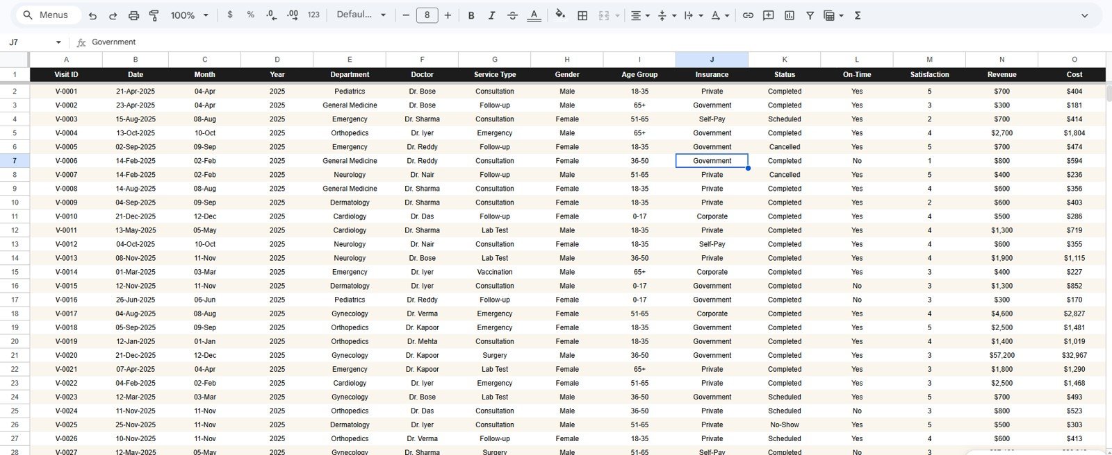
The Data Sheet is the input layer, with one row per visit and the same fields shown on the Search sheet. Status values in the sample include Completed, Scheduled, Cancelled and No-Show, and Insurance values include Private, Government, Self-Pay and Corporate. Add your records in the same format so the cards, filters, charts and search keep working.
KPI Cards at a Glance
The table below lists the headline cards and what each one tells you. The sample values come from the template’s demo data.
| KPI (page) | What it measures | Sample value | Better when |
|---|---|---|---|
| Total Patients (Overview) | Patient visit records in the current filter | 500 | Context metric |
| Completed Visits (Overview) | Visits that were completed | 390 | Higher |
| Total Revenue (Overview) | Headline revenue card. In the sample it is lower than the $3,265,300 that the monthly and service-type charts add up to for all 500 visits, so check which visit statuses it counts before reporting it | $2,845,800 | Higher |
| Avg Revenue / Visit (Departments) | Total revenue of all visits divided by visits ($3,265,300 ÷ 500) | $6,531 | Higher, if cost keeps pace |
| Avg Satisfaction (Overview) | Average patient rating on a 1–5 scale | 3.8 / 5 | Higher |
| Completion % (Performance) | Share of visits completed: Completed Visits ÷ Total Patients (390 ÷ 500) | 78.0% | Higher |
| On-Time % (Performance) | On-time rate based on the Yes/No On-Time column | 83.1% | Higher |
| Follow-up % (Engagement) | Share of visits that are follow-ups | 19.0% | Depends on your care model |
| Flagged (Details) | Records the template flags for review | 75 | Review the flagged rows each period |
How to Use It With Your Own Data
- Make your own copy of the template in Google Drive.
- Open the Data Sheet and review the column headers and sample values.
- Replace the sample rows with your visit records in the same column order, using consistent department, doctor and service type names.
- Check the Overview cards, then move through Departments, Performance, Engagement and Details.
- Use the filter controls for monthly or departmental reviews and the Search sheet for single-visit lookups.
Google Sheets vs Excel vs Healthcare SaaS
| Feature | Healthcare Services Dashboard in Google Sheets | Excel dashboard | Healthcare SaaS |
|---|---|---|---|
| Cost | $9.99 one-time | Template cost plus Excel access | Monthly or annual subscription |
| Platform | Google Sheets in browser | Excel desktop or web | Vendor-hosted system |
| Setup | Copy, replace sample data, review | Open workbook, replace data | Implementation and onboarding |
| Collaboration | Google Sheets sharing | Requires OneDrive or SharePoint | Permission-managed |
| Customizable fields | Editable sheet structure | Editable workbook | Limited by vendor |
| Visit ID lookup | Included | Possible with formulas | Depends on system |
| Best fit | Internal service reporting | Offline reporting | System-of-record workflows |
Who Should Use This Template
Clinic managers, department heads, healthcare administrators, finance analysts, practice managers, operations leads and consultants who need a clean reporting layer for visit records — especially teams that already export data from another system and want a shareable dashboard before investing in a full BI rollout.
It is not a replacement for an EHR, EMR, billing system, patient portal or compliance platform. Sensitive patient data should only be stored according to your organisation’s security, privacy and access-control policies.
Real-World Use Cases
Clinic operations manager: reviews Completed Visits and Patients by Department before weekly staffing meetings.
Healthcare finance analyst: compares Revenue vs Cost by Month and by Department, then checks Revenue by Service Type to explain financial performance.
Department head: uses Score by Department and the Sentiment Split chart to identify where service quality needs attention.
Advantages and Limitations
The main advantage is speed: copy the file, replace the sample records and start reviewing performance without building formulas and charts. Google Sheets sharing keeps managers and analysts on the same numbers, and the template stays focused on patients, visits, revenue, cost, satisfaction, departments, service types and doctors. To learn how dashboards like this are built, see the Pivot Tables & Dashboards course on NextGenTemplates Academy.
Limitations: it depends on clean input data. Inconsistent doctor names, missing Visit IDs, duplicates or renamed headers will affect the charts. Larger teams may eventually need automated imports, governed refresh or direct system integration.
Best Practices
- Keep the Data Sheet column structure unchanged unless you also update the linked formulas and charts.
- Use consistent department, service type and doctor names.
- Start each review on the Overview page, then use the other pages to explain what changed.
- Use the Search sheet for single visits, not broad analysis.
- Limit access to authorised users and avoid storing unnecessary personal data.
Related Templates and Guides
On this site: the Healthcare Management Dashboard in Google Sheets, the Healthcare Dashboard in Google Sheets, the Hospital Patient Flow Dashboard in Google Sheets and the Healthcare KPI Dashboard in Google Sheets.
Related products: Medical Practice Dashboard in Google Sheets, Telehealth Dashboard in Google Sheets and the Healthcare & Hospital Management Bundle.
Frequently Asked Questions
What does the Healthcare Services Dashboard in Google Sheets include?
Overview, Departments, Performance, Engagement and Details pages with KPI cards, charts and filter controls, plus a Search sheet for Visit ID lookup and a Data Sheet for your records.
Can I use my own healthcare services data?
Yes. Replace the sample records in the Data Sheet using the same column format.
Does it connect directly to an EHR?
No. It is a Google Sheets template. Export or prepare your data, then add it to the Data Sheet.
Can multiple team members view the dashboard?
Yes. After making your own copy, share it through Google Drive permissions.
Is the dashboard editable?
Yes. You can change labels, colours, formulas, charts and sheet names in your copy.
Is this a HIPAA-compliant tool?
The template alone does not guarantee HIPAA compliance. Compliance depends on your Google Workspace configuration, access controls, policies and data handling practices.
About the Author
Built by PK — Microsoft Certified Professional with 15+ years of Excel, Google Sheets and Power BI experience, and founder of NextGenTemplates. Every template is hand-built and tested before release.
Wrapping Up
The Healthcare Services Dashboard in Google Sheets gives healthcare teams one place to review patients, completed visits, revenue, cost, satisfaction, departments, service types and doctor activity, with Visit ID lookup for individual records. Make a copy, load your visit data and start with the Overview page.
Get the Healthcare Services Dashboard
📅 Last updated: October 2026