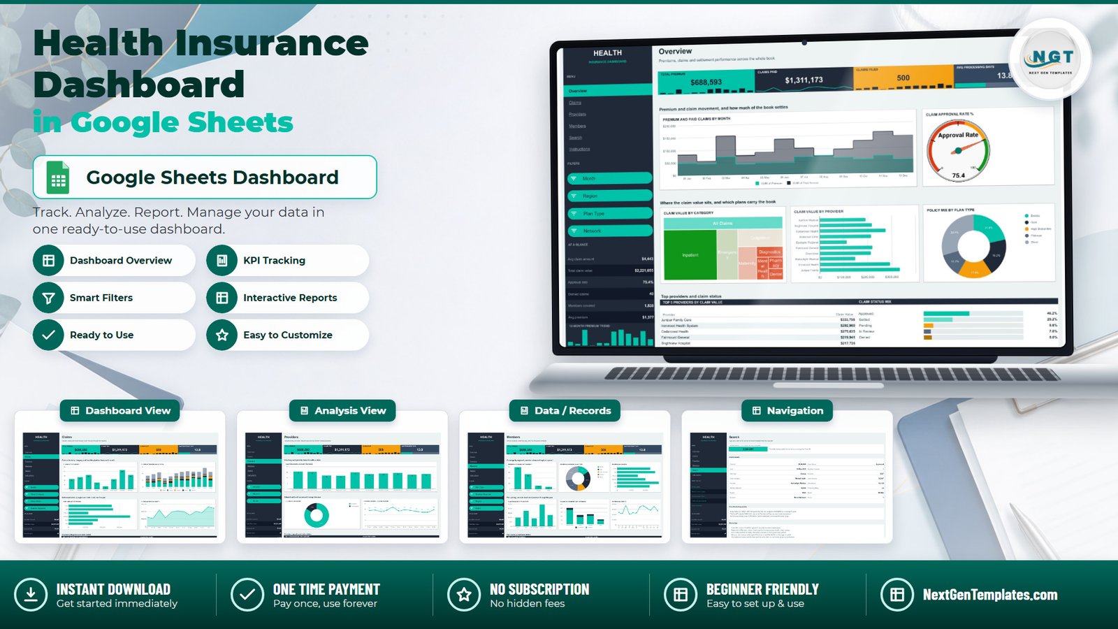
Most health insurance reporting still happens the same way: someone exports a claims extract, drops it into a spreadsheet, rebuilds the same four pivot tables they built last month, and screenshots the result into a deck. The Health Insurance Dashboard in Google Sheets removes the rebuilding half of that job. It ships with 500 sample claim rows spanning a full 2024 calendar year, 18 pivot-driven charts across four filtered pages, 15 slicers, and a single-record lookup page – and the formulas are already sized for 1,000 claims, so replacing the sample data is a paste, not a rebuild.
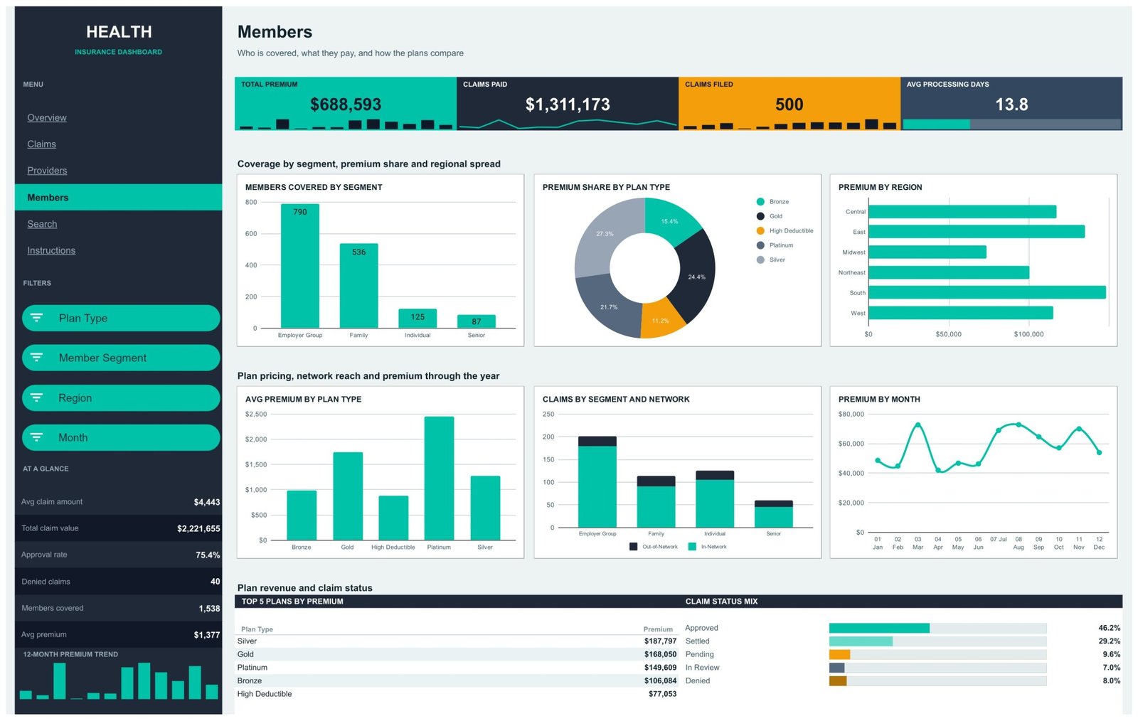
In the sample book the headline numbers read $688,593 of premium against $1,311,173 of claims paid, 500 claims filed across 1,538 covered lives, an average processing time of 13.8 days and an approval rate of 75.4%. Those are the four numbers a monthly reporting pack usually opens with, and here they sit in a band that follows you across every page.
Before anything else, one thing said plainly: this is a reporting template. It charts numbers you supply. It does not connect to a claims system, does not adjudicate or price anything, and carries no compliance certification of any kind.
Key Features of the Health Insurance Dashboard in Google Sheets
- Four filtered reporting pages plus two support tabs. Overview, Claims, Providers and Members are the dashboards; Search and Instructions round the file out, and a Data tab holds everything.
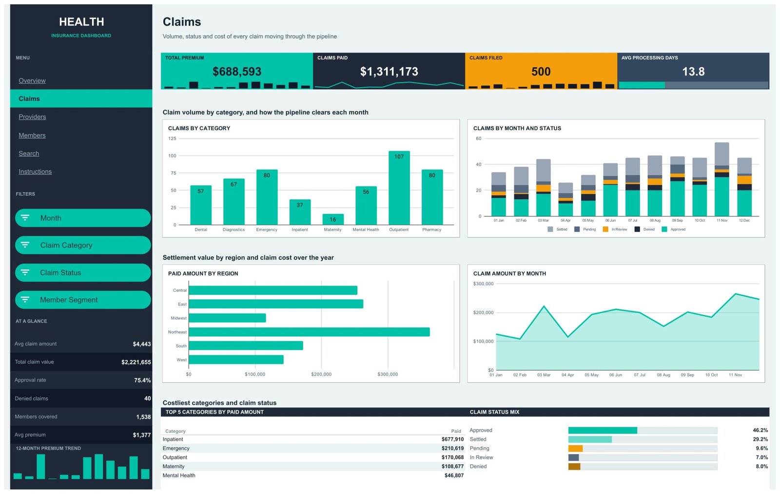
- A KPI band that travels. Total Premium, Claims Paid, Claims Filed and Avg Processing Days appear under the title on all four dashboard pages, each with an inline sparkline strip.
- A six-stat side rail. Avg claim amount ($4,443), Total claim value ($2,221,655), Approval rate (75.4%), Denied claims (40), Members covered (1,538) and Avg premium ($1,377), with a 12-month premium trend under them.
- 18 charts, every one fed by a pivot table. The pivots sit off to the right of each page starting at column Z, so changing a pivot field changes its chart.
- 15 slicers spread across the pages. Month, Region, Plan Type, Network, Claim Category, Claim Status, Member Segment and Provider – and each page filters independently, so one can show December while another shows the whole year.
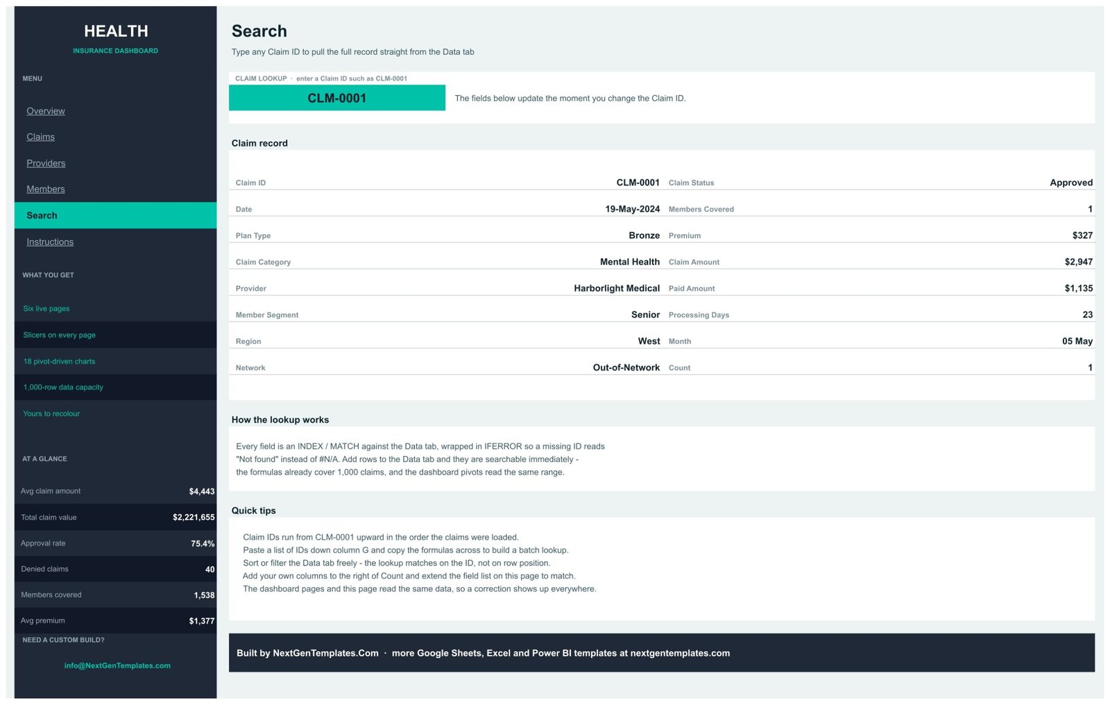
- A Claim ID lookup. The Search page resolves all 16 fields of a single claim through INDEX/MATCH, wrapped in IFERROR so an unknown ID reads “Not found” rather than #N/A.
- A written Instructions tab with five numbered sections – load your data, use the filters, move around, read the charts, make it yours.
- Nothing to install. No Apps Script, no add-on, no macro. It is a plain Google Sheets file.
Dashboard Pages Explanation
Overview
The landing page answers “how is the book doing” in one screen. A stepped Premium and Paid Claims by Month chart shows the two series against each other through the year, with a Claim Approval Rate dial beside it reading 75.4 in the sample. Below, a treemap sizes Claim Value by Category – Inpatient dominates, with Emergency, Outpatient, Maternity, Diagnostics, Mental Health, Pharmacy and Dental filling out the rest – next to a Claim Value by Provider bar chart across ten facilities and a Policy Mix by Plan Type ring. The strip at the bottom pairs Top 5 Providers by Claim Value with a Claim Status Mix breakdown: Approved 46.2%, Settled 29.2%, Pending 9.6%, Denied 8.0%, In Review 7.0%. Its slicers are Month, Region, Plan Type and Network.
Claims
This page is about volume and pipeline. Claims by Category counts each service line – Outpatient leads the sample at 107 claims, Maternity trails at 16 – and Claims by Month and Status stacks each month so you can see the settled/pending/denied split move. Underneath, Paid Amount by Region ranks the six regions (Northeast is the largest payer in the sample) and Claim Amount by Month traces cost through the year. The Top 5 panel switches to categories by paid amount, with Inpatient at $677,910 well clear of Emergency at $210,619. Slicers: Month, Claim Category, Claim Status, Member Segment.
Providers
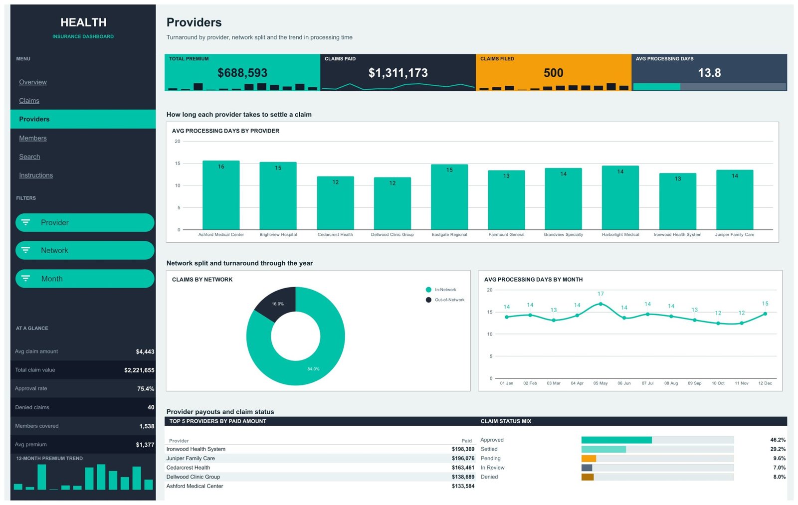
Turnaround lives here. Avg Processing Days by Provider charts all ten facilities side by side – the sample runs from 12 days at Cedarcrest Health and Dellwood Clinic Group up to 16 at Ashford Medical Center. Claims by Network splits the book 84% in-network against 16% out, and Avg Processing Days by Month tracks whether turnaround is drifting (it peaks at 17 days in May in the sample). The Top 5 panel ranks providers by paid amount. Slicers: Provider, Network, Month.
Members
The membership side. Members Covered by Segment shows Employer Group at 790 lives, Family 536, Individual 125 and Senior 87. Premium Share by Plan Type and Avg Premium by Plan Type sit together, which is the useful pairing: Silver carries the largest share of premium at 27.3% while Platinum has much the highest average premium per policy. Premium by Region, Claims by Segment and Network and Premium by Month complete the page, and the Top 5 panel ranks plans by premium (Silver $187,797, Gold $168,050, Platinum $149,609, Bronze $106,084, High Deductible $77,053). Slicers: Plan Type, Member Segment, Region, Month.
Search
Type a Claim ID into the green box and the record below fills in: date, plan type, claim category, provider, member segment, region and network on the left; status, members covered, premium, claim amount, paid amount, processing days and month on the right. Every field is an INDEX/MATCH against the Data tab, so the lookup matches on the ID rather than on row position – you can sort and filter the Data tab freely without breaking it.
Instructions and Data
Instructions is a written guide covering the five things people ask about. Data is the only tab you edit: 16 columns – Claim ID, Date, Plan Type, Claim Category, Provider, Member Segment, Region, Network, Claim Status, Members Covered, Premium, Claim Amount, Paid Amount, Processing Days, Month and Count – read by every pivot over the range A1:P1001.
What is – and is not – in that Data tab
Worth stating exactly, because claims data deserves it. The shipped sample holds no member or claimant names, no policy numbers, no member IDs, no diagnosis or procedure codes, no dates of birth and no addresses. The only identifier is a sequential claim reference (CLM-0001 upward), and the ten provider names are invented. Claim Category is a broad service line, not a coded diagnosis.
Your own data is a different matter. Paste a real book into those columns and the file then holds health-related information about identifiable claims, in a Google Sheet whose only access control is how you share it in Drive. Restrict the sharing, and aggregate or de-identify before circulating it. And to be unambiguous: this template is not HIPAA-certified, not GDPR-certified and not built to NAIC or Solvency II reporting requirements. It provides none of these.
Health Insurance Dashboard in Google Sheets vs. Microsoft Excel vs. a Paid BI Suite – Feature Comparison
| This Google Sheets dashboard | The same build in Microsoft Excel | A paid BI suite (Tableau, Power BI Pro) | |
|---|---|---|---|
| Cost | $9.99 once | $13.99 once + an Office licence | $14-$70 per user per month |
| Platform | Any browser | Excel desktop | Desktop authoring + cloud service |
| Setup time | Copy, paste your claims, done | Similar, plus file distribution | Days: connect, model, build, publish |
| Real-time collaboration | Yes, native | OneDrive co-authoring only | Yes, on the paid service |
| Mobile access | Google Sheets app | Excel mobile | Vendor app |
| Customisable fields | Yes – rename plans, categories, providers freely | Yes | Yes, with modelling work |
| Share with a link | Yes | No, you send a file | To licensed viewers only |
| Year-1 cost at 5 users | $9.99 | $13.99 + licences | $840-$4,200 |
| Claim-level record lookup | Built in (Search page) | Built in | Needs a drill-through page |
| Row capacity out of the box | 1,000 claims | Larger | Millions |
One category deliberately left off that table: a policy administration or claims adjudication platform – the software an insurer actually runs its book on. That is a different kind of product, not a more expensive version of this one. This template does not adjudicate, rate, reserve, detect fraud or determine eligibility. It reports on claims another system has already processed.
Who Should Use This Template
It fits employee-benefits brokers who need a client-ready view of a quarterly extract, TPA analysts who track provider turnaround, benefits managers preparing for renewal talks, and finance leads at small health plans who want the monthly numbers without waiting on a report request. It also fits anyone learning how pivot tables in Google Sheets drive charts, because the whole file is built that way and nothing is hidden behind a script.
It does not fit a team that needs a live feed from a claims system, more than 1,000 rows without extending the pivot ranges by hand, per-user row-level security, an audit trail of edits, or clinical detail at ICD or CPT level – there is no column for it.
Real-World Use Cases
Priya, an employee benefits broker. Each quarter she pastes a client’s claims extract into the Data tab and walks the HR director through the Members page – premium share by plan type against average premium – ahead of renewal negotiations.
Daniel, an analyst at a third-party administrator. He filters the Providers page to out-of-network claims only and takes the average-processing-days chart into a provider review, using the monthly trend line to show whether a slow facility is improving.
Rekha, finance lead at a small health plan. During the monthly close she keeps the Overview page open, reads premium against paid claims month by month, and uses the Claim Status Mix strip to see how much of the book is still pending.
Advantages of the Health Insurance Dashboard in Google Sheets
- Zero setup friction. One copy into your Drive and it runs – no install, no licence, no connector to configure.
- Genuinely shareable. A view-only link is the whole distribution story, which matters when the audience is a broker’s client or an HR team.
- Transparent construction. Every chart traces back to a visible pivot table, so you can audit any number rather than trusting a black box.
- Per-page filtering. Because slicers apply to one page each, four people can look at four different cuts of the same file at once.
- Recolourable end to end. The rail, KPI cards and chart palette are all yours; nothing is hardcoded to a plan or provider name.
- One payment. No seat count, no renewal, no feature tier.
Opportunities for Improvement
Being fair about the limits: the 1,000-row ceiling is a real one, and a mid-sized insurer will hit it in a single month. There is no automated import – every refresh is a manual paste, and if your source system exports in a different column order you will re-map it each time. The file has no loss-ratio or PMPM measure built in, which some reporting packs will want added. There is no year-over-year comparison, only the twelve months you load. And because Google Sheets recalculates the whole workbook, the pages get noticeably slower as you approach the row limit on a modest machine.
Best Practices
- Never leave Claim ID blank. It is the key the pivots use to skip empty rows and the Search page uses to find a record.
- Keep the Month label’s leading number (“01 Jan”, “02 Feb”) so the charts stay in calendar order rather than sorting alphabetically.
- Add your own columns to the right of Count, never in the middle – the 16 headers are what the pivots and the lookup expect.
- Refresh the pivots after a paste, then clear the slicers with the Reset option inside each one before you read a page.
- De-identify before you share. If a link is going outside your organisation, strip anything that could identify a member first.
- Keep a clean master copy. Duplicate the file per reporting period rather than overwriting the one everyone has bookmarked.
Explore Relevant Templates
- Health Insurance Dashboard in Power BI – the same subject with a full data model, for larger books.
- Health Insurance Dashboard in Excel – the desktop build for Office-first teams.
- Healthcare Insurance KPI Dashboard in Google Sheets – a month-picker scorecard with traffic lights, a different product from this one.
- Insurance Policy and Premium Tracker in Google Sheets – policy-side record keeping.
- Healthcare Management Dashboard in Google Sheets – the provider-side view.
Related Templates
More related walkthroughs on this blog: Insurance Agency Dashboard in HTML, Insurance Agency Dashboard in Google Sheets and Healthcare Insurance KPI Scorecard In Google Sheets. Each is a separate template with its own layout and sample data.
Want to build skills like this step by step? The Excel Pivot Tables & Dashboards course on NextGenTemplates Academy walks you through it with practice files.
Frequently Asked Questions
Does this connect to a claims system?
No. It is static. You paste or type into the Data tab; there is no connector, API or scheduled import.
How many claims can it hold?
The pivots read A1:P1001, so 1,000 rows out of the box. Past that you extend the pivot ranges yourself.
Does the 75.4% approval rate mean claims were approved by the template?
No. It is the share of rows whose Claim Status column reads “Approved” – a count of decisions made elsewhere. The template makes no adjudication or eligibility decisions.
Is it HIPAA or GDPR compliant?
It carries no compliance certification and provides none. How you handle the data you load is your responsibility.
Can I rename the plan types, categories and providers?
Yes. They are just values in the Data tab. Replace them and every chart, slicer and Top 5 panel follows.
Do I need Excel or an add-on?
No. It runs in a browser in Google Sheets. No Apps Script, no macro, nothing to install.
How is this different from the KPI dashboard version?
The KPI dashboard is a scorecard – month picker, traffic lights, trend and analysis pages. This is an analytical dashboard: slicers, 18 pivot charts and a record lookup across four pages.
About the Author
Built by PK – Microsoft Certified Professional with 15+ years of Excel, Google Sheets, and Power BI experience. Founder of NextGenTemplates, reaching 300K+ subscribers across YouTube channels. Every template is hand-built and tested before release.
Conclusion
The Health Insurance Dashboard in Google Sheets is honest about what it is: a well-built reporting layer over a claims extract, not a claims system. What it gives you is four pages you can hand to a client or a finance lead without apologising for the formatting, 18 charts that all trace back to a pivot you can inspect, a record lookup for the inevitable “what happened on this one claim” question, and a file anyone can open in a browser. If your monthly routine currently involves rebuilding the same pivots, this replaces that half of the job for the price of a sandwich.
Get the Health Insurance Dashboard in Google Sheets – instant download, one payment, yours forever. For more Google Sheets walkthroughs, visit youtube.com/@PKAnExcelExpert.