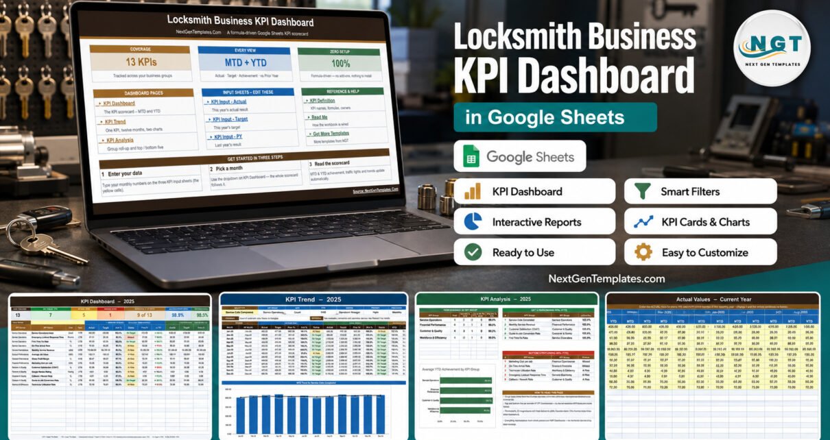
Most locksmith shops already know their busiest week and their worst callback. What they rarely have is one page that puts service, response, money, customers and technician time side by side for the month and the year so far. The Locksmith Business KPI Dashboard in Google Sheets does exactly that: thirteen locksmith KPIs, four groups, a month picker, and red / amber / green status calculated from your own numbers – all in a browser, with no add-on, macro or subscription.
This walkthrough covers every page of the workbook, how the scoring actually works, who it suits, and where it deliberately stops.
Key Features of the Locksmith Business KPI Dashboard in Google Sheets
13 locksmith KPIs across four management groups
The KPI register is grouped the way a locksmith business is actually run:
- Service Operations (4): Service Calls Completed, Emergency Lockout Response Time, First-Time Fix Rate, On-Time Arrival Rate.
- Financial Performance (4): Monthly Service Revenue, Average Job Value, Gross Profit Margin, Marketing Cost per Job.
- Customer & Quality (4): Customer Satisfaction (CSAT), Google Review Rating, Callback / Rework Rate, Quote-to-Job Conversion Rate.
- Workforce & Efficiency (1): Technician Utilization Rate.
Each one carries a written formula, a plain-English definition, an owner, a priority and a reporting frequency, so the meeting argues about the number rather than about what the number means.
Direction-aware achievement and traffic lights
Ten of the thirteen KPIs are upper-the-better (UTB) and three are lower-the-better (LTB): Emergency Lockout Response Time, Marketing Cost per Job and Callback / Rework Rate. Achievement is Actual / Target for UTB metrics and Target / Actual for LTB metrics, so arriving faster than promised or spending less per booked job scores above 100% and shows green. Status bands are On Target from 100%, At Risk between 95% and 99%, and Missed below 95% – and those thresholds live in the Status formulas, so you can move them.
One month picker, two reporting horizons
Choose a month at the top of the KPI Dashboard sheet and the whole workbook follows it: the MTD block, the cumulative YTD block, the header cards, the trend page and the analysis page. There is no refresh step, no query and no script to authorise.
Dashboard Pages Explanation
1. Home
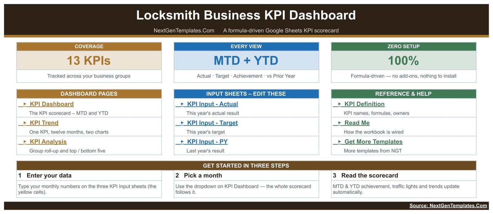
The landing page states the coverage (13 KPIs, MTD + YTD, formula-driven) and links every sheet in three columns – dashboard pages, the three input sheets you edit, and reference material including the KPI Definition list and a Read Me. A three-step getting-started strip sits underneath.
2. KPI Dashboard
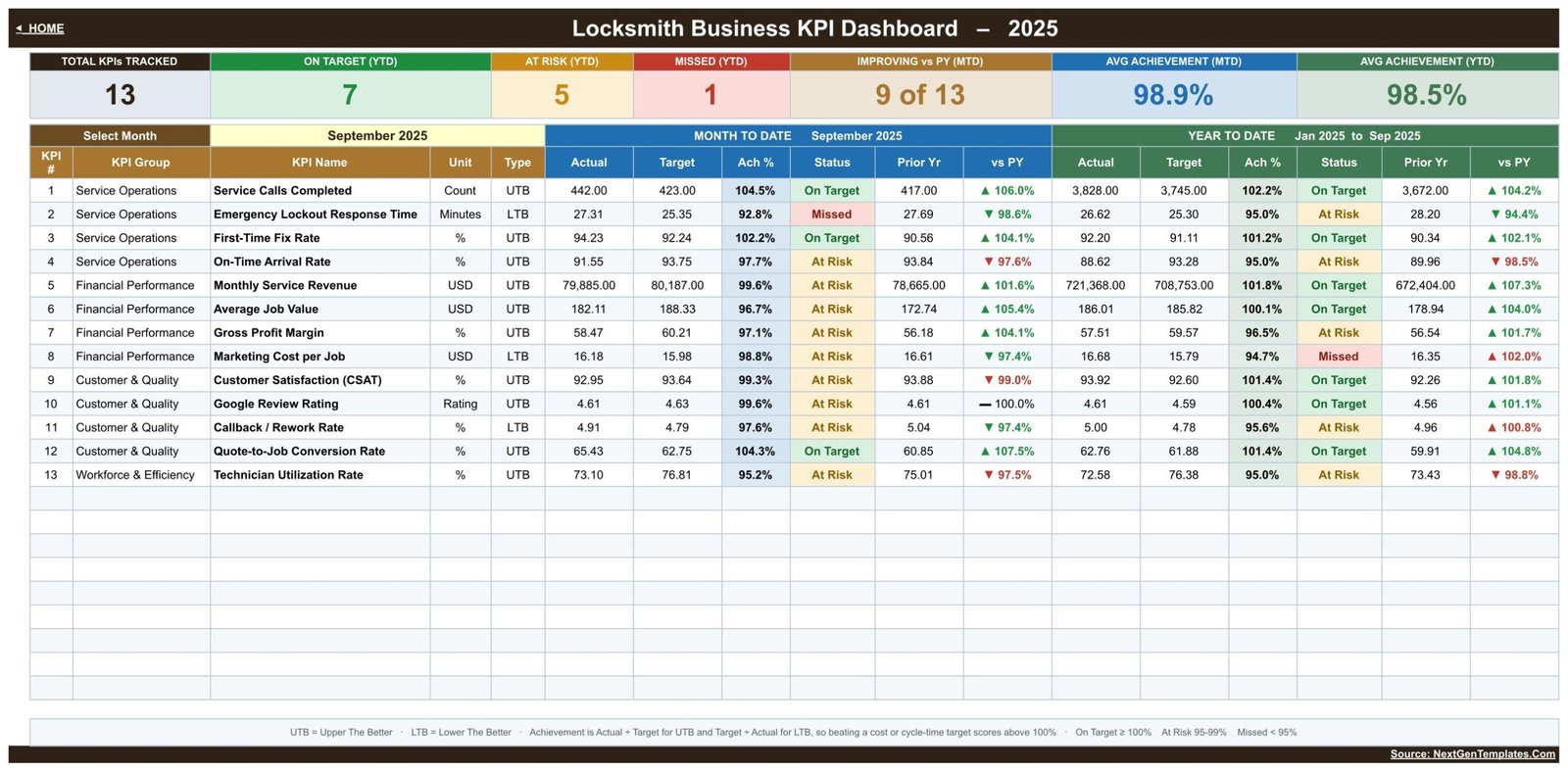
This is the scorecard. Seven header cards summarise the selected month – total KPIs tracked, On Target / At Risk / Missed counts on YTD, how many KPIs are improving against prior year, and average achievement for MTD and YTD. Underneath, every KPI gets a row with Actual, Target, Achievement %, Status, Prior Year and vs PY, twice: once for the month, once for the year to date.
In the supplied September 2025 sample the shop is running 7 On Target, 5 At Risk and 1 Missed on YTD, with 9 of 13 KPIs improving against last year and average achievement of 98.9% MTD and 98.5% YTD. Those are invented demonstration figures, not benchmarks – they exist so the workbook is readable the moment you open it.
3. KPI Trend
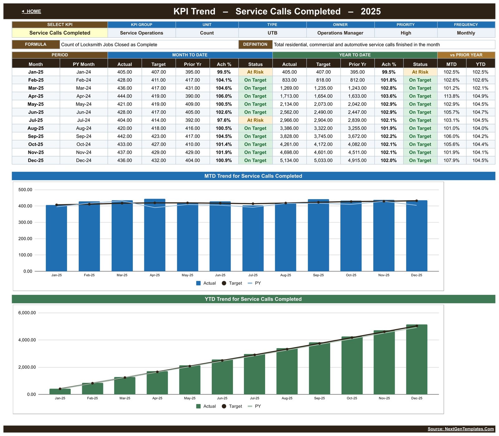
Pick a single KPI from the dropdown and the page rebuilds around it: its group, unit, direction, owner, priority and frequency at the top, its formula and definition beneath, then a twelve-row table of January to December showing MTD and YTD Actual, Target, Prior Year, achievement and status, plus vs-PY percentages. Two charts follow – an MTD trend and a YTD trend, each plotting Actual as columns against Target and Prior Year lines. This is the page for the question “is the response time really getting worse, or was March just bad?”
4. KPI Analysis
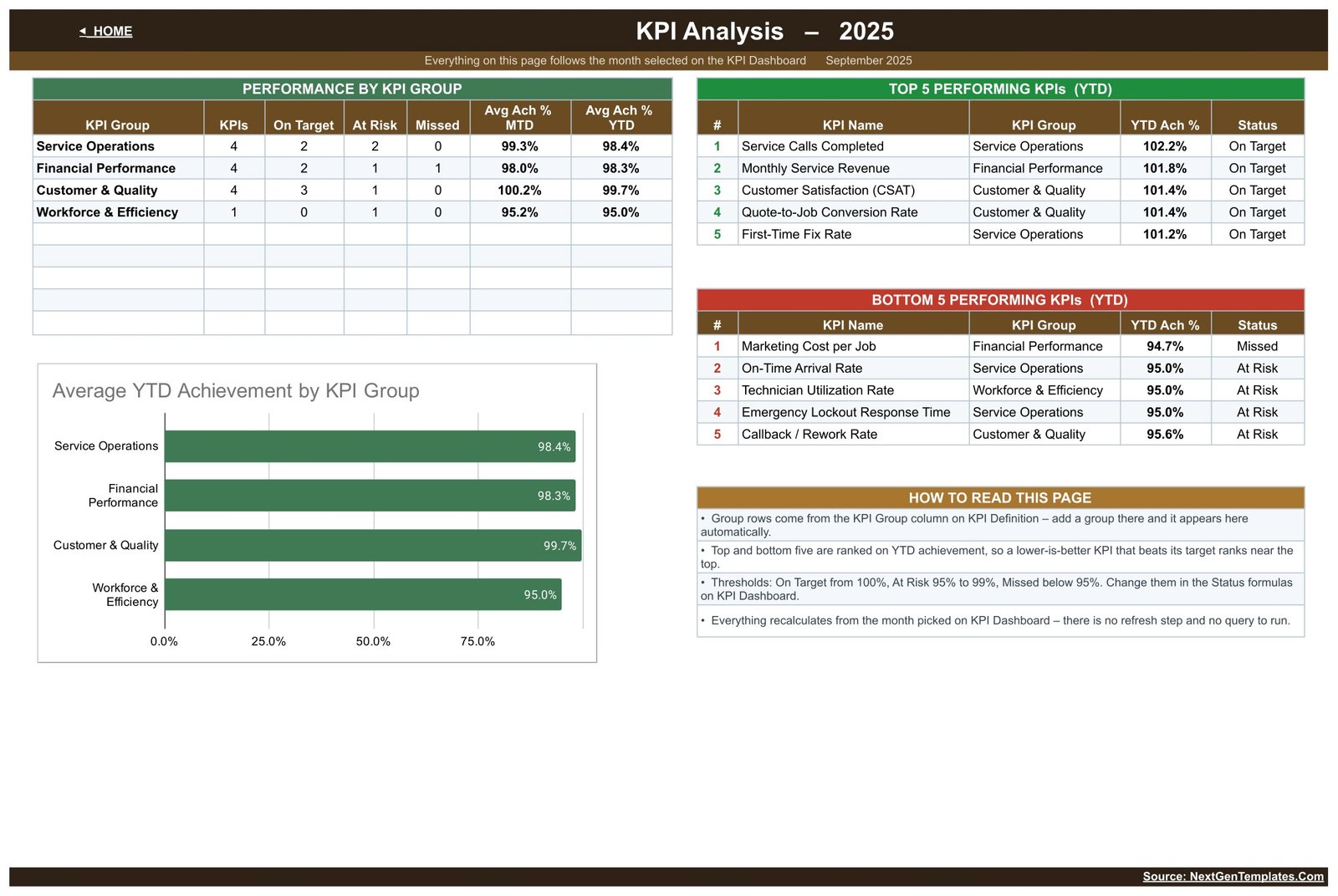
Group roll-ups come first: for each of the four groups, how many KPIs it holds, how they split across On Target / At Risk / Missed, and average achievement for MTD and YTD, with a bar chart of average YTD achievement by group. To the right, the top five and bottom five KPIs by YTD achievement are ranked automatically. Because ranking uses direction-aware achievement, a lower-is-better metric that beats its target rises to the top rather than being punished for having a small number.
5. Actual, Target and PY input sheets
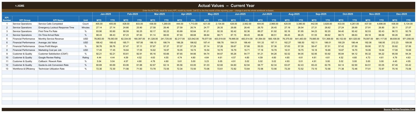
Three sheets – KPI Input – Actual, KPI Input – Target and KPI Input – PY – hold the numbers. You type into the yellow MTD cells for each month; the YTD column beside it accumulates for you, summing counts and revenue and averaging rates and ratios as each KPI’s definition requires. Everything else in the workbook reads from here.
6. KPI Definition

The master list. Add, rename or delete a KPI here and every other sheet follows – the dashboard grid, the trend dropdown, the analysis groups and the input tables all read this register. It is also where you change a metric from UTB to LTB if your shop scores it the other way round.
Locksmith KPI Dashboard vs. Excel vs. Paid Field Service Software
| Area | This Google Sheets dashboard | An Excel KPI workbook | Paid field service software |
|---|---|---|---|
| Cost | One-time $8.99 sale price | Template plus Microsoft 365 if needed | Recurring per-user subscription |
| Time to first report | Minutes – copy and type | Minutes, once installed | Days or weeks of onboarding |
| Where data comes from | Monthly totals you enter | Monthly totals you enter | Captured live from jobs |
| Sharing | A link, from any browser | File or OneDrive | Seats and roles |
| Changing a KPI | Edit a row in the register | Edit the workbook | Depends on the plan |
| Dispatch, invoicing, job tickets | No | No | Usually yes |
Who Should Use This Template
Owner-operators who want the month on one page. Operations and dispatch managers who report response and arrival performance. Field service supervisors tracking first-time fix against callbacks. Office managers and bookkeepers who assemble the monthly numbers anyway and would rather they landed somewhere permanent. It fits a single-van business as comfortably as a shop running six technicians.
It is not the right tool if you need live dispatch, routing, job tickets, quoting or invoicing – keep your field service system for that and use this above it, as the management layer. It also holds no customer, address, job or key records, and it says nothing about licensing, bonding, insurance, background checks, key control or restricted keyways. Those obligations sit with you and your licensing authority; this workbook measures service and financial performance only.
Real-World Use Cases
Pricing review. Monthly Service Revenue, Average Job Value and Gross Profit Margin read together show whether a busy month actually paid better than a quiet one, before any call-out fee changes.
The emergency promise. Emergency Lockout Response Time and On-Time Arrival Rate are the two numbers customers feel. Watching them monthly on the trend page tells you whether a dispatch change worked or whether one bad week distorted the average.
Quality, honestly measured. First-Time Fix Rate and Callback / Rework Rate belong in the same conversation – a strong fix rate beside a rising callback rate usually means the definition of “fixed” has drifted.
Marketing that pays. Marketing Cost per Job next to Quote-to-Job Conversion Rate separates a lead-volume problem from a closing problem.
Adding a van. Technician Utilization Rate against Service Calls Completed is the pair to look at before hiring.
Advantages
- Formula-driven throughout – no macros, no add-ons, nothing to authorise, and every calculation is visible.
- One month picker drives the entire workbook, so there is no version of the report that is out of step with another.
- Direction-aware scoring is built in, which is the single most common error in a hand-built KPI sheet.
- Twelve months of sample data ship with it, so the layout can be judged before any of your figures are entered.
- Runs anywhere Google Sheets runs, including a phone in a van, and shares with a link.
- One-time purchase, with the copy living in your own Drive.
Opportunities for Improvement
Being straightforward about the limits: input is manual, so somebody has to enter monthly totals; there is no drill-down to individual jobs; the workbook is monthly by design, so it will not give you a daily or weekly view without restructuring the input sheets; and the single-KPI Workforce & Efficiency group is thin if you want deeper labour analysis – though adding rows to the register is a two-minute job.
Best Practices
- Set targets for the whole year once, at the start, rather than editing them to match results.
- Check the UTB/LTB flag on every KPI you add. It is the one setting that silently inverts a traffic light.
- Enter the prior-year column even if it is approximate – most of the value in the dashboard is the comparison.
- Lock or protect the calculated sheets and give edit access only to whoever maintains the three input tabs.
- Review the bottom five on the analysis page first; that is where the month’s decisions usually are.
- Label the supplied sample rows clearly if you keep any of them, so nobody mistakes demonstration data for history.
Explore Relevant Templates
- Locksmith Business KPI Scorecard in Google Sheets – the same trade in the compact card-wall format, with sparklines and comparison dropdowns instead of the MTD/YTD grid.
- Swimming Pool Service KPI Dashboard in Google Sheets – the identical dashboard build for a route-service business.Locksmith Business KPI Dashboard in Google Sheets
- Septic Tank Service KPI Dashboard in Google Sheets – another emergency call-out trade using the same month picker.
- Fencing Contractor KPI Dashboard in Google Sheets – a contractor edition of the same layout.
- Drywall Contractor KPI Dashboard in Google Sheets – trade KPIs, same four-page structure.Locksmith Business KPI Dashboard in Google Sheets
Frequently Asked Questions
Is this the KPI Dashboard or the KPI Scorecard?
The Dashboard. It has 13 KPIs, a month picker, an MTD and YTD grid with traffic lights, a per-KPI Trend page, a group Analysis page and three monthly input sheets. The Locksmith Business KPI Scorecard is a different 10-KPI template built around KPI cards – related, but not a duplicate.
Do I need a paid Google Workspace account?
No. A free Google account can make a copy, edit it and share it.Locksmith Business KPI Dashboard in Google Sheets
Can I add my own KPIs?
Yes. The KPI Definition sheet is the master register; add or rename rows there and the rest of the workbook follows. Keep the names identical between the register and the input sheets so lookups keep matching.Locksmith Business KPI Dashboard in Google Sheets
Are the results in the screenshots industry benchmarks?
No. Every figure is invented sample data supplied so the workbook is legible on first open. Replace it with your own.Locksmith Business KPI Dashboard in Google Sheets
Does it prove licensing, insurance or key-control compliance?
No. It measures service and financial performance and stores no compliance records of any kind.
Will it import job data from my scheduling software automatically?
No. Monthly figures are entered by hand. There is no API, connector or sync.Locksmith Business KPI Dashboard in Google Sheets
How do I receive the template?
You download a PDF that carries the Google Sheets link. Click it, make your own copy, and the workbook is yours in your Drive.
About the Author
Built by PK – Microsoft Certified Professional with 15+ years of Excel, Google Sheets, and Power BI experience. Founder of NextGenTemplates, reaching 300K+ subscribers across YouTube channels. Every template is hand-built and tested before release.Locksmith Business KPI Dashboard in Google Sheets
Conclusion
A locksmith business generates enough numbers every month to argue about and rarely enough structure to decide with. Thirteen KPIs, four groups, a month picker and honest direction-aware traffic lights turn that into a ten-minute review you can repeat. The Locksmith Business KPI Dashboard in Google Sheets is a one-time purchase at an $8.99 sale price, with the editable copy living in your own Google Drive.