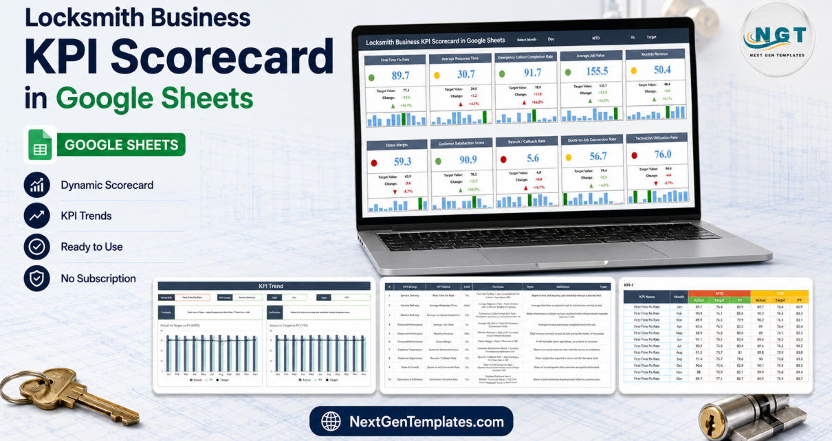
Most locksmith firms measure exactly two things: how many jobs went out, and what came in at the end of the month. That is enough to know whether you had a good month, and useless for knowing why. The Locksmith Business KPI Scorecard in Google Sheets takes a middle path – 10 KPIs across 5 groups, one screen, a red/amber/green light on every card, and 120 rows of monthly input as the only thing you have to maintain. It ships with a full 12 months of sample numbers already typed in, so you can see the whole thing working before you touch it.
This post walks through every tab, says plainly what the build does well, and – because we opened the actual workbook rather than the screenshots – flags two real defects you should know about before you rely on it.
Key Features of the Locksmith Business KPI Scorecard in Google Sheets
- Ten KPIs named for the trade. First-Time Fix Rate, Average Response Time, Emergency Callout Completion Rate, Average Job Value, Monthly Revenue, Gross Margin, Customer Satisfaction Score, Rework / Callback Rate, Quote-to-Job Conversion Rate, Technician Utilization Rate.
- Five KPI groups. Service Delivery holds three, Financial Performance three, Customer Experience two, and Sales & Growth and Operations & Efficiency one each.
- Three dropdowns and nothing else. Select Month, MTD or YTD, and Vs. Target or Vs. PY. No macros, no add-ons, no authorisation prompt.
- Direction-aware traffic lights. Eight KPIs are flagged UTB (upper the better) and two are LTB (lower the better) – Average Response Time and Rework / Callback Rate. A rise in either of those two correctly reads as a worse month.
- Editable RAG bands. The Color Settings tab holds separate variance thresholds for UTB and LTB KPIs, so “amber” means whatever you decide it means.
- A sparkline on every card showing all twelve months, with the selected month picked out.
- A per-KPI trend page with two Jan-Dec charts – Actual vs Target vs PY on both an MTD and a YTD basis.
- A written formula for every KPI, visible on the same screen as the number.
The Eight Tabs, Explained
Scorecard
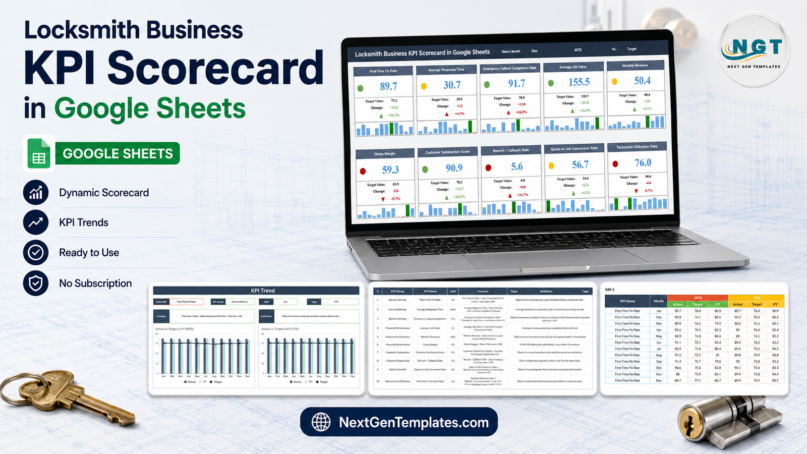
Ten cards in two rows of five. Each carries the KPI name, a coloured status dot, the value, the target, the absolute change, the change percentage with an arrow, and a twelve-bar sparkline. Above them sits the control strip: Select Month, the MTD/YTD toggle and the Vs. Target / Vs. PY toggle.
In the shipped sample, December MTD against Target reads four green, three amber, three red. The three reds are Gross Margin (59.3% against a 62.9% target, -5.7%), Rework / Callback Rate (5.6% against 4.8%, +16.7% – and worse because it is a lower-the-better KPI), and Technician Utilization Rate (76.0% against 80.6%, -5.7%). The two ambers on Monthly Revenue and Quote-to-Job Conversion are both around +4%, just inside the band. The lights and the percentages agree with each other on all ten cards, which is not something you can take for granted in a template.
KPI Trend
One dropdown picks a KPI. The page then fills in that KPI’s Group, Unit, Type and Formula, along with a one-line definition, and redraws two grouped column charts across Jan to Dec: Actual vs Target vs PY (MTD) and Actual vs Target vs PY (YTD), with Target overlaid as a line. Having the formula on the same screen as the chart is the quiet win here – a monthly review stops turning into an argument about how the number was calculated.
KPI Definition
The reference table: ten rows, with number, group, name, unit, formula and definition, plus the UTB/LTB flag. Units are deliberately mixed – eight percentages, one in minutes (Average Response Time), one in dollars (Average Job Value), and Monthly Revenue in thousands of dollars. The sample Monthly Revenue of 50.4 therefore means $50,400.
Input Data
Ten stacked blocks, KPI-1 through KPI-10, each twelve rows deep with six typed columns: MTD Actual, Target and PY, then YTD Actual, Target and PY. 120 rows in total, and the only place in the workbook you type. There is no import, no connector and no source system.
Read Me, Color Settings, Support and Trend_Support
Color Settings is worth opening – it holds the RAG variance bands for both KPI directions. Support and Trend_Support are the lookup engine behind the cards and the charts; leave them alone. Read Me is meant to be the orientation page, and in this build it is not (see below).
What We Found When We Checked This Build
Two defects, both real, both fixable in a couple of minutes.
1. The month dropdown does not match the data – and it blanks the scorecard. The Select Month list on the Scorecard tab offers Jan, Feb, Mar, Apr, May, June, July, Aug, Sep, Oct, Nov, Dec. The Input Data tab stores those two months as Jun and Jul. Because the scorecard matches the month as exact text, choosing June or July returns no match and all ten KPI cards go blank. The other ten months are fine.
The fix: click cell N1 on the Scorecard tab, open Data → Data validation, and change the two long names in the list to Jun and Jul. Nothing else needs touching. Do this before you show the sheet to anyone.
2. The Read Me tab is empty. Not thin – completely blank, with no cells and no content at all. Everything a Read Me would tell you is in this post and in the KPI Definition tab, but if you hand the file to a colleague expecting a starting page, there is not one.
Neither defect affects a single calculation. The formulas, the RAG logic, the UTB/LTB flags and all 120 rows of sample data are correct and internally consistent – we checked the traffic light against the variance on all ten cards.
Locksmith Business KPI Scorecard vs. Excel vs. Paid Field-Service Software – Feature Comparison
| This Google Sheets scorecard | An Excel KPI scorecard | Paid field-service SaaS | |
|---|---|---|---|
| Cost | One-time, under $15 | One-time, plus an Office licence | Recurring, usually per technician per month |
| Platform | Any browser, nothing to install | Desktop Excel | Web plus a mobile app |
| Setup time | Minutes – 120 rows of monthly numbers | Minutes, same data entry | Days to weeks – jobs, pricebook, technicians, integrations |
| Real-time team collaboration | Yes, native | Only via OneDrive co-authoring | Yes |
| Mobile access | Yes, browser or Sheets app | Limited | Yes, purpose-built |
| Customizable fields | Fully – names, formulas and thresholds | Fully | Within what the vendor exposes |
| Share with link | Yes | No, you send a file | Seat-based invitations |
| Year-1 cost at 5 users | The purchase price, once | The purchase price, once | Four figures a year on most published plans |
| Number of KPIs | 10, fixed, named for locksmithing | Depends on the build | Dozens, most unused |
| Jobs, scheduling, dispatch | No – monthly reporting only | No | Yes |
How the Google Sheets and Excel Editions Differ
There is an Excel edition of this locksmith scorecard in preparation. It is a separate build on a different engine, not a port – across this product line, twin editions have repeatedly shared a structure while sharing very few KPI names. Do not assume the two carry the same ten KPIs; check the Excel listing’s own KPI table when it goes live.
Who Should Use This Template
It fits a locksmith firm of roughly two to twenty-five technicians that already has monthly totals somewhere – an invoicing system, a job book, an accountant’s summary – and wants a monthly review page rather than another spreadsheet nobody opens. Owner-operators use it for their own trend line; multi-van operations use it as the single shared page in a monthly meeting.
It does not fit anyone who wants live job tracking, dispatch, scheduling or an automatic feed from invoicing software. None of that is here. It also will not help if you need a daily or weekly view – the grain is one row per KPI per month and cannot be made finer without rebuilding the Input Data tab.
One thing worth stating plainly: this workbook holds monthly KPI totals and nothing else. There are no customer names, no addresses, no key or lock records and no job-level history anywhere in it. Keep it that way. If you ever add anything that identifies a customer or a property, switch off link sharing and share with named people instead – a Google Sheet set to “anyone with the link” is not an appropriate place for customer or security-related records.
Real-World Use Cases
The margin drift. A four-van emergency locksmith firm has steady callout volume and a shrinking bank balance. Filling in twelve months of Gross Margin and Average Job Value shows margin red against target for four consecutive months while average job value climbs – parts cost rising faster than pricing. The scorecard did not diagnose it; it pointed at the right tab.
The inherited business. A new owner with no historical numbers back-fills last year into the PY columns from the accountant’s monthly summaries, sets this year’s targets, and reviews one page on the last Friday of each month. Rework / Callback Rate becomes the watched card, because it is the KPI most directly within the team’s own control.
The two-technician start. A small mobile operation uses only the Service Delivery group at first – First-Time Fix Rate, Average Response Time, Emergency Callout Completion Rate – and leaves the other seven KPIs on sample data. Nothing breaks; the unused cards simply keep showing demo numbers until they are overwritten.
Advantages of This Scorecard
- The direction logic is right. Two lower-the-better KPIs are flagged and scored as such. Getting this wrong is the single most common fault in KPI templates, and this build gets it right.
- Every number is auditable. The formula text sits beside the KPI on two separate tabs.
- The thresholds are yours. RAG bands live in a visible settings tab, not buried in conditional formatting.
- It is genuinely small. One typing surface, 120 rows, no dependencies. That is why it will still work in two years.
- It reads on a phone. A card wall of ten tiles survives a small screen far better than a chart-heavy dashboard does.
Opportunities for Improvement
- Fix the June / July dropdown before first use – see the defect section above. This is the one item that will actually bite you.
- Write your own Read Me. The tab is there and empty; a short paragraph on where to type and who owns the file pays for itself the first time someone else opens the sheet.
- The KPI count is fixed at ten. You can rename any of them, but adding an eleventh means extending the Input Data blocks and the support lookups by hand.
- Targets are typed, not derived. There is no growth rule or seasonality logic – if you want targets to step up quarterly, you type them that way.
- No data validation on the input cells. A percentage typed as 0.897 instead of 89.7 will be accepted and will quietly wreck a card. Sense-check the first month you enter.
Best Practices
- Repair the month list first. Then test it by selecting June and confirming the cards still populate.
- Reconcile the definitions before the data. Read the ten formulas on KPI Definition and decide what “Total Jobs” means in your books. Write the answer down.
- Enter one month completely across all ten KPIs before doing the other eleven. You will catch unit mistakes – especially the ($K) on Monthly Revenue – while there is only one row to fix.
- Set the RAG bands once, then leave them. Moving thresholds because you dislike a red defeats the purpose of having them.
- Review Vs. Target first, then Vs. PY. Target tells you whether the month met the plan; PY tells you whether the plan was realistic.
- Keep a copy per year. The sheet holds twelve months. Duplicate it in January rather than overwriting.
- Share it read-only. Give edit access to whoever types the numbers and view access to everyone else. Google’s own guidance on sharing files from Google Drive covers the settings.
Explore Relevant Templates
Other trade-service scorecards built on the same engine:
- Septic Tank Service KPI Scorecard in Google Sheets
- Swimming Pool Service KPI Scorecard in Google Sheets
- Fencing Contractor KPI Scorecard in Google Sheets
- Pest Control Business KPI Scorecard in Google Sheets
- Drywall Contractor KPI Dashboard in Google Sheets – the KPI Dashboard line, for comparison
Interested in how scorecards like this are built? The Excel Pivot Tables & Dashboards course on NextGenTemplates Academy covers the reporting techniques behind them, with practice files.
Frequently Asked Questions
What exactly do I download?
A PDF. It carries the “Make a copy” link that creates your own editable copy of the Google Sheet in your Drive. There is no zip and no spreadsheet file to manage.Locksmith Business KPI Scorecard in Google Sheets
Do I need a paid Google account?
No. A free personal Google account is enough.Locksmith Business KPI Scorecard in Google Sheets
Will selecting June really blank the whole scorecard?
Yes, until you fix the dropdown. The Input Data tab stores Jun, the dropdown offers June, and the lookup is an exact text match, so nothing is found for any of the ten KPIs. It takes about thirty seconds to correct in Data validation.Locksmith Business KPI Scorecard in Google Sheets
Can I change the KPIs?
Yes – name, group, unit, formula text and UTB/LTB flag are all editable on the KPI Definition tab, and the rest of the workbook follows. The count is fixed at ten unless you extend the input blocks yourself.Locksmith Business KPI Scorecard in Google Sheets
Why is Monthly Revenue only 50.4?
It is measured in thousands, marked ($K). 50.4 means $50,400. Average Job Value is in plain dollars, so 155.5 means $155.50.Locksmith Business KPI Scorecard in Google Sheets
How is this different from your KPI Dashboard templates?
The names are close and the products are not. This is the KPI Scorecard family – a fixed grid of ten target-versus-actual cards, a per-KPI trend page and typed monthly input. The KPI Dashboard line is a different build with a month picker over a traffic-light grid plus separate KPI Trend and KPI Analysis pages. Choose the scorecard for a monthly review page and the dashboard for more analysis surface.Locksmith Business KPI Scorecard in Google Sheets
Can I use it for compliance or insurance paperwork?
No. It is a management reporting sheet holding numbers you typed yourself. It is not a record of work performed, it verifies nothing, and it is not designed or intended to serve as evidence for anybody.Locksmith Business KPI Scorecard in Google Sheets
About the Author
Built by PK – Microsoft Certified Professional with 15+ years of Excel, Google Sheets, and Power BI experience. Founder of NextGenTemplates, reaching 300K+ subscribers across YouTube channels. Every template is hand-built and tested before release.Locksmith Business KPI Scorecard in Google Sheets
Conclusion
The Locksmith Business KPI Scorecard in Google Sheets does one job properly: it turns twelve months of typed numbers into a page a locksmith owner can read in ten seconds and act on in one meeting. The KPI set is right for the trade, the direction logic on the two lower-the-better metrics is correct, the thresholds are yours to move, and the whole thing runs in a browser with nothing installed. Fix the June/July dropdown in your copy, write two lines on the empty Read Me tab, and it is ready.Locksmith Business KPI Scorecard in Google Sheets
Get the Locksmith Business KPI Scorecard in Google Sheets – one-time price, instant download, no subscription. For walkthrough videos of templates like this one, visit youtube.com/@PKAnExcelExpert.Locksmith Business KPI Scorecard in Google Sheets