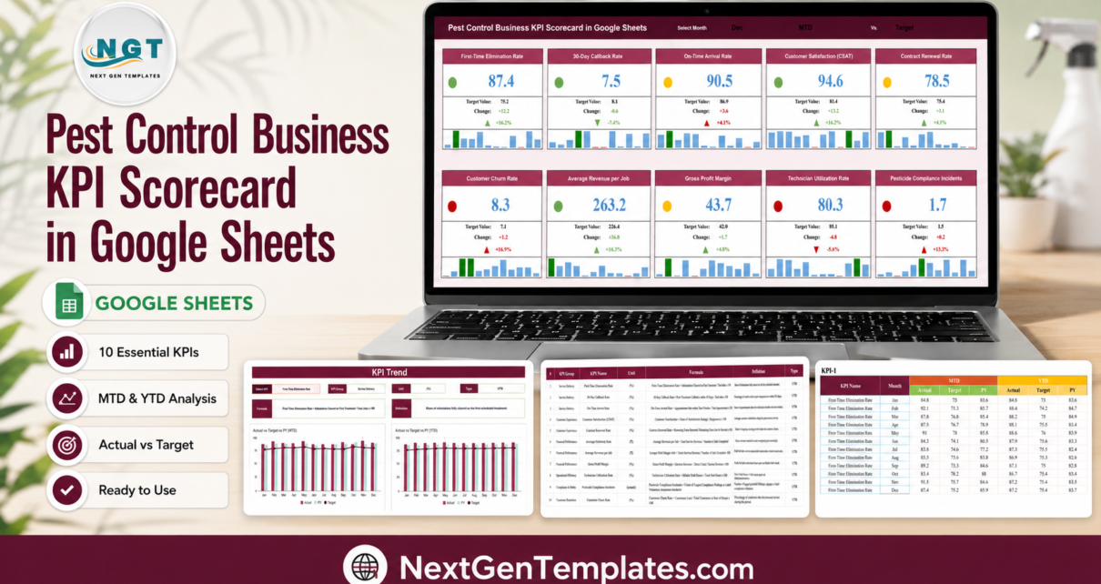
Ask a pest control owner how the year went and you will hear about the summer ant surge, the two technicians who left in March, and one commercial account that nearly churned. Ask for the numbers and most people reach for a routing export, a stack of invoices and a gut feeling about callbacks. The Pest Control Business KPI Scorecard in Google Sheets replaces that with one screen: ten pest-control KPIs, each carrying an actual, a target, the gap in units and in percent, a red / amber / green light and a twelve-month mini bar strip.
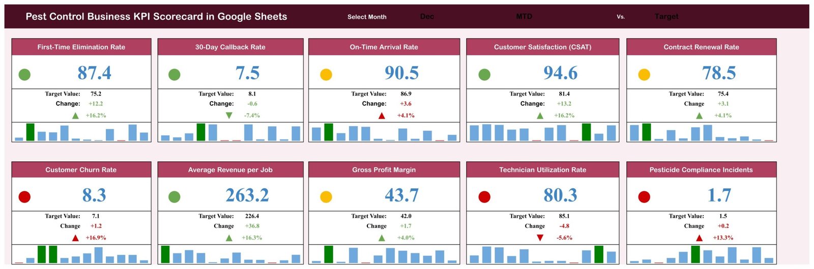
In the December sample that ships with the file, four KPIs are green, three amber and three red, and seven of the ten beat their target. That is deliberately not a demo where everything glows green – it is the split a real route business produces, and the three reds are the ones that actually cost money.
Quick orientation. This is a month-picker scorecard: four working pages, ten KPIs, 120 rows of editable monthly data and pure Google Sheets formulas. It is not an analytics dashboard with slicers and pivot pages, and it is not the KPI Dashboard family. Three product lines share very similar names, so the distinction is worth making before you read on.
This post walks through what is actually on each page, what each of the ten KPIs measures, where the sheet stops, and how to run a monthly numbers meeting off it. Every figure quoted below is a number sitting in the shipped December sample, not a feature read off a box.
Key Features of the Pest Control Business KPI Scorecard
- Ten pest-control KPIs in four groups – Service Delivery (3), Customer Experience (3), Financial Performance (2) and Operations & Compliance (2). The grouping is written on the KPI Definition page, so it is yours to rename.
- Three header dropdowns drive the whole board – a month picker, an MTD / YTD switch and a Vs. switch for Target or PY (prior year). Change any one and all ten cards, lights, arrows and percentages recalculate together.
- Red / amber / green traffic lights – one coloured dot per card, scored against that KPI’s own target rather than one global rule. Green is comfortably ahead of target, amber is on or just past it, red is behind.
- Direction-aware scoring – seven KPIs are typed UTB (upper is better) and three are LTB (lower is better): 30-Day Callback Rate, Customer Churn Rate and Pesticide Compliance Incidents. A rising callback rate therefore scores red, not green, which is the whole point of typing them.
- A twelve-month bar strip on every card – each tile carries a Jan-to-Dec mini chart with the selected month picked out in a darker bar, so a single number always sits next to the shape of the year.
- MTD and YTD held in parallel – every KPI carries a month-to-date and a year-to-date actual, target and prior-year value in the data page. The switch is not a recalculation trick; both bases genuinely exist in the file.
- A KPI Trend page with its own KPI picker, returning that metric’s group, unit, UTB/LTB type, written formula and plain-English definition above two charts – Actual vs Target vs PY on an MTD basis and the same on a YTD basis.
- A written formula and definition for all ten metrics – no number on the board is left without a stated meaning.
- An open data page – ten KPI blocks, twelve months each, six figures per month. That is 720 editable cells, none locked, none hidden behind a script.
- Pure Google Sheets formulas – SUMIFS against named ranges. No Apps Script, no add-on, no macro, no permission prompt. It opens in any browser and in the Google Sheets mobile app.
The Four Working Pages, Explained
The workbook holds eight tabs: four you work on, two reference pages and two calculation sheets. Here is what each one actually does.
Page 1 – the Scorecard
The header carries the title, the month picker (Dec in the sample), the MTD / YTD switch and the Target / PY switch. Below it sit ten cards in two rows of five, each with a coloured dot, the value, the target value, the change in units, the change in percent with an up or down arrow, and the twelve-month bar strip.
The December sample, on MTD vs Target, reads:
- First-Time Elimination Rate 87.4% against a 75.2% target – up 12.2 points, +16.2%, green.
- 30-Day Callback Rate 7.5% against 8.1% – down 0.6 points, -7.4%, green (it is lower-is-better, so under target is good).
- On-Time Arrival Rate 90.5% against 86.9% – up 3.6 points, +4.1%, amber.
- Customer Satisfaction (CSAT) 94.6 against 81.4 – up 13.2, +16.2%, green.
- Contract Renewal Rate 78.5% against 75.4% – up 3.1 points, +4.1%, amber.
- Customer Churn Rate 8.3% against 7.1% – up 1.2 points, +16.9%, red (lower-is-better, so over target is bad).
- Average Revenue per Job $263.2 against $226.4 – up $36.8, +16.3%, green.
- Gross Profit Margin 43.7% against 42.0% – up 1.7 points, +4.0%, amber.
- Technician Utilization Rate 80.3% against 85.1% – down 4.8 points, -5.6%, red.
- Pesticide Compliance Incidents 1.7 against 1.5 – up 0.2, +13.3%, red (lower-is-better).
Read that list once and the month has a story. Work is landing well – nearly nine in ten infestations cleared on the first treatment, callbacks under plan, satisfaction high, revenue per job up almost 16%. What is dragging is capacity and retention: technicians are billing 80.3% of paid hours against an 85.1% goal, and 8.3% of customers cancelled against a 7.1% plan. That is a staffing and save-desk conversation, not a service-quality one, and the board gets you there in about fifteen seconds.
The light is not a mood. It comes from a variance band you control. For an upper-is-better KPI, comfortably ahead of target is green, on or barely past it is amber, and behind it is red; for a lower-is-better KPI the bands are mirrored. Notice that On-Time Arrival, Contract Renewal and Gross Profit Margin all beat target in December and still show amber – being 4% ahead is not the same as being 16% ahead, and the board says so rather than flattening everything into a pass mark.
Page 2 – KPI Trend
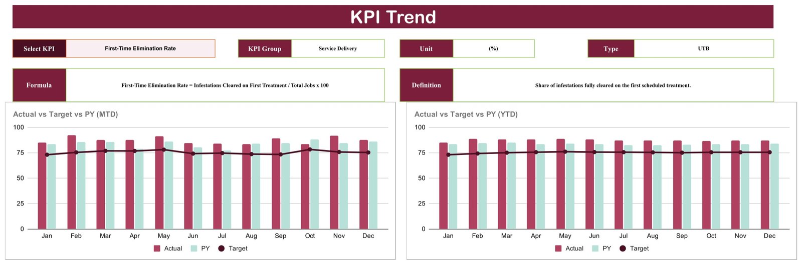
Pick a KPI from the dropdown at the top left and the page rebuilds around it. Four header boxes return the KPI Group, the Unit, the Type (UTB or LTB) and, on the row below, the written Formula and the plain-English Definition. Underneath sit two charts: Actual vs Target vs PY (MTD) on the left and Actual vs Target vs PY (YTD) on the right, both running Jan to Dec, with Actual and PY as bars and Target as a line.
With First-Time Elimination Rate selected, the header reads Service Delivery, (%), UTB, and the formula is spelled out as Infestations Cleared on First Treatment / Total Jobs x 100. The MTD chart shows actual bobbing between roughly 83 and 92 all year while the target line sits flat near 75 – a KPI comfortably clear of plan in every single month. The YTD chart smooths that into an almost straight line near 87. That contrast is the point: the MTD view shows the volatility, the YTD view shows whether the volatility mattered.
This is the page you open when a card turns red. Instead of arguing about whether December was bad, you look at whether the metric has been sliding for four months or simply had one poor week.
Page 3 – KPI Definition

A single table, ten rows, seven columns: number, KPI Group, KPI Name, Unit, Formula, Definition, Type. This is the contract the rest of the workbook honours. Rename a KPI here and the scorecard card, the trend page picker and the traffic-light direction all follow it.
It is also the page that makes the file defensible in a meeting. When someone asks what “utilization” means, the answer is on the sheet in writing – Billable Field Hours / Total Paid Hours x 100 – rather than in the head of whoever built the spreadsheet.
Page 4 – Input Data
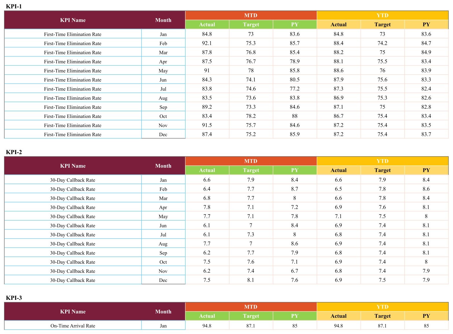
Ten labelled blocks, KPI-1 through KPI-10, each twelve rows of months. Every row wants six figures, split into an orange MTD group (Actual, Target, PY) and a yellow YTD group (Actual, Target, PY). The KPI name repeats down the left of each block so you always know which metric you are typing into.
The KPI-1 block in the sample carries First-Time Elimination Rate at 84.8, 92.1, 87.8, 87.5, 91.0, 84.3, 83.8, 83.5, 89.2, 83.4, 91.5 and 87.4 on an MTD basis, with the YTD column beside it settling from 84.8 in January to 87.2 by December. KPI-2 does the same for 30-Day Callback Rate. That is the whole data model – 10 blocks x 12 months x 6 columns = 720 cells – and replacing those numbers is the only setup step the file asks of you.
The four supporting tabs
- Color Settings – a printed reference showing the red / amber / green variance bands the scorecard uses.
- Read Me – a placeholder tab in this build. It exists but carries no content; everything it would have said is in the product listing, in the download PDF and in this post.
- Support – the calculation layer behind the ten cards, and the tab that holds the live RAG threshold cells (columns Z to AE).
- Trend_Support – the calculation layer behind the two trend charts.
Worth knowing before you start editing. The traffic-light thresholds the formulas actually read live in the RAG table on the Support tab, not on Color Settings. Color Settings shows the same bands as a readable reference. Edit the bands on Support and the whole board follows; editing Color Settings alone changes nothing on the scorecard.
The Ten Pest Control KPIs, One by One
The KPI Definition page writes each metric out in full. Here they are with the formula the sheet uses, why a pest control business would track it, and how the sample year behaved.
Service Delivery
- First-Time Elimination Rate (%, UTB) – Infestations Cleared on First Treatment / Total Jobs x 100. The share of infestations fully cleared on the first scheduled treatment. This is the single most useful quality number in the trade, because every job that needs a second visit costs a route slot and earns nothing. The sample runs in the mid-to-high 80s all year against a target near 75.
- 30-Day Callback Rate (%, LTB) – Jobs Needing a Return Visit within 30 Days / Total Jobs x 100. The mirror image of the metric above, measured from the customer’s side. Lower is better, so the sheet scores it in reverse. December came in at 7.5% against an 8.1% target.
- On-Time Arrival Rate (%, UTB) – Appointments Met within Time Window / Total Appointments x 100. The share of appointments where the technician arrived inside the promised window. Route businesses live and die on this: a missed window is the complaint customers remember long after the pests are gone.
Customer Experience
- Customer Satisfaction / CSAT (%, UTB) – Satisfied Survey Responses / Total Survey Responses x 100. Average post-service satisfaction from your own surveys. At 94.6 against an 81.4 target it is the strongest card on the December board.
- Contract Renewal Rate (%, UTB) – Recurring Plans Renewed / Recurring Plans Due for Renewal x 100. For a business built on quarterly and annual plans, this is the number that decides next year’s revenue base before a single new job is sold.
- Customer Churn Rate (%, LTB) – Customers Lost in Period / Customers at Start of Period x 100. The share of active customers who cancelled during the month. Renewal rate and churn sit deliberately side by side, because a renewal number that looks healthy in isolation reads differently next to the customers who left anyway.
Financial Performance
- Average Revenue per Job ($, UTB) – Total Service Revenue / Number of Jobs Completed. The mean revenue earned on each completed pest-control job. Rising ARPJ with flat job counts usually means a better mix; rising ARPJ with falling counts is a warning, and the twelve-month strip on the card shows which one is happening.
- Gross Profit Margin (%, UTB) – (Service Revenue – Direct Job Cost) / Service Revenue x 100. What is left after direct chemical, labour and travel cost. Sitting it on the same board as callback rate is intentional: the cost of returning to a job for free lands here.
Operations & Compliance
- Technician Utilization Rate (%, UTB) – Billable Field Hours / Total Paid Hours x 100. The share of paid technician hours spent on billable field work. The December red at 80.3% against 85.1% is roughly one unbilled hour per technician per day, which is a real cost hiding behind a good-looking quality month.
- Pesticide Compliance Incidents (count, LTB) – Count of Logged Chemical-Handling or Label Violations. A number you calculate and type in. See the note directly below before you use it.
Please read this about the compliance KPI. Pesticide Compliance Incidents is a figure you work out and type into the Input Data page yourself. It is a management count for your own monthly review and nothing more. It is not a licence record, not an application or restricted-use log, not a submission or report to any agency, and not anything an inspector, auditor or insurer would accept as documentation. This spreadsheet does not track, verify, validate or attest to anything. Keep your real records wherever you keep them today, exactly as you keep them today, and treat the card on this board as a discussion prompt in a management meeting.
The same applies to the service percentages. First-Time Elimination Rate, On-Time Arrival Rate, CSAT and the rest are summary figures you enter by hand. They are management numbers for a monthly review, not job records, service tickets or customer-facing reports.
Pest Control KPI Scorecard vs. Excel vs. Paid Field-Service SaaS – Feature Comparison
| This Google Sheets scorecard | An Excel KPI workbook | Paid pest / field-service SaaS | |
|---|---|---|---|
| Cost | One-time, under $15 | One-time purchase | Roughly $100-400 per user per month, often plus onboarding |
| Platform | Google Sheets, any browser | Microsoft Excel desktop | Vendor-hosted web and mobile app |
| Setup time | Minutes – copy the sheet, replace ten blocks of sample data | Minutes, once Excel is installed | Weeks of configuration and data migration |
| Real-time team collaboration | Yes, native Google Sheets sharing | Only through OneDrive co-authoring | Yes |
| Mobile access | Yes, via the Google Sheets app | Limited | Yes, purpose-built apps |
| Customisable KPIs | Yes – name, group, unit, formula text, target and UTB/LTB type are all editable cells | Yes | Only inside the vendor’s data model |
| MTD and YTD on one board | Yes – one dropdown switches the basis | Depends on the workbook | Yes |
| Compare against prior year | Yes – a Vs. dropdown swaps Target for PY | Depends on the workbook | Usually yes |
| Route scheduling, dispatch, invoicing | No | No | Yes – that is what you are paying for |
| Share with a link | Yes | No | Per-seat login required |
| Formulas visible and editable | Yes – nothing locked or hidden | Usually | No |
The honest summary: if you need scheduling, routing, technician apps and invoicing tied together, buy the SaaS – a spreadsheet will not replace it. If what you actually want is ten pest-control numbers reviewed once a month against target and last year, this sheet does that for less than the cost of a single service call.
Who Should Use This Template
A good fit for:
- Owner-operators and small-to-mid pest control firms running residential and commercial routes.
- Branch and operations managers who hold a monthly numbers meeting and currently rebuild the same one-page summary by hand every time.
- Service managers who want callback rate and first-time elimination sitting next to churn and gross margin instead of in four different reports.
- Multi-branch operators who want each branch on an identical board so the comparison is like for like.
- Anyone reporting monthly to an owner, a franchisor or an investor who wants one page, not a deck.
Not a good fit for:
- Anyone looking for job scheduling, route optimisation, technician mobile apps, chemical inventory or invoicing – none of that is here.
- Teams who need daily or per-technician detail. The grain is one figure per KPI per month, by design.
- Anyone wanting the sheet to pull numbers automatically from routing, CRM or accounting software. There are no integrations.
- Anyone looking for a compliance or records system. It is not one; see the note above.
Real-World Use Cases
- The monthly branch review. Set the month, leave it on MTD vs Target, and walk the ten cards in order. In the December sample that conversation is short and specific: First-Time Elimination at 87.4 against 75.2 and CSAT at 94.6 against 81.4 are carrying the month, while Technician Utilization at 80.3 against 85.1 and Customer Churn at 8.3 against 7.1 are the two to talk about. Two problems, named, in the first minute.
- Checking whether a good month was actually a good year. Flip the switch to YTD and the picture holds – seven of the ten still beat target, and the same three miss. When the MTD and YTD verdicts disagree, that is the interesting result, and it is one dropdown away.
- Was it us, or was it the season? Switch Vs. from Target to PY and every card re-scores against the same month last year. For a business with a summer peak and a winter trough, that is the honest test – a target can be stale, but last December really happened.
- Pricing and margin review. Average Revenue per Job and Gross Profit Margin sit on the same board as callback rate, so the cost of going back to a job for free is visible right next to the revenue that job earned.
- Retention conversations. Contract Renewal Rate and Customer Churn Rate side by side stop a healthy-looking renewal percentage from hiding the customers who left before renewal was ever due.
- Onboarding a new branch manager. Hand over the KPI Definition page and they know what the business measures, how each metric is calculated and which direction counts as good – without a single meeting.
Advantages of the Pest Control Business KPI Scorecard
- One screen, ten answers. The whole month fits above the fold. Nobody scrolls, nobody exports, nobody rebuilds anything.
- Nothing is hidden. Every figure on the board is a formula reading one open data page. The Support and Trend_Support tabs are visible and unprotected if you want to see how a card is assembled.
- The lights are honest. Scoring each KPI against its own target, with direction-aware UTB/LTB typing, means a falling callback rate reads as a win and a rising one reads as a problem. Boards that score everything upward get this backwards.
- Two comparison bases, not one. Target answers “did we hit plan”; PY answers “are we better than we were”. Seasonal trades need both, and switching between them is a dropdown rather than a rebuild.
- It shares like a link, not a file. Give five managers view access and the branch looks at one board instead of five emailed copies drifting out of sync.
- No permissions, no add-ons, no macros. Nothing to authorise, nothing for IT to approve, nothing that breaks when Google changes something.
- Genuinely rebrandable. Rename all ten KPIs on the Definition page and the same shell becomes a scorecard for any route-based service business.
- One-time price. No seat count, no renewal, no per-branch licence.
Opportunities for Improvement
Every honest walkthrough should say where a file stops. This one stops here:
- The Read Me tab is empty in this build. The tab exists as a placeholder with no content on it. Everything it would have carried is in this post, in the product listing and in the download PDF – but it is a gap, and calling it anything else would be dishonest.
- The live RAG bands are not where you would first look for them. Color Settings looks like the control panel and is actually a reference print; the cells the formulas read sit on the Support tab. Once you know, it is a non-issue – but you have to know.
- Ten KPIs, no more. The layout is a fixed two-by-five wall. You can swap any of the ten for something else, but there is no eleventh card and no second page of KPIs.
- Monthly grain only. No weekly view, no per-technician view, no per-branch roll-up. If you want branch comparison you run one copy per branch.
- No integrations, no imports, no API. The monthly figures are typed or pasted in. That trade-off is what keeps it a one-time purchase rather than a subscription, but it is a real cost in minutes each month.
- No alerts. The traffic lights are visual and on the sheet. Nothing emails you when a KPI turns red.
- No variance commentary field. There is nowhere on the card to type “utilisation down because two techs were on leave”. Most teams end up keeping that note elsewhere.
Best Practices
- Set the targets before you type a single actual. A scorecard with lazy targets produces lazy lights. Decide what good looks like for your branch first, then fill in the months.
- Get the UTB / LTB type right for every KPI you change. This is the single most common way to break a scorecard: swap in a lower-is-better metric and leave it typed UTB, and the light will cheerfully turn green as the number gets worse.
- Fill both the MTD and the YTD columns. They are independent inputs, not derived from each other. Filling only MTD leaves half the board and the right-hand trend chart empty.
- Tune the variance bands once, on the Support tab, then leave them alone. Moving thresholds mid-year to make a month look better is the fastest way to make the board worthless.
- Review on a fixed date. The value is in the rhythm. Same day each month, same order of cards, same two questions: what turned, and what are we doing about it.
- Open the Trend page for every red before the meeting, not during it. A red that has been amber for three months is a different conversation from a red that appeared this month.
- Keep one copy per branch, not one sheet with branch columns. The file is built for one operating unit. Copies are free.
- Do not retype the sample data over itself. Take a fresh copy from the PDF link for each new year so you always keep a clean reference build.
- Share view-only. Give edit rights to whoever owns the numbers and view rights to everyone else, or your December actuals will quietly change.
Explore Relevant Templates
- Pest Control Business KPI Scorecard in Excel – the Excel companion, released alongside this one. It is a separate build rather than a file-for-file port: it ships its own ten pest-control KPIs (Treatments Completed, Avg Response Time, First-Visit Resolution %, Inspection Pass Rate %, New Contracts Signed, Plan Retention %, Revenue per Treatment and so on), groups them as Operations / Service Quality / Sales & Growth / Finance, adds a KPI Analysis page with Top 5 and Bottom 5, offers Prior Month as a third comparison basis alongside Target and PY, and leaves a picker for a second set of ten KPIs. Only the arrival, utilisation and callback measures appear in both editions, and even those are named differently. Pick the platform your team already lives in – this Google Sheets edition is the one that shares by link and opens on a phone.
- Pest Control Dashboard in Google Sheets – the analytical build for the same industry, with slicers, pivots and multi-page charts, for when a ten-card scorecard is no longer enough.
- Pest Control Checklist in Google Sheets – the job-level companion to a monthly scorecard.
- Paving Contractor KPI Scorecard in Google Sheets – the same board built for asphalt and sealcoating crews.
- Fencing Contractor KPI Scorecard in Google Sheets – the same shell for fencing installers.
- Swimming Pool Service KPI Scorecard in Google Sheets – the closest cousin to pest control, another recurring-plan route business.
- Browse the whole Google Sheets catalogue or the KPI Dashboard category for more scorecards.
Curious how scorecards like this are put together? The Excel Pivot Tables & Dashboards course on NextGenTemplates Academy covers the reporting skills behind them, with practice files you can follow along with.
Frequently Asked Questions
Is this the KPI Scorecard, the KPI Dashboard, or the analytical Pest Control dashboard?
This is the KPI Scorecard: ten cards, a month picker and traffic lights on one page, plus a single-KPI trend page. It is a different product from the Pest Control Dashboard in Google Sheets, which is the analytical build with slicers, pivots and multi-page charts. NextGenTemplates also publishes a KPI Dashboard line, which is a third layout again. Three families, very similar names; this article is about the scorecard.
Does it connect to my routing, CRM or accounting software?
No. There are no integrations, no imports and no API. You type or paste the monthly values into the Input Data page. That is the deliberate trade-off that keeps it a one-time purchase rather than a subscription.
Will it alert me when a KPI goes red?
No. There are no alerts, notifications or scheduled reminders. The traffic lights are visual only, on the sheet.
Can I change the ten KPIs to my own?
Yes. Every KPI name, group, unit, formula text, definition and UTB / LTB type is an editable cell on the KPI Definition page, and Input Data has a matching twelve-month block for each one. Keep the row structure intact and the scorecard, the trend page and the traffic lights all follow whatever you put there.
Is the Pesticide Compliance Incidents KPI a regulatory record?
No. It is a count you calculate and type in yourself, purely for your own monthly management review. It is not a licence record, not a restricted-use or application log, not a submission or report to any agency, and not anything an inspector, auditor or insurer would accept as documentation. The spreadsheet verifies nothing and attests to nothing. Keep your actual records wherever you keep them today.
Do the service percentages count as service documentation?
No. First-Time Elimination Rate, On-Time Arrival Rate, CSAT and the rest are summary percentages you enter by hand. They are management numbers for a monthly review, not job records, service tickets or customer-facing reports.
Why is a KPI that beat its target showing amber?
Because the bands measure how far ahead you are, not merely whether you cleared the bar. On-Time Arrival at +4.1% over target reads amber while First-Time Elimination at +16.2% reads green. If you would rather any beat count as green, widen the amber band in the RAG table on the Support tab.
Can I add an eleventh KPI?
Not without rebuilding the layout. The card wall is a fixed two rows of five and the Input Data page has exactly ten blocks. Swapping a KPI for a different one is easy; adding one is not.
Do I need a paid Google Workspace account?
No. A free Google account is enough. The PDF’s copy link creates the sheet in your own Drive, and it stays yours.
How long does setup actually take?
If your ten numbers already exist somewhere, the first fill is a focused hour – 720 cells, mostly paste. Every month after that is ten rows of six figures, which is minutes. If you still have to define the KPIs and agree targets, budget an afternoon with whoever owns the numbers.
What exactly do I download?
A PDF. It carries the Google Sheets Make a copy link, so one click puts your own fully editable copy in your own Google Drive. The original stays read-only, which means you can always start again from a clean build.
About the Author
Built by PK – a Microsoft Certified Professional with 15+ years of Excel, Google Sheets and Power BI experience, and the founder of NextGenTemplates, reaching 300K+ subscribers across YouTube channels. Every template is hand-built and tested before release, and every walkthrough on this blog is written from the file itself rather than from a spec.
Conclusion
Most pest control businesses do not lack data. They lack one page that says, on the same day every month, whether the numbers moved in the right direction. The Pest Control Business KPI Scorecard in Google Sheets is that page: ten KPIs across service delivery, customer experience, money and operations, each with a target, a variance, a twelve-month shape and a light that scores in the correct direction.
It will not schedule a route or raise an invoice, and it is not a compliance system. What it will do is turn a monthly review from a search through four reports into a fifteen-second read followed by two real conversations – in December’s sample, technician utilisation and customer churn. That is a good trade for a file you copy once and fill in ten rows at a time.
Get the Pest Control Business KPI Scorecard in Google Sheets – one-time payment, instant download, no subscription. Open the PDF, click the copy link, and you have ten pest-control KPIs on one screen in under five minutes.