Most fencing contractors know last month’s revenue. Far fewer can say, on the fifth of the month, whether the cost of a linear foot crept up, whether callbacks quietly ate the margin, or whether the quote pipeline is converting worse than it did a year ago. The Fencing Contractor KPI Dashboard in Google Sheets puts all of that on one page: 14 fencing-specific KPIs in five groups, each showing Month-to-Date and Year-to-Date actual, target, achievement percentage, status, prior-year figure and a direction arrow. Pick a month from a single dropdown and every page in the workbook follows it.Fencing Contractor KPI Dashboard in Google Sheets
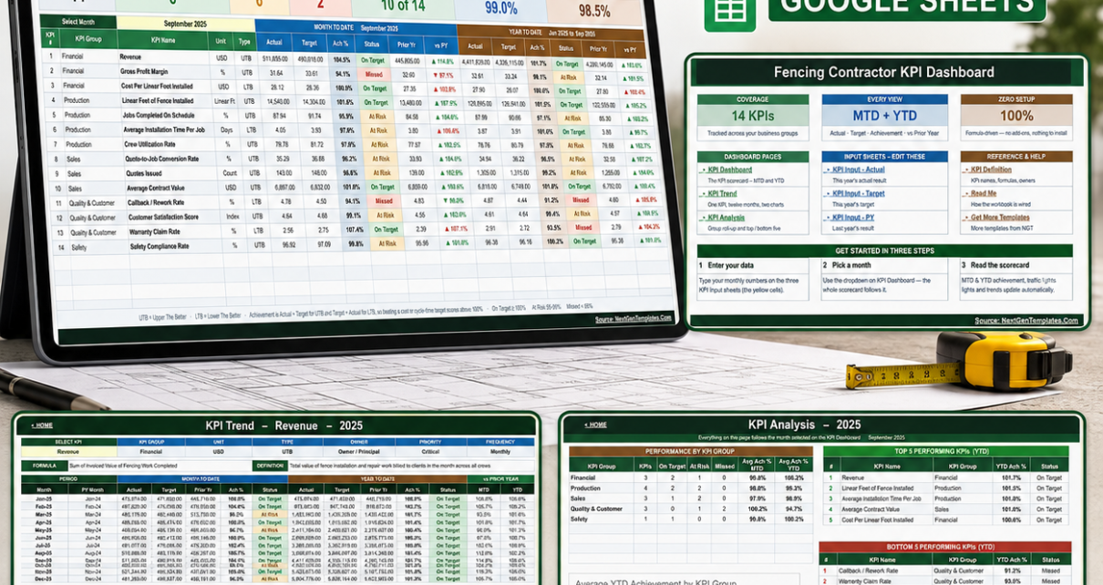
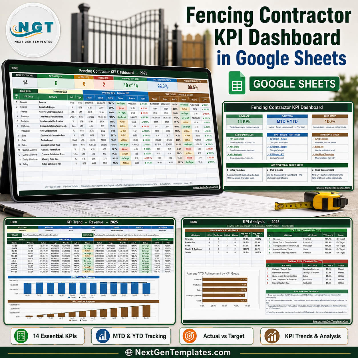
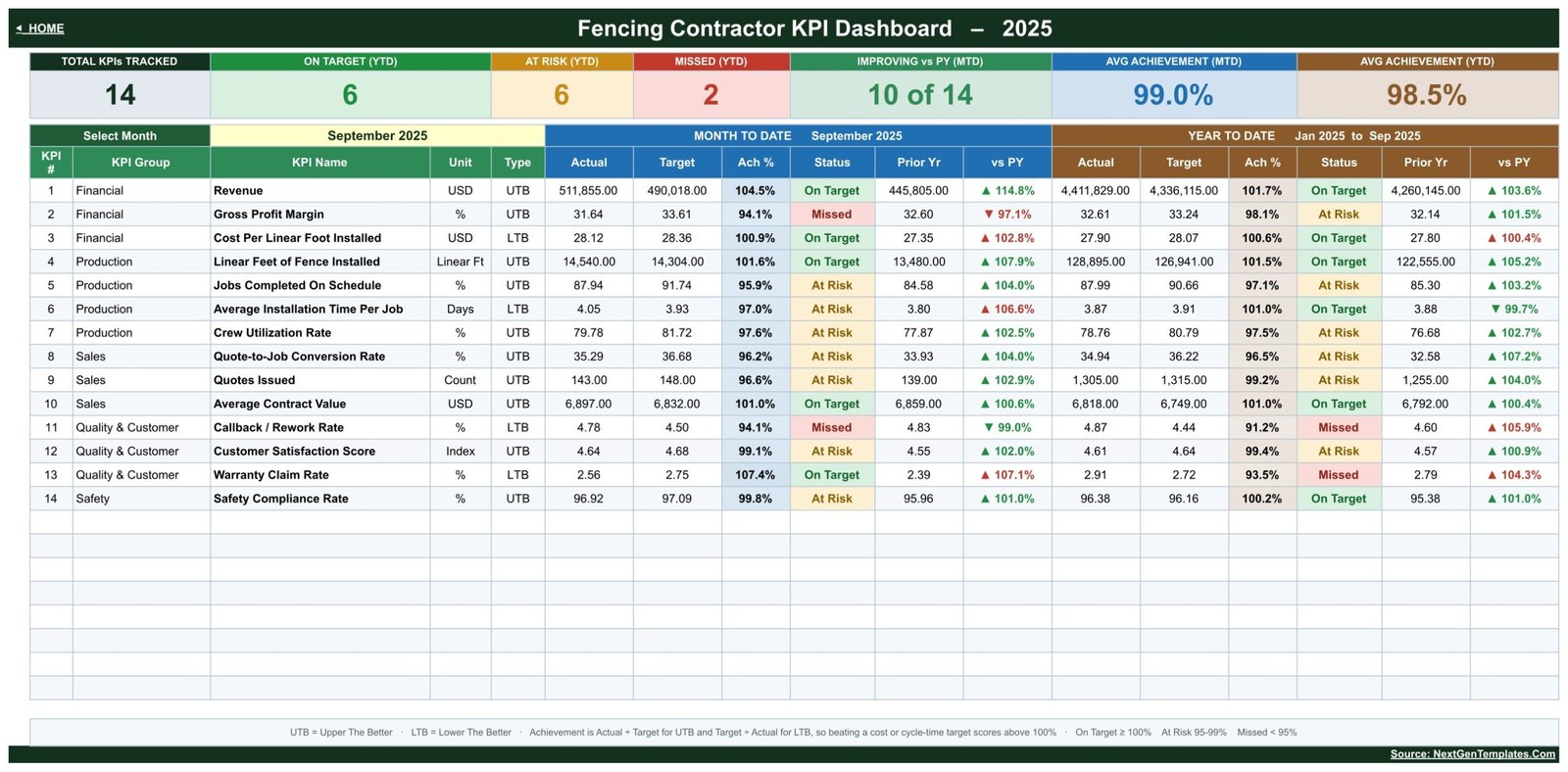
In the sample year that ships with the template – 2025, with September selected – 6 of the 14 KPIs sit On Target for the year, 6 are At Risk and 2 are Missed, with average achievement of 99.0% for the month and 98.5% for the year, and 10 of 14 KPIs improving against prior year. That is on purpose. A template that opens all green teaches you nothing about how it behaves when a real month goes sideways.Fencing Contractor KPI Dashboard in Google Sheets
Get the Fencing Contractor KPI Dashboard in Google Sheets – instant download, lifetime access, free updates.
Get the Fencing Contractor KPI Dashboard
Key Features of the Fencing Contractor KPI Dashboard
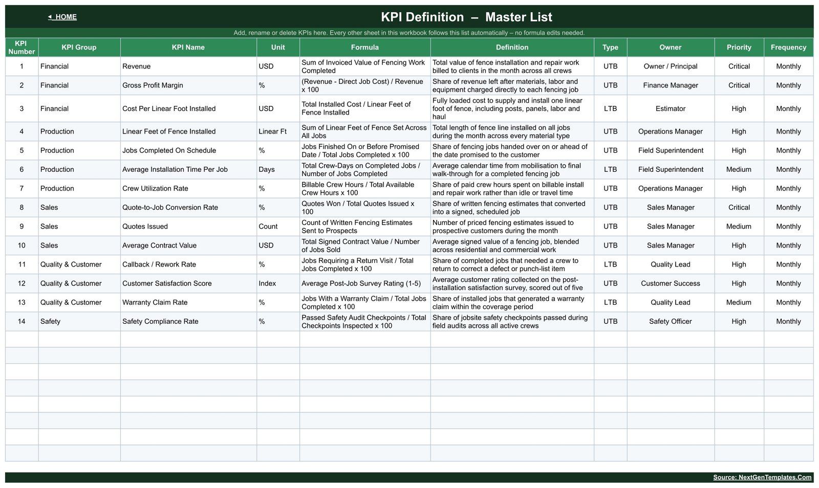
- 14 fencing KPIs in five groups. Financial: Revenue, Gross Profit Margin, Cost Per Linear Foot Installed. Production: Linear Feet of Fence Installed, Jobs Completed On Schedule, Average Installation Time Per Job, Crew Utilization Rate. Sales: Quote-to-Job Conversion Rate, Quotes Issued, Average Contract Value. Quality & Customer: Callback / Rework Rate, Customer Satisfaction Score, Warranty Claim Rate. Safety: Safety Compliance Rate.Fencing Contractor KPI Dashboard in Google Sheets
- MTD and YTD on the same row. Twelve result columns per KPI – Actual, Target, Achievement %, Status, Prior Yr and vs PY, once for the selected month and once for the year to date.
- One dropdown drives the whole workbook. The Select Month cell on the KPI Dashboard sheet lists the twelve months of your reporting year. Change it and the summary tiles, the KPI rows, the trend page and the analysis page all re-calculate.
- Upper-the-better and lower-the-better scoring. Ten KPIs are UTB and four are LTB – Cost Per Linear Foot Installed, Average Installation Time Per Job, Callback / Rework Rate and Warranty Claim Rate. Achievement is Actual divided by Target for UTB and Target divided by Actual for LTB, so beating a cost or a rework target scores above 100% the same way beating a revenue target does.Fencing Contractor KPI Dashboard in Google Sheets
- Traffic-light thresholds you can edit. On Target from 100%, At Risk 95% to 99%, Missed below 95%. The bands live in plain Status formulas on the dashboard sheet, so you can move them to match your own governance.
- Seven live summary tiles. Total KPIs Tracked, On Target (YTD), At Risk (YTD), Missed (YTD), Improving vs PY (MTD), Avg Achievement (MTD) and Avg Achievement (YTD) – all COUNTIF, SUMPRODUCT and AVERAGE formulas that recount themselves when you change the KPI list.Fencing Contractor KPI Dashboard in Google Sheets
- A master KPI list. The KPI Definition sheet holds the number, group, name, unit, formula, definition, type, owner, priority and frequency for every KPI. The sheets are wired for 22 rows and 14 are filled, so eight live empty rows are already waiting.
- No add-ons and no Apps Script. Native Google Sheets formulas throughout. Nothing to authorise, nothing to install, no refresh step.Fencing Contractor KPI Dashboard in Google Sheets
Dashboard Pages Explanation
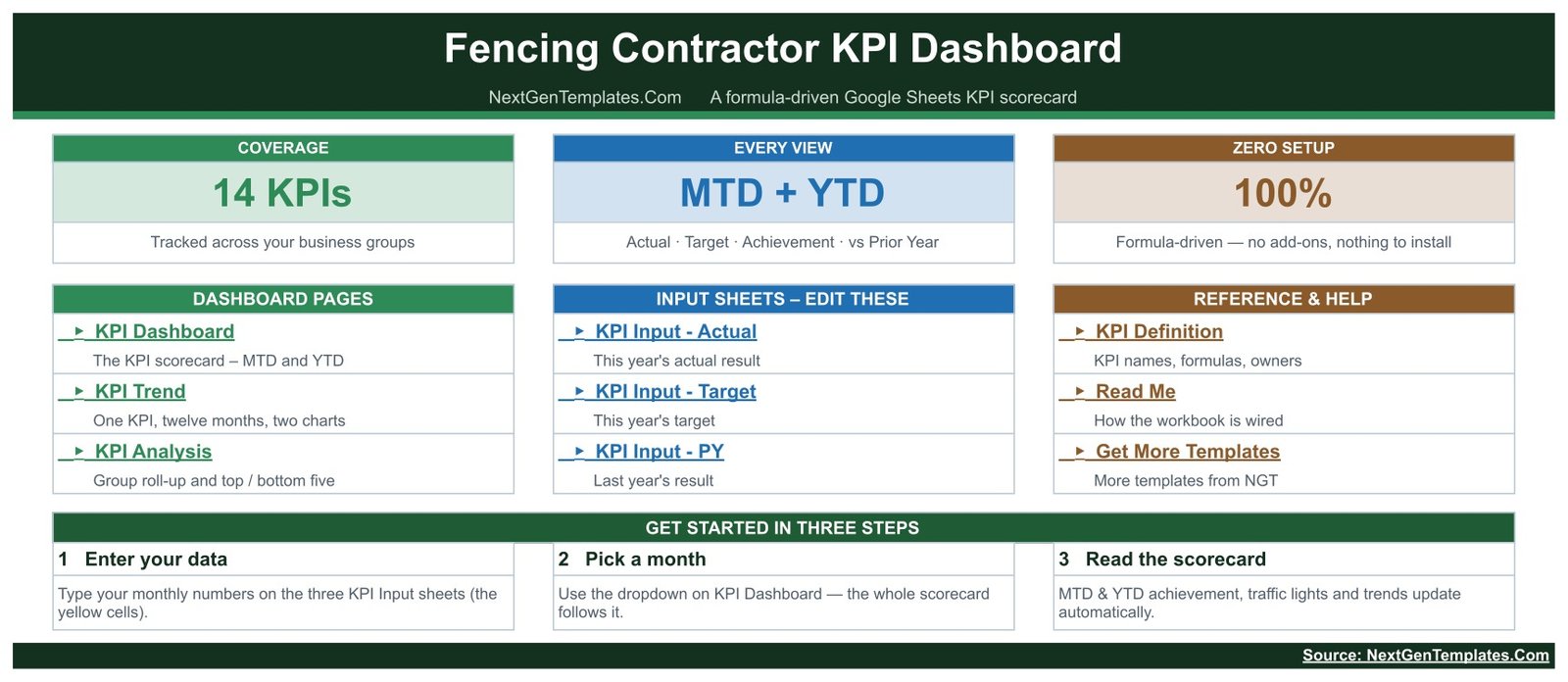
The workbook ships with eleven sheets, all reachable from a Home page that also carries a three-step start guide.
KPI Dashboard
The scorecard. A month picker, seven summary tiles across the top, and one row per KPI showing group, name, unit, type, then the Month-to-Date block and the Year-to-Date block side by side. Status cells are colour-coded green, amber and red, and the vs PY column carries an arrow whose direction is the raw movement against last year while its colour tells you whether that movement is good for that particular KPI. That is why a falling cost per linear foot shows a green arrow and a rising warranty claim rate shows a red one – a distinction most homemade scorecards get wrong.
KPI Trend
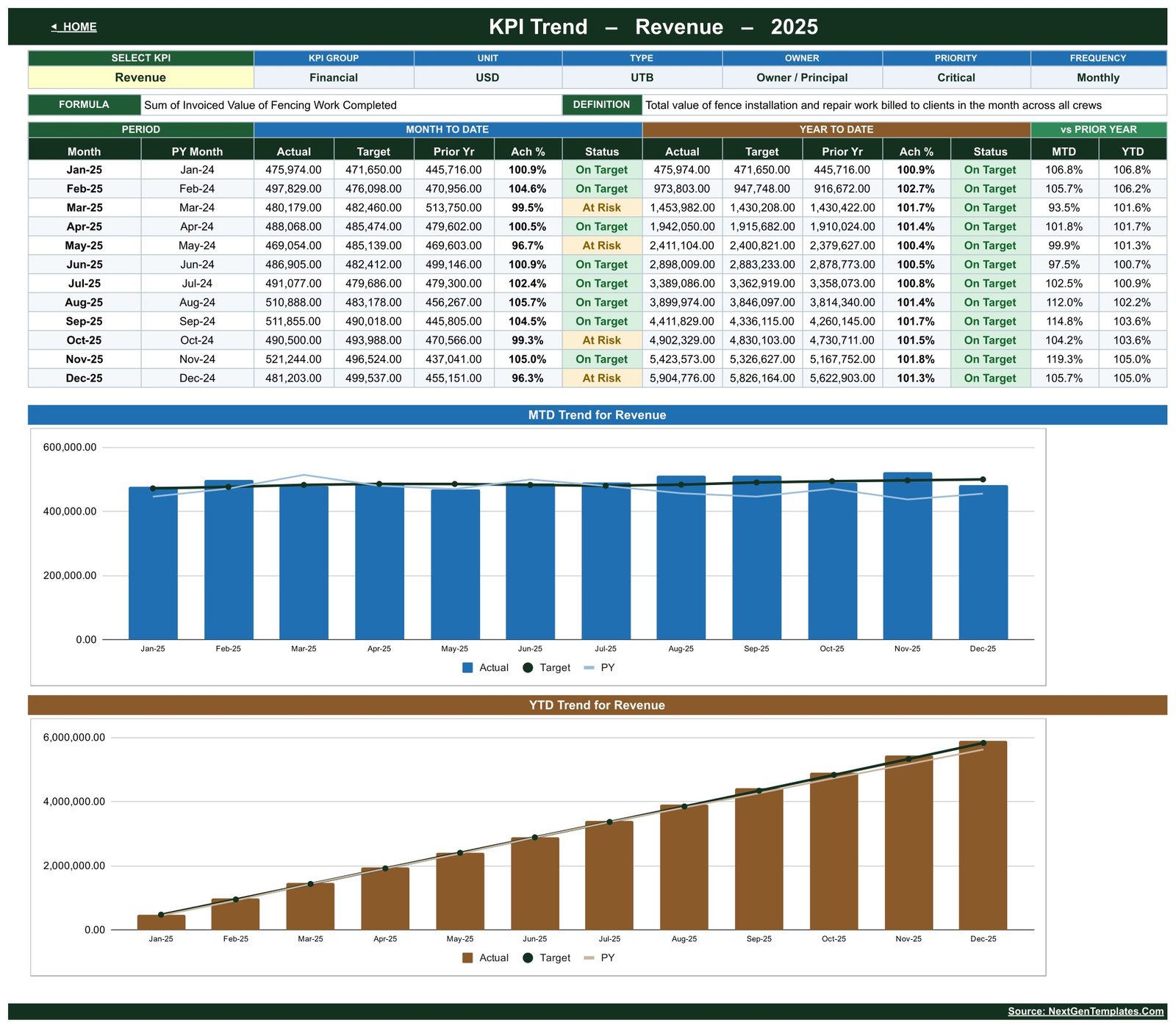
One KPI at a time. Pick any name from the dropdown and the page shows its group, unit, type, owner, priority and frequency, its calculation formula and its plain-English definition, then twelve months of MTD and YTD actual, target, prior year, achievement and status, and finally two charts – an MTD Trend chart and a YTD Trend chart, each plotting actual columns against a target line and a prior-year line. This is the page that answers “is this one bad month or six?”.
KPI Analysis
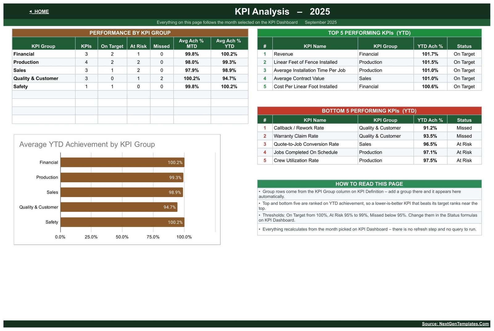
The roll-up. A Performance by KPI Group table counts KPIs, On Target, At Risk and Missed per group and averages MTD and YTD achievement for each; an Average YTD Achievement by KPI Group bar chart sits beneath it; and two ranked lists show the Top 5 and Bottom 5 Performing KPIs on year-to-date achievement. In the sample year, Quality & Customer is the weak group at 94.7% average YTD achievement while Financial and Safety both sit just above 100%.
The three input sheets
KPI Input – Actual, KPI Input – Target and KPI Input – PY are the only sheets you normally type in. Each holds an MTD and a YTD column for every month of the year, for every KPI, in yellow cells. Storing both means you decide how your year to date is defined: volumes such as Revenue, Linear Feet of Fence Installed and Quotes Issued accumulate through the year, while rates, indices and per-unit costs run as averages. Cell E3 on KPI Input – Actual is the first month of the reporting year – change it and the target sheet, the prior-year sheet, the month dropdown and every sheet title re-base automatically.
KPI Definition, Support, Read Me and Get More Templates
KPI Definition is the master list every other sheet follows. Support holds the helper calculations – the selected month, the dropdown list, the trend series and the ranking helpers – and needs no editing. Read Me explains how the workbook is wired, and Get More Templates links to the rest of the catalogue.
Fencing Contractor KPI Dashboard vs. a Sheet You Build Yourself vs. Field-Service SaaS
| What you get | This template | Build it yourself | Field-service SaaS |
|---|---|---|---|
| Setup time | Minutes – copy and type your numbers | Days of formula work | Weeks of onboarding |
| Fencing KPIs defined for you | 14, with formula, definition, owner and priority | You research and define them | Generic service metrics |
| Lower-is-better scoring | Built in per KPI | Easy to get backwards | Varies by product |
| MTD and YTD in one row | Yes | Usually two tabs | Usually separate reports |
| Prior-year comparison | Built in, MTD and YTD | Manual | Often an add-on |
| Runs on | Any browser, free Google account | Whatever you build it in | Vendor platform |
| Cost | One-off, under fifteen dollars | Your own time | Typically 1,200 – 6,000 per year |
Who Should Use This Template
It fits a fencing installation and repair business with roughly 2 to 40 field staff that already captures job values, linear feet, crew hours and quote outcomes somewhere, and wants one monthly page instead of five spreadsheets. The KPI Definition sheet already names the owner roles it expects: Owner / Principal, Finance Manager, Estimator, Operations Manager, Field Superintendent, Sales Manager, Quality Lead, Customer Success and Safety Officer.
It is not an integration. Nothing reads from your accounting system automatically – this is a monthly manual-entry scorecard, and that is the trade for having it working in five minutes. It is also not crew scheduling, take-off estimating, materials ordering or a CRM.
Real-World Use Cases
Catching a margin illusion
September closed at 104.5% of the revenue target and looked like a strong month. The scorecard showed Gross Profit Margin Missed at 94.1% of target and Callback / Rework Rate also Missed at 94.1% – revenue was holding up because crews were going back to re-set posts. Without both numbers on the same row as revenue, that month reads as a win.
Reporting to a lender
A finance manager watching a covenant works from the YTD half of the grid – Revenue, Gross Profit Margin and Cost Per Linear Foot Installed – exports the KPI Dashboard sheet to PDF and sends it as-is. It replaces a hand-built deck that used to take most of a day each quarter.
Separating a bad week from a bad trend
Quotes Issued was close to plan but Quote-to-Job Conversion Rate sat at 96.2% of target for the month and 96.5% for the year. Opening the KPI Trend page for that KPI showed a steady slide rather than one weak week, which pointed at quote turnaround and follow-up rather than lead volume.
Advantages of This Dashboard
- Everything is a worksheet formula, so it opens and works with no authorisation prompt, no add-on and no refresh step.
- The KPI list is data, not structure – rename a KPI once on KPI Definition and every sheet follows.
- Direction handling is correct out of the box, which is the single most common defect in home-made KPI sheets.
- Both MTD and YTD are stored rather than derived, so a business with an odd year-to-date convention is not forced into someone else’s.
- It shares like any Google Sheet – your finance manager can type financials while your superintendent types crew hours.
Opportunities for Improvement
- Data entry is manual and monthly. If you want live job costing, this is the wrong shape of tool.
- It reports one company. There is no crew-by-crew or branch-by-branch breakdown built in, although you can add crew-level KPIs as extra rows on KPI Definition.
- The trend page shows one KPI at a time by design. Comparing two KPIs on one chart means building that chart yourself.
- The sample data is invented. Do not read the shipped numbers as fencing industry benchmarks – they exist so the charts render on first open.
Best Practices
- Set the reporting year first, on cell E3 of KPI Input – Actual, before typing anything else.
- Fix the KPI list before you fill twelve months of data. Renaming a KPI later is safe, but deciding what you actually manage first saves re-typing.
- Enter targets for the whole year up front. Achievement and status mean nothing without them.
- Set the UTB / LTB type deliberately on every KPI. It is the field that decides whether a number is read as good news.
- Review from the Bottom 5 list on KPI Analysis, not from the top of the grid, then open KPI Trend for each miss before deciding it is a problem.
- Give edit access only to the people who type numbers, and view access to everyone else.
Explore Relevant Templates
- Fencing Contractor KPI Scorecard in Google Sheets – the lighter ten-card scorecard for the same trade, built on a different KPI set.
- Drywall Contractor KPI Dashboard in Google Sheets
- Masonry Contractor KPI Dashboard in Google Sheets
- Painting Contractor KPI Dashboard in Google Sheets
- Roofing Contractor KPI Dashboard in Google Sheets
- Flooring Installation KPI Dashboard in Google Sheets
- Electrical Contractor KPI Dashboard in Google Sheets
Curious how dashboards like this are put together? The Excel Pivot Tables & Dashboards course on NextGenTemplates Academy teaches the reporting techniques step by step, with practice files.
Get the Fencing Contractor KPI Dashboard
Frequently Asked Questions
What do I actually download?
A PDF. It carries the “Make a copy” link for the Google Sheet plus setup notes. Click the link and Google Drive creates your own private, fully editable copy. There is no file to import and nothing to install.
How is this different from the Fencing Contractor KPI Scorecard?
They are two different templates with two different KPI sets. The KPI Scorecard is a ten-card layout with RAG dot lights, sparklines and a comparison switch, built on metrics such as Fence Footage Installed per Crew Day, Post-Set Rework Rate, 90-Day Callback Rate and Estimate Turnaround Time. This KPI Dashboard is a fourteen-row MTD / YTD grid with a month picker, a dedicated trend page and an analysis page. Only Crew Utilization Rate appears in both.
Is there an Excel or Power BI edition?
Both are being prepared and are not on sale yet. When they list, each will be built natively for its own tool rather than converted, so treat the KPI sets as related but not guaranteed identical to this one.
Can I add my own KPIs?
Yes. Fill the next empty row on KPI Definition with a number, group, name, unit, formula, definition, type, owner, priority and frequency. The three input sheets pick the name up immediately and the dashboard, trend and analysis pages follow. The sheets are wired for 22 KPIs and 14 are filled.
Does it work on a phone or tablet?
Yes, in the free Google Sheets mobile app, though the fourteen-row grid with both MTD and YTD blocks is far easier to read on a laptop.
Why do some lower-is-better KPIs show above 100%?
Because achievement for an LTB KPI is Target divided by Actual. Coming in under a cost, installation-time, callback or warranty target is a good result, so it scores above 100% rather than looking like a miss.Fencing Contractor KPI Dashboard in Google Sheets
Can two people use it at once?
Yes. It is a normal Google Sheet with normal sharing, so more than one person can type at the same time.Fencing Contractor KPI Dashboard in Google Sheets
Is the sample data real fencing company data?
No. It is a full year of invented but realistic figures so every chart, status and ranking renders the moment you open the file. Replace it on the three input sheets. Nothing in the template is a benchmark or an industry average.Fencing Contractor KPI Dashboard in Google Sheets
About the Author
Built by PK – Microsoft Certified Professional with 15+ years of Excel, Google Sheets and Power BI experience, founder of NextGenTemplates and NeoTechNavigators, reaching 300K+ subscribers across YouTube channels. Every template is hand-built and tested before release.Fencing Contractor KPI Dashboard in Google Sheets
Conclusion
A fencing business does not fail because revenue fell. It fails quietly, one callback and one extra crew-day at a time, while the top line still looks fine. Putting Revenue, Gross Profit Margin, Cost Per Linear Foot Installed, Callback / Rework Rate and Safety Compliance Rate on one page, with a target beside each and last year behind it, is what turns a monthly close into a decision.
Get the Fencing Contractor KPI Dashboard in Google Sheets – instant download, lifetime access, free updates, and a 30-day refund if it is not right for your business.