The Paving Contractor KPI Dashboard in Google Sheets tracks 14 asphalt-paving KPIs across 5 KPI groups and 11 linked sheets. Ten of those KPIs are upper-the-better and four are lower-the-better, so a falling rework rate or a lower cost per ton scores above 100% rather than reading as a loss. One dropdown — Select Month — re-drives seven header cards, a 14-row traffic-light grid and a group roll-up page, with no refresh step and no add-on to install.
Get the Paving Contractor KPI Dashboard in Google Sheets
Most paving companies already have the numbers. Tonnage sits in the plant tickets, square yards sit on the daily reports, density cores sit in a QC folder, placed cost sits in the accounting file, and incident hours sit with the safety director. Nobody sees them next to each other until a bad month forces the question. The gap is not data collection — it is a single monthly view where target, actual and last year sit on the same row, in the right direction. That is exactly what this workbook does, and nothing more: it is a reporting layer, not an estimating or dispatch system.
Key Features of the Paving Contractor KPI Dashboard in Google Sheets
Fourteen KPIs, grouped the way a paving business runs. Production & Output holds three, Quality & Compliance four, Delivery & Utilization two, Cost & Profitability three, and Safety & Satisfaction two. The grouping is not decoration — the KPI Analysis page rolls performance up by group, so you can see that quality is holding while delivery is slipping.
MTD and YTD side by side. The scorecard grid carries Actual, Target, Achievement %, Status, Prior Yr and vs PY twice: once for Month to Date and once for Year to Date. There is no toggle to flip, so a weak month inside a solid year is obvious in a single glance.
Direction-aware achievement. Every KPI is flagged UTB or LTB on the KPI Definition sheet. Achievement is Actual ÷ Target for upper-the-better KPIs and Target ÷ Actual for lower-the-better ones. Rework Rate, Average Cost Per Ton, Cost Per Square Yard and Safety Incident Rate (TRIR) therefore score above 100% when they come down.
Editable traffic lights. Status reads On Target from 100%, At Risk from 95% to 99%, and Missed below 95%. Those bands live in ordinary Status formulas on the KPI Dashboard sheet, so you can move them to match your own governance rather than living with someone else’s tolerance.
The KPI list is data, not code. The KPI Definition sheet is the master list, and every other sheet follows it. Rename a KPI there and it changes everywhere. The sheets are wired for 22 KPIs and 14 are filled, so eight live empty rows are already waiting for KPIs of your own — no formula work at all.
Plain spreadsheet formulas. There is no Apps Script, no add-on, no external connector and no query. Every number is a worksheet formula and every chart is a native Google Sheets chart, so nothing needs authorising and nothing breaks when a permission changes.
Dashboard Pages Explanation
Home
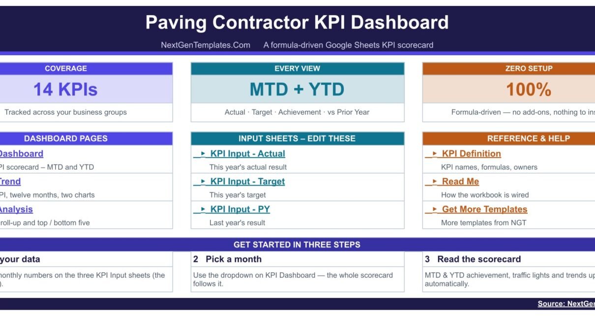
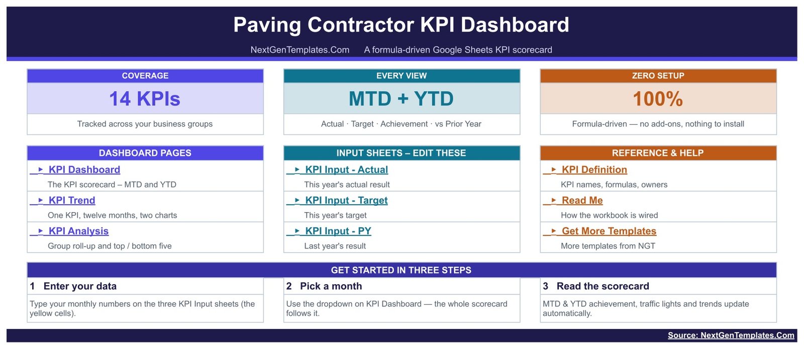
The navigation cover. Three coverage cards read 14 KPIs, MTD + YTD, and 100% formula-driven. Below them are three link blocks — Dashboard Pages, Input Sheets to edit, and Reference & Help — and a three-step “get started” strip: enter your data, pick a month, read the scorecard.
KPI Dashboard
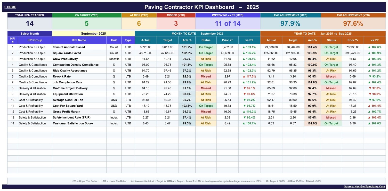
The scorecard, and the page you will live on. Seven header cards read Total KPIs Tracked, On Target (YTD), At Risk (YTD), Missed (YTD), Improving vs PY (MTD), Avg Achievement (MTD) and Avg Achievement (YTD). Under them, a 14-row grid gives KPI #, KPI Group, KPI Name, Unit and Type, then Actual, Target, Ach %, Status, Prior Yr and vs PY for Month to Date, and the same six columns again for Year to Date. The Select Month dropdown at the top left drives every figure on the page, and the footer restates the UTB/LTB rule and the traffic-light bands so nobody has to remember them.
KPI Trend
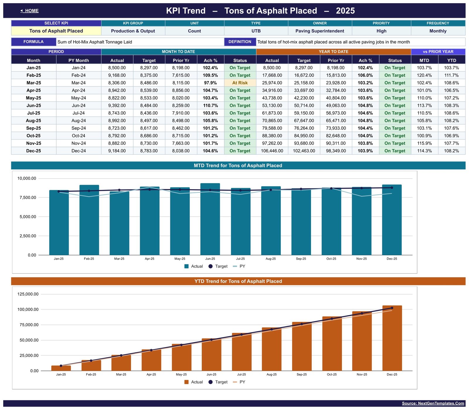
One KPI at a time. Choose a KPI from the dropdown and the attribute strip fills in its KPI Group, Unit, Type, Owner, Priority and Frequency, with its calculation formula and its plain-English definition on the line below — so an argument about what “Crew Productivity” means is settled on the page. A twelve-month table then gives Actual, Target, Prior Yr, Ach % and Status on both an MTD and a YTD basis, plus the vs-prior-year percentages for each. Two charts follow: the MTD trend and the YTD trend for the selected KPI, each plotting Actual as columns with Target and Prior Year as lines.
KPI Analysis
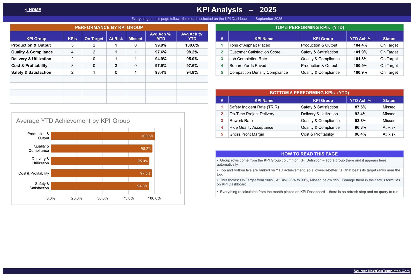
The roll-up, and the page most scorecards do not have. A Performance by KPI Group table counts how many KPIs each group holds and how many are On Target, At Risk and Missed, with average achievement for MTD and YTD. An Average YTD Achievement by KPI Group bar chart plots the same figures. On the right, Top 5 and Bottom 5 Performing KPIs (YTD) rank every KPI by year-to-date achievement with its group and status — and because achievement is direction-aware, a lower-is-better KPI that beats its target ranks near the top rather than the bottom. A “How to read this page” panel spells out the ranking rule and the thresholds. Everything here follows the month chosen on the KPI Dashboard.
KPI Input – Actual
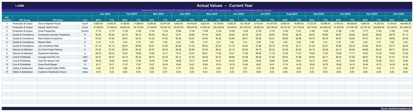
Your data, and one of only three sheets you normally type into. Every KPI gets a row and every month gets an MTD and a YTD column, so twelve months run across the sheet. The KPI numbers, groups, names and units come from the KPI Definition sheet, so the rows always line up. Cell E3 holds the first month of the reporting year — change it and the Target sheet, the Prior Year sheet, the month dropdown and every sheet title re-base together. KPI Input – Target and KPI Input – PY have exactly the same shape.
KPI Definition – Master List
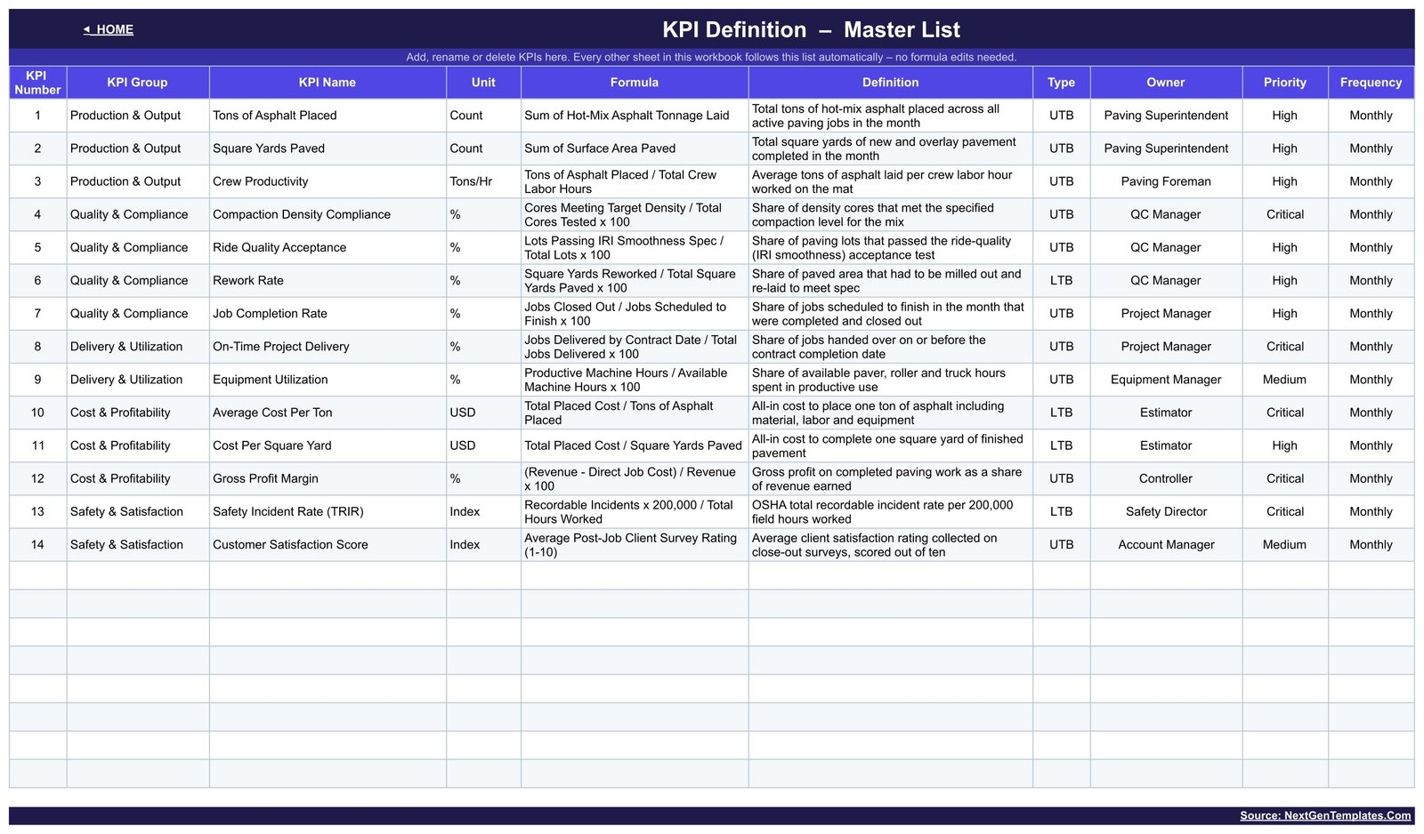
The master list. Each row carries KPI Number, KPI Group, KPI Name, Unit, Formula, Definition, Type (UTB or LTB), Owner, Priority and Frequency. The shipped list names real paving roles as owners — Paving Superintendent, Paving Foreman, QC Manager, Project Manager, Equipment Manager, Estimator, Controller, Safety Director and Account Manager — and flags four KPIs as Critical. Rows 15 to 22 are live and empty.
Two more sheets round it out. Read Me documents how MTD and YTD are stored, why rates and per-unit costs are running averages rather than sums, how to add, rename or remove a KPI, and gives a sheet-by-sheet map. Get More Templates links the rest of the catalogue. A hidden Support sheet holds the helper calculations — the selected month, the month list, the trend series behind the charts and the ranking helpers — and never needs editing.
The 14 KPIs, and Which Direction Each One Runs
| KPI Group | KPI | Unit | Direction | Owner |
|---|---|---|---|---|
| Production & Output | Tons of Asphalt Placed | Count | Upper the better | Paving Superintendent |
| Production & Output | Square Yards Paved | Count | Upper the better | Paving Superintendent |
| Production & Output | Crew Productivity | Tons/Hr | Upper the better | Paving Foreman |
| Quality & Compliance | Compaction Density Compliance | % | Upper the better | QC Manager |
| Quality & Compliance | Ride Quality Acceptance | % | Upper the better | QC Manager |
| Quality & Compliance | Rework Rate | % | Lower the better | QC Manager |
| Quality & Compliance | Job Completion Rate | % | Upper the better | Project Manager |
| Delivery & Utilization | On-Time Project Delivery | % | Upper the better | Project Manager |
| Delivery & Utilization | Equipment Utilization | % | Upper the better | Equipment Manager |
| Cost & Profitability | Average Cost Per Ton | USD | Lower the better | Estimator |
| Cost & Profitability | Cost Per Square Yard | USD | Lower the better | Estimator |
| Cost & Profitability | Gross Profit Margin | % | Upper the better | Controller |
| Safety & Satisfaction | Safety Incident Rate (TRIR) | Index | Lower the better | Safety Director |
| Safety & Satisfaction | Customer Satisfaction Score | Index | Upper the better | Account Manager |
Each of those carries its own calculation formula on the KPI Definition sheet — Crew Productivity is Tons of Asphalt Placed divided by total crew labour hours, Compaction Density Compliance is cores meeting target density over total cores tested, Ride Quality Acceptance is lots passing the IRI smoothness spec over total lots, Average Cost Per Ton is total placed cost over tons placed, and Safety Incident Rate is recordable incidents times 200,000 over total hours worked. The formulas are text you can edit, so if your company measures something slightly differently, the definition changes with it.
Paving Contractor KPI Dashboard in Google Sheets vs. the KPI Scorecard vs. Paid Construction Software — Feature Comparison
| Feature | Paving Contractor KPI Dashboard in Google Sheets | Paving Contractor KPI Scorecard in Google Sheets | HCSS / B2W / paid construction ERP |
|---|---|---|---|
| Cost | $8.99 one-time | $8.99 one-time | $100-500+ / month, often per seat |
| KPIs tracked | 14, in 5 groups | 10, in 5 groups | Vendor-defined metric set |
| MTD and YTD | Both, side by side on one grid | One at a time, via a toggle | Configurable reports |
| Group roll-up and top/bottom five | Yes, a dedicated KPI Analysis page | Not included | Yes, in reporting modules |
| Setup time | Under 10 minutes | Under 10 minutes | Weeks, plus onboarding and training |
| Platform | Google Sheets, browser only | Google Sheets, browser only | Vendor cloud app |
| Add-ons or scripts required | None | None | Vendor platform |
| Customizable KPI list | Edit the KPI Definition sheet, no code | Edit the definition sheet | Fixed unless you buy a higher tier |
| Lower-the-better KPI handling | Built in, 4 of the 14 KPIs | Built in, 3 of the 10 | Varies by vendor |
| Year-1 cost at 5 users | $8.99 total | $8.99 total | $6,000-$30,000 |
| Estimating, dispatch, telematics, payroll | No — reporting only | No | Yes |
Dashboard or Scorecard? They Are Two Different Templates
NextGenTemplates ships two paving KPI templates for Google Sheets and the names are close enough to confuse anyone. They are not two versions of one product.
The Paving Contractor KPI Scorecard in Google Sheets is a card-style layout with 10 KPIs and three header dropdowns — month, MTD/YTD, and Target versus prior year. You change a dropdown to change what the cards show.
The Paving Contractor KPI Dashboard in Google Sheets — the template in this article — puts 14 KPIs in one grid with MTD and YTD side by side rather than behind a toggle, and adds a KPI Analysis page with a group roll-up, an Average YTD Achievement by KPI Group chart and a ranked top and bottom five. Buy one or the other, not both.
And neither is the same as the analytical Dashboard in Google Sheets range. Those are transaction-level templates built on a data table with pivots and slicers, for slicing a job list by region or crew. A KPI scorecard answers a different question: are we hitting the numbers this month, and are we better or worse than last year.
Who Should Use This Template
It fits an owner, general manager, paving superintendent or controller at an asphalt paving, road-surfacing or overlay contractor who already knows the monthly numbers but has them scattered across four files. It suits a company that runs on Google Workspace and wants a monthly report shareable by link, view-only for the crew and editable for whoever enters the figures. It is also a sensible first KPI system for a company that has never had one, because the KPI list is already written — 14 paving KPIs with formulas, definitions, owners and priorities — so the first month is data entry rather than a design project.
It does not fit if you need job costing pulled automatically out of accounting, GPS or telematics feeds from pavers and rollers, daily crew dispatch, bid and estimating management, or certified payroll. There is no job-level drill-down and no schedule — only company-level KPIs by month, entered by hand.
Real-World Use Cases
The monthly ops review. Close the month, enter tonnage, square yards, density results, placed cost and incident hours, pick the month in the dropdown, and walk into the review with one page: how many KPIs are on target for the year, which are missed, and how the month compares with the same month last year.
Chasing a quality problem. Rework Rate turns red. The QC Manager opens KPI Trend, selects Rework Rate, and reads the twelve-month table to see whether it is an outlier or the continuation of a slide — then checks whether Compaction Density Compliance moved with it.
Defending a bid margin. Average Cost Per Ton and Cost Per Square Yard are scored as lower-the-better against target, with Gross Profit Margin on the next row, so a creeping placed cost is visible months before it shows up as a thin year.
Separating volume from efficiency. Equipment Utilization and Crew Productivity sit in the same view as tonnage, so an owner can tell the difference between “we paved less” and “we paved less per available machine hour” — two problems with very different fixes.
A safety conversation with evidence. Safety Incident Rate (TRIR) is scored as lower-the-better against a target and against last year, so the safety director can talk about direction rather than argue about a single incident.
Lender or board reporting. The KPI Analysis page gives a group-level summary and a ranked top and bottom five — enough for a one-page pack without exporting anything.
Advantages of the Paving Contractor KPI Dashboard in Google Sheets
Nothing to install and nothing to authorise. Formulas and native charts only. It opens in a browser and on the Google Sheets mobile app, and there is no add-on to be disabled by an admin.
Direction handled properly. Four of the fourteen KPIs are lower-the-better, and the workbook scores them as such rather than leaving a reader to invert them mentally. The vs-prior-year arrow shows raw direction while its colour shows whether that direction is good — a falling cost gets a green down-arrow.
Honest year-to-date maths. Volumes and counts accumulate through the year; rates, ratios, indices and per-unit costs are running averages. A compliance percentage that sums to 1,100% by December is the classic sign of an invented KPI pack, and the sample data deliberately does not do it.
Extensible without formula work. Twenty-two KPI slots, fourteen filled. Adding a KPI is filling a row on KPI Definition and typing its monthly numbers.
Ownership is written down. Every KPI carries an owner, a priority and a reporting frequency, so the monthly review has a name against each red row.
Opportunities for Improvement
Data entry is manual. Tonnage, cost and hours are typed in each month. If your plant tickets or accounting system can export monthly totals, you can paste them, but there is no live connection.
Company level only. There is no breakdown by job, crew, region or customer. If you need to compare two crews, you would either run two copies or add crew-specific KPIs to the definition list.
One reporting year at a time. The workbook holds the current year and the prior year. Multi-year history means keeping a copy per year, or extending the input sheets.
Monthly granularity. Every KPI is defined as Monthly. A weekly production huddle would need a separate sheet.
Best Practices
Set the reporting year first. Cell E3 on KPI Input – Actual re-bases everything. Set it before you paste anything, or you will paste against the wrong month labels.
Trim the KPI list before you fill it. Delete the KPIs you genuinely do not measure rather than entering guesses. A dashboard with ten honest KPIs beats one with fourteen where four are invented.
Agree the targets before the month starts. Achievement is measured against the Target sheet, so a target set after the fact is not a target.
Decide your YTD convention once. Because MTD and YTD are both stored, you control whether a rate’s YTD is a simple average or a weighted one. Write the choice into the KPI Definition formula text so it survives staff changes.
Move the thresholds deliberately. 100 / 95 / below-95 is a starting point. If everything is amber every month, the bands are wrong or the targets are — decide which before you loosen them.
Share view-only. Give the crew a view link and keep edit access with whoever owns data entry, so a stray click cannot overwrite a formula.
Explore Relevant Templates
Same trade, different template: the Paving Contractor KPI Scorecard in Google Sheets and the Paving Contractor KPI Scorecard in Excel use the flatter 10-KPI card layout described above.
Neighbouring trades on the same engine: the Concrete Contractor KPI Dashboard in Google Sheets, the Masonry Contractor KPI Dashboard in Google Sheets, the Drywall Contractor KPI Dashboard in Google Sheets and the Insulation Contractor KPI Dashboard in Google Sheets are the same workbook with trade-specific KPIs.
Excel and Power BI editions of this paving dashboard are being prepared and are not on sale yet. Browse the full Google Sheets template catalogue in the meantime.
To get more from a KPI dashboard like this, the Excel Pivot Tables & Dashboards course on NextGenTemplates Academy covers the reporting and charting techniques behind it, with practice files.
Get the Paving Contractor KPI Dashboard in Google Sheets
Frequently Asked Questions
What KPIs does the Paving Contractor KPI Dashboard in Google Sheets track?
Fourteen, in five groups. Production & Output: Tons of Asphalt Placed, Square Yards Paved and Crew Productivity. Quality & Compliance: Compaction Density Compliance, Ride Quality Acceptance, Rework Rate and Job Completion Rate. Delivery & Utilization: On-Time Project Delivery and Equipment Utilization. Cost & Profitability: Average Cost Per Ton, Cost Per Square Yard and Gross Profit Margin. Safety & Satisfaction: Safety Incident Rate (TRIR) and Customer Satisfaction Score.
How does it score KPIs where a lower number is better?
Each KPI is flagged UTB or LTB. Achievement is Actual ÷ Target for upper-the-better and Target ÷ Actual for lower-the-better, so Rework Rate, Average Cost Per Ton, Cost Per Square Yard and Safety Incident Rate score above 100% when they fall. On the KPI Analysis page this matters twice over: a lower-is-better KPI that beats its target ranks in the top five, not the bottom.
How is this different from the Paving Contractor KPI Scorecard?
The Scorecard is a card layout with 10 KPIs and three header dropdowns. This dashboard has 14 KPIs in one grid with MTD and YTD side by side, plus a KPI Analysis page with a group roll-up and a ranked top and bottom five. They are different templates for the same trade — pick one.
Does it handle DOT specifications, IRI acceptance or OSHA record-keeping?
No. It reports the outcomes — the share of density cores that met spec, the share of lots that passed the smoothness test, and the recordable incident rate — but it is not a compliance system and holds no core results, lot records or incident logs. Keep those where they live and enter the monthly summary here.
How long does setup take?
Under ten minutes if your numbers are already in a spreadsheet. Set the reporting-year cell, edit or trim the KPI Definition rows, then paste twelve months of MTD and YTD figures into the three input sheets. Nothing else needs touching.
Can I change the KPIs to match my own company?
Yes. The KPI Definition sheet is the master list — rename, delete or add rows there and set each KPI’s unit, formula, UTB or LTB type, owner, priority and frequency. The KPI Dashboard, KPI Trend and KPI Analysis sheets all follow it automatically. Eight of the 22 wired rows are empty and ready.
Do I need any add-on or Apps Script to run it?
No. Every number is a worksheet formula and every chart is a native Google Sheets chart. There is nothing to install, nothing to authorise, no query to refresh, and it works on the Google Sheets mobile app.
About the Author
Built by PK — Microsoft Certified Professional with 15+ years of Excel, Google Sheets and Power BI experience, and founder of NextGenTemplates, reaching 300K+ subscribers across YouTube channels. Every template is hand-built and tested before release.
Conclusion
If you run a paving company and your monthly review still means opening four files, the Paving Contractor KPI Dashboard in Google Sheets replaces them with one sheet, one dropdown and fourteen rows scored in the right direction. It will not dispatch a crew or price a bid — it will tell you, every month, which of your fourteen numbers moved, whether that was good or bad, and how the year is tracking against last year.
Instant download · One-time payment · No subscription
Last updated: September 2026