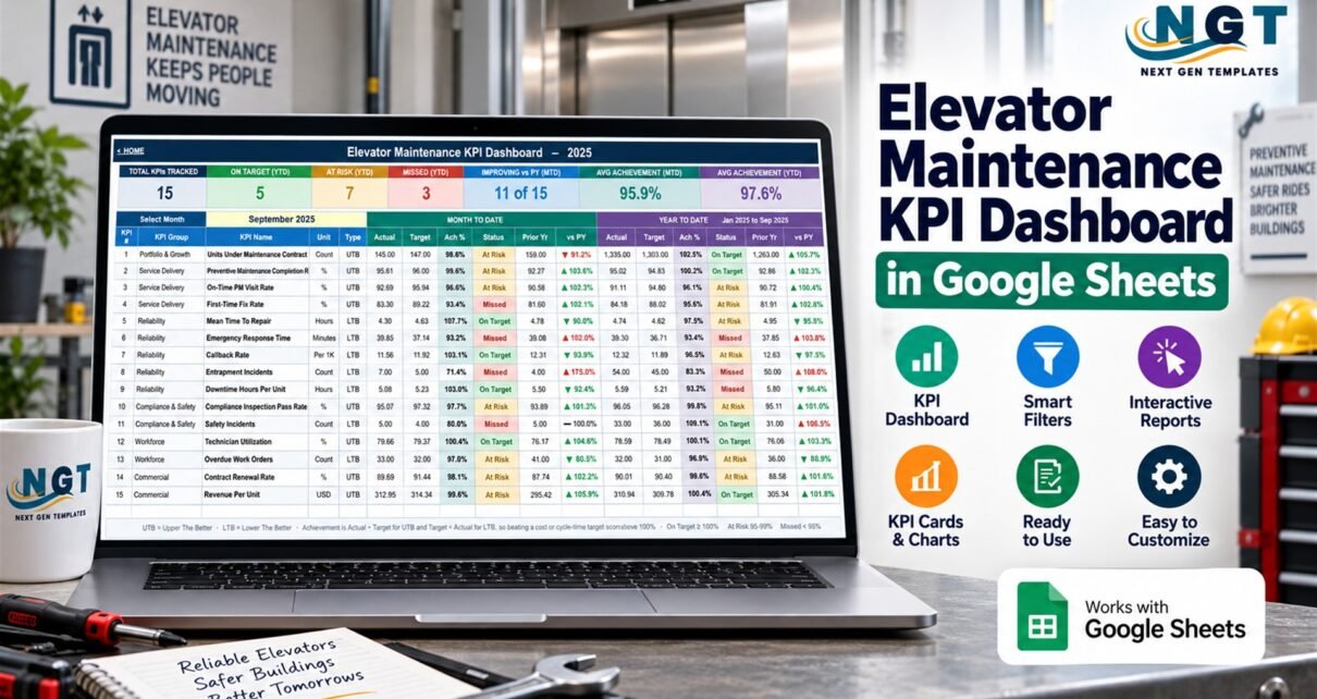
The Elevator Maintenance KPI Dashboard in Google Sheets brings 15 monthly performance measures into one connected scorecard. Managers can compare actuals with targets and prior-year results, switch between MTD and YTD context, inspect a selected KPI trend, and review performance by operational group.
This walkthrough from NeoTechNavigators explains the real spreadsheet and its boundaries. The Elevator Maintenance KPI Dashboard organizes user-entered monthly results; it does not perform inspections, monitor elevators, manage maintenance, dispatch responders, certify compliance, or replace a field-service or safety platform.
Elevator Maintenance KPI Dashboard Structure
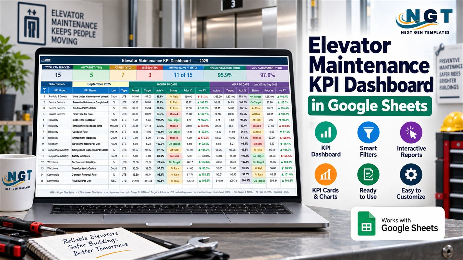
The Home sheet links the reporting pages, input sheets, definitions, and guidance. The main KPI Dashboard summarizes 15 measures for a selected month. Its seven header cards count on-target, at-risk, missed, and improving measures and show average MTD and YTD achievement.
The KPI Trend sheet focuses on one selected measure. It displays the KPI group, unit, upper- or lower-the-better direction, owner, priority, frequency, formula, and definition, followed by monthly MTD and YTD comparisons and two charts. KPI Analysis rolls the selected month into six groups and ranks the top and bottom five measures by YTD achievement.
The remaining operational pages shown in the gallery include the monthly Actual Values table and the KPI Definition master list. The Home page also identifies separate Target and Prior Year input sheets, plus a Read Me page.
The 15 Included KPIs
The supplied measures are Units Under Maintenance Contract, Preventive Maintenance Completion Rate, On-Time PM Visit Rate, First-Time Fix Rate, Mean Time To Repair, Emergency Response Time, Callback Rate, Entrapment Incidents, Downtime Hours Per Unit, Compliance Inspection Pass Rate, Safety Incidents, Technician Utilization, Overdue Work Orders, Contract Renewal Rate, and Revenue Per Unit.
They are organized into Portfolio & Growth, Service Delivery, Reliability, Compliance & Safety, Workforce, and Commercial groups. Eight measures are upper-the-better and seven are lower-the-better. That distinction matters: lower downtime may represent improvement, while higher completion may represent improvement. Users should validate each direction and formula against their own reporting policy.
A Practical Monthly Workflow
- Make a private Google Sheets copy using the verified link in the purchased PDF.
- Review KPI definitions, units, owners, frequency, and performance direction.
- Enter approved actual, target, and prior-year figures for each month.
- Select the reporting month and check MTD and YTD status on the scorecard.
- Open KPI Trend when a single measure needs time-series context.
- Use KPI Analysis to compare groups and identify items for investigation.
- Reconcile the output with source records and document decisions in approved systems.
What the Dashboard Can and Cannot Do
The spreadsheet can standardize a monthly review and reduce the effort of rebuilding scorecards and charts. It can make differences between actual, target, and prior-year results easier to scan. It can also keep metric definitions and ownership visible beside the analysis.
It cannot collect inspection evidence, verify maintenance completion, manage statutory due dates, issue service certificates, interpret jurisdiction-specific rules, monitor entrapment or emergency signals, dispatch technicians, or initiate repairs. A displayed status is the result of user-entered figures and workbook rules, not an independent safety determination.
Data Quality and Access Controls
Before relying on a monthly review, confirm the reporting period, input source, KPI denominator, target, direction, and YTD method. Investigate blanks and unusual movements. If several users collaborate, protect formulas and limit edit access to the people responsible for data entry. Google explains the available roles in its Drive sharing documentation.
Displayed sample figures are fictional, not benchmarks. Organizations should set targets through their own governance process and retain work orders, inspection evidence, incident records, and service documentation in approved systems.
Who May Find It Useful
The template may suit elevator service managers, maintenance coordinators, reliability leads, field-service supervisors, workforce planners, and commercial reviewers who already have approved monthly totals. It is designed for aggregated management reporting rather than asset-level histories, technician schedules, inspection records, certificates, incidents, alarms, or customer cases.
Visible Layout Note
The verified screenshots show minor column-width clipping for two long labels. “Preventive Maintenance Completion Rate” is shortened on the main scorecard, and “Service Operations Manager” is shortened on the definition page. The labels remain available in the editable sheet, and users can adjust column widths.
Frequently Asked Questions
Is this a live elevator monitoring system?
No. It is a Google Sheets reporting template based on figures entered by the user.
How many metrics are included?
The verified scorecard includes 15 editable KPIs across six groups.
Can it compare with prior year?
Yes. The scorecard and trend areas include prior-year comparisons alongside actual and target values.
Can the KPI definitions be changed?
Yes, but users should update dependent input structures and test the full workbook after changes.
Does it guarantee regulatory compliance?
No. It cannot interpret rules, verify evidence, or certify results.
Is the data imported automatically?
No. Approved monthly figures must be entered into the input sheets.
Get the Google Sheets Dashboard
See every verified screenshot and get the customer PDF on the product page. You can also browse the Google Sheets KPI Dashboard collection for other reporting topics.
Prepared by PK, Founder of NextGenTemplates.