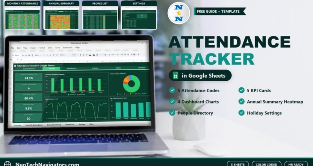
The Attendance Tracker in Google Sheets is a ready-to-use template for recording daily attendance and turning it into clear monthly and yearly insight. You mark each person as Present, Absent, Late, Half Day or Work From Home on a colour-coded grid, and the tracker totals the month, updates a dashboard and builds a 12-month summary for you.
It suits HR managers, team leads, small business owners, school administrators, teachers and training institutes, because it works for employees and students alike. The file has five working tabs (Monthly Attendance, Dashboard, Annual Summary, People List and Settings) plus an Instructions tab, linked by a navigation bar, and needs no add-ons or macros. This guide explains each tab, the KPIs it reports, how attendance codes are counted and how to set it up for your own team or class.
🎥 Watch the Video Tutorial
Get the Attendance Tracker in Google Sheets
Why Track Attendance in Google Sheets?
Paper registers and loose spreadsheets make it hard to answer simple questions: who has been absent most this term, which department has a lateness problem, or how attendance changed after a policy update. A structured tracker answers them in seconds. Google Sheets adds two practical benefits: several people can update the same file at once, and it works on any device without installing software.
The Tabs at a Glance
| Tab | Purpose | Main contents |
|---|---|---|
| Monthly Attendance | Daily data entry | #, Name and Dept down the side, days 1–31 across the top, colour-coded drop-down codes, then Total P, Total A, Total L, Total WFH and Attendance % |
| Dashboard | Visual overview | 5 KPI cards and 4 charts |
| Annual Summary | Year view | Attendance % per person for Jan–Dec as a heatmap, plus Avg %, Best and Worst month |
| People List | Directory | #, Full Name, Department / Class, Email, Phone, Join Date, Status (Active / Inactive) |
| Settings | Configuration | Working Days Configuration, Holiday List and Attendance Code Legend |
| Instructions | Guidance | How to use the tracker |
1. Monthly Attendance
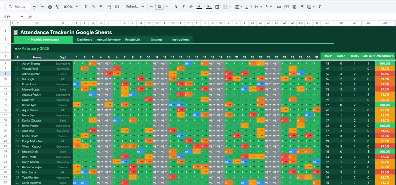
This is the daily register for the month chosen in Settings (February 2025 in the sample). Each row is a person with their department, and each column is a day of the month. You pick one code per day from a drop-down, and the cell colours itself automatically:
- P: Present (green)
- A: Absent (red)
- L: Late (yellow)
- H: Half Day (orange)
- WFH: Work From Home (blue)
- WE: weekend days, shown in grey
Summary columns on the right show Total P, Total A, Total L, Total WFH and Attendance % for each person, with the percentage colour-coded so low attendance stands out. In the sample, Aarav Sharma (Engineering) has 18 P, 0 A, 1 L and 1 WFH for 100.0%, while Aditya Kumar (Finance) has 16 P and 3 A for 87.5%.
2. Dashboard
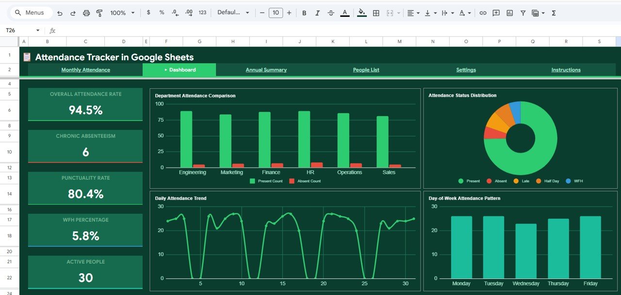
The Dashboard summarises the month in five KPI cards and four charts. The values in the table are from the sample data.
| KPI card | Sample value | What it tells you | Better when |
|---|---|---|---|
| Overall Attendance Rate | 94.5% | How much of the available working time people attended | Higher |
| Chronic Absenteeism | 6 | How many people are flagged for high absence, using the Acceptable Absence Threshold (%) in Settings | Lower |
| Punctuality Rate | 80.4% | How often people arrived on time rather than late | Higher |
| WFH Percentage | 5.8% | Share of attendance that was work from home | Depends on your policy |
| Active People | 30 | Headcount covered by the tracker | Context only |
The four charts are Department Attendance Comparison (Present Count and Absent Count for Engineering, Marketing, Finance, HR, Operations and Sales), Attendance Status Distribution (a donut of Present, Absent, Late, Half Day and WFH), Daily Attendance Trend (attendance for each day of the month, dropping to zero on weekends) and Day-of-Week Attendance Pattern (Monday to Friday). The day-of-week chart is especially useful: in the sample, Wednesday is the weakest day, which is the kind of pattern you can plan meetings and shifts around.
3. Annual Summary
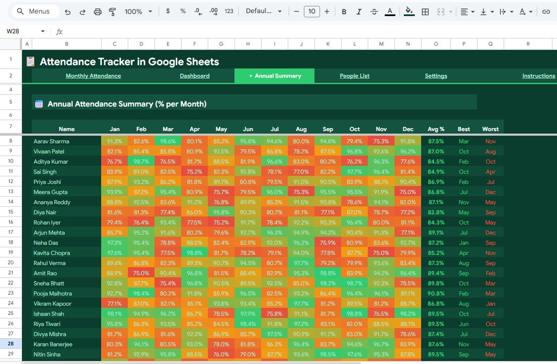
The Annual Attendance Summary (% per Month) shows each person’s attendance percentage for every month from Jan to Dec. Cells are shaded like a heatmap from red to green, so high and low months stand out immediately. Three columns at the end show each person’s Avg %, Best month and Worst month (for example, Aarav Sharma averages 87.5%, best in Mar, worst in Nov). That is helpful for appraisals, term reports and spotting long-running issues.
4. People List
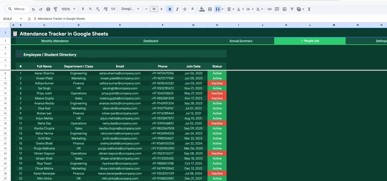
The Employee / Student Directory holds #, Full Name, Department / Class, Email, Phone, Join Date and Status, where Status is Active (green) or Inactive (red). Keeping it current means your register reflects who is actually on the team or in the class.
5. Settings
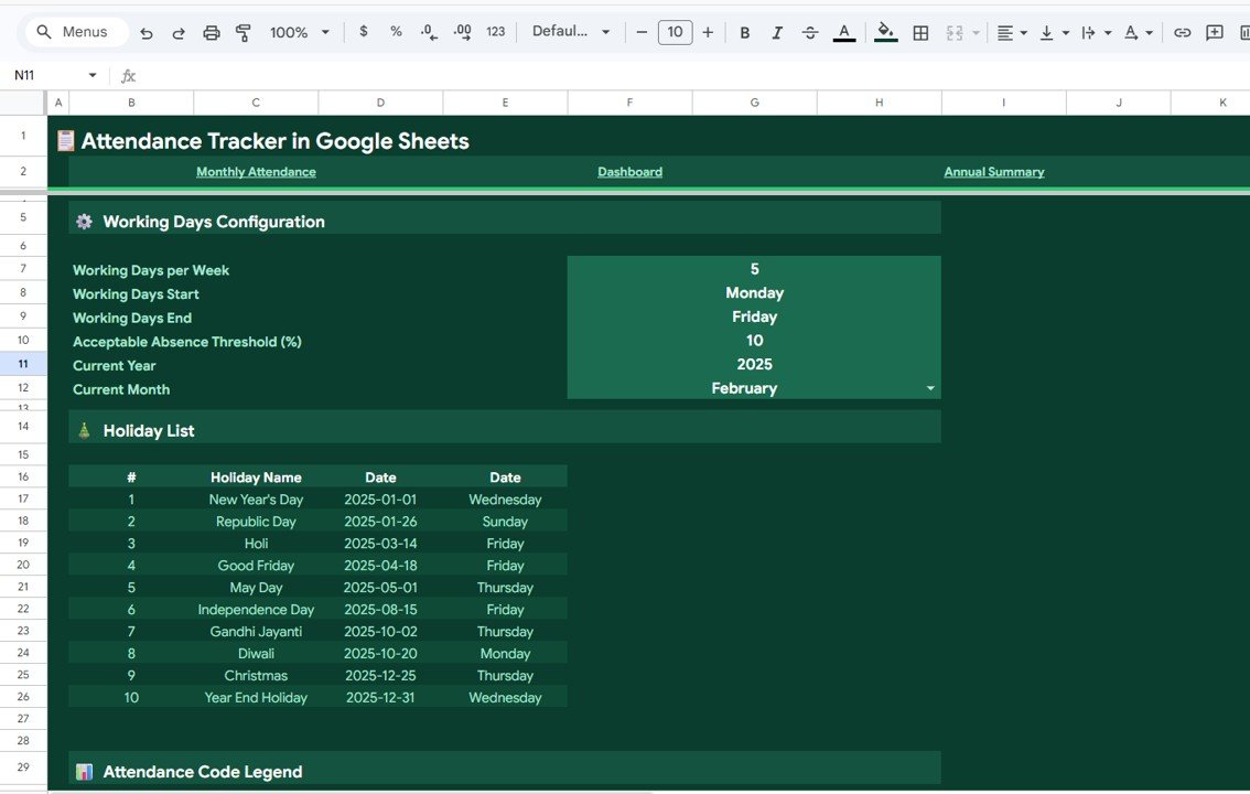
Settings controls how the whole tracker behaves:
- Working Days Configuration: Working Days per Week (5), Working Days Start (Monday) and Working Days End (Friday)
- Acceptable Absence Threshold (%): 10 in the sample; used for the Chronic Absenteeism card
- Current Year and Current Month: 2025 and February in the sample, which drive the Monthly Attendance view
- Holiday List: #, Holiday Name, Date and day of the week; the sample lists 10 holidays from New Year’s Day to Year End Holiday
- Attendance Code Legend: the codes and their colours
How Attendance Codes Are Counted (Example)
The template does the counting for you, but if you want to understand the logic, or build a quick check of your own, these are the standard Google Sheets formulas for counting codes in one person’s row (here, row 7 from column E to AI, the days 1–31):
Present days:  =COUNTIF(E7:AI7,"P")
Absent days:   =COUNTIF(E7:AI7,"A")
Late days:     =COUNTIF(E7:AI7,"L")
Half days:     =COUNTIF(E7:AI7,"H")
WFH days:      =COUNTIF(E7:AI7,"WFH")
A simple do-it-yourself example for one employee in a month with 20 working days (this is an illustration, not the template’s exact Attendance % formula):
| Code | Days |
|---|---|
| Present (P) | 15 |
| Late (L) | 2 |
| Work From Home (WFH) | 1 |
| Half Day (H) | 1 |
| Absent (A) | 1 |
If you count a half day as half, this person attended 18.5 of 20 days, about 92.5%. Absence is 1.5 days, or 7.5%, which is under a 10% threshold. Your organisation may treat half days or late arrivals differently, so agree the rule before you compare people.
How to Set Up the Tracker
- Open the PDF guide that comes with your purchase, click the Google Sheets copy link and save an editable copy to your Google Drive.
- Go to Settings first. Set working days, the absence threshold, the current year and month, and replace the sample holidays with your own.
- Replace the sample names in the People List with your employees or students, including department or class and status.
- Each day, open Monthly Attendance and choose one code per person from the drop-down.
- At the end of the week or month, review the Dashboard cards and charts.
- Use the Annual Summary for quarterly reviews, term reports or appraisals.
- Share the file with department heads through Share > Editor so each can mark their own team.
Real-World Use Cases
- Small office or agency: track hybrid work with the WFH code and check the WFH Percentage card against your policy.
- School or coaching centre: enter classes in the Department / Class field, mark students daily and use the Annual Summary for parent meetings and term reports.
- Retail or warehouse team: use the Day-of-Week Attendance Pattern and Punctuality Rate to plan shift cover on the weakest days.
Best Practices
- Configure Settings and holidays before entering any attendance.
- Mark attendance daily; filling in a week later leads to mistakes.
- Agree how late arrivals and half days are treated, and keep it consistent.
- Mark leavers as Inactive instead of deleting them, so past months stay correct.
- Discuss the dashboard in team meetings to address absenteeism early and fairly.
- Keep one file per year and archive the previous year’s copy.
Limitations: When to Choose Something Else
This is a manual register, so attendance is entered by a person rather than captured by a biometric device or app. It does not calculate payroll, overtime or leave balances, and it does not send automatic email alerts. Google Sheets handles hundreds of people well, but very large organisations may prefer separate files per department or a dedicated HR system. If you need payroll linked to attendance, look at a payroll-specific solution.
Related Attendance and HR Guides
For an analysis-focused view, see the Employee Attendance Dashboard in Google Sheets. Smaller teams may prefer the simpler Weekly Attendance Sheet in Google Sheets, and schools can look at the Student Attendance Calendar in Google Sheets. To plan who works when, read about the Employee Shift Schedule in Google Sheets, and for leave, our guide to tracking employee leave days in Google Sheets.
Prefer Excel? The Attendance Tracker in Excel offers the same approach for desktop users.
If you want to master the counting and lookup formulas behind trackers like this, the Excel AI Mastery: 100 Formulas course on NextGenTemplates Academy covers COUNTIF, lookups and conditional logic with practical exercises.
Frequently Asked Questions
How do I track employee attendance in Google Sheets?
List your people in rows and days in columns, enter one attendance code per day, and count each code with COUNTIF. This template does all of that for you and adds a dashboard and annual summary.
Can I use this tracker for students?
Yes. The People List is an Employee / Student Directory, and the Department / Class field takes class names. The dashboard and Annual Summary work the same way for students as for employees.
Does it support Work From Home and Half Day?
Yes. The register uses P (Present), A (Absent), L (Late), H (Half Day) and WFH (Work From Home), with WE marking weekends. The codes and colours are listed in the Attendance Code Legend in Settings.
How are holidays handled?
Add each holiday with its name, date and day in the Holiday List on the Settings tab. The sample includes 10 holidays for 2025, which you can replace with your own calendar.
How many people can the tracker handle?
Google Sheets comfortably handles hundreds of rows. For very large organisations, a separate copy per department keeps the file fast and easy to manage.
Can several managers update it at the same time?
Yes. Share the file with editors in Google Sheets and each manager can mark attendance for their own team while everyone sees the same dashboard.
Wrapping Up
Good attendance tracking is less about catching people out and more about spotting patterns early. The Attendance Tracker in Google Sheets gives you a colour-coded daily register, a dashboard with attendance rate, chronic absenteeism, punctuality and WFH KPIs, and an annual heatmap for reviews. Configure the Settings tab, load your people list and start marking attendance tomorrow morning.
Get the Attendance Tracker in Google Sheets
📅 Last updated: October 2026