Google Sheets offers a wide range of features to help you visualize and analyze data efficiently. One of the most powerful and visually appealing options is Conditional Formatting in Google Sheets Charts. By using conditional formatting, you can instantly highlight key data points, making it easier to interpret your data.
In this article, we will explain how to apply conditional formatting to Google Sheets charts, using a sales data example. We’ll guide you through each step and offer tips for customizing your charts based on your preferences.
What is Conditional Formatting in Google Sheets Charts?
Conditional formatting in Google Sheets allows you to automatically change the style of a chart or cell based on certain conditions or criteria. In the case of charts, conditional formatting enhances the visual appeal by color-coding elements like bars, lines, or pie segments to make trends and patterns clearer.
You can use conditional formatting to:
- Change chart colors depending on data values.
- Highlight specific data points, such as sales above or below a target.
- Visualize the performance against a benchmark, like a target sales value.
By using this technique, you can make your data more understandable at a glance and even motivate team members by visually showcasing performance.
Step-by-Step Guide to Apply Conditional Formatting in Google Sheets Chart
Let’s walk through the process of adding conditional formatting to a sales data chart in Google Sheets.
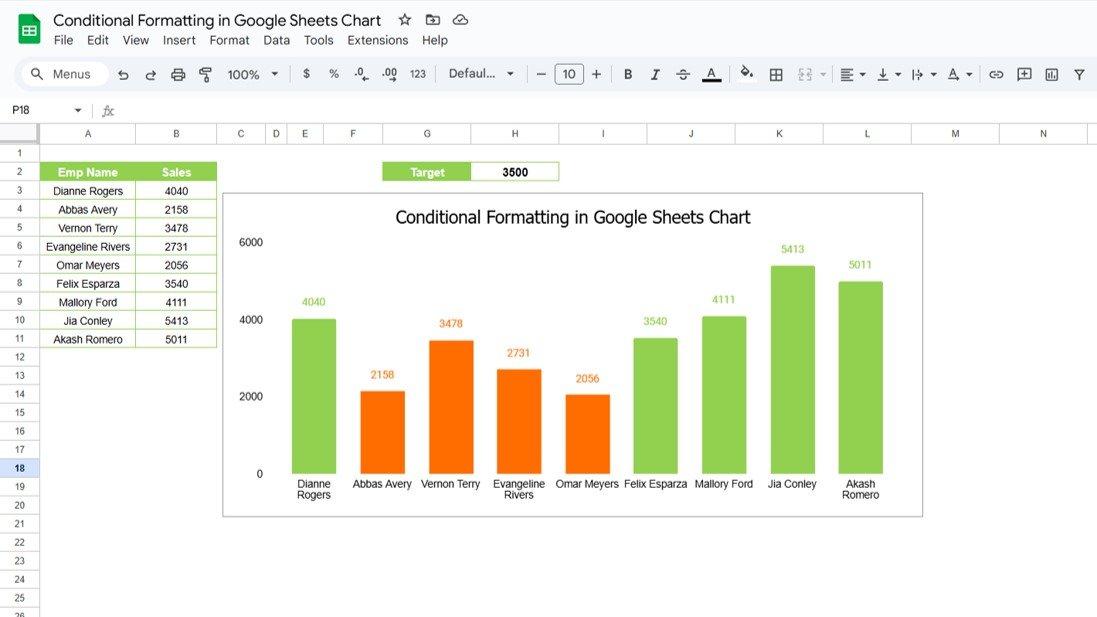
Step 1: Prepare Your Data

Additionally, here is the target sales value for comparison:
Step 2: Insert a Chart
- Select the data range.
- Go to Insert > Chart.
- Google Sheets will automatically generate a default chart, typically a bar or column chart.
Now, you have a basic chart that represents the sales data of different employees. The next step is where the magic happens: applying conditional formatting.
Step 3: Apply Conditional Formatting to Your Chart
Now let’s enhance the chart by using conditional formatting. The goal is to apply the following rules:
- If the sales value exceeds the target (3500), the bar should turn green.
- If the sales value is below the target, the bar should turn red.
Here’s how you can apply these rules:
- Click on the chart to select it.
- In the chart editor, go to the Customize tab.
- Under Series, look for Conditional formatting (if available, depending on your chart type).
- Set the rule to check if the sales value is greater than the target (3500) for the green color.
- Rule 1: If value > 3500 → Green
- Add another rule to highlight sales below the target.
- Rule 2: If value < 3500 → Red

Now your chart will dynamically change colors based on the sales performance of each employee.
Why Use Conditional Formatting in Google Sheets Charts?
Applying conditional formatting to your charts can make your data clearer and more impactful. Here’s why it’s essential:
Advantages of Conditional Formatting in Google Sheets Charts
- Quick Visual Insights: Conditional formatting gives you an instant visual representation of how the data compares to the target, making it easy to spot trends and outliers.
- Enhanced Decision-Making: By visually distinguishing high and low performers, it helps managers and team leaders make better, quicker decisions without having to dig deep into numbers.
- Increased Data Engagement: Color-coded charts naturally attract attention, which can help ensure that important metrics don’t go unnoticed.
- Improved Communication: When presenting your data, conditional formatting helps convey the message faster, especially in team meetings or reports.
Opportunities to Improve Conditional Formatting in Google Sheets Charts
While conditional formatting can vastly improve your charts, there are always opportunities to enhance them further. Here are some ideas:
- Multiple Data Points: Instead of just one target, you could compare multiple targets or benchmarks. For example, you could set a rule for sales over 5000 to be green, between 3500 and 5000 to be yellow, and under 3500 to be red.
- Dynamic Conditional Formatting: Use formulas and Google Sheets functions like
IFto automatically adjust the formatting based on dynamic conditions (e.g., a target value that changes over time). - Advanced Color Schemes: Experiment with different colors or even gradient fills to represent performance more subtly.
- Use Icons or Data Bars: If your chart type allows it, you could also use conditional formatting with icons or data bars to make the differences even more visible.
Best Practices for Conditional Formatting in Google Sheets Charts
To get the most out of conditional formatting, here are some best practices to follow:
- Keep It Simple: Use conditional formatting sparingly. Too many colors or rules can make your chart look cluttered and hard to interpret.
- Be Consistent: Ensure consistency across different charts and dashboards. Use the same colors and rules for similar data points, so your audience can easily understand what each color represents.
- Use Clear, Contrasting Colors: Choose colors that clearly distinguish between different data points (e.g., green for good, red for bad). Avoid using too similar shades as they may confuse viewers.
- Test with Real Data: Always test your chart with actual data to see if the conditional formatting helps highlight the key information effectively. Adjust the rules accordingly based on the results.
- Combine with Other Visual Elements: Don’t rely on conditional formatting alone. Combine it with other elements like labels, titles, and legends to provide a comprehensive understanding of the data.
Conclusion
Conditional formatting in Google Sheets charts can significantly enhance your data visualization. By following the steps outlined above, you can easily add visual cues that help your team understand the performance metrics at a glance. Whether you are tracking sales, performance, or any other key metric, conditional formatting helps you present data more effectively and make informed decisions faster.
Frequently Asked Questions (FAQs)
1. How do I apply conditional formatting in Google Sheets charts?
To apply conditional formatting in Google Sheets charts, select your chart, go to the Customize tab in the chart editor, and apply the desired color rules under Series. You can set rules to change the color of the chart elements based on specific conditions.
2. Can I use multiple conditions in conditional formatting for charts?
Yes! You can set multiple rules in Google Sheets. For example, you could set one color for values above a certain target and a different color for values below that target. This helps differentiate performance levels clearly.
3. How can I improve the visual appeal of my charts with conditional formatting?
To enhance the visual appeal, use contrasting colors, keep the formatting simple, and make sure the chart is easy to read. Avoid using too many rules or colors that can make the chart look cluttered.
4. Is conditional formatting in charts available for all chart types in Google Sheets?
Conditional formatting is available for most chart types, but some charts may not support advanced features like coloring individual data points. You may need to experiment with different chart types to achieve the desired effect.
5. Can I use formulas in conditional formatting for Google Sheets charts?
Yes! You can use formulas like in conditional formatting rules to dynamically apply formatting based on specific conditions, such as sales figures or performance against a target.
Visit our YouTube channel to learn step-by-step video tutorials
Youtube.com/@NeotechNavigators
