The Cybersecurity Dashboard in Google Sheets is a practical reporting template for IT, cybersecurity, GRC and operations teams that need a simple way to monitor security events, critical alerts, response time, vulnerabilities, compliance training, assets, endpoints and Event ID details. Instead of building a dashboard from scratch, you copy the template into Google Drive, add data in the provided format, and use 20 built-in charts and slicers to review security performance.
A spreadsheet dashboard will not replace SIEM, SOAR, endpoint detection or vulnerability scanning tools. What it does well is help leadership and security teams see the story behind the data: whether critical events are rising, how fast incidents are closed, where vulnerabilities cluster and which departments are behind on training.
🎥 Watch the Video Tutorial
Get the Cybersecurity Dashboard in Google Sheets
Key Features of the Cybersecurity Dashboard in Google Sheets
- Seven working tabs: Overview, Threats & Incidents, Vulnerabilities, Compliance & Training, Assets & Endpoints, Search and the Data Sheet, with an Instructions page in the side navigation.
- Headline KPI cards for Total Security Events, Critical Alerts, Avg Response (Hrs) and Risk Mitigated, plus four cards on each analysis page.
- 20 charts (four per dashboard page) covering severity trends, event types, detection sources, attack vectors, patch velocity, training status, policy violations and endpoint risk.
- Four slicers on every dashboard page. Google explains how slicers filter charts and tables in Google Sheets.
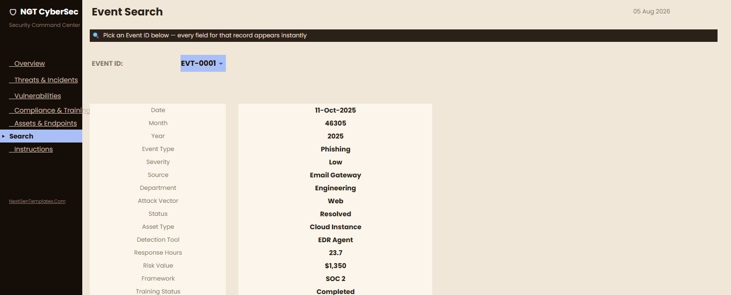
- A Search page for selecting an Event ID and seeing the full event record.
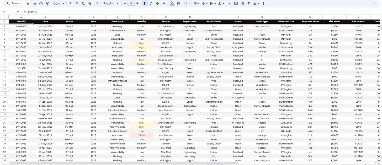
- An editable Data Sheet so teams can add their own security records in the same format.
KPI Cards and Slicers by Page
| Page | KPI cards | Slicers |
|---|---|---|
| Overview | Total Security Events, Critical Alerts, Avg Response (Hrs), Risk Mitigated | Year, Severity, Department, Month |
| Threats & Incidents | Open Incidents, Resolved, Avg Resolution Hrs, Escalated | Severity, Status, Attack Vector, Month |
| Vulnerabilities | Open Vulns, Critical Vulns, Patched, Avg Patch Hrs | Severity, Asset Type, Status, Month |
| Compliance & Training | Training Completed, Training Overdue, Completion Rate, Policy Violations | Framework, Department, Training Status, Month |
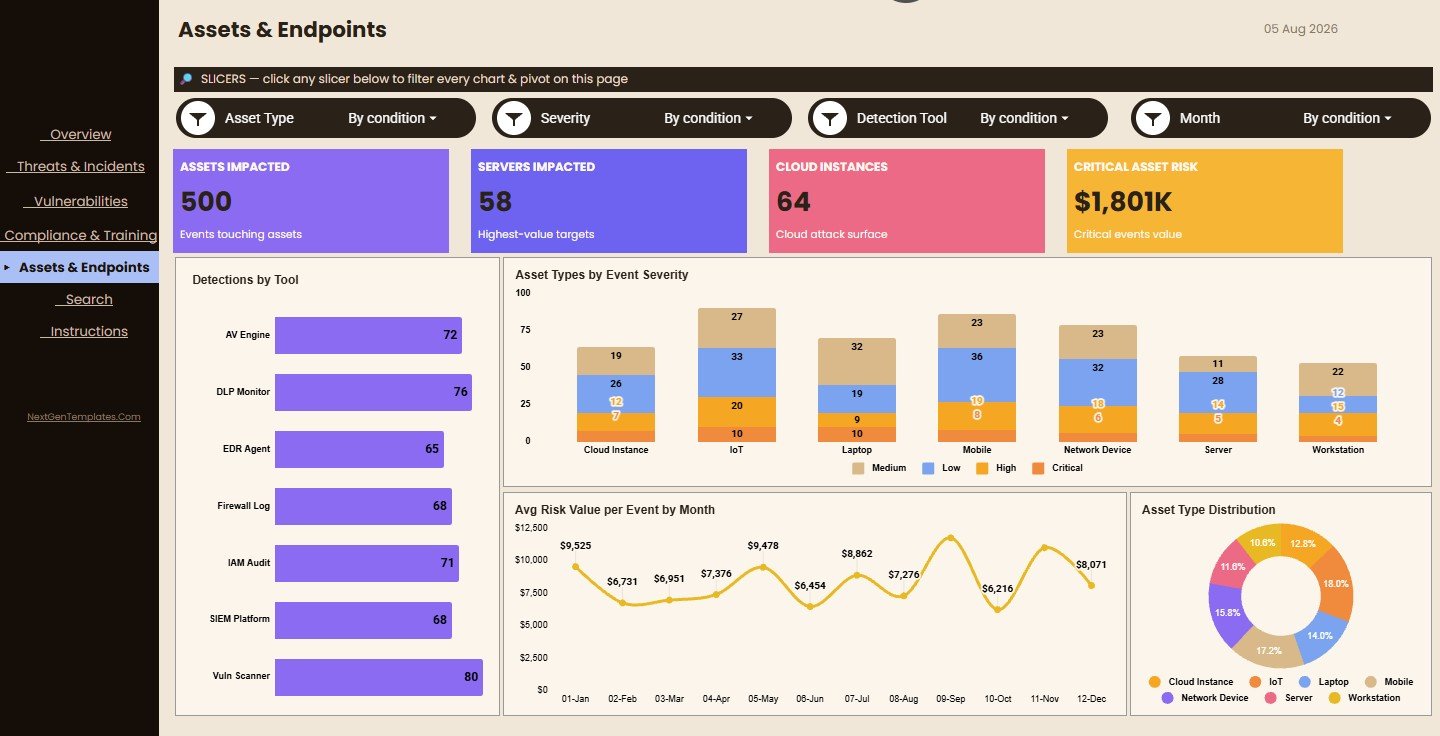
| Assets & Endpoints | Assets Impacted, Servers Impacted, Cloud Instances, Critical Asset Risk | Asset Type, Severity, Detection Tool, Month |
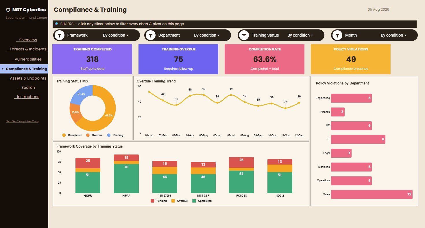
Completion Rate is Training Completed divided by total records. In the sample data, 318 ÷ 500 = 63.6%, which matches the card.
Overview Page
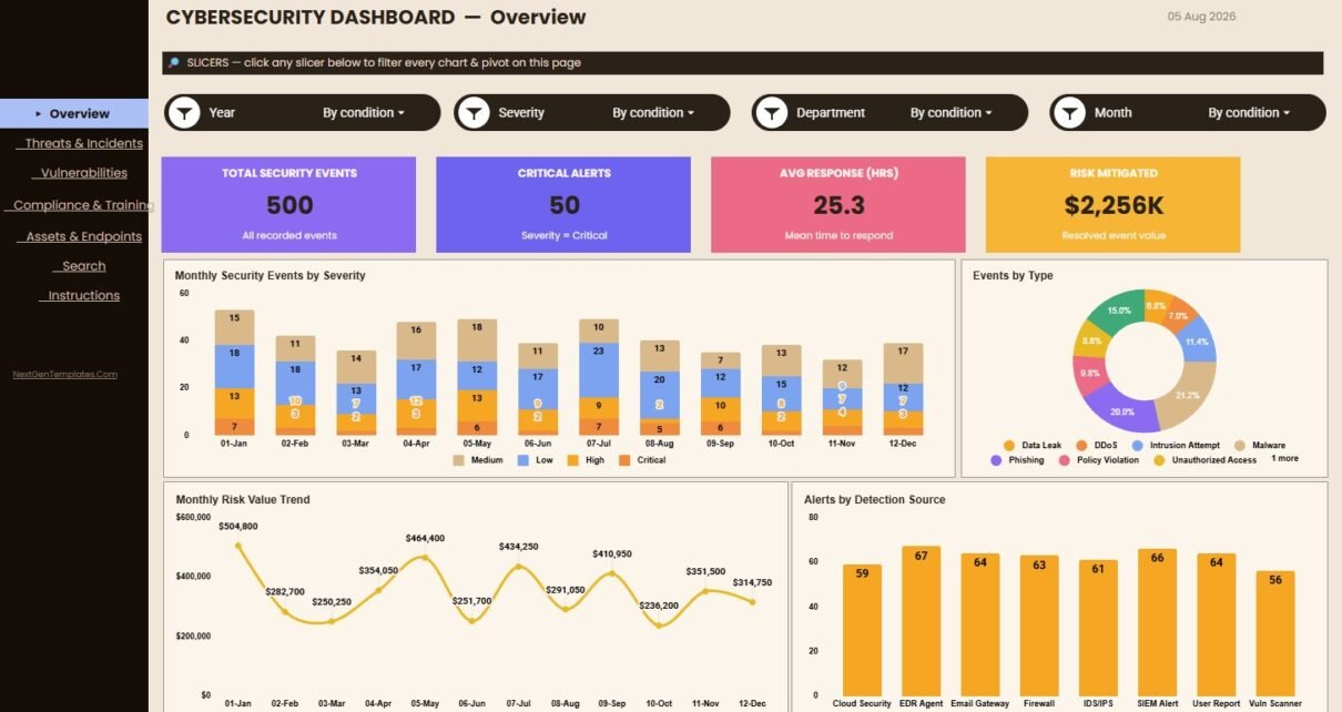
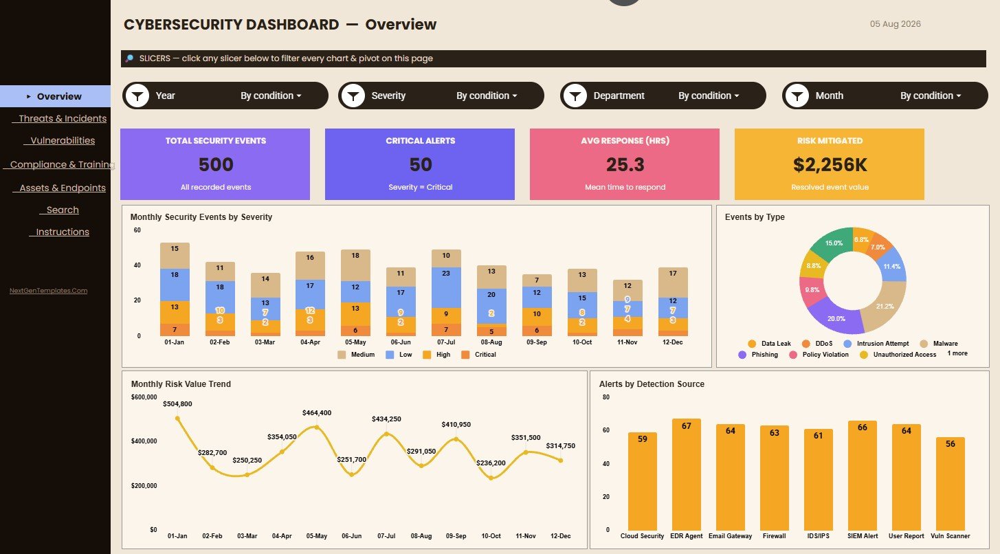
The Overview page gives decision makers a high-level snapshot of security activity. The cards show Total Security Events, Critical Alerts, Avg Response (Hrs) and Risk Mitigated, so a manager can read volume, urgency, response speed and risk reduction at a glance.
Monthly Security Events by Severity: event volume by month, stacked by Critical, High, Medium and Low. Use it to see whether critical and high events are rising or being hidden by lower-severity noise.
Events by Type: the share of Data Leak, DDoS, Intrusion Attempt, Malware, Phishing, Policy Violation, Unauthorized Access and other event types.
Monthly Risk Value Trend: turns event records into a month-by-month risk trend, which shows whether exposure is rising even when event counts look stable.
Alerts by Detection Source: compares alert volume from Cloud Security, EDR Agent, Email Gateway, Firewall, IDS/IPS, SIEM Alert, User Report and Vuln Scanner. It shows whether detection relies too heavily on one tool.
Threats & Incidents
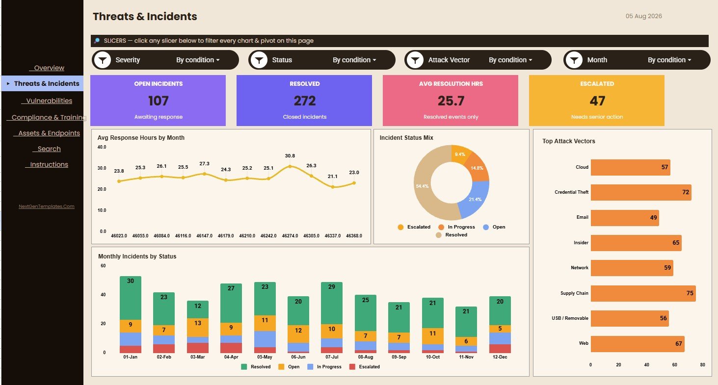
The Threats & Incidents page focuses on incident response workload, attack patterns and status. It suits weekly security reviews, incident retrospectives and operational planning.
Avg Response Hours by Month: how quickly the team responds each month. A rising trend may point to process delays, staffing limits or more complex investigations.
Incident Status Mix: the share of Open, In Progress, Escalated and Resolved incidents, which shows backlog pressure.
Top Attack Vectors: incidents by entry route, such as Cloud, Credential Theft, Email, Insider, Network, Supply Chain, USB / Removable and Web.
Monthly Incidents by Status: combines time and status, so you can tell a temporary spike from a persistent problem.
Vulnerabilities
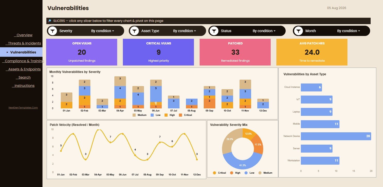
The Vulnerabilities page helps teams review exposure, patching and priorities. It is useful when scan results, remediation trackers or ticket exports need to become a readable summary.
Monthly Vulnerabilities by Severity: vulnerability counts over time by severity, showing whether critical and high findings shrink after remediation.
Patch Velocity (Resolved / Month): how many findings are resolved each month, so leaders can see whether patching is speeding up or slowing down.
Vulnerability Severity Mix: the split of Critical, High, Medium and Low findings, a starting point for deciding where to focus.
Vulnerabilities by Asset Type: where findings concentrate across Cloud Instance, IoT, Laptop, Mobile, Network Device, Server and Workstation.
Compliance & Training
The Compliance & Training page connects security operations with staff readiness and policy control. GRC teams can review training completion, overdue training, policy violations and framework coverage.
Training Status Mix: the share of Completed, Overdue and Pending training.
Overdue Training Trend: overdue training by month, so compliance owners can see whether delays are improving.
Policy Violations by Department: where violations concentrate across departments such as Engineering, Finance, HR, IT, Legal, Marketing, Operations and Sales, which supports targeted coaching.
Framework Coverage by Training Status: training status for GDPR, HIPAA, ISO 27001, NIST CSF, PCI DSS and SOC 2.
Assets & Endpoints
The Assets & Endpoints page shows where detections and risks appear across the technology estate. It is useful for endpoint reviews, tool coverage discussions and asset risk summaries.
Detections by Tool: detection volume from AV Engine, DLP Monitor, EDR Agent, Firewall Log, IAM Audit, SIEM Platform and Vuln Scanner.
Asset Types by Event Severity: whether certain asset groups are tied to more critical or high-severity events.
Avg Risk Value per Event by Month: whether the average risk per event is changing, which matters when volume alone does not explain the workload.
Asset Type Distribution: the asset mix behind the data, which gives context for event counts.
Search Page
The Search page is built for quick event lookup. Pick an Event ID and it returns the date, month, year, event type, severity, source, department, attack vector, status, asset type, detection tool, response hours, risk value, framework and training status.
It is handy when someone asks “what happened with this event?” in a review meeting. Instead of scrolling raw rows, you get one readable record.
Data Sheet
The Data Sheet is the source table. Its columns are Event ID, Date, Month, Year, Event Type, Severity, Source, Department, Attack Vector, Status, Asset Type, Detection Tool, Response Hours, Risk Value, Framework and Training Status. Add data in the same format so the charts, cards, slicers and search keep working.
Dashboard quality depends on consistent fields. Keep severity names, status names, department labels, asset types and dates clean so the summaries stay correct.
Cybersecurity Dashboard in Google Sheets vs. Excel Dashboard vs. Security Platforms
| Option | Best for | Trade-off |
|---|---|---|
| Google Sheets dashboard | Collaborative reporting, easy sharing, cloud-based review | Manual entry or export/import workflow |
| Excel dashboard | Offline analysis, workbook control, local reporting | Sharing and collaboration are less fluid |
| Security platform (SIEM, SOAR) | Live monitoring, integrations, automated alerts | Higher cost and heavier setup |
The Cybersecurity Dashboard in Google Sheets sits in the middle: it is not a live security platform, but it gives teams a polished reporting layer they can adapt quickly.
Who Should Use This Cybersecurity Dashboard?
It suits CISOs, IT managers, security analysts, compliance teams, internal auditors, MSPs and consultants who need a consistent way to summarise security operations. It works well for monthly leadership reports, weekly security reviews, incident trend discussions, remediation updates and training check-ins.
It is not built for automated ingestion from security tools. Teams that need real-time alerting, endpoint containment, automated ticketing or forensic investigation should use dedicated platforms and treat this dashboard as a summary layer.
Real-World Use Cases
A CISO uses the Overview page to brief executives on security activity, critical alerts, response performance and mitigated risk. An IT manager uses the Threats & Incidents page to review backlog, closures and attack vectors. A GRC analyst uses the Compliance & Training page to chase overdue training and check framework coverage. An MSP duplicates the dashboard for each client to create a consistent reporting pack.
Limitations to Know
- No live connection to SIEM, EDR or scanners: data is entered or pasted in.
- Response and patch times are only as accurate as the timestamps you record.
- Very large event logs may be slow in Google Sheets. Summarise or archive older rows when needed.
Best Practices for Using the Template
- Keep one row per security event or incident.
- Use consistent severity names: Critical, High, Medium and Low.
- Keep Event IDs unique so the Search page works reliably.
- Check the month and year fields before each reporting cycle.
- Use slicers for leadership views instead of editing formulas during meetings.
- Archive each monthly version before major data changes.
Related Templates and Guides
For KPI-focused tracking, see the Cybersecurity Incident KPI Dashboard in Google Sheets and the Cybersecurity KPI Scorecard. Larger teams may prefer the Cybersecurity Operations Center Dashboard in Power BI or the IT Manager & CISO Toolkit.
On NeoTech Navigators, related guides include the Cybersecurity KPI Dashboard, the Cyber Incident Response KPI Dashboard, the Cybersecurity Awareness KPI Scorecard, the IT Security Incident Report Tracker and the Cybersecurity Checklist in Google Sheets.
If you want to build or customise dashboards like this, the Excel Pivot Tables and Dashboards course on NextGenTemplates Academy covers pivots, slicers and charts in structured lessons.
Frequently Asked Questions
What is the Cybersecurity Dashboard in Google Sheets?
A Google Sheets dashboard template for tracking security events, critical alerts, incident response, vulnerabilities, compliance training, assets, endpoints and Event ID details.
Does the dashboard connect automatically to security tools?
No. It is a manual reporting template. You add or paste your security data into the Data Sheet.
Which compliance frameworks does it cover?
The sample data and Framework Coverage chart include GDPR, HIPAA, ISO 27001, NIST CSF, PCI DSS and SOC 2. You can rename or add frameworks in your own data.
Can I customize the dashboard?
Yes. In your copy you can edit fields, labels, formulas, charts, slicers and layout.
What details does the Search page show?
Date, month, year, event type, severity, source, department, attack vector, status, asset type, detection tool, response hours, risk value, framework and training status for the selected Event ID.
Is this a replacement for a SIEM?
No. A SIEM handles live security monitoring and alerting. This dashboard is for reporting, review and management visibility.
About the Author
Built by PK, a Microsoft Certified Professional with 15+ years of Excel, Google Sheets and Power BI experience. He founded NextGenTemplates, and its YouTube channels reach 300K+ subscribers. Every template is built by hand and tested before release.
Wrapping Up
A strong security program needs more than alerts. It needs clear reporting that explains trends, response speed, risk, vulnerabilities, compliance readiness and workload. The Cybersecurity Dashboard in Google Sheets gives teams a structured, shareable way to review those signals without building a dashboard from scratch. Load last month’s events, filter by severity or department, and take the Overview page to your next security review.
Get the Cybersecurity Dashboard in Google Sheets
📅 Last updated: October 2026