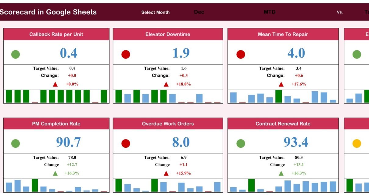
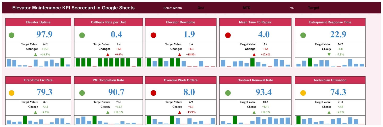
A lift that is out of service for a day is not a maintenance problem, it is a tenant-relations problem, and by the time anyone counts the callbacks the month is over. The Elevator Maintenance KPI Scorecard in Google Sheets exists to close that gap: ten monthly measures, one board, one dropdown. In the December sample that ships with the file, five of ten cards are green, two amber and three red – 97.9% uptime against an 84.2% target, but downtime at 1.9% against 1.6%, mean time to repair at 4.0 hours against 3.4, and 8.0% of work orders past due against a 6.9% target. That is a management conversation you can have in ninety seconds.
Get the Elevator Maintenance KPI Scorecard in Google Sheets
Key Features of the Elevator Maintenance KPI Scorecard in Google Sheets
The file is eight tabs of plain Google Sheets – no add-on, no script, no account to create.
- Ten KPIs in five groups. Reliability & Uptime holds three, Service Response three, Maintenance Compliance two, Commercial one and Workforce one.
- A month picker in the Scorecard header that drives all ten cards at once.
- An MTD / YTD basis selector, because a bad month inside a good year deserves a different reaction than a bad year.
- A Target / PY comparison selector, so the same board answers “did we hit plan?” and “are we better than last year?”.
- Per-KPI direction logic. Six measures are typed upper-the-better and four lower-the-better, so Elevator Downtime rising turns a card red while Elevator Uptime rising turns it green.
- A twelve-bar sparkline beneath every card.
- A KPI Trend page that isolates one KPI at a time.
- 120 rows of sample data – ten KPI blocks of twelve months – that you overwrite with your own numbers.
Scorecard Pages Explanation
Scorecard
Two rows of five cards. Each card shows the KPI name, the value for the month you picked, the target, the absolute change, the percentage change, an up or down arrow, a red/amber/green dot and a twelve-month bar strip. The header carries the three dropdowns: month, MTD or YTD, Target or PY.
KPI Trend
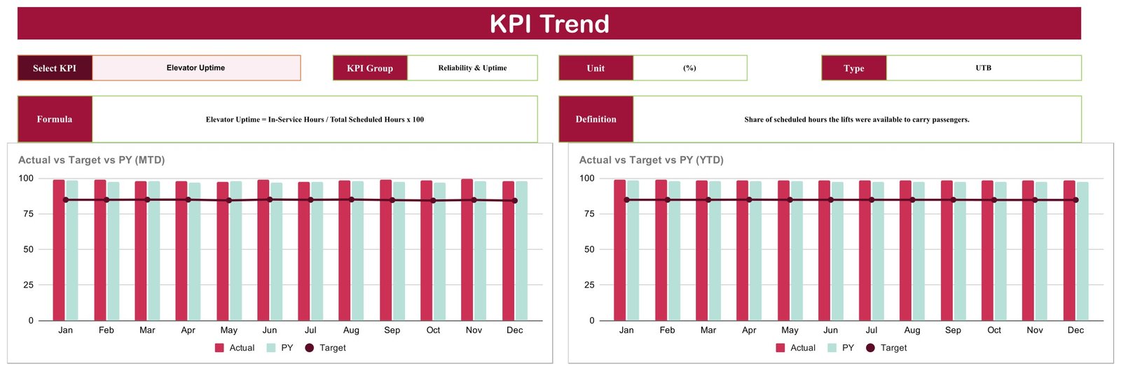
Choose any one of the ten KPIs from a dropdown and the page fills in its group, unit, type (UTB or LTB), formula and one-line definition, then draws two column charts – Actual vs Target vs PY across twelve months on an MTD basis, and the same on a YTD basis. Selecting Elevator Uptime, for example, returns “Reliability & Uptime”, “(%)”, “UTB”, “In-Service Hours / Total Scheduled Hours x 100” and “Share of scheduled hours the lifts were available to carry passengers.”
KPI Definition
The reference tab, and the one that makes the file survive a handover. Ten numbered rows, each with group, KPI name, unit, formula, definition and type:
- Elevator Uptime (%) – In-Service Hours / Total Scheduled Hours x 100 – UTB
- Callback Rate per Unit (calls/unit/mo) – Unplanned Service Calls / Units Under Contract – LTB
- Elevator Downtime (%) – Out-of-Service Hours / Total Scheduled Hours x 100 – LTB
- Mean Time To Repair (hours) – Total Repair Hours / Number of Repairs – LTB
- Entrapment Response Time (minutes) – Total Response Minutes / Entrapment Calls – LTB
- First-Time Fix Rate (%) – Faults Fixed on First Visit / Total Faults x 100 – UTB
- PM Completion Rate (%) – Preventive Visits Completed / Visits Scheduled x 100 – UTB
- Overdue Work Orders (%) – Work Orders Past Due / Total Open Work Orders x 100 – LTB
- Contract Renewal Rate (%) – Contracts Renewed / Contracts Up for Renewal x 100 – UTB
- Technician Utilisation (%) – Billable Field Hours / Total Paid Hours x 100 – UTB
Input Data
Ten labelled blocks, twelve month rows each, six numeric columns per row: MTD Actual, MTD Target, MTD PY, then YTD Actual, YTD Target, YTD PY. This is the only tab most owners ever touch.
Read Me, Color Settings, Support and Trend_Support
Color Settings documents the red/amber/green bands. Support and Trend_Support hold the lookup and calculation engine behind the cards and charts. Read Me is meant to be the orientation page.
Elevator Maintenance KPI Scorecard in Google Sheets vs. Excel vs. Paid Field-Service SaaS – Feature Comparison
| This scorecard (Google Sheets) | An Excel KPI workbook | Paid field-service SaaS | |
|---|---|---|---|
| Cost | 8.99 one-off | Usually 10-20 one-off | 30-90 per user per month |
| Platform | Any browser | Desktop Excel | Vendor web app |
| Setup time | Under 2 minutes to copy | Download and open | Days of onboarding |
| Real-time collaboration | Yes, native Sheets sharing | Only via OneDrive co-authoring | Yes |
| Mobile access | Yes | Limited | Yes |
| Customizable KPIs | Yes – rename, re-unit, re-type | Yes | Rarely without a paid tier |
| Share with link | Yes | No | Seat-based |
| Year-1 cost at 5 users | 8.99 | Around 15 | 1,800-5,400 |
| Direction-aware RAG lights | Yes (6 UTB / 4 LTB) | Depends on the workbook | Yes |
| Pulls from your service software | No – typed monthly | No | Yes |
Who Should Use This Template
Lift service contractors with a monthly management review. Portfolio and facilities managers who buy elevator service rather than provide it and want one page for the contract review. Operations leads who already extract these numbers from a CMMS but have nowhere consistent to present them.
It is not for anyone who wants a live feed – there is no import, API, scheduled refresh, alert or reminder. And it is not an inspection, certification or safety record. The group named Maintenance Compliance measures whether planned visits happened and whether work orders are past due; nothing in the file evidences statutory inspection, engineer certification or code conformance, and those records must stay in whatever system your jurisdiction requires.
Real-World Use Cases
A 600-unit maintenance portfolio. The service manager types last month’s figures into Input Data on the first Tuesday, sets the month, and puts the Scorecard on screen. The red cards write the agenda. Because every formula sits on KPI Definition, the meeting argues about causes rather than about arithmetic.
A five-technician independent. The owner tracks two numbers before renewing contracts: Callback Rate per Unit, because it is what customers actually feel, and Technician Utilisation, because it is what pays for the van. KPI Trend shows both across twelve months against prior year.
A hospital group’s facilities lead. He does not employ the engineers. He keeps his own copy, types in what the contractor reports each month, and brings the twelve-month uptime chart to the contract review instead of a folder of job sheets.
Advantages of the Elevator Maintenance KPI Scorecard in Google Sheets
The direction logic is the part that earns its keep. On most homemade KPI sheets every metric is treated as “bigger is better”, which quietly mislabels downtime, callbacks, mean time to repair and overdue work orders – four of the ten measures here. This file types each KPI as UTB or LTB and mirrors the traffic-light bands accordingly, so a lower Entrapment Response Time reads green rather than red.
The second advantage is that the definitions travel with the file. A scorecard that outlives the person who built it needs its formulas written down, and this one keeps them on their own tab rather than in someone’s head.
Opportunities for Improvement
Two faults ship with the current build, and both are worth knowing before you rely on the file.
The month dropdown does not match the data. The Scorecard’s month list offers June and July written out in full, while the Input Data table stores Jun and Jul. The lookup behind the cards is an exact-text match, so choosing either of those two months blanks all ten cards. The fix takes one edit: open the cell’s data validation list and shorten those two entries to Jun and Jul. Google’s own data validation documentation covers the two clicks involved. The other ten months are unaffected.
The Read Me tab is empty. Not sparse – zero cells. Write your own orientation note there, or delete the tab.Elevator Maintenance KPI Scorecard in Google Sheets
One smaller thing: the Color Settings tab documents the red/amber/green bands but no formula reads it. The thresholds that actually run are inside the Support tab’s calculation block, so change them there and treat Color Settings as a note to the reader.Elevator Maintenance KPI Scorecard in Google Sheets
Best Practices
- Set targets before the month starts, not after you see the actuals.
- Fix the direction flags first. If you rename a KPI, check its UTB/LTB type on KPI Definition before you trust its light.
- Keep the month labels short – Jan, Feb, Mar and so on – across Input Data, the dropdown and the Support header. Every blank-card report on scorecards like this one traces back to a month spelled two ways.
- Fill both MTD and YTD columns. The basis selector is useless if only one side has numbers.
- Share read-only with meeting attendees and keep edit rights with one owner.
- Review the amber cards, not just the red ones. With bands set at 10%, an amber card is a KPI that beat target but only just.Elevator Maintenance KPI Scorecard in Google Sheets
Explore Relevant Templates
If you want the job-level record rather than the monthly summary, the Elevator Maintenance Checklist in Google Sheets covers the visit itself, and the Equipment Maintenance Management System Web App is the step up when a spreadsheet stops scaling. Same-line neighbours worth comparing are the Locksmith Business KPI Scorecard, the Glass Installation KPI Scorecard and the Septic Tank Service KPI Scorecard. Note that the KPI dashboard line, such as the Septic Tank Service KPI Dashboard, is a different product with a different layout – worth a look, but not a substitute.
If you want to build reporting views like this yourself, the Excel Pivot Tables & Dashboards course on NextGenTemplates Academy teaches the method with practice files.
Get the Elevator Maintenance KPI Scorecard in Google Sheets
Frequently Asked Questions
How many KPIs are included?
Ten, across reliability and uptime, service response, maintenance compliance, commercial and workforce.
Can I switch between MTD and YTD?
Yes. A basis dropdown sits in the header and every input row carries both.
Can I compare against prior year?
Yes. Switch the comparison dropdown from Target to PY.
Can I rename a KPI?
Yes. Edit its row on KPI Definition and the matching label in Input Data, keeping the block structure intact.
Why do all my cards go blank when I pick June?
Because the dropdown says “June” and the data says “Jun”. Shorten the two long entries in the month validation list and the cards return.Elevator Maintenance KPI Scorecard in Google Sheets
Does it connect to job or CMMS software?
No. You enter summarised monthly figures by hand.Elevator Maintenance KPI Scorecard in Google Sheets
Is this an inspection or safety compliance record?
No. It is a management scorecard and measures service performance only. Keep inspection, certification and incident records separately.Elevator Maintenance KPI Scorecard in Google Sheets
What is delivered?
A PDF carrying the link that creates your own editable Google Sheets copy.Elevator Maintenance KPI Scorecard in Google Sheets
About the Author
Built by PK – Microsoft Certified Professional with 15+ years of Excel, Google Sheets, and Power BI experience. Founder of NextGenTemplates, reaching 300K+ subscribers across YouTube channels. Every template is hand-built and tested before release.Elevator Maintenance KPI Scorecard in Google Sheets
Conclusion
The Elevator Maintenance KPI Scorecard in Google Sheets turns a month of service activity into ten honest numbers with the right arrow beside each one. It will not inspect a lift, file a certificate or page an engineer – it will tell you, on one page, whether uptime is holding, whether callbacks are drifting, and whether your technicians are billing. Fix the two June/July dropdown entries, write yourself a Read Me, then run your next monthly review off it. Get the Elevator Maintenance KPI Scorecard in Google Sheets and make your private copy. For more Google Sheets walkthroughs, visit NeoTechNavigators on YouTube.Elevator Maintenance KPI Scorecard in Google Sheets