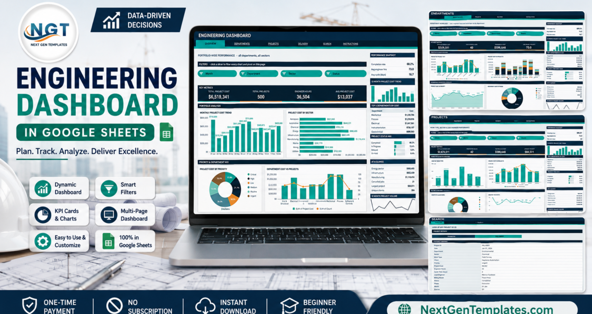
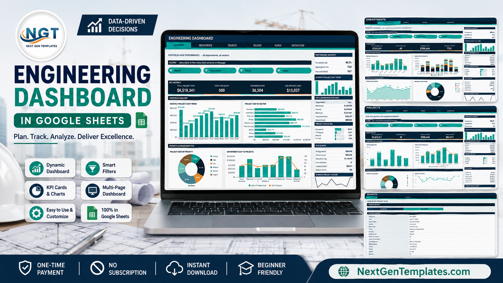
Most engineering teams already keep a project log in a spreadsheet. What they usually do not have is a way to read it. The Engineering Dashboard in Google Sheets closes that gap: it takes a flat log of projects and turns it into six linked reporting pages driven by native pivot tables and slicers.Engineering Dashboard in Google Sheets
The build ships with a 500-row sample dataset carrying $6,518,341 of project cost, 36,504 engineer hours and 304 unique clients across 8 engineering departments, 9 industry sectors, 8 work types and 10 lead engineers. Average project cost lands at $13,037, average cycle time at 16.7 days, and the completion rate at 68.2%. Replace those rows with your own and every figure on all six pages recalculates.
Get the Engineering Dashboard in Google Sheets
Key Features of the Engineering Dashboard in Google Sheets
- Pivot-and-slicer architecture. Every chart reads a pivot table parked to the right of its page rather than a block of helper formulas. That is the reason the file stays responsive as the project log grows.
- Four slicers on each of the four analysis pages. One click filters every chart, pivot and Top 5 panel on that page, and slicers are scoped per page so each view keeps its own filter state.
- 16 KPI cards. Total Project Cost, Total Projects, Engineer Hours, Avg Project Cost, Completed Projects, Mechanical Cost, Avg Hours per Project, Detailed Design Cost, Prototype Builds, Testing & QA Cost, Largest Project, Critical Priority Cost, High Priority Jobs, Unique Clients, On-Hold Rate and Total Engineer Hrs.
- 16 charts spanning column, bar, stacked column, area, line, donut and dual-axis combination types.
- A consistent right-hand sidebar on every analysis page: a three-row snapshot, a 12-month project cost sparkline, a Top 5 ranking table, a share-of-cost bar list, an At a Glance summary and a 12-month project volume sparkline.
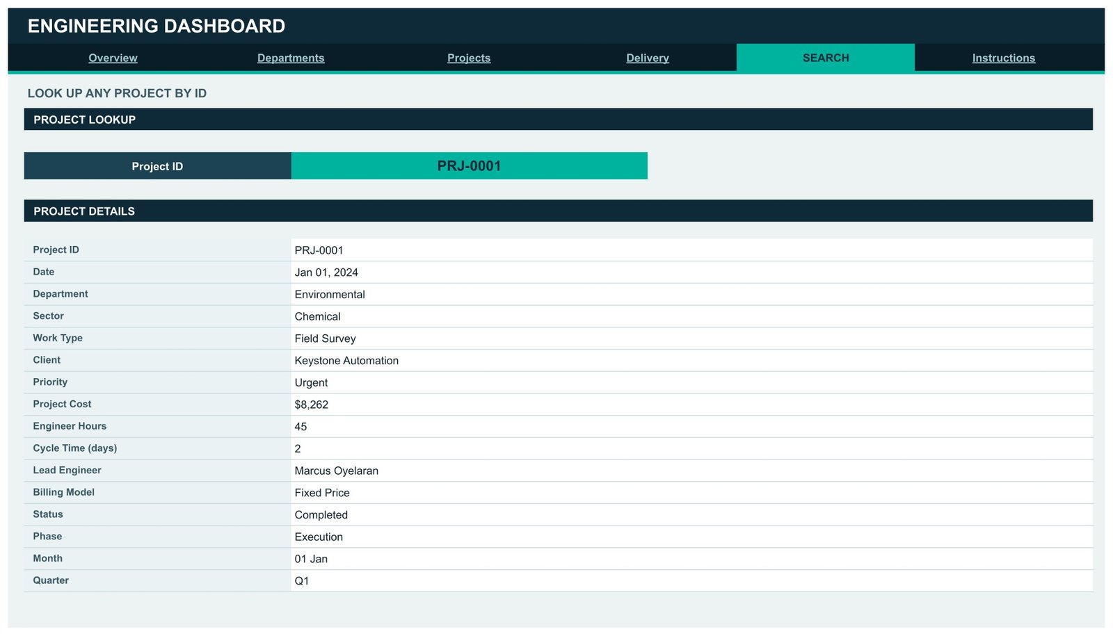
- A dedicated Search page returning the full 16-field record for any Project ID.
- Auto-expanding ranges to 1,000 rows. Pivots, slicers and formulas already cover row 1001, so pasting new projects needs no range editing.
- A three-colour theme edited from a single palette block: ink
#0E2A38, accent#00B39Fand amber#F2A03Dfor second chart series.
Dashboard Pages Explanation
1. Overview – portfolio-wide performance
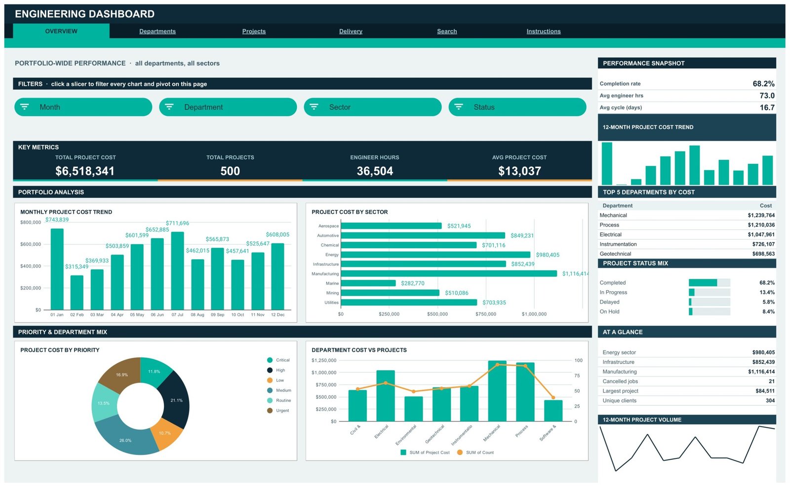
The Overview page reports every department and every sector at once. Its slicer strip carries Month, Department, Sector and Status. Four KPI cards sit below: Total Project Cost $6,518,341, Total Projects 500, Engineer Hours 36,504 and Avg Project Cost $13,037.
The Portfolio Analysis band holds Monthly Project Cost Trend, which opens at $743,839 in January, dips to $315,349 in February and recovers to $608,005 by December, and Project Cost by Sector, where Manufacturing leads at $1,116,414, followed by Energy at $980,405 and Infrastructure at $852,439. Marine is the smallest at $282,770.
Below that, Project Cost by Priority splits spend into Medium 26.0%, High 21.1%, Urgent 16.9%, Routine 13.5%, Critical 11.8% and Low 10.7%, while Department Cost vs Projects plots spend as columns against project count as a line across all eight departments.
The sidebar reports a 68.2% completion rate, 73.0 average engineer hours, a 16.7-day average cycle, the Top 5 Departments by Cost led by Mechanical at $1,239,764, and a Project Status Mix of 68.2% Completed, 13.4% In Progress, 8.4% On Hold and 5.8% Delayed.
2. Departments – workload, capacity and quality
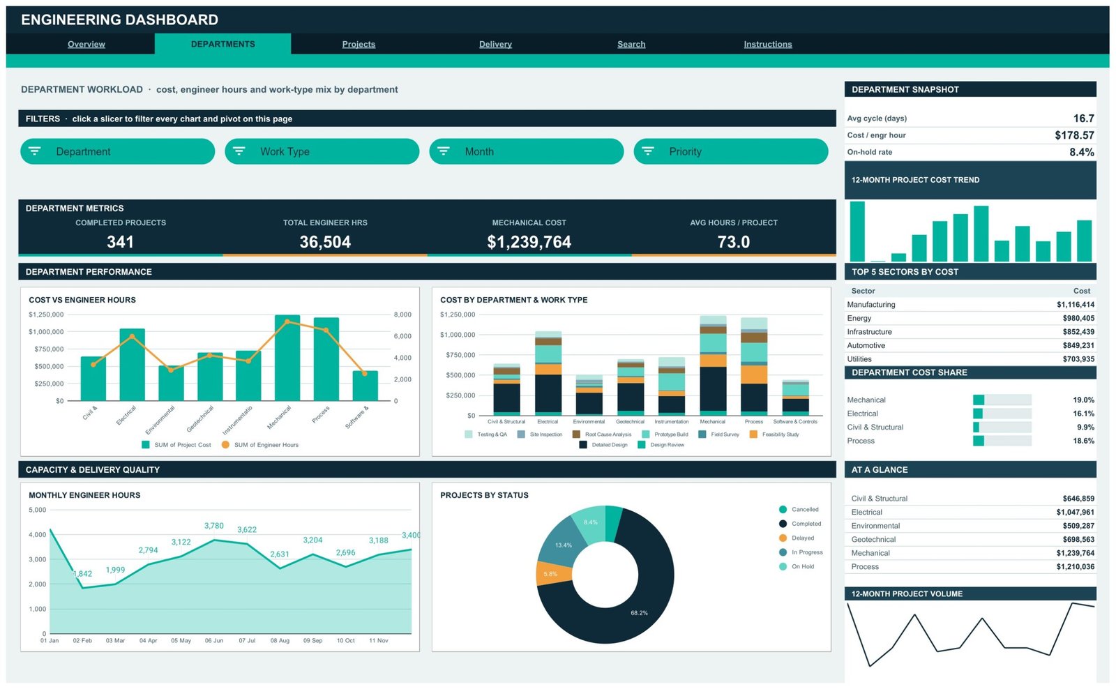
Slicers here are Department, Work Type, Month and Priority. The KPI row switches to Completed Projects 341, Total Engineer Hrs 36,504, Mechanical Cost $1,239,764 and Avg Hours / Project 73.0.
Cost vs Engineer Hours puts spend and effort on the same axis pair per department, so an outlier – a department burning hours without matching cost, or the reverse – is obvious at a glance. Cost by Department & Work Type stacks all eight work types inside each department column: Detailed Design, Design Review, Feasibility Study, Field Survey, Prototype Build, Root Cause Analysis, Site Inspection and Testing & QA.
The lower band pairs Monthly Engineer Hours, an area chart running from 1,842 hours in February up to 3,400 in November, with Projects by Status as a donut. The sidebar’s headline number is cost per engineer hour at $178.57, alongside an on-hold rate of 8.4% and a Department Cost Share list showing Mechanical 19.0%, Process 18.6%, Electrical 16.1% and Civil & Structural 9.9%.
3. Projects – work type, sector and lead engineer
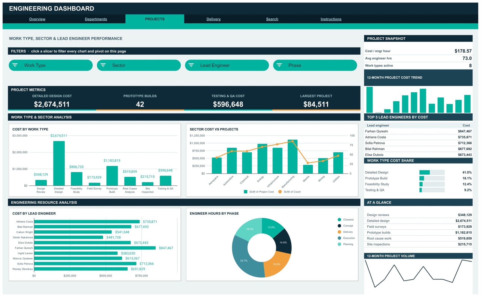
Slicers: Work Type, Sector, Lead Engineer and Phase. KPI cards read Detailed Design Cost $2,674,511, Prototype Builds 42, Testing & QA Cost $596,648 and Largest Project $84,511.
Cost by Work Type makes the concentration plain – Detailed Design alone is 41.0% of all spend at $2,674,511, with Prototype Build second at $1,182,815 and Field Survey smallest at $173,929. Sector Cost vs Projects repeats the cost-versus-volume pairing at sector level.
Cost by Lead Engineer ranks all ten engineers on a horizontal bar chart, from Farhan Qureshi at $847,467 down to Derek Nakamura at $481,728. Engineer Hours by Phase divides effort into Execution 33.7%, Delivery 19.8%, Closeout 18.0%, Concept 14.6% and Planning 13.8%. The sidebar’s Work Type Cost Share confirms the Detailed Design 41.0% concentration.
4. Delivery – priority, phase and billing
Slicers: Priority, Phase, Billing Model and Month. KPI cards show Critical Priority Cost $769,932, High Priority Jobs 102, Unique Clients 304 and On-Hold Rate 8.4%.
Projects by Priority counts 147 Medium, 102 High, 86 Routine, 67 Low, 63 Urgent and 35 Critical. Phase Cost vs Engineer Hours identifies Execution as the heaviest phase at $2,123,501, ahead of Delivery at $1,248,334 and Planning at $1,150,781. Cost by Billing Model breaks the commercial mix into Fixed Price 29.1%, Time & Materials 16.4%, Lump Sum 15.4%, Milestone 15.4%, Cost Plus 12.6% and Retainer 11.2%. Monthly Project Volume tracks throughput between 33 and 50 jobs a month.
The sidebar adds $21,442 of cost per client, 1.6 projects per client and 17.0% of work billed on milestones.

5. Search – single project lookup
Choose a Project ID from the dropdown and the page returns the complete record: date, department, sector, work type, client, priority, project cost, engineer hours, cycle time, lead engineer, billing model, status, phase, month and quarter. The sample record PRJ-0001 is an urgent Field Survey for Keystone Automation in the chemical sector – $8,262, 45 engineer hours, 2-day cycle, led by Marcus Oyelaran on a fixed-price contract.
6. Instructions – the built-in user guide
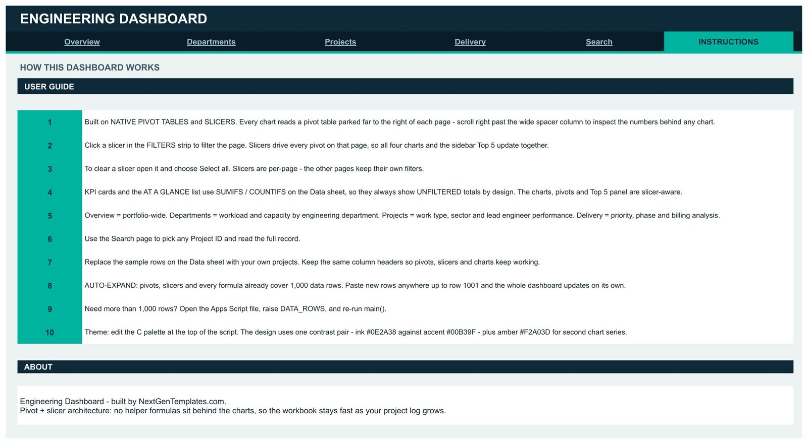
Ten numbered steps explain the architecture, how to clear a slicer with Select all, why the KPI cards are deliberately unfiltered, how to swap in your data without breaking the pivots, and how to raise the row limit past 1,000 by editing DATA_ROWS in the Apps Script file.
Engineering Dashboard in Google Sheets vs. Excel vs. Paid Project Portfolio Software – Feature Comparison
| Factor | Engineering Dashboard in Google Sheets | Excel engineering dashboard | Smartsheet / Monday.com |
|---|---|---|---|
| Cost | $9.99 one time | $70-$160 per year for Microsoft 365 | $9-$24 per user per month |
| Platform | Any browser | Desktop Excel preferred | Vendor cloud |
| Setup time | About 10 minutes | 10 minutes plus an Excel install | Days of workspace configuration |
| Real-time team collaboration | Native | OneDrive co-authoring only | Native |
| Mobile access | Google Sheets app | Excel mobile, limited | Native apps |
| Customisable fields | Add columns freely | Add columns freely | Limited to the vendor schema |
| Share with a link | Yes | File or OneDrive link | Yes, seat permitting |
| Year-1 cost at 5 users | $9.99 | $350-$800 | $540-$1,440 |
| Cost per engineer hour | Built in | Build it yourself | Often a premium add-on |
| Where the data lives | Your Google Drive | Your file | Vendor database |
Who Should Use This Template
Engineering managers who assemble a monthly performance pack and want the department, work-type and status views prepared in advance rather than rebuilt each cycle.
Practice and discipline leads in civil, structural, mechanical, electrical, process, geotechnical, environmental or instrumentation groups, who need to compare workload across named lead engineers.
Consulting and design offices that bill on a mix of fixed price, time and materials, milestone and retainer contracts and need the commercial mix visible next to delivery performance.
Finance partners to an engineering division, for whom cost per engineer hour, cost per client and phase-level spend are the three numbers that matter.
Real-World Use Cases
Monthly departmental review. Filter the Departments page to a single department, read the Cost vs Engineer Hours chart and the $178.57 cost-per-hour benchmark, and the review slide is written.
Rebalancing workload. Cost by Lead Engineer exposing a $847,467 to $481,728 spread across ten engineers is a straightforward prompt to redistribute the next quarter’s assignments.
Contract mix negotiation. Fixed Price at 29.1% of revenue, read alongside a 68.2% completion rate and $2,123,501 of Execution-phase cost, is the evidence base for pushing more work onto milestone terms.
Client profitability review. $21,442 of cost per client against 1.6 projects per client points straight at whether the account base is broad and shallow or narrow and deep.
Advantages of the Engineering Dashboard in Google Sheets
- It stays fast. Because pivots do the aggregation, there is no wall of array formulas recalculating on every edit.
- It is auditable. Scroll right past the spacer column on any page and you can read the pivot table behind any chart – useful when a number is challenged in a meeting.
- It is genuinely collaborative. Google Sheets sharing means the whole team reads the same live file, with no version suffixes.
- It is yours. The copy sits in your own Drive. No vendor account, no seat count, no export process if you stop paying.
- It extends. New departments, sectors, work types or engineers typed into the Data sheet appear in the slicers and charts on their own.
Opportunities for Improvement
Worth knowing before you buy, so there are no surprises:
- The KPI cards are unfiltered by design. They use SUMIFS and COUNTIFS against the Data sheet, so a slicer selection changes the charts and pivots but not the cards. That is documented on the Instructions page, but it does catch people out on first use.
- 1,000 rows out of the box. Going beyond that means editing DATA_ROWS in the Apps Script file and re-running main() – a small step, but a step.
- Slicers are per page. Convenient once you know it, confusing on day one when Overview and Departments show different filtered views.
- It reports, it does not schedule. There is no Gantt view, no task dependency and no resource levelling.
- Sharing is file-level. Google Sheets cannot hide the Data sheet’s cost column from one viewer and show it to another.
- Wide pages on a phone. The numbers read fine in the mobile app, but the four-chart layouts want a laptop or tablet.
Best Practices
- Keep the column headers exactly as shipped. The pivots, slicers and charts bind to them by name; rename one and the page it feeds goes blank.
- Load a full 12 months before judging the trends. The monthly cost and volume charts only tell you something once there is a year of history behind them.
- Standardise your category values. “Mech” and “Mechanical” become two departments in every pivot. A short validation list on the Data sheet prevents a lot of cleanup.
- Clear slicers before you screenshot. Open the slicer, choose Select all, and you know the chart shows the whole portfolio.
- Learn how pivot tables and slicers behave if you plan to extend the build – the Google Docs Editors Help guide to pivot tables is the reference to keep open.
- Recolour once, at the start. Edit the three hex codes in the palette block before anyone gets attached to the default teal.
Explore Relevant Templates
- Project Management Office (PMO) Dashboard in Google Sheets – portfolio governance one level above engineering delivery
- Innovation & Transformation Dashboard in Google Sheets – for R&D pipelines and change programmes
- Cement and Steel Dashboard in Google Sheets – heavy industry and materials reporting
- Real Estate Development Dashboard in Google Sheets – build-side project delivery
- Daily Production Output Tracker in Google Sheets – shop-floor output logging
If you want to learn how dashboards like this are built, the Excel Pivot Tables & Dashboards course on NextGenTemplates Academy takes you through pivots, slicers and layout with practice files.
Frequently Asked Questions
What exactly do I receive when I buy?
A PDF containing a Make a Copy link. Click it while signed in to Google and a fully editable copy of the dashboard lands in your own Drive.
Do I need a paid Google Workspace account?
No. A free personal Google account is enough.
How many projects will it handle?
1,000 rows with no changes at all. Beyond that, raise DATA_ROWS in the Apps Script file and re-run main().
Why did my slicer not change the KPI cards?
Because the cards are built on SUMIFS and COUNTIFS over the whole Data sheet and always show portfolio totals. The charts, pivots and Top 5 panels are the slicer-aware components.
Can I add engineering departments or work types that are not in the sample?
Yes. Type them into the Data sheet and they flow through to the slicers, pivots and charts with no list maintenance.
Can I match it to our corporate colours?
Yes. The design uses one contrast pair – ink #0E2A38 against accent #00B39F – plus amber #F2A03D for second chart series, all set from one palette block at the top of the script.
Is there a recurring charge?
No. One payment, lifetime access, and the file lives in your Drive.
About the Author
Built by PK – Microsoft Certified Professional with 15+ years of Excel, Google Sheets, and Power BI experience. Founder of NextGenTemplates, reaching 300K+ subscribers across YouTube channels. Every template is hand-built and tested before release.
Conclusion
The Engineering Dashboard in Google Sheets is a reporting layer for a project log you almost certainly already keep. Six pages, 16 KPI cards, 16 pivot-driven charts and a project lookup, for a one-time $9.99 against a $16.99 list price – set against $540 to $1,440 a year for a five-seat portfolio tool that would still need configuring.
If your engineering reporting currently means rebuilding pivot tables at the end of every month, this replaces that hour with a paste.